Time History and Comparison
- 📅 Date Picker
- 🏷️ Area names
- 🏷️ Attribute names (v3.32)
- ⚡ Energy Date Sync
- 📅 Show Full Period
- 📅 Long-Range Views
- 📆 Week Start
↔️ Time Offset- 👥 Period Comparison
- 🔮 Forecast Horizon
📅 Date Picker
A built-in date navigation panel that lets users browse historical data by Day, Week, Month, or Year — without leaving the dashboard.
type: custom:statistics-graph-chart-card
show_date_picker: true
date_picker_position: top
entities:
  - entity: sensor.temperature_living
color: "#ff6b35"The date picker bar shows the current period label with arrow buttons to move forward/backward:
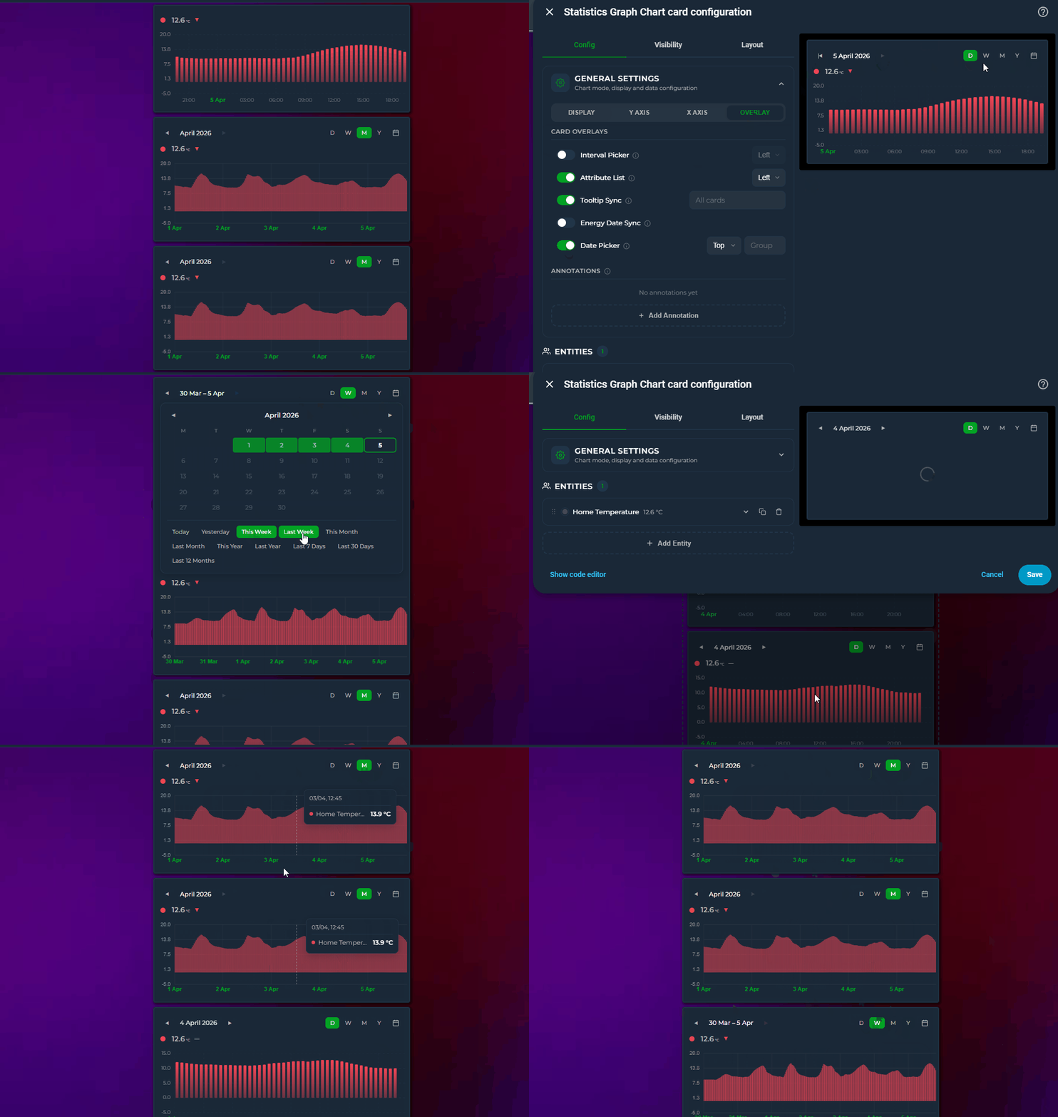
- D / W / M / Y — switch between Day, Week, Month, and Year views
- ◀ ▶ — navigate to the previous/next period
- 📅 — open the calendar popup for direct date selection
Layout: the ‹ period › navigator and the D/W/M/Y + 📅 shortcuts can each sit left / center / right:
date_picker_nav_position: center
date_picker_shortcuts_position: rightClick the calendar icon to open a panel with:
- Calendar grid — click two dates to select a custom range
- Quick presets — Today, Yesterday, This/Last Week, This/Last Month, This/Last Year, Last 7 Days, Last 30 Days, Last 12 Months
The calendar stays open after selection so you can adjust the range. Click the 📅 icon again to close it.
Cards with the same date_picker_group share their date selection. You don't need a visible date picker on every card — only one card needs show_date_picker: true. Other cards in the same group will follow along automatically.
# Card 1: Has the visible date picker — this is the "controller"
show_date_picker: true
date_picker_group: bedroom

# Card 2: No visible picker — just follows Card 1
date_picker_group: bedroom

# Card 3: Also follows Card 1
date_picker_group: bedroom
Changing the date on Card 1 updates all three cards. Cards 2 and 3 show no picker UI but their data range follows the group selection.
This is ideal for dashboards where you want one date picker controlling multiple charts without repeating the picker bar on every card.
The same mechanism exists for the other on-card controls: interval_picker_group for the Interval Picker, and pph_picker_group / group_by_picker_group for the on-card Points/Hour and Group By pickers — each group is independent.
Control which period buttons appear with date_picker_modes:
# Show only Month and Year
date_picker_modes:
  - month
  - year

# Lock to Month — buttons hidden, navigation centered
date_picker_modes:
  - month
When only one mode is listed, the D/W/M/Y buttons are hidden entirely and the navigation (◀ label ▶) is centered for a minimal look. The 📅 calendar icon stays visible on the right.
The arrows jump period by period — for a quick peek into the recent past without leaving the current view, add extended_window_multiplier:
show_date_picker: true
extended_window_multiplier: 2   # render 2× the period, scroll back through the extra half
The card renders N× the selected period but opens showing exactly the period you picked, at its own scale and bucket density — then you can scroll horizontally into the extra history (scrollbar or mouse wheel, per scroll_mode). It follows the picker: on a Week view one extra week sits behind the current one; switch to Day and it's one extra day. The picker's header and arrows stay on the selected period — scrolling is a peek, the arrows remain the navigation. Also works without the date picker (extends hours_to_show or graph_start periods the same way).
With forecast data (data_attribute entities or forecast_horizon data whose points reach into the future — weather, prices): the chart opens with the current period in view (right edge at "now"), with the forecast reachable by scrolling right and history by scrolling left. This also works together with graph_start: normally graph_start cuts the window at the period's end, but with the multiplier active the forecast tail is rendered and scrollable, and the viewport spans the full selected period (so the scale doesn't creep as the day progresses). show_full_period is the exception — it keeps its "whole period, cut at its end" contract.
Alongside the calendar modes, the picker offers rolling windows that always end at now: last_24h, last_3d, last_7d, last_15d, last_30d, last_90d, last_180d, last_12m. Unlike Day / Week / Month / Year (which snap to calendar boundaries), these show the last N up to the current moment, and the ◀ ▶ arrows jump a full N back/forward (e.g. the previous 7 days).
Use them two ways:
# Always open on the last 7 days
show_date_picker: true
date_picker_default_mode: last_7d
# Offer rolling buttons in the picker bar (shown as 24H / 7D / 30D …)
show_date_picker: true
date_picker_modes:
- day
- last_7d
- last_30d- As Default Mode (
date_picker_default_mode) a rolling window is forced as the starting view on every load. - As Visible Modes (
date_picker_modes) the rolling options appear as extra buttons —24H,3D,7D,15D,30D,90D,180D,12M— next to D/W/M/Y. Calendar modes are on by default; rolling buttons are off until you add them. In the editor the two families are shown under separate Calendar periods / Rolling windows headings, and on the picker bar a thin divider separates the D/W/M/Y buttons from the rolling ones so the two aren't mistaken for each other. (v3.30) - The label reads e.g. Last 7 days at the current window, switching to a date range (
May 16 – May 23) once you navigate back.
date_picker_step controls how many units make up one "window". Default 1 = the legacy behavior (each click moves one day, one week, one month, etc.). When you set it higher, the picker becomes a rolling N-unit window and prev/next buttons jump a full N units at a time.
# Last 4 weeks, prev/next jumps 4 weeks
show_date_picker: true
date_picker_step: 4
date_picker_modes:
  - week
# Last 30 days, prev/next jumps 30 days
date_picker_step: 30
date_picker_modes:
- dayThe label adapts automatically: step > 1 shows the date range (Mar 11 – Apr 7), step = 1 keeps the existing single-period labels (April 2026, Apr 1 – Apr 7).
Editor: General Settings → Calendar tab → Date Navigation → Window Step (appears next to Visible Modes when the date picker is enabled)
| Period | X-axis range | Live updates |
|---|---|---|
| Today | 00:00 → end of day | ✅ Active |
| Yesterday | 00:00 → 23:59 | ❌ Paused |
| This Week | Monday 00:00 → end of week | ✅ Active |
| Last 7 Days | 7 days ago → now | ✅ Active |
| Custom range | Start → End | Depends on whether end is today |
General Settings → Calendar tab → Date Navigation → Date Picker toggle. Position and Group options appear on the same row. The Group field is always editable — even when the Date Picker toggle is off — so you can assign a group to cards that don't show their own picker. When enabled, a Visible Modes section appears below with D/W/M/Y checkboxes plus the rolling options (24H / 3D / 7D … 12M), and a Default Mode dropdown that also lists the rolling windows. The Date Nav and Shortcuts dropdowns control where the navigator and the mode buttons sit in the bar.
- Cannot be used together with
energy_date_sync— enabling one disables the other - Date picker state is persisted in
localStorageand restored on page reload - When viewing the current period, the X-axis extends to the end of the period with empty space after the current time
- Cards with only
date_picker_group(noshow_date_picker) use their normalhours_to_showuntil a sync event arrives from a card in the same group
🏷️ Area names
Append each entity's Home Assistant area to its label. Handy when a card mixes rooms, and essential with integrations like Advanced History that hand several entities the same friendly name (three Heating Temperature sensors, one per room, otherwise indistinguishable):
type: custom:statistics-graph-chart-card
include_area_names: true   # default false
entities:
  - entity: sensor.lounge_heating    # friendly_name: "Heating Temperature"  (area: Lounge)
  - entity: sensor.office_heating    # friendly_name: "Heating Temperature"  (area: Office)
  - entity: sensor.fridge            # friendly_name: "Fridge Temp"          (area: Kitchen)
  - entity: sensor.lounge_lamp       # friendly_name: "Lounge Lamp Power"    (area: Lounge)
Legend result:
Heating Temperature · Lounge
Heating Temperature · Office
Fridge Temp · Kitchen
Lounge Lamp Power              ← already says "Lounge", not doubled up
- Every entity that has an area gets it — there is no duplicate detection. A rule that only fired on collisions would make your legend change shape whenever an unrelated entity was added or removed; if you switch this on, you want the areas.
- The area is taken from the entity's own area registry entry; if it has none, the card falls back to the entity's device area. If neither resolves, the name is left unchanged.
- A friendly name that already contains its area (e.g. Lounge Heating Temperature in the Lounge) isn't doubled up.
- An explicit
name:(including template names) is your own label and is never modified. - Applies to the state row, legend, tooltip, stats, exports and the editor's entity list, so every surface agrees.
- Comparison ghosts inherit the parent's suffix — Heating Temperature · Lounge (previous period).
- Off by default. Resolution is a couple of registry key-lookups per configured entity, so the cost is negligible.
General Settings → Chart tab → Visual Options → the Area names toggle (next to the legend options).
🏷️ Attribute names (v3.32)
When a card plots two attributes of the same entity, both series carry that entity's friendly name — so the legend and the tooltip show the same label twice and there is no way to tell which line is which:
entities:
  - entity: climate.lounge_heating
    attribute: current_temperature     # legend: "Lounge Heating"
  - entity: climate.lounge_heating
    attribute: temperature             # legend: "Lounge Heating"   ← identical
Two card-level options qualify the label with the attribute, everywhere the name appears — state row, legend, tooltip, stats and exports:
include_attribute_name: true      # "Lounge Heating · Current temperature"
use_only_attribute_name: true # "Current temperature"| Options | Label |
|---|---|
| neither | Lounge Heating |
include_attribute_name |
Lounge Heating · Current temperature |
use_only_attribute_name |
Current temperature |
use_only_attribute_name + include_area_names
|
Current temperature · Lounge |
Details:
- Only rows that actually plot an attribute change. An entity graphed on its own state has no attribute name, so it is left exactly as it was — which means you can turn these on for a whole card without touching its ordinary series.
-
An explicit
name:always wins, as everywhere else in the card. - The attribute label comes from Home Assistant's own translated attribute name when your HA version provides one, so a German dashboard reads Zieltemperatur. Otherwise the attribute key is humanised:
current_temperature→Current Temperature. The runtime attribute picker uses the same label, so the dropdown and the chart always name an attribute the same way (v3.32). - With
ref_entity, both halves of the combined name are qualified —Current Temperature - Target Temperaturerather than one attribute minus a bare entity name. - Rows using
data_attribute(an attribute array such as a forecast) are never renamed afterattribute:, since that is not what they plot. - If you switch attributes with the runtime attribute picker, the label follows.
- The two options are alternatives, not a stack. In the visual editor, switching one on turns the other off; in YAML,
use_only_attribute_namewins if you set both. - It cooperates with
include_area_names: the "name already contains its area" rule is evaluated against the label you will actually see, soLounge Heatingkeeps its area suppressed whileCurrent temperaturecorrectly gains· Lounge.
General Settings → Chart tab → Visual Options → the Attribute names and Attribute names only toggles, next to Area names.
⚡ Energy Date Sync
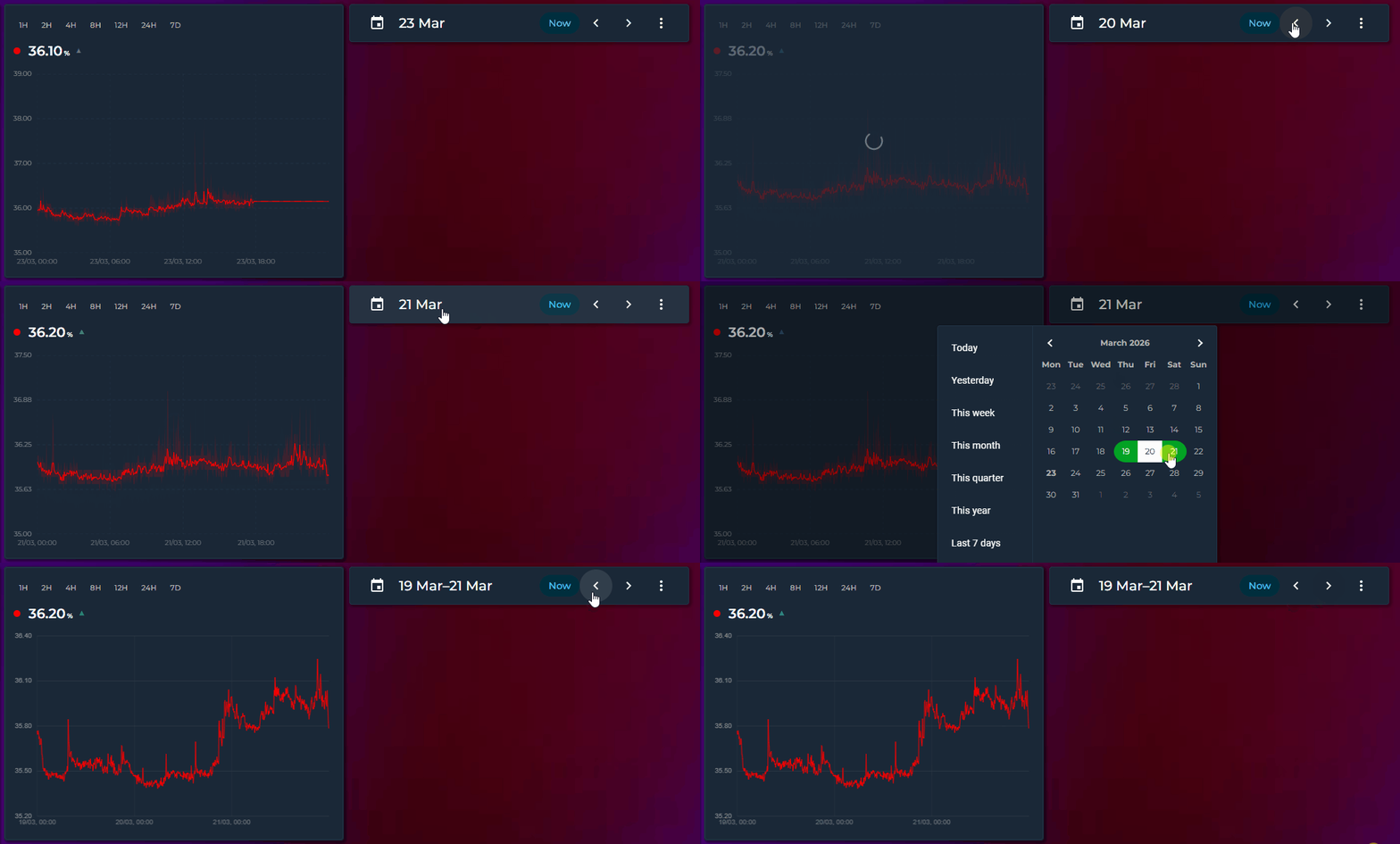
Syncs the card's time range with Home Assistant's Energy dashboard date picker or the energy-period-selector-plus custom card.
type: custom:statistics-graph-chart-card
energy_date_sync: true
entities:
  - entity: sensor.energy_consumption
    color: "#ff4757"
    aggregate_func: sum
  - entity: sensor.solar_production
    color: "#2ecc71"
    aggregate_func: sum
Place the card on the same dashboard as an Energy date picker. When the user selects a day, week, month, or custom range, this card automatically updates to show the same period.
| Date selection | X-axis range | Live updates |
|---|---|---|
| Today | 00:00 → current time | ✅ Active — graph updates in real time |
| Yesterday | 00:00 → 23:59 | ❌ Paused — historical data is frozen |
| This week | Monday 00:00 → current time | ✅ Active |
| Last week | Monday 00:00 → Sunday 23:59 | ❌ Paused |
| This month | 1st 00:00 → current time | ✅ Active |
| Custom range | Start → End (clamped to now if end is in the future) | Depends on whether end is today |
- HA's built-in Energy dashboard date picker (DAY / WEEK / MONTH / YEAR)
- energy-period-selector-plus custom card
- Any card that uses HA's energy data collection system
General Settings → Calendar tab → Date Navigation → Energy Date Sync toggle.
- When
energy_date_syncis active, it overrideshours_to_showand the interval picker selection - Period changes made in the Energy dashboard are picked up instantly — no polling, no refresh delay
- If the Energy panel hasn't loaded yet, the card retries every 2 seconds for up to 60 seconds
📅 Show Full Period
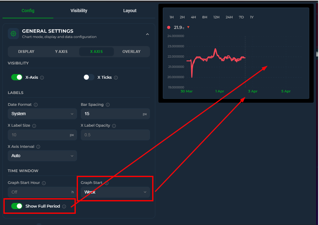
Extends the X-axis to cover a complete calendar period, leaving empty space after the current time. A dashed vertical "now" line marks where live data ends.
graph_start_hour: 0
hours_to_show: 24
show_full_period: true    # X-axis: 00:00 → 23:59, empty after now
The end of the period is determined by graph_start:
graph_start |
X-axis extends to |
|---|---|
| off | End of today (next midnight) |
week |
End of week (next Monday 00:00) |
month |
End of month (1st of next month) |
year |
End of year (Jan 1st next year) |
show_full_period also works with energy_date_sync: true. When the energy date picker selects a current period (today, this week, this month), the X-axis extends to the full period end. Past periods display in full as before.
energy_date_sync: true
show_full_period: true    # energy picker "This Month" → X-axis: Apr 1 → May 1
This is especially useful for:
- Imported data (energy, gas) that arrives with a few days delay — the graph shows the gap instead of filling it with the last known value
- Day comparison with offset — today's card shows a partial day with empty space; yesterday's card (offset: 24) shows a complete day
- Weekly/monthly dashboards — see the full period at a glance with the "now" marker
-
Energy dashboard — combine with
energy_date_syncto see the full billing period
Editor: General Settings → Calendar tab → Time Window → Show Full Period checkbox
📅 Long-Range Views
Visualize data over weeks, months, and years with calendar-aware grouping and native HA statistics.
group_by: week
graph_start: month         # this month's weeks
aggregate_func: change     # consumption per week
graph_type: bargroup_by: month
graph_start: year # start from Jan 1group_by: year
hours_to_show: 87600 # ~10 years
aggregate_func: change # annual consumption
graph_type: barWhen group_by is set to date, week, month, or year, the card fetches data using native HA statistics periods (period: 'day', 'week', 'month'). Year mode fetches monthly data and aggregates client-side. This enables the change aggregate field and bypasses the database retention limit — you can display a full year of data even if your recorder purge is set to 10 days.
Even in interval mode with short ranges (hours_to_show ≤ 24), the card auto-routes to long-term statistics in two cases:
-
Any entity declares
statistic_idexplicitly — the user vouches that the entity has long-term statistics available. Useful for entities that exist only in the statistics database (Gazpar, Linky, etc.) or for forcing the route. -
hours_to_show > 240(≈ 10 days, the typical recorder retention) — statistics is the only source that can serve the range, so the card switches automatically.
In both cases the route is conditional on every relevant entity having long-term statistics available — meaning a state_class of measurement, total, or total_increasing, or an explicit statistic_id. If any entity in the card lacks LTS, the route falls back to the regular history API to keep that entity working.
When the requested range exceeds 10 days but some entities lack LTS, a console warning is printed once listing the offending entities and explaining how to enable state_class in HA.
When graph_start is set, hours_to_show is ignored — the calendar period directly determines the start:
| Value | Behavior |
|---|---|
week |
Start from Monday 00:00 |
month |
Start from the 1st of the month |
year |
Start from January 1st |
Editor: General Settings → Calendar tab → Time Window → Graph Start
graph_start: tomorrow sets the window to tomorrow 00:00 → end of day — ideal for next-day spot prices (Nord Pool, EPEX, Tibber) via data_attribute. The window extends into the future automatically without show_full_period.
type: custom:statistics-graph-chart-card
card_header: Tomorrow Spot Prices
graph_start: tomorrow
group_by: hour
entities:
  - entity: sensor.nord_pool_fi_contract_current_price
    data_attribute: tomorrow_hourly
    data_time_field: start
    data_value_field: value
    graph_type: bar
    decimals: 2
unit: c/kWhManual control over tick spacing:
x_axis_interval: 2h    # Every 2 hours (00:00, 02:00, 04:00…)
x_axis_interval: 1d    # Daily (midnight)
x_axis_interval: 1w    # Weekly (Mondays)
x_axis_interval: 1M    # Monthly (1st of month)
Available presets in the editor: Auto, 1H–12H, 1D, 2D, 7D, 1W, 2W, 1M, 3M.
Editor: General Settings → X-Axis → X Axis Interval
Control the appearance of horizontal (Y) and vertical (X) grid lines independently.
y_grid_style: solid      # dashed (default), solid, dotted, long-dash
y_grid_width: 0.5         # thickness in px (default: 1)
y_grid_color: "rgba(255,255,255,0.1)"  # any CSS color or {{ template }}
y_grid_opacity: 0.3       # 0–1 (default: 0.15)

x_grid_style: dotted
x_grid_width: 0.5
x_grid_color: "var(--divider-color)"
x_grid_opacity: 0.3
Editor: Y Axis tab → Grid section, X Axis tab → Grid section
The X-axis automatically adapts to the group_by setting:
- Week — Ticks on Mondays: "3 Mar", "10 Mar"
- Month — Ticks on the 1st: "Jan", "Feb" (with year when spanning multiple years)
- Date — Daily ticks: "3 Mar", "4 Mar"
- Hour — Hourly ticks; midnight shows date instead of "00:00"
In interval mode, midnight labels also show the date for any view longer than 12 hours.
📆 Week Start
Everything week-shaped on the card follows Home Assistant's "First day of the week" user setting (your profile page) — no YAML, no card option.
-
Weekly buckets —
group_by: weekbuckets start on your configured weekday - Date picker — the Week view's window and the calendar popup's day grid both start on that day
-
X-axis ticks — weekly tick marks (automatic weekly labels and
x_axis_interval: 1w) land on that weekday - Box Plot — weekly box buckets align to the same boundary
Automatic (the setting's default) derives the first day from your language, exactly like the rest of HA — Monday for most European locales, Sunday for en-US.
Home Assistant's recorder computes weekly long-term statistics Monday-anchored on the server — there is no Sunday-based weekly row to fetch. When your week starts on any day other than Monday, the card transparently fetches daily statistics rows instead and builds the weekly buckets client-side, so totals and change aggregates stay correct. Nothing to configure.
↔️ Time Offset
Compare the same sensor across different time periods by adding multiple entity entries with different offset values. Each offset shifts that entity's data backward in time while keeping it aligned on the same graph.
hours_to_show: 168
entities:
  - entity: sensor.energy_consumption
    name: "This week"
    offset: 0
    color: "#ff4757"
  - entity: sensor.energy_consumption
    name: "Last week"
    offset: 168
    color: "#378ADD"
  - entity: sensor.energy_consumption
    name: "2 weeks ago"
    offset: 336
color: "#2ecc71"-
offset: 168means "fetch data from 168 hours (7 days) before the current display window" - The fetched data is time-shifted forward to align with the current window on the X axis
- All rendering features work at full quality — line, bar, step, fill, gradient, points, tooltips, stacking, zoom
- Each entity with an offset gets its own API call with the correct time range
| Offset | Period |
|---|---|
24 |
Yesterday |
168 |
Last week |
336 |
2 weeks ago |
720 |
Last month (~30 days) |
8760 |
Last year |
Instead of a fixed number, you can point offset to any HA entity whose state is a number (in hours). The card reads the entity's current state and re-fetches history automatically when it changes.
entities:
  - entity: sensor.energy_consumption
    name: "Current"
  - entity: sensor.energy_consumption
    name: "Comparison"
    offset: input_number.comparison_offset
    color: "#378ADD"
This works with any entity type — input_number, template sensors, or any sensor that outputs a numeric state. Combine with HA template sensors for fully dynamic comparisons:
# In HA configuration.yaml
template:
  - sensor:
      - name: "Dynamic Offset"
        state: "{{ 24 if now().weekday() < 5 else 168 }}"
unit_of_measurement: "h"Entity → Advanced tab → Advanced Calculations → Offset (in hours).
- Offset entities do not receive live WebSocket updates (they show historical data)
- The state row, sparkline, and gauge correctly display the last value from the offset time window — not the live entity state
- Works with all chart modes that support multiple entities
- Can be combined with
value_transform,value_factor, and all other entity options - Each offset generates a separate cache entry, so switching between views is fast
👥 Period Comparison
Overlay a faded "ghost" of the same entity from a previous period underneath the main series — today vs yesterday, this week vs last week, this month vs last month — with a single per-entity compare option. Unlike a manual Time Offset entry, compare needs no duplicate entity: the ghost inherits the main entity's whole configuration and stays in lock-step with it. Since v3.26, compare also accepts a list of comparisons — one ghost per entry, each reaching further back via periods_back — see Multiple comparisons below.
type: custom:statistics-graph-chart-card
card_header: Power — Today vs Yesterday
hours_to_show: 24
entities:
  - entity: sensor.power_consumption
compare: yesterday| Value | Ghost shows |
|---|---|
previous_period |
The window immediately before the visible one (a 24h view compares against the 24h before it) |
yesterday |
Same window, 24 hours earlier |
last_week |
Same window, one week earlier |
last_month |
Same window, one month earlier |
last_year |
Same window, one year earlier |
| number | Same window, that many hours earlier |
true |
Shorthand for previous_period
|
For full styling control, use the object form — every sub-option is optional:
type: custom:statistics-graph-chart-card
card_header: Energy — This Week vs Last Week
hours_to_show: 168
group_by: date
entities:
  - entity: sensor.energy_daily
    name: Energy
    graph_type: bar
    aggregate_func: change
    color: "#2ecc71"
    compare:
      period: last_week      # which period the ghost shows
      color: "#9b59b6"       # empty = faded main color
      opacity: 0.6           # 0.05–1
      line_style: solid      # dashed (default) | solid | dotted
      line_width: 1.5        # empty = same as main
      show_fill: true
      show_points: false
      show_in_legend: true   # empty = inherit the main entity's setting
show_delta: true # Δ% next to the main value in the tooltip| Sub-option | Default | Description |
|---|---|---|
period |
previous_period |
Which period the ghost shows — same values as the short forms above (previous_period, yesterday, last_week, last_month, last_year, or a number of hours). |
periods_back |
1 |
(new in v3.26) How many periods back this comparison reaches — an integer ≥ 1, max 520. 1 = the previous period, 2 = two periods ago, and so on; the value multiplies the shift of period (e.g. period: last_week + periods_back: 2 = two weeks ago). Most useful in the list form below. |
hide_on_load |
false |
(new in v3.26) This comparison starts hidden when the card loads — click its legend entry to reveal it (the reveal sticks; it is not re-hidden). Note that clicking the main series in the legend still toggles the whole comparison group together. Also available as a Hide on Load toggle on each editor row. |
color |
null |
Ghost color. Empty = a faded version of the main entity color. The editor offers the standard color picker for this field, with {{ }} template support. |
opacity |
0.45 |
Ghost opacity, 0.05–1. |
line_style |
dashed |
Ghost line pattern: dashed, solid, or dotted. |
line_width |
null |
Ghost line thickness in pixels. Empty = same as the main line. |
show_fill |
false |
Draw the fill area under the ghost line. (new in v3.27) Also available as a Fill toggle on each editor row. |
show_average |
false |
(new in v3.27) Draw a dashed horizontal line at this ghost's average value — the mean of the compared period, in the ghost color. Handy for comparing period averages at a glance. Also available as a Show Average toggle on each editor row. |
show_points |
false |
Draw dots at the ghost's data points. |
show_in_legend |
null |
Show the ghost as its own legend entry. Empty = inherit the main entity's show_in_legend; an explicit false also hides the ghost from the simple legend. |
show_delta |
true |
Show a Δ% next to the main value in the tooltip — green for a positive delta, red for a negative one. |
In the tooltip, each comparison row is preceded by a small line showing that ghost value's actual date and time (hover 15 Jul, 14:00 and the previous-period row is headed by 14 Jul, 14:00 for yesterday), so it is always clear which moment is being compared.
compare also accepts a list of comparison objects — one ghost series per entry. Each entry takes the full sub-option set above plus periods_back, which sets how many periods back that ghost reaches:
type: custom:statistics-graph-chart-card
card_header: Power — vs the last two periods
hours_to_show: 24
entities:
  - entity: sensor.power_consumption
    compare:
      - periods_back: 1        # previous period
      - periods_back: 2        # two periods ago
      - periods_back: 3
        line_style: dotted
color: "#9b59b6"- Follows the date picker. With the picker on Week, the entries above show the last three weeks; switch to Year and the same config shows the last three years — calendar-aligned in Month/Year modes, leap years handled.
-
Each ghost is distinct. Later entries fade progressively by default (opacity
0.45→0.30→0.20…), and legend entries beyond the first read "Name (previous period ×2)", "… ×3", and so on. - Per-ghost tooltip. Every ghost row is headed by its own date sub-header, and with multiple comparisons each ghost row carries its own Δ% against the current value. With a single comparison the tooltip looks exactly as in v3.25 — one date sub-header and the Δ% next to the main value.
- Every entry still takes the full style set (
period,color,opacity,line_style,line_width,show_fill,show_average,show_points,show_in_legend,show_delta,hide_on_load), and hiding the main series from the legend hides all of its ghosts. - Existing single string/object
compareconfigs are untouched — the list form is purely additive.
- The ghost is drawn faded and dashed under the main series and is named "<main name> (previous period)" — the suffix follows the dashboard language.
-
previous_periodshifts by the current window length. In the date picker's Month / Year modes the shift is calendar-aware: July compares against June, wall-clock aligned, and month-end dates are clamped (Mar 31 → Feb 28/29). - A main entity with its own
offsetcompares against the previous period of its shifted window. - Clicking the entity in the legend or its state row toggles the main series and its ghosts together.
-
(improved in v3.28) Under
stacked: true, ghosts stack with each other — the previous period appears as its own faded stacked column next to the current one (one ghost stack per comparison entry, honoringstack_group). Ghosts never stack onto the current period and stay excluded from the tooltip's grand Total. - (new in v3.28) With stacked comparisons the tooltip also shows the previous period's stack total — e.g. "Aktuell Total (previous period)", fully translated — and the current stack's Total row carries a Δ% against it.
- Ghost values go through exactly the same aggregation pipeline as the main entity (
aggregate_func,points_per_hour,group_by, transforms) — the comparison is truly like-for-like. - Timeline charts only. Ignored for
candlestick,fixed_value, anddata_attributeentities, and in sparkline mode.
Per-entity → Graph tab → Period Comparison section (shown in Timeline mode; also hidden on a candlestick entity). Since v3.32 that kind of hiding is systematic: the editor drops every option that does nothing for the selected chart mode, field by field, and a section vanishes once all of its fields have gone — as does a tab once all of its sections have, moving you to the first surviving tab. Your YAML is untouched by it: a hidden option keeps its value and reappears when you switch back. Redesigned as a list in v3.26:
- The section starts empty with an Add Comparison button; each click adds one comparison row and steps the default Periods Back automatically (1, 2, 3 …).
- Each row holds a period select (labels now read Previous Period / Day Before / Week Before / Month Before / Year Before — only the labels changed, the YAML values are still
previous_period,yesterday,last_week,last_month,last_year), a Periods Back input, line style, color, opacity, a Show Δ% in tooltip toggle, and a delete button. - Legacy string/object
compareconfigs load into the list unchanged, and a one-row list commits back to the legacy short form — your YAML stays as compact as before.
🔮 Forecast Horizon
Some sensors expose a forecast value — their current state represents what is predicted for N hours in the future, not what is happening right now. Typical examples:
-
sensor.solcast_pv_forecast_leistung_in_1_stunde— PV power expected in 1 hour - A template sensor whose state is "temperature in 3 hours"
- A weather forecast exposed as a numeric future-hour prediction
Plotting these directly is misleading: the line shows each prediction at the time it was recorded, not at the time it is predicting. forecast_horizon: N fixes this by shifting each recorded data point forward by N hours on the X-axis so every point lands at the moment it is forecasting.
type: custom:statistics-graph-chart-card
graph_start_hour: now
show_full_period: true
entities:
  - entity: sensor.solcast_pv_forecast_leistung_in_1_stunde
    name: "Forecast +1h"
    forecast_horizon: 1
The result: a line that extends 1 hour into the future past the "now" marker, representing the forecast for each upcoming moment. The X-axis end is automatically extended by the largest forecast_horizon across all entities so shifted points stay visible.
The forecast_horizon value should match the actual prediction horizon the sensor represents:
| Sensor | forecast_horizon |
|---|---|
solcast_pv_forecast_leistung_in_1_stunde |
1 |
solcast_pv_forecast_leistung_in_8_stunden |
8 |
| Custom "temperature in 30 minutes" | 0.5 |
Setting a value that doesn't match the sensor's real horizon will still shift the line — but the displayed time no longer corresponds to what the sensor is actually predicting.
Some forecast integrations (Solcast PV, EPEX spot prices, weather APIs) expose future data through entity attributes — a single sensor whose attributes contain an array of timestamped points covering the next 24–48 hours. Combined with data_attribute, you can plot this future data directly. But what if you want to see tomorrow's forecast on today's chart timeline for an at-a-glance comparison?
A negative forecast_horizon shifts each point backward in time. Setting -24 moves tomorrow's points 24 hours earlier so they appear at today's clock positions:
type: custom:statistics-graph-chart-card
show_legend: true
entities:
  - entity: sensor.solcast_pv_forecast_tomorrow
    data_attribute: detailedHourly
    data_time_field: period_start
    data_value_field: pv_estimate
    name: "Tomorrow's forecast (shown today)"
    forecast_horizon: -24
The X-axis stays anchored to today — only the data slides into view. Combine with the live PV sensor (no horizon) on the same chart to see today's reality next to tomorrow's prediction, both aligned to the same hours.
forecast_horizon and offset are orthogonal:
-
offsetshifts the fetch window backward (for past-period overlay comparison) -
forecast_horizonshifts the display forward (positive) or backward (negative)
Both can be used on the same entity. Example: overlay yesterday's 1-hour forecast sensor onto today's timeline, shifted 1h forward:
entities:
  - entity: sensor.solcast_pv_forecast_leistung_in_1_stunde
    offset: 24            # fetch yesterday's recordings
    forecast_horizon: 1   # show them shifted 1h forward
name: "Yesterday's +1h forecast"Entity → Advanced tab → Forecast Horizon (in hours, supports decimals — including negative values).
- Leave empty (or
0) to disable — the sensor plots at its recording time as before - The fetch window is extended backward by the largest horizon so past recordings can be retrieved and shifted forward into the visible future range
- Works with live state updates — new recordings appear on the chart at recording time + horizon
- Multiple entities can use different horizons — the X-axis is extended to cover the largest one