Neumorphic is a SwiftUI utility to build Neumorphism Soft UI easily using custom view modifier and custom button style. It supports all shapes.
Hi, I’m Costa. It is simple to create outer shadow in SwiftUI by writing two lines of code. However, we can’t easily create inner shadow in SwiftUI. That’s the reason why I build this tool to make it simple and reusable.
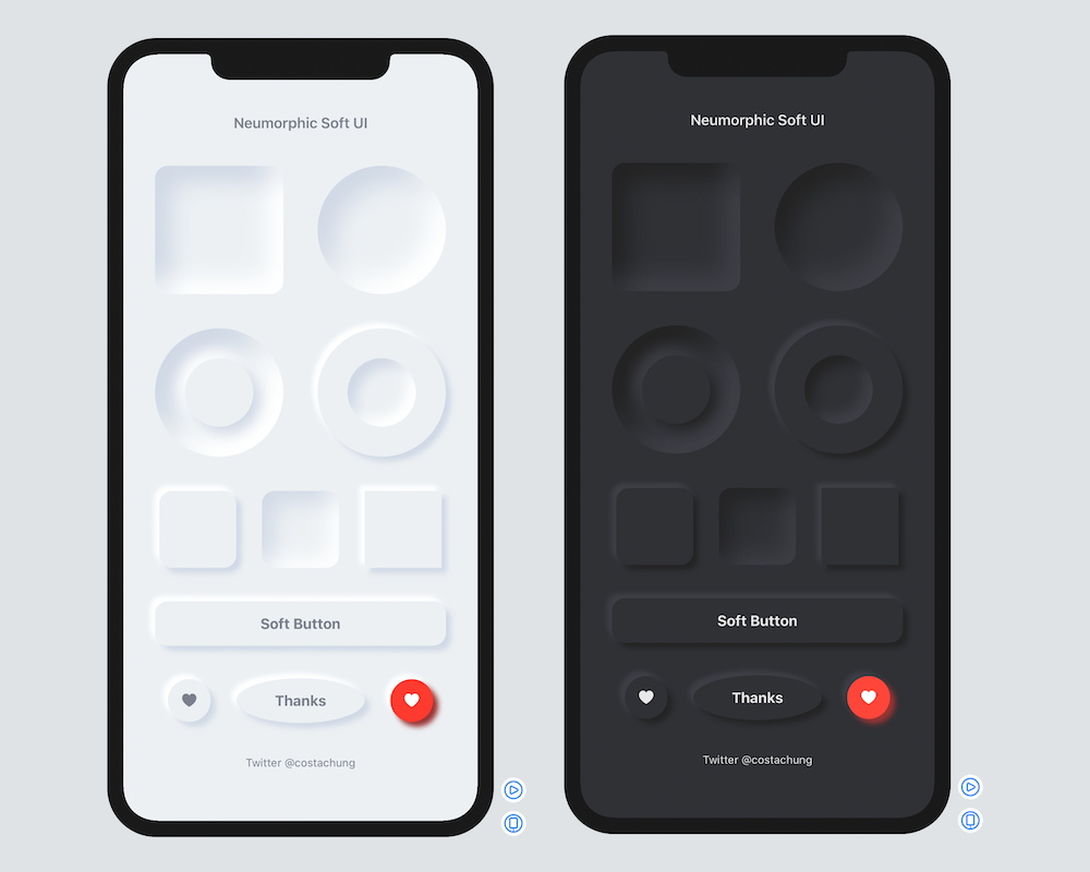
The following views and styles were added in the v2.x updates (see ExampleShowcaseView.swift for copy-ready usage):
- Theme —
NeumorphicTheme, including accent / onAccent button roles andresolvedButtonColors - Buttons —
FixedSizeSoftDynamicButtonStylefor fixed-size soft buttons - Inputs —
NeumorphicTextField,NeumorphicSlider,NeumorphicStepper,NeumorphicPicker,NeumorphicDatePicker - Chrome —
NeumorphicCard,NeumorphicLink,NeumorphicMenu,NeumorphicDisclosureGroup - Progress —
NeumorphicProgressView,NeumorphicCircularProgressView - Selection —
NeumorphicSelectionControls - Interaction —
NeumorphicFocusRing,NeumorphicHoverEffect - Accessibility —
NeumorphicAccessibilityhelpers (contrast / accessibility labels for soft UI)
Open the example app, then the settings screen, to try accent palettes and the new controls.
Requirements .iOS(.v13),.macOS(.v10_15)
- In Xcode, open your project and go to File → Swift Packages → Add Package Dependencies.
- Paste the repository URL (https://github.com/costachung/neumorphic/) and click Next.
- For Rules, select version.
- Click Finish.
.package(url: "https://github.com/costachung/neumorphic/", .upToNextMajor(from: "2.4.1"))Import Neumorphic package to your view.
import NeumorphicSimply use .softOuterShadow and .softInnerShadow methods to create outer shadow and inner shadow respectively.

RoundedRectangle(cornerRadius: 20).fill(Color.Neumorphic.main).softOuterShadow()
RoundedRectangle(cornerRadius: 20).fill(Color.Neumorphic.main).softInnerShadow(RoundedRectangle(cornerRadius: 20))
  HStack {
      Circle().fill(Color.Neumorphic.main).softOuterShadow()
      Circle().fill(Color.Neumorphic.main).softInnerShadow(Circle())
}You can change the color, spread of the shadow, and the shadow radius of the shadow.
func softOuterShadow(
    darkShadow: Color = Color.Neumorphic.darkShadow,
    lightShadow: Color = Color.Neumorphic.lightShadow,
    offset: CGFloat = 6,
    radius: CGFloat = 3
) -> some View

func softInnerShadow<S: Shape>(
    _ content: S,
    darkShadow: Color = Color.Neumorphic.darkShadow,
    lightShadow: Color = Color.Neumorphic.lightShadow,
    spread: CGFloat = 0.5,
    radius: CGFloat = 10
) -> some View
Or reach for a preset instead of tuning by hand — .standard, .subtle, or .none:
RoundedRectangle(cornerRadius: 16)
    .fill(Color.Neumorphic.main)
    .softOuterShadow(.subtle)
An inset field, for instance, is just a text field over an inner-shadowed background:

Example of using background method to add it under TextField:
HStack {
    Image(systemName: "magnifyingglass")
        .foregroundColor(Color.Neumorphic.secondary)
        .font(Font.body.weight(.bold))
    TextField("Search ...", text: $name)
        .foregroundColor(Color.Neumorphic.secondary)
}
.padding()
.background(
    RoundedRectangle(cornerRadius: 30)
        .fill(Color.Neumorphic.main)
        .softInnerShadow(RoundedRectangle(cornerRadius: 30), spread: 0.05, radius: 2)
)
And a bar chart is an inner-shadowed track with a plain fill on top:

ZStack(alignment: .bottom) {
    RoundedRectangle(cornerRadius: 20)
        .fill(Color.Neumorphic.main)
        .softInnerShadow(RoundedRectangle(cornerRadius: 20), spread: 0.3, radius: 2)
        .frame(width: 30, height: 150)

    RoundedRectangle(cornerRadius: 20)
        .fill(barColor)
        .frame(width: 30, height: 100)
}Rather than rebuilding these on top of the shadow modifiers each time, the package ships them:
| Category | Controls |
|---|---|
| Input | NeumorphicSlider, NeumorphicTextField, NeumorphicStepper, NeumorphicDatePicker |
| Selection | NeumorphicPicker, NeumorphicCheckbox, NeumorphicRadio, NeumorphicMenu |
| Status | NeumorphicProgressView, NeumorphicCircularProgressView |
| Layout | NeumorphicDisclosureGroup, .neumorphicCard() |
| Navigation | NeumorphicLink |
VStack(spacing: 20) {
    NeumorphicSlider(value: $volume, in: 0...100, step: 1)
    NeumorphicTextField("Name", text: $name)
    NeumorphicProgressView(value: progress)
    NeumorphicPicker(selection: $mode, options: ["Light", "Dark"])
}
macOS gets two extras: .neumorphicFocusRing(_:isFocused:) for keyboard focus and .neumorphicHover(_:isHovered:) for pointer feedback.

Button(action: {}) {
    Text("Soft Button").fontWeight(.bold)
}
.neumorphicThemedButtonStyle(RoundedRectangle(cornerRadius: 20))
func neumorphicThemedButtonStyle<S: Shape>(
_ shape: S,
padding: CGFloat = 16,
pressedEffect: SoftButtonPressedEffect = .hard
) -> some View
func neumorphicThemedButtonStyle<S: Shape>(
_ shape: S,
role: NeumorphicButtonRole,
padding: CGFloat = 16,
pressedEffect: SoftButtonPressedEffect = .hard
) -> some View
HStack {
    Button(action: {}) {
        Image(systemName: "heart.fill")
    }.neumorphicThemedButtonStyle(Circle(), role: .accent)

    Button(action: {}) {
        Image(systemName: "heart.fill")
    }.buttonStyle(
        SoftDynamicButtonStyle(
            Circle(),
            mainColor: .red,
            textColor: .white,
            darkShadowColor: Color(red: 0.6, green: 0.2, blue: 0.2),
            lightShadowColor: Color("redButtonLightShadow"),
            pressedEffect: .hard
        )
    )
}
For a fixed visual size that still keeps a 44-point hit area, use .fixedSizeSoftButtonStyle(_:size:).

HStack {
    Button(action: {}) { Text(".none").fontWeight(.bold) }
        .neumorphicThemedButtonStyle(Capsule(), pressedEffect: .none)
    Button(action: {}) { Text(".flat").fontWeight(.bold) }
        .neumorphicThemedButtonStyle(Capsule(), pressedEffect: .flat)
    Button(action: {}) { Text(".hard").fontWeight(.bold) }
        .neumorphicThemedButtonStyle(Capsule(), pressedEffect: .hard)
}
.hard presses the surface in, .flat removes the shadow, .none leaves it alone.

Toggle("Toggle", isOn: $toggleIsOn)
      .toggleStyle(.neumorphicSwitch)
Or .neumorphicThemedSwitchStyle(tint:labelsHidden:height:) to follow the environment theme, and NeumorphicSwitchToggleStyle(tint:labelsHidden:) when you want to configure it directly.

A toggle that presses in and stays in — good for play/stop:
Toggle(isOn: $toggleIsOn) {
    Image(systemName: toggleIsOn ? "stop.fill" : "play.fill")
        .font(.title)
}
.neumorphicThemedToggleStyle(Circle(), padding: 20)Color.Neumorphic adapts to light and dark mode on its own. For anything beyond that, put a theme in the environment — built-in controls read it, and the themed button and toggle modifiers follow it. Buttons use .surface by default; use .accent for the theme's accent/onAccent pair:
VStack {
    NeumorphicTextField("Name", text: $name)
    Button("Save") { }
        .neumorphicThemedButtonStyle(RoundedRectangle(cornerRadius: 12), role: .accent)
}
.neumorphicTheme(.highContrast)
.standard and .highContrast ship with the package; NeumorphicTheme is a plain struct, so your own palette is just another value. The four-color initializer remains available and maps accent/onAccent to secondary/main for source-compatible behavior; use the six-color initializer when those semantic pairs differ.
NeumorphicKit.colorSchemeType still exists for source compatibility with apps that override color resolution globally. New code should prefer preferredColorScheme(_:) and .neumorphicTheme(_:).
Neumorphism is a low-contrast style, which makes accessibility work load-bearing rather than optional. Across the full supported deployment range, the controls here provide VoiceOver labels, values, traits, and adjustable actions; keep at least 44-point interaction targets; signal selection with symbols and not color alone; and respect Reduce Motion in anything animated.
Two things worth doing on your side: pass accessibilityLabel to sliders and progress views so VoiceOver announces something more useful than "Slider", and test with VoiceOver, Larger Text, Increase Contrast, Reduce Motion, and a hardware keyboard on macOS.
Check out the neumorphic-examples XCode project to see how to use neumorphic UI.
Open neumorphic-examples/neumorphic-examples.xcodeproj. Demo screens live in neumorphic-examples/Shared/ (ExampleShowcaseView.swift, ExampleSettingsView.swift).


https://twitter.com/costachung
Neumorphic Package is released under the MIT license. See the LICENSE file for more info.