Understanding the Views
This page is the map. It describes the anatomy of a Guidepost visualization — the panels you see and how they link together — and points to the per-view pages for the detailed interactions.
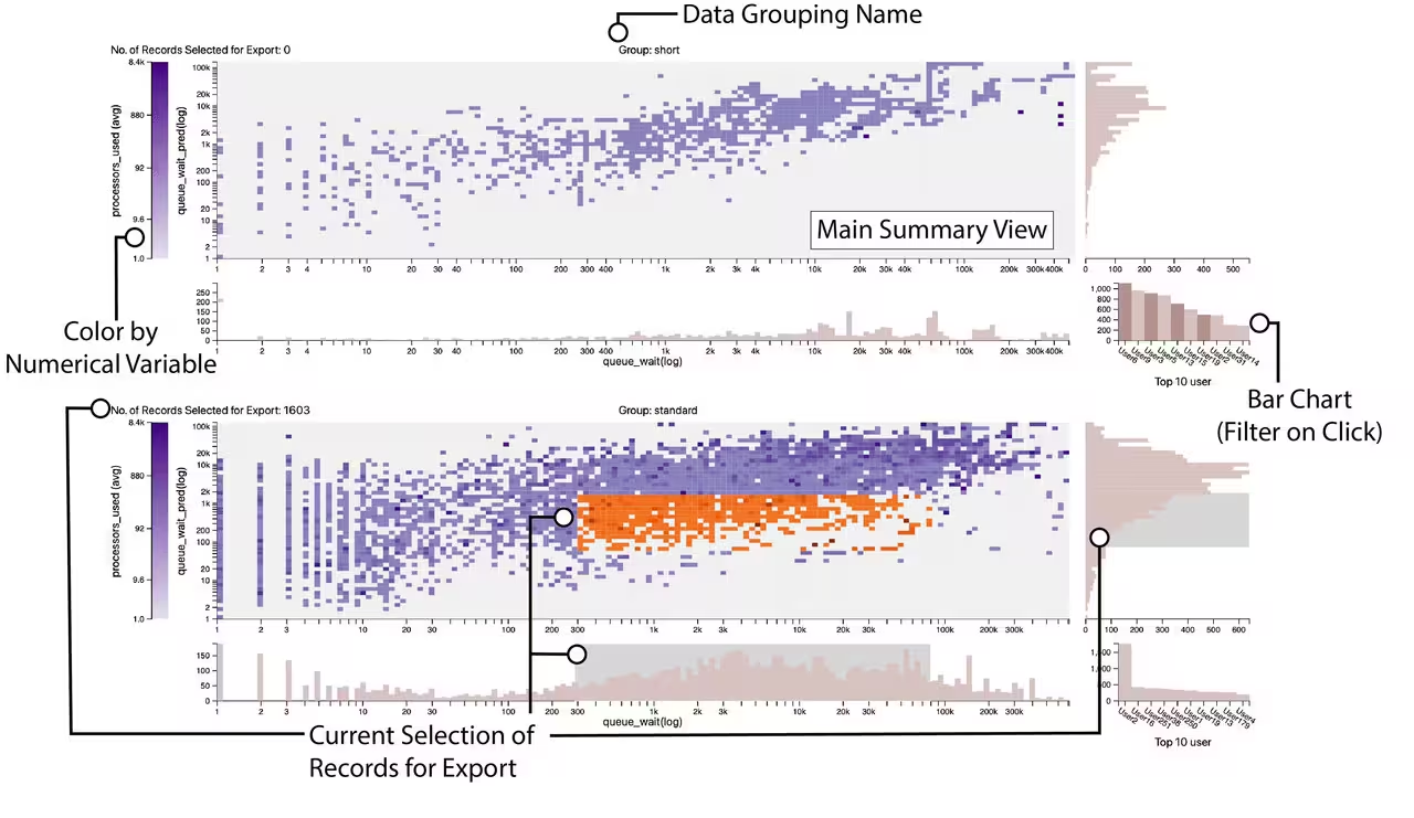
Guidepost splits your data by the facet_by column (see Configuration). Each distinct value gets its own panel of charts, stacked vertically and labeled with a group name at the top (e.g. Group: short). All panels share the same axis configuration, so you can compare groups directly.
If your data is logically one group, the synthetic "no grouping" column produces a single panel (shown as n/a). If there are more groups than the display cap, the largest groups are shown and a note indicates how many were elided — filter your data to inspect the rest.
Each facet panel contains four linked views:
| View | What it shows | Detail page |
|---|---|---|
| Main Summary View (heatmap) | A grid: x-axis bins × y-axis bins, each cell colored by the aggregated color value. The heart of the chart. |
Main Summary View Heatmap |
| Framing histograms | A histogram along the bottom (distribution across x) and along the right (distribution across y). | Histograms Bar Chart and Legend |
| Categorical bar chart | Top-10 values of the categorical column; hover/click to filter the panel. |
Histograms Bar Chart and Legend |
| Color legend | The color scale for the cells, with a live "Records Selected for Export" counter — and itself brushable. | Histograms Bar Chart and Legend |
The bottom histogram is drawn for continuous/datetime x-axes. For a categorical or list x-axis, the area below the heatmap instead carries count/sharedness strips and (for list columns) a fleet overview and co-occurrence arcs — see Main Summary View Heatmap.
Everything in a panel is linked: a selection made in one view highlights the matching records (in orange) across the others and updates the export counter. Guidepost tracks three independent selection streams and exports their union (a record is selected if any stream picks it):
- Box brush — the 2D heatmap brush and the x/y histogram brushes (a rectangular region of the grid).
- Pins — pinned columns or pinned cells from the heatmap's selection modes.
- Color band — a range brushed on the color legend (cells whose color falls in that range, regardless of x/y).
These combine per panel into one selection that you retrieve in Python. The full selection and export story — including how to pull it back as a DataFrame — is on Selecting and Exporting Data.
Brushes and pins apply to the panel you act in; they do not automatically mirror into the other facet groups. You can build a selection across several panels at once, and the exported DataFrame is the combined set. The one thing that affects all panels together is changing a configuration dropdown (x/y/color/facet/categorical), which re-renders every panel.
Next: Main Summary View Heatmap · Histograms Bar Chart and Legend · Selecting and Exporting Data