Conversation
|
Test summary
Run details
View run in Cypress Dashboard ➡️ This comment has been generated by cypress-bot as a result of this project's GitHub integration settings. You can manage this integration in this project's settings in the Cypress Dashboard |
 HendrikThePendric
force-pushed
the
feature/click-menu
branch
from
HendrikThePendric
force-pushed
the
feature/click-menu
branch
from
424f6da to
9b5bd2a
Compare
 ghost
mentioned this pull request
HendrikThePendric
force-pushed
the
feature/click-menu
branch
3 times, most recently
from
ghost
mentioned this pull request
HendrikThePendric
force-pushed
the
feature/click-menu
branch
3 times, most recently
from
c5c70e0 to
ea7db98
Compare
 Mohammer5
left a comment
Mohammer5
left a comment
Mohammer5
left a comment
There was a problem hiding this comment.
When clicking an item that does not have a sub menu, there's still an empty menu card opened.
I'm not sure the following is an actual issue, but it could become one:
Currently when opening a sub-menu while another one is opened, the previously opened one closes because it's not being rendered anymore. These menus lose their entire state, which could interfere with custom component's logic that store some local state (e. g. whether a specific request was made, it's data, etc). So this could be a bit fragile.
I'm not sure if there's an easy way around this though, maybe display: none would be a better solution than not rendering the sub-menus. I don't think that will trickle down the actual dom tree, so this might require a different approach than the current one.
There are stories for the MenuDivider, MenuItem, MenuList & MenuSectionHeader.
- The
MenuListone we could just omit (also exporting theMenuListfrom thecore/src/index.js; as far as I can see it's only used internally by theMenucomponent) - I'd wrap the
MenuDivider,MenuItem&MenuSectionHeaderstories in aMenu, to both indicate that it shouldn't be used in a different context as well as being able to see what it looks like in aMenu(right now I have no idea how much space a divider would take inside a menu for example) - I'd probably change the name of the
MenuDivider's,MenuItem's &MenuSectionHeader's story names so they could be found in theMenuitem in the storybook's sidebar instead of having their own item
| <style jsx>{` | ||
| div { | ||
| display: inline-block; | ||
| min-width: 128px; |
There was a problem hiding this comment.
This should be over-writable as well. If I want to use the menu in the sidebar, I'd want it to always take 100% of the space. So either we add a useFullWidth prop (just an ad hoc name) or we allow min-width to be changed to 100%.
There was a problem hiding this comment.
With the select we had a similar issue. We decided to always render full width there. For consistency I think it'd be nice to do the same here. Then we could set the width just for the popups (as those are independent of the layout).
There was a problem hiding this comment.
In the MenuList demo stories I've included an example for creating a sidebar menu. The point is, you'd use the MenuList for that, and not the Menu. The MenuList just occupies the full width of its parent.
To me this makes sense, and I even think that is why @Mohammer5 extracted the MenuList from the Menu a long time ago. See dhis2/ui-core#297
There was a problem hiding this comment.
min-width: 128px;
This should be over-writable as well.
I was actually going to point you to the design specs to show you that these mention a fixed min-width. Not sure if that has been changed or if I just got confused. I'll check with @cooper-joe
There was a problem hiding this comment.
Aha, yes there are the fixed sizes, they were slightly hidden in a different place they used to be, because dense and normal are now slightly different:
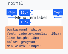
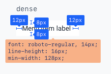
It used to be a single fixed min-width, but now dense and normal have their own. FIxed that in 7ae718a.
There was a problem hiding this comment.
and I even think that is why @Mohammer5 extracted the MenuList from the Menu a long time ago
I don't remember that 🤣
In the MenuList demo stories I've included an example for creating a sidebar menu. The point is, you'd use the MenuList for that, and not the Menu. The MenuList just occupies the full width of its parent.
I think we have to work on the names then as they don't convey their intended usecases. Terminology-wise, I'd expect to use a Menu, when I need a Menu. If I had to use a MenuList as a menu, I'd expect it to be a list of menus. It does make sense to have a MenuList as an internal component so we wrap everything with an ul, but once it becomes public or even has different use-cases, then this is a rather confusing name.
So the Menu is actually a PoppableMenu and the MenuList is a MenuItemContainer. These are just ad hoc names, not meant as serious names, but they illustrate what I want to say: They convey a very clear intended usage, while Menu and MenuList do not.
I think using display none would confuse me more. In my opinion state should not live in a component if it needs to persist beyond that component being rendered, so I wouldn't cater to that usecase. Seems like normal react behaviour to me. If the state should persist, the dev should move it up. |
| Scenario: A non-blocking layer | ||
| Given a Layer with pointerEvents none and a button below it is rendered | ||
| When the user clicks the button | ||
| Then the onClick handler of the button is called | ||
|
|
There was a problem hiding this comment.
Was wondering why this test was removed.
There was a problem hiding this comment.
Good question. This was done intentionally:
- When I was working on the
Layercomponent I kept thinking that sometimes it would be useful to have a concept of a "non-blocking layer", meaning that elements would be stacked correctly along the z-axis, but that the user could still interact with the underlying layers. - However, when I worked on the Menu, this was the first time I actually encountered a scenario like that in real-life. I initially tried it with a
<Layer pointerEvents="none" />. This worked fine, but I felt that this prop on the Layer was very quirky, and since the actual Layer element was still being created, I also thought it was just the wrong solution to the problem I was trying to solve. - It occurred to me that what I actually wanted, was to just be able to append something to its parent layer, so if I just had access to the parent layer node, that would be enough.
So what I've done is:
- Remove everything related to "non-blocking layers" from the Layer component
- Export a
useLayerContexthook that is also exposed inindex.js - Refactor the MenuItem (as sub-menu) to just use
createPortaland append the portal to the layer node which is returned fromuseLayerContext
Let me know if that makes sense...
There was a problem hiding this comment.
Judging from your explanation during our call this would align the behaviour with our other components (open state blocks entire UI). Good change in my opinion 👍
| () => { | ||
| getMenuItemAndSubMenuRects().then(([menuItemRect, subMenuRect]) => { | ||
| expect(menuItemRect.right).to.equal(subMenuRect.left) | ||
| expect(menuItemRect.right).to.be.approximately( |
There was a problem hiding this comment.
Was wondering why this can't be asserted exactly. With the Select tests I'm working on in another PR the assertions with popper placement seem to work with exact comparisons.
There was a problem hiding this comment.
Also, if my findings in the other PR are correct, these tests will probably have to be updated to at least use should so that cypress keeps trying for a while instead of asserting once.
There was a problem hiding this comment.
I happened to be getting floats here were ever so slightly different. Not quite sure why.
I agree that we should be using should 🤣 but shall we address that more holistically when we tackle issues #87 & #86?
(bearing in mind that we want to release v5 ASAP so we can freeze the ui-core and ui-widgets repos)
Or should I just fix this now?
|
The new api looks good to me. Would it be possible to add an extra story to That'd help me take a more in-depth look at the code, with the intended use-case in mind. |
Resolved in 8c40e03
I did not address this. I agree it could be or become a problem, but the current approach is in line what we do in other places too, i.e. For now, I think this is the most clean approach. And I'd suggest we keep advising app-devs to create stateful wrapper components to solve these type of issues. IMO we should only address this once we start seeing problems that can't be solved using some wrapper. Oh, I just noticed @ismay already commented on this too:
I completely agree with that 👍 Let me know if you are convinced @Mohammer5 😄 These were my responses to the general comments that needed a reply/fix. The rest of the comments are about specific sections of code, so I can reply in thread. I'll start doing that now. |
Yes, I wasn't trying to force a change, just a discussion / create awareness |
I've added one in b157bbe, but beware:
|
Well spotted, fixed in 35370e4 |
HendrikThePendric
force-pushed
the
feature/click-menu
branch
2 times, most recently
from
9af382a to
98de1a5
Compare
|
@Mohammer5 and @ismay: as discussed, the I've renamed |
COMMIT HISTORY:
- refactor: introduce click based menu ui
- refactor(menu): update component folder structure and replace files
- fix(menu-item): solve prop-types error
- docs(menu-item): add jsdocs
- docs(menu-item): add demo story
- fix(menu-item): correct demo link and spread props on li
- fix(menu-divider): spread props, add jsdocs and demo story
- fix(menu-section-header): tweak styles, add docs and story
- fix: fix demo story links for menu-item/divider/sectionheader
- fix(menu-list): tweak story and docs
- docs(menu-item): add demo for toggle menu and custom icon color
- docs(menu): tweak jsDocs and demo stories
- docs(menu): add default dataTest value to jsDocs for various components
- docs(menu-list): add demo for usage in a sidebar
- fix(menu): only clone react elements, just render strings etc
- fix(menu): stop spreading props and adding refs
- test(menu): assert SubMenu toggling and rendering children
- test(sub-menu): add e2e stories and cypress tests for positioning
- test(menu-item): tweak e2e story and cypress tests
- test(menu-item): wrap list-items in list to ensure valid HTML
- test(menu-section-header): add e2e story and test for accepting children
- chore(menu-section-header): remove unused import
- fix: export all components and hooks that were introduced with the Menu
- docs(menu-item): improve toggle-menu-item demo clarity
- refactor(menu-item): integrate sub-menu into menu-item
- test(menu): fix failing position cypress tests
- test(menu-item): update failing cypress test for children to label
- refactor(menu-section-header): change children to label like menu-item
- fix(component-cover): align with Layer by removing pointerEvents
- refactor: rename menu to flyout-menu and menu-list to menu
- fix(menu-item): make sure menuItems for open sub-menus are active
- refactor: move responsibility for dense and hideDivider on items to Menu

BREAKING CHANGE: Fully overhauled Menu and related components:
- MenuList was renamed to Menu
- Menu was renamed to FlyoutMenu
- The sub-menus now open on click instead of hover
- We have introduced a dedicated `MenuDivider` and `MenuSectionHeader`
- To create sub-menus, you can now add MenuItems directly under a parent MenuItem, no need to wrap them in a Menu/FlyoutMenu anymore
HendrikThePendric
force-pushed
the
feature/click-menu
branch
from
98de1a5 to
a8b26a0
Compare
Mohammer5
left a comment
Mohammer5
left a comment
There was a problem hiding this comment.
Nice 👌 This looks much better!
|
🎉 This PR is included in version 5.0.0-alpha.18 🎉 The release is available on:
Your semantic-release bot 📦🚀 |
|
🎉 This PR is included in version 5.0.0 🎉 The release is available on:
Your semantic-release bot 📦🚀 |
3 participants
This PR implements the Menu and related components according to the updated design specs and #30 can be closed when this PR gets merged into alpha.
We've ended up with the following components:
MenuList: anulwith appropriate styles that just renders childrenMenuItem: aliwith appropriate styles depending on propsMenuSectionHeader: aliwith aDividerand ah6in which the children are renderedMenuDivider: aliwith aDividerMenu: renders children into aCardwith aMenuListand controls the toggling of theSubMenuopen stateSubMenu: renders aMenuItemand a fly-out menu, which is toggled on click. It has amenuItemContentprop to control the content of the menu-item-label and aniconprop to set the icon for the menu-item.Some aspects of the design-specs have not been implemented:
Menucomponent. However the "Dropdown Menu" story illustrates how an app could easily implement this behaviour.fillcolour is passed to theiconprop the icon will get that colour anyway. FYI: the icon colour for default / destructive / disabled is inherited from the li element. This means that any icon with a fill colour applied to it directly will not get our colour-scheme applied to it. I have included a story to illustrate how to do apply a custom icon colour.MenuItem: I reckon we should add support for this once we have a system in place for actual keyboard shortcuts and scopes.Some things that I'd like to get your opinion about:
cloneElementand some "private props" which are prefixed with an underscore (_openand_toggleSubMenu) on theSubMenu. Not overly excited about this, but thecloneElementstrategy does seem to be in line with what we do elsewhere. I could also implement this via a menu-context, but that comes with its own set of potential problems. The underscore prefix aspect would be new, but I think in this case it's quite helpful to make the private/internal nature of these props explicit.PopupMenuorToggleMenuItemcomponent because they are so easy to build.TODO:
TODO - after PR review meeting