Support 'selectionMode' on tabular and cards#8010
Support 'selectionMode' on tabular and cards#8010rijkvanzanten merged 19 commits intodirectus:mainfrom
Conversation
 joselcvarela
changed the title
joselcvarela
changed the title
|
Before: lrVLQB13qe.mp4After: ubWhg7Wp9Y.mp4 |
|
@joselcvarela we should also figure out how this would work for the Calendar and Map layouts 🤔 |
|
I didn't find the select all on those layouts. I am still discovering the app, so it's completely normal. I will setup those fields and try to replicate the behavior. But my concern is how the 'selectionMode' is declared. It is ok like that or should I change? |
|
Interesting point. I don't think we have a selection mode in Map or Calendar... but we should (need to?). I can work on a design for this. |
|
By the way, this is awesome work, @joselcvarela!! ❤️ |
Yeah looks good to me! The only thing I would change is that I would call them "one, multiple, none" instead of "select-*" as we're already in the selectMode context 🙂 |
joselcvarela
force-pushed
the
fix-7935
branch
from
6218713 to
9a73ad2
Compare
|
Updated 😉 |
 nickrum
left a comment
nickrum
left a comment
nickrum
left a comment
There was a problem hiding this comment.
With this PR we have selection, selectMode and selectionMode layout props. This might be a bit confusing, but I can't think of a better name either.
app/src/modules/settings/routes/presets/collection/collection.vue
Outdated
Show resolved
Hide resolved
Yeah we should differentiate between those last two somehow 🤔 |
|
@nickrum @rijkvanzanten what about |
|
@joselcvarela I don't think that necessarily solves for the "selectMode" prop 🤔 "selectMode" tells the layouts that we don't want to navigate to the detail page at all, and only want to select things. This is different from the amount of items that are allowed to be selected. We have to keep in mind that there's cases where you can both select X items and navigate to the detail page, like on the tabular layout |
|
I was referring to
Seems correct? |
Not entirely! 😁 When you open the collection page for any collection, the table layout allows both clicking the row to navigate, and allows for selection multiple items:
(1) Will navigate to the detail page for the item However, when the same layout is used in a relational selection drawer, the interaction change slightly...
Now, both (1) and (2) should select the row. The "one vs multiple" question is also only relevant in that drawer-use So we'll need to keep a prop for "navigate to detail on click", and a separate prop for "how many items can be selected; none, one, multiple". I think it's mostly a naming question. Maybe we can rename |
|
In my point of view,
What do you think? |
I think that still would have the same problem. For example, the tabular layout by default would have "multiple" and needs to be able to click on a single row to navigate. By having it as a single prop, you can't have "multiple" and "none" from your examples at the same time |
joselcvarela
force-pushed
the
fix-7935
branch
from
9a73ad2 to
0fda1c3
Compare
|
@rijkvanzanten updated |
|
Here's a summary: 7Gjnaw1HCh.mp4 |
Update on additional changes I pushed
Question/DiscussionShow we hide the checkbox when the user only has
|
|
Thanks @azrikahar That's a good question. |
|
No worries 👍 The sharing link is interesting! Maybe leaving it on & showing the checkboxes won't really be a huge deal since I assume a user should understand they only have read permissions anyway. Maybe others can share more thoughts on it 😄 |
Co-authored-by: ian <licitdev@gmail.com>
|
Pushed a fix to de-selecting by clicking on a row during selection mode. Screen.Recording.2021-11-12.at.8.04.35.PM.movThere's a warning about the collection name not being a string. I believe it's something to do with the following code, but am unsure how to go about it. directus/app/src/modules/settings/routes/presets/item.vue Lines 332 to 340 in 076e28f |
|
There are some issues with the map selection:
Enregistrement.de.l.ecran.2021-11-16.a.12.19.45.mov
I suggest reverting to the previous behavior rules (but open to discuss it)
Nothing to add on the rest of this PR, looks good! |
I think this should not be like this. I didn't know how to deselect a point and needed to check the source code to see how I could deselect it. When you see something selected/checked, usually you click on it for deselect. What are your thoughts @benhaynes @rijkvanzanten ? |
|
Good point.. I'm actually not too sure what I would expect to happen 🤔 There's a bit of a conflict here between click to navigate and click to select. That being said, once you've selected one or more items, I would expect further clicks to toggle between the selection state (this would also match the UX from tabular/cards) |
|
I'm a little lost in terms of what we're doing now, but here's what I think... Navigate
Select
Basically, Another point, when you drag OVER a point (but haven't released), it would be nice if it changed the style/state of the item dot to show it is about to be selected. Did I miss anything? This is how most design applications work, and seems to be the most intuitive. |
OK with these rules, @joselcvarela I can take it from there if that works for you! |
|
Yeah, no problem @oreilles 🤝 |
|
It seems like the above mentioned rules by @benhaynes work in this PR (with Shift instead of Alt for mac vs windows interoperability). Seeing this PR fixes numerous bugs elsewhere, lets pick up any optimizations in the selection state of the map layout we'd wanna do in a separate PR. |
7 participants
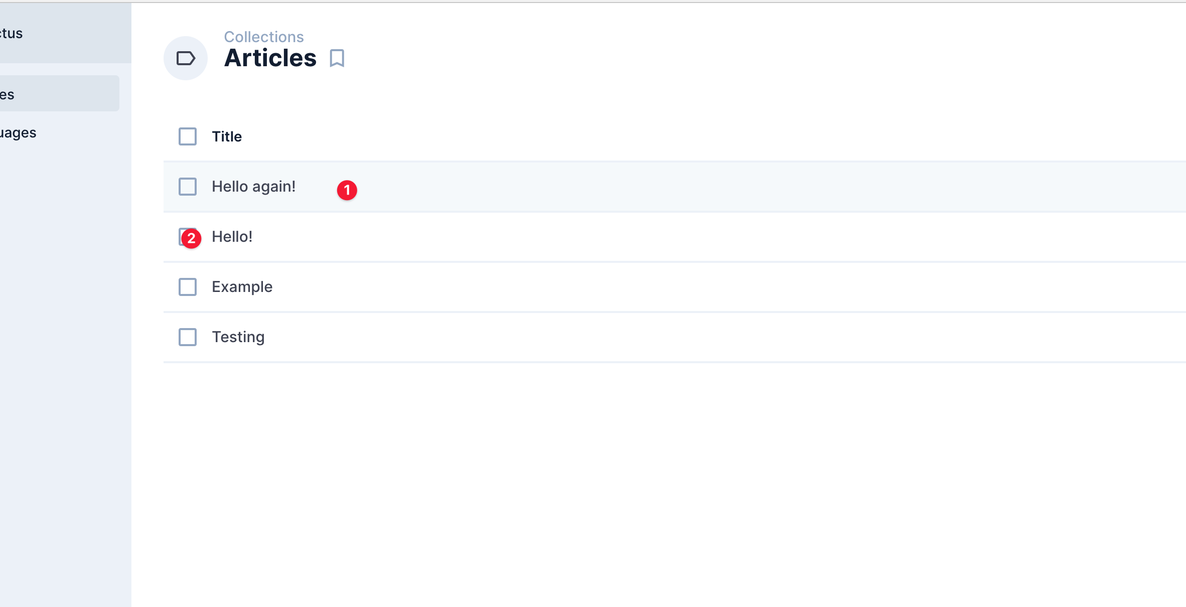
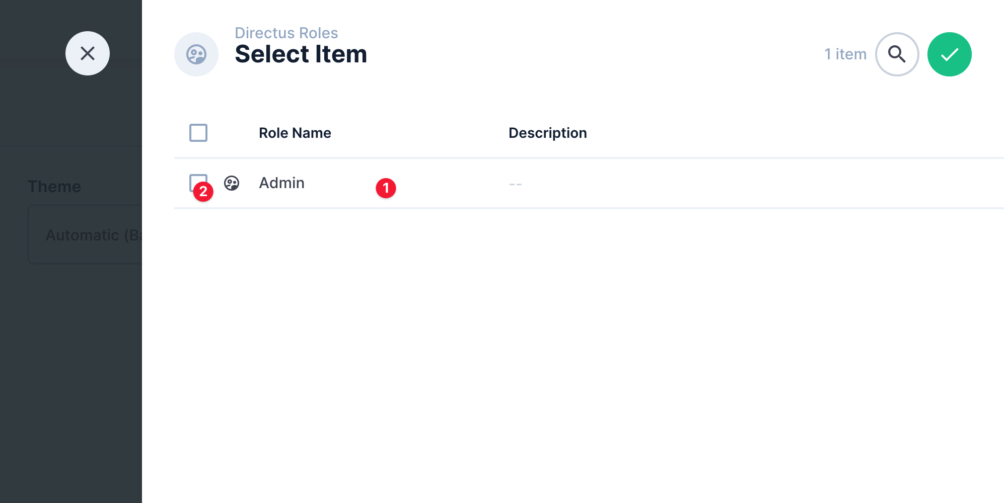
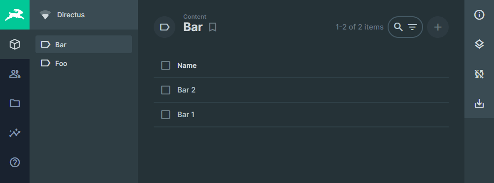
If 'selectionMode'
== 'no-select' : hides checkboxes
== 'select-one': hides select all but show checkboxes (as radio buttons)
== 'select-multiple': show select all and checkboxes
Fixes #7935
Fixes #7818
Fixes #7761 (not using v-radio, but emulating with icons)
Edit:
Fixes #8019