A flexible grid layout for responsive dashboards
Install with Bower:
$ bower install angular-widget-gridAdd <script> and <link> tags to your index.html:
<link rel="stylesheet" href="bower_components/angular-widget-grid/angular-widget-grid.css">
<script src="bower_components/angular-widget-grid/angular-widget-grid.min.js"></script>
Add the angular-widget-grid module as a dependency to your application module:
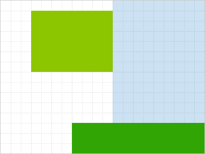
angular.module('myApp', ['widgetGrid']);<wg-grid columns="20" rows="15" style="width: 400px; height: 300px;">
<wg-widget position="{ top: 2, left: 4, height: 6, width: 8 }">
<div style="background-color: rgb(140, 198, 0);"></div>
</wg-widget>
</wg-grid>
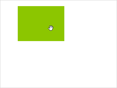
<wg-widget wg-movable editable="true" position="[...]">If editable is true, users will be able to move the respective widget.
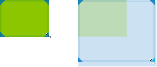
<wg-widget wg-resizable editable="true" position="[...]">If editable is true, users will be able to resize the respective widget.
Optionally, you can limit the resize directions:
<wg-widget wg-resizable="{ directions: ['NW', 'NE', 'E', 'SW'] }" ...>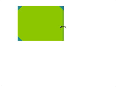
<wg-grid columns="20" rows="15" options="{ showGrid: true }">Shows the grid's structure and provides visual feedback when resizing or moving widgets.
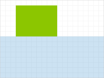
<wg-grid columns="20" rows="15" options="{ highlightNextPosition: true }">Highlights the largest free area in the grid, if any. This area will be automatically assigned to the next widget with an empty or conflicting position.

The grid emits wg-grid-full and wg-grid-space-available in the respective situations, so that you can e.g. enable/disable UI elements accordingly.
$scope.$on('wg-grid-full', function () {
  // e.g. disable something
});