Parsed icons set from materialdesignicons.com and display control implementations for different GUI frameworks.
- All icons are always up-to-date because automatically updated every 6 hours.
- Small package size because icons are graphically encoded via SVG Path.
- Icon types are strongly typed enum, so your IDE will suggest available variants:
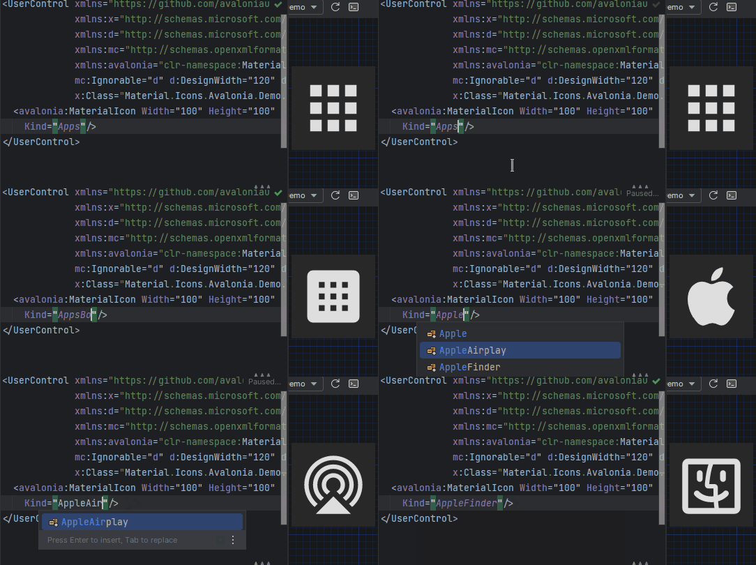
This project consists of 3 parts:
-
contains info about the icons
-
contains controls for AvaloniaUI
-
contains controls for WPF
-
FAQ - frequently asked questions



contains controls for WinUI/UNO (separate repository)

- Install Material.Icons.Avalonia nuget package:
dotnet add package Material.Icons.Avalonia
- Include styles in
App.xaml(for2.0.0version and higher):<Application xmlns:materialIcons="clr-namespace:Material.Icons.Avalonia;assembly=Material.Icons.Avalonia" ...> <Application.Styles> ... <materialIcons:MaterialIconStyles /> </Application.Styles> </Application>


Add Material.Icons.Avalonia namespace to the root element of your file (your IDE can suggest it or do it automatically):
xmlns:materialIcons="clr-namespace:Material.Icons.Avalonia;assembly=Material.Icons.Avalonia"
Use MaterialIcon control:
<materialIcons:MaterialIcon Kind="Abacus" />The Foreground property controls the color of the icon.
Also, there is MaterialIconExt which allows you to use is as the markup extension:
<Button Content="{materialIcons:MaterialIconExt Kind=Abacus}" />- Install Material.Icons.Avalonia nuget package:
dotnet add package Material.Icons.Avalonia
- Import styles in Application (or if you use XAML check instructions for plain Avalonia)
type App() =
    inherit Application()

    override this.Initialize() =
        ..
        this.Styles.Add(MaterialIconStyles(null))
        ..
- Create bindings for
MaterialIconnamespace Avalonia.FuncUI.DSL [<AutoOpen>] module MaterialIcon = open Material.Icons open Material.Icons.Avalonia open Avalonia.FuncUI.Types open Avalonia.FuncUI.Builder let create (attrs: IAttr<MaterialIcon> list): IView<MaterialIcon> = ViewBuilder.Create<MaterialIcon>(attrs) type MaterialIcon with static member kind<'t when 't :> MaterialIcon>(value: MaterialIconKind) : IAttr<'t> = AttrBuilder<'t>.CreateProperty<MaterialIconKind>(MaterialIcon.KindProperty, value, ValueNone)
- Use
Button.create [
     Button.content (
         MaterialIcon.create [
             MaterialIcon.kind MaterialIconKind.Export
        ]
    )
]
Install Material.Icons.WPF nuget package:
dotnet add package Material.Icons.WPF

Add Material.Icons.WPF namespace to the root element of your file (your IDE can suggest it or do it automatically):
xmlns:materialIcons="clr-namespace:Material.Icons.WPF;assembly=Material.Icons.WPF"
Use MaterialIcon control:
<materialIcons:MaterialIcon Kind="Abacus" />The Foreground property controls the color of the icon.
Also, there is MaterialIconExt which allows you to use is as the markup extension:
<Button Content="{materialIcons:MaterialIconExt Kind=Abacus}" />Install Material.Icons nuget package:
dotnet add package Material.Icons

Icon types stored in Material.Icons.MaterialIconKind enum.
We can resolve an icon path by using Material.Icons.MaterialIconDataProvider.GetData().
Currently, there is no way to add your own icons, as icons are enum and cannot be modified.
But you can override some existing icons to use your own data:
public class CustomIconProvider : MaterialIconDataProvider
{
    public override string ProvideData(MaterialIconKind kind)
    {
        return kind switch
        {
            MaterialIconKind.TrophyVariant => "some SVG code",
            _ => base.ProvideData(kind)
        };
    }
}

// When your application starts (e.g. in the Main method) replace MaterialIconDataProvider with your own
public static int Main(string[] args)
{
    MaterialIconDataProvider.Instance = new CustomIconProvider(); // Settings custom provider

    // Application startup code
    // return BuildAvaloniaApp().StartWithClassicDesktopLifetime(args);
}- Change
Foregroundproperty.
- If you are using
MaterialIconcontrol - useWidthor/andHeightproperties. - If you are using
MaterialIconExt- useSizeproperty.
- You can manually set
Material.Iconspackage version in your project file.
- We use semver.
Any package with identical major and minor versions is compatible.
For example,1.0.0and1.0.1are compatible, but1.0.0and1.1.0might not be.