Overview
We need to make the Partners section of the About Us page have more spacing / breathing room so that it is easier for viewers to read
Action Items
- View original Figma mockup of the About Us "Partners" section (screenshot also available below)
- Adjust the scss of the Partners section logos to look closer to the origin design more spacing between icons
- Move the District Attorney and City Attorney badges to different areas further away from each other (so that their size difference isn't quite so apparent)
Resources/Instructions
About Us page
Events page Figma file (final design in green rectangle)
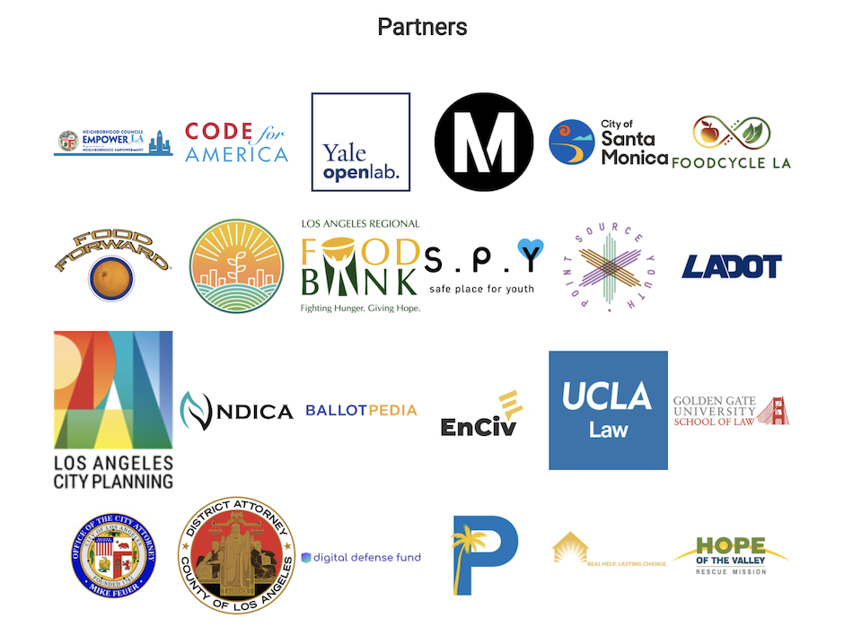
Partners section looks like this right now:
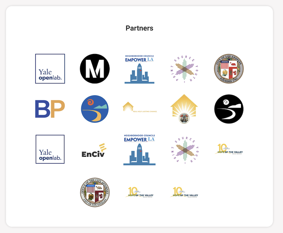
It should look more like this:
Overview
We need to make the Partners section of the About Us page have more spacing / breathing room so that it is easier for viewers to read
Action Items
Resources/Instructions
About Us page
Events page Figma file (final design in green rectangle)
Partners section looks like this right now:
It should look more like this: