A retro CRT curved-screen datagrid for the web. Barrel-distorted columns, phosphor aesthetics, more data per viewport.




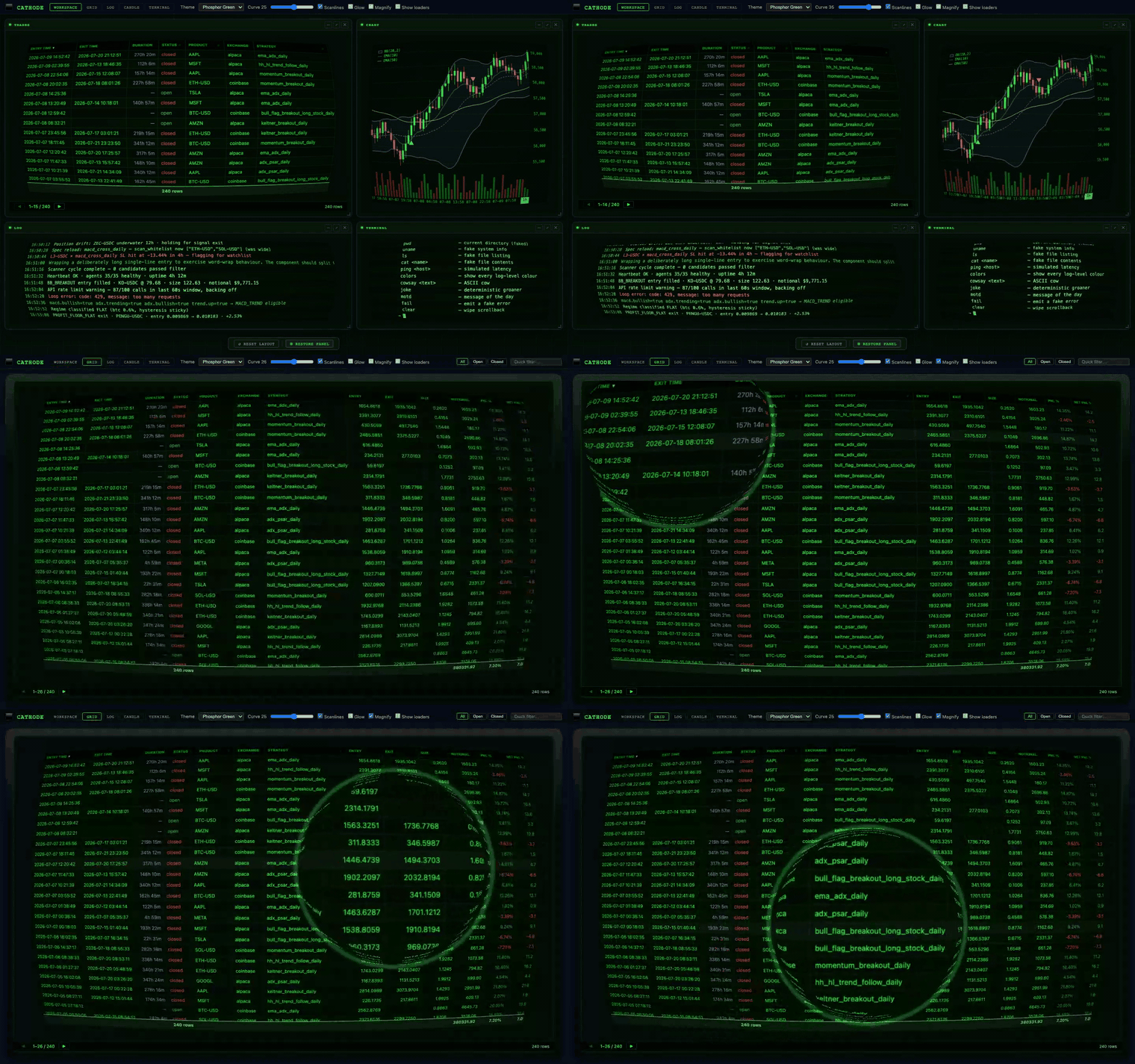
▶ Try it live — the curve slider is the fun part. 🎬 Watch the 26-second tour (mp4) — workspace → magnifier lens → three.js candles → themes.
Stills reproduce with npm run capture:hero (see tools/capture-hero.mjs); the workspace hero lives at docs/hero.png.
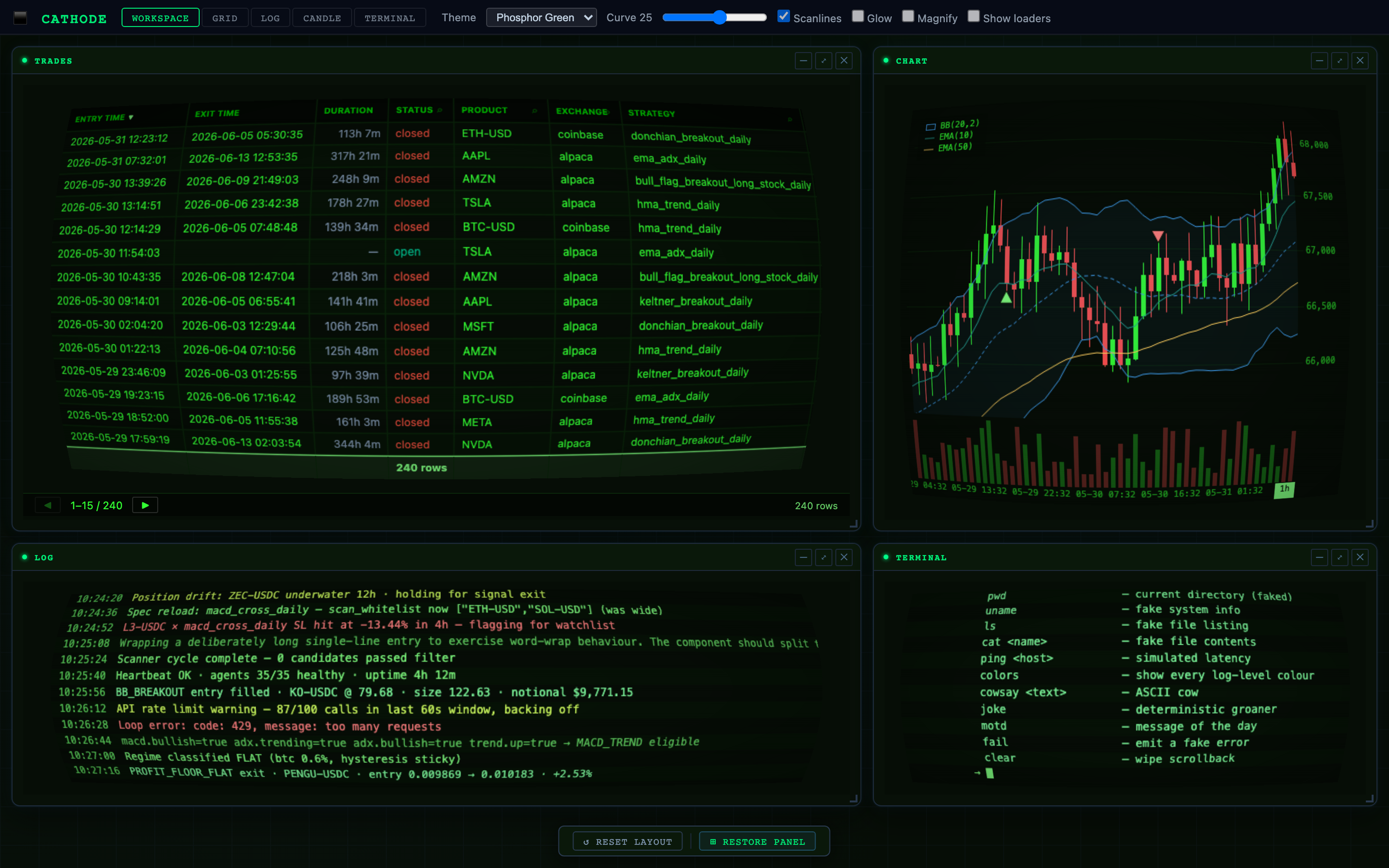
Flat datagrids waste peripheral vision. A curved screen — like a real CRT monitor — angles the left and right columns toward the viewer, creating a panoramic effect that lets you read more columns comfortably without horizontal eye strain. Edge columns are slightly foreshortened, fitting 10–15% more content at the same viewport width.
The effect is pure CSS 3D (perspective + rotateY per column). Text stays real DOM —
selectable, copyable, accessible.
npm install @hetalhouse/cathodeMinimal — drop a grid into a Vue 3 app:
<script setup lang="ts">
import { CathodeGrid, type ColDef } from '@hetalhouse/cathode'
import '@hetalhouse/cathode/style'

const cols: ColDef[] = [
  { field: 'ticker', headerName: 'Ticker' },
  { field: 'price',  headerName: 'Price'  },
]

const rows = [
  { ticker: 'BTC', price: 67_341.20 },
  { ticker: 'ETH', price: 2_481.05  },
]
</script>

<template>
  <CathodeGrid :column-defs="cols" :row-data="rows" theme="phosphor" />
</template>
That's it. The grid renders, the curve activates, the phosphor glow lights up.
Comprehensive example — API callback, pagination, custom styling
<script setup lang="ts">
import { CathodeGrid } from '@hetalhouse/cathode'
import '@hetalhouse/cathode/style'
import type { ColDef, GridApi } from '@hetalhouse/cathode'

const cols: ColDef[] = [
  { field: 'ticker',   headerName: 'Ticker',  width: 90 },
  { field: 'price',    headerName: 'Price',   width: 100, cellStyle: { textAlign: 'right' } },
  { field: 'pnl',      headerName: 'PnL %',   width: 80  },
]

let api: GridApi

function onGridReady(e: { api: GridApi }) {
  api = e.api
  api.setGridOption('rowData', myRows)
}
</script>

<template>
  <CathodeGrid
    :column-defs="cols"
    :row-height="28"
    theme="phosphor"
    :curvature="12"
    :scanlines="true"
    :glow="true"
    :pagination="true"
    :pagination-page-size="50"
    @grid-ready="onGridReady"
    @row-clicked="e => console.log(e.data)"
  />
</template>v0.1.x — production-ready for small-to-mid datasets. Cathode is in active use rendering live trading data in a production dashboard.
| Works well for | Choose something else for |
|---|---|
| 100s–10ks of rows | 100k+ rows (use TanStack Table — virtual scrolling is on cathode's roadmap but not yet shipped) |
| Vue 3 apps | React (no wrapper yet — see ROADMAP.md) |
| Dashboards, status panels, sci-fi UIs | Spreadsheet-style apps with row grouping / aggregation (not yet shipped) |
| Built-in CRT / phosphor aesthetic | Plain Material / Tailwind look — pass theme="none" and bring your own CSS vars |
See ROADMAP.md for what's coming next.
| Prop | Type | Default | Description |
|---|---|---|---|
columnDefs |
ColDef[] |
required | Column definitions |
rowData |
any[] |
[] |
Initial row data (use api.setGridOption('rowData', …) to update) |
rowHeight |
number |
28 |
Row height in px |
defaultColDef |
Partial<ColDef> |
{} |
Merged into every column definition |
getRowStyle |
(p) => CSSProperties |
— | Per-row inline style callback |
pinnedBottomRowData |
any[] |
— | Rows pinned to the bottom of the scroll area |
pagination |
boolean |
false |
Enable pagination bar |
paginationPageSize |
number |
50 |
Rows per page |
theme |
'none' | 'phosphor' | 'amber' | 'paper' |
'none' |
Built-in colour theme ('none' inherits parent CSS vars) |
curvature |
number |
10 |
Max rotateY angle (°) for edge columns — 0 = flat |
perspective |
number |
1400 |
CSS perspective distance (px) — higher = subtler vanishing point |
scanlines |
boolean |
true |
Overlay repeating scanline gradient |
glow |
boolean |
true |
Apply text-shadow phosphor glow to cell text |
Emitted via @grid-ready. Mirrors the ag-Grid Community API surface used in typical dashboards.
api.setGridOption('rowData', rows)
api.setGridOption('pinnedBottomRowData', pinnedRows)
api.setGridOption('quickFilterText', 'BTC')

api.getColumnState()                   // → ColState[]
api.applyColumnState({ state, applyOrder })
api.setFilterModel({ status: { type: 'equals', filter: 'open' } })
api.getFilterModel()
await api.setColumnFilterModel('status', { type: 'equals', filter: 'open' })
api.onFilterChanged()                  // no-op — Vue reactivity handles it

api.refreshCells()                     // force re-evaluation (e.g. Age column)
api.exportDataAsCsv({ fileName: 'trades.csv' })
api.resetColumnState()interface ColDef {
field?: string // row[field]
headerName?: string
colId?: string // explicit ID; defaults to field → headerName slug
width?: number
minWidth?: number
sortable?: boolean
filter?: boolean // shows ⌕ icon in header → popup text filter
resizable?: boolean
hide?: boolean
sort?: 'asc' | 'desc' // initial sort
valueGetter?: (p) => any
valueFormatter?: (p) => string
cellStyle?: CSSProperties | ((p) => CSSProperties)
cellRenderer?: (p) => string // HTML string rendered via v-html
comparator?: (a, b) => number
}| Theme | Background | Text | Use for |
|---|---|---|---|
none (default) |
inherits --c-bg CSS var |
inherits --c-tx1 |
Drop into an existing dashboard |
phosphor |
#060d06 |
#33ff33 |
Classic green CRT terminal |
amber |
#0a0700 |
#ffb000 |
Amber phosphor |
paper |
#f6f6f6 |
#222 |
Light / Lumen-style |
If no theme is set, the grid reads these variables from its parent — making it a natural
fit alongside an existing :root / html.light token system:
--c-bg, --c-surface, --c-header, --c-tx1, --c-tx2, --c-tx4,
--c-border, --c-input
See CONTRIBUTING.md for development setup, the Playwright regression-test suite, and the release process.
MIT — © Brady House