Home page needs IPFS description and UX tweaks #1040
Description
tl;dr The docs landing page is great, but as a new user I felt it needs some tweaks. It's too hard to quickly discover what IPFS is. For example, compare IPFS docs home with the landing page for Google Ads API. Also there's too much fluffy text up top. Scannability wins. Please see my detailed usability impressions that follow my proposed changes if your interested in the nitty gritty.
Proposed changes
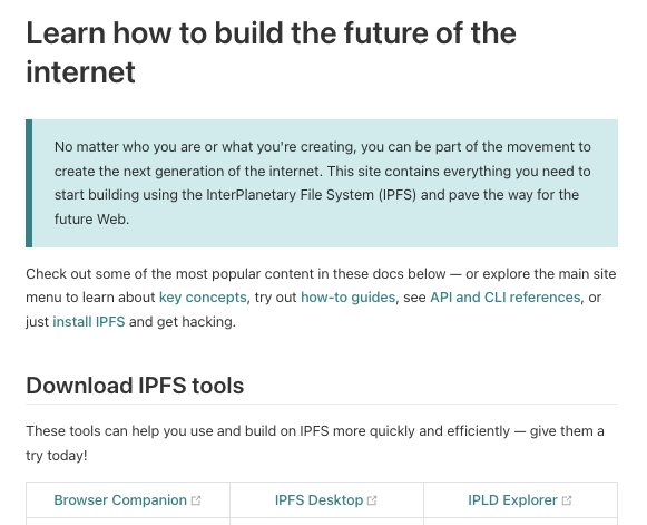
Before:
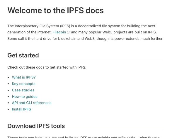
After (note the addition of the "What is IPFS?" and "Case studies" topic links):
Detailed usability impressions
Being new to IPFS, I sought docs.ipfs.io to quickly find out what IPFS is (you know, like "Where's the overview?") as a first step in learning, but instead:
- (Issue 1) The docs landing page doesn't provide a concise and clear description of IPFS or a quick option for getting this info. As a docs user, I expect this to be readily apparent in seconds, but it was not.
- (Issue2) Given my goal of finding specific info quickly, the H1 text "Learn how to build the future of the internet" immediately felt like I was in for more than I had bargained for. The H1 text also didn't mention "IPFS", which felt like the ambiguity I was seeking to end by coming here from ipfs.io was now increasing again.
- (Issue 3) The page begins with fluffy text that, though nice and friendly, forced me to read more than I wanted to and didn't seem worthy of the real estate it consumed or the green callout box. After spending more time reading than I felt necessary–that is, several seconds–I didn't see anything I could click to quickly find out what IPFS is, such as an Overview topic (basic for a satisfactory docs UX). I did notice the "Concepts" link, but "concepts" as a word doesn't connote getting a quick, concise description of a product or system. So this didn't seem like the right path to go down for the info I was seeking. Granted we are entering subjective land here–some users would click "Concepts". But it's easy enough to make a fix that solves for the other set of users like me, while also making it crystal clear rather than sort of clear, which would help all users for sure.
- (Issue 4) The first scannable item was the H2 "Download IPFS tools", which was great because it was scannable, but was also annoying because I was being pointed to start downloading stuff when I hadn't yet learned anything about what these products are used for and didn't even know yet what IPFS is or where to find out.