Vega-Lite Power BI visual templates for use with the Deneb custom visual available on the Power BI AppSource.
All of these have taken inspiration from the excellent work by David Bacci, who has many examples (in Vega) on GitHub here. He is also quite supportive on Stack Exchange.
All data presented here is publically available via the Queensland Government Open Data Portal, or otherwise randomised, fabricated and obscured.
Map visual written in Vega-Lite. Geographic boundaries are hard-coded, to support usage by the Microsoft Certified version of Deneb available via AppSource.
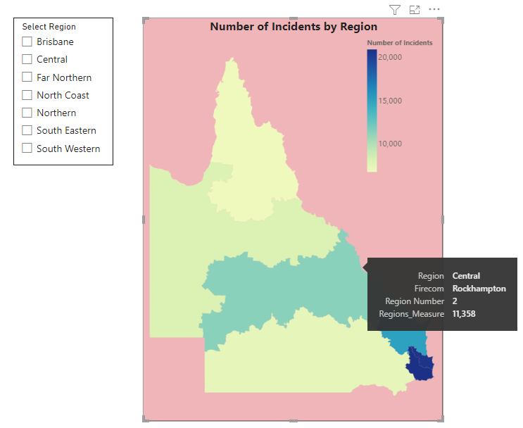
Regions are highlighted by some measure defined in Power BI. The simplest implementation of this is to create a table in Power BI, via DAX or Power Query, with a single row for each Region, and a column of data to be presented. Can be easily adjusted to support additional data layers (eg, labels), colours & formatting, or to change the spacial join field (Region Name, Region Number, and Firecom Name are currently supported).
Note, Regions have been simplified by exclusion of all islands and by algorithm in R {rmapshaper} to 20%. Regions presented here may therefore differ to those publicly available on Queensland Open Data Portal.
- Northern - 1 - Townsville
- Central - 2 - Rockhampton
- South Western - 3 - Toowoomba
- North Coast - 4 - Kawana
- Brisbane - 5 - Brisbane
- South Eastern - 6 - Southport
- Far Northern - 7 - Cairns
A Deneb template using Vega-Lite. Histogram with vertical lines for member values.
For a given metric and group, plot the histogram of the metric with vertical lines for specified member values. Allows an individual value to be compared against the overall distribution of a metric, potentially useful for identifying outliers or assessing overall utility of a metric.
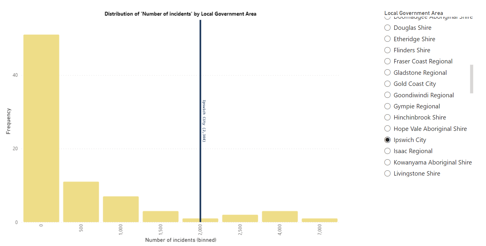 Note, the data to generate this image has been randomised and does not reflect the true distrubtion of the shown metric.
This assumes the following features of a Power BI model:
- Table with data.
- Table of unique group members, taken from the data table above. Append a value not found in the list to "turn off" this layer in Deneb. This is then used as a slicer for the vertical lines only, preserving the data in the original table. Example using DAX (note that ALLEXCEPT can be used instead of ALL to include any slicers on the page):
Deneb_Member_List =
UNION(
    // Get list of all LGAs for use in slicer
    DISTINCT(
        ALL( Incidents[Member_name] )
    ),
    // Add option to turn off this layer in Deneb
    ROW( "Member_name", "_Turn off_" )
)
- For a given metric, three measures are created:
- Determine the value for all available rows in the data table.
Num_incidents = DISTINCTCOUNT( Incidents[IncidentID] )
- Determine the value for only the rows available in the unique group member table.
Deneb_vert =
CALCULATE(
    [Num_incidents],
    FILTER(
        Incidents,
        Incidents[Member_name] IN VALUES( Deneb_Member_List[Member_name] )
    )
)
- A measure for the label displayed with the vertical line.
Deneb_vert_label =
FIRSTNONBLANK(
    VALUES( Deneb_Member_List[Member_name] )
    , 1 )
    & " ("
    & FORMAT( [Deneb_vert] , "#,##0" )
    & ")"
)
A horizontal bar chart to show ranged temporal data in Vega-Lite. This does not include dependencies or milestones etc that is often utilised by such visuals, relying on tooltips to display additional information instead. A dotted black line is included to show the current date.
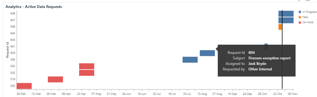
Slightly modified from an example posted by David Bacci on Stack Exchange here. Only the deneb specification has been uploaded, as it seems easier to use than a template.
Input variables:
- Task/project ID (text)
- Start date
- End date
- Status (for legend & bar colour)
- Ohter variables for tooltip display