Repository navigation
Visual Reports PR 1798
components > combobox > Combobox (1)
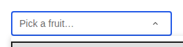
combobox-with-truncated-option-@1x
| Current |
|---|
 |
components > badge > Badge (4)
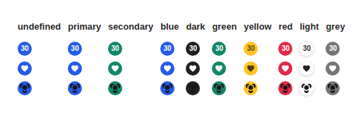
all-colors-@1x
| Previous |
|---|
 |
with-icon-@1x
| Previous |
|---|
 |
with-text-@1x
| Previous |
|---|
 |
with-thumbnail-@1x
| Previous |
|---|
 |
components > button > ButtonGroup (3)
many-buttons-@1x
| Previous |
|---|
 |
one-button-@1x
| Previous |
|---|
 |
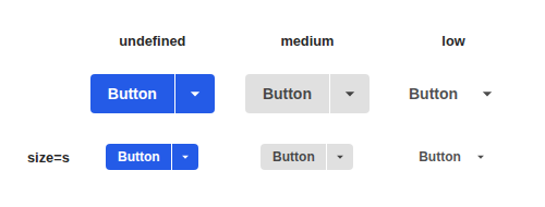
variants-@1x
| Previous |
|---|
 |
components > card > Card (3)
as-element-@1x
| Previous |
|---|
 |
default-@1x
| Previous |
|---|
 |
elevation-@1x
| Previous |
|---|
 |
components > chip > ChipGroup (2)
default-@1x
| Previous |
|---|
 |
small-@1x
| Previous |
|---|
 |
components > dialog > DialogHeading (2)
custom-typography-@1x
| Previous |
|---|
 |
default-@1x
| Previous |
|---|
 |
components > divider > Divider (1)
default-@1x
| Previous |
|---|
 |
components > drag-handle > DragHandle (2)
all-themes-@1x
| Previous |
|---|
 |
default-@1x
| Previous |
|---|
 |
components > grid-column > GridColumn (2)
columns-@1x
| Previous |
|---|
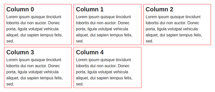 |
default-@1x
| Previous |
|---|
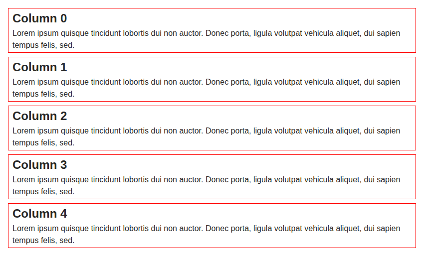 |
components > icon > Icon (1)
inside-text-@1x
| Previous |
|---|
 |
components > inline-list > InlineList (3)
mixed-no-wrap-and-truncate-@1x
| Previous |
|---|
 |
with-elements-@1x
| Previous |
|---|
 |
wrap-@1x
| Previous |
|---|
 |
components > input-helper > InputHelper (2)
all-kinds-@1x
| Previous |
|---|
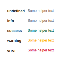 |
default-@1x
| Previous |
|---|
 |
components > input-required-legend > InputRequiredLegend (2)
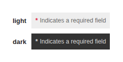
all-themes-@1x
| Previous |
|---|
 |
default-@1x
| Previous |
|---|
 |
components > list > List (2)
default-@1x
| Previous |
|---|
 |
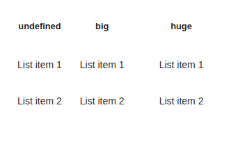
item-padding-@1x
| Previous |
|---|
 |
components > list > ListDivider (1)
default-@1x
| Previous |
|---|
 |
components > list > ListSubheader (1)
default-@1x
| Previous |
|---|
 |
components > progress > ProgressLinear (1)
default-@1x
| Previous |
|---|
 |
components > radio-button > RadioButton (2)
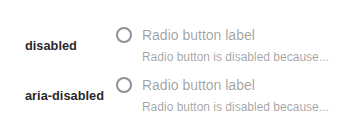
disabled-@1x
| Previous |
|---|
 |
label-and-helper-@1x
| Previous |
|---|
 |
components > skeleton > SkeletonCircle (2)
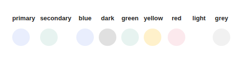
all-color-@1x
| Previous |
|---|
 |
all-size-@1x
| Previous |
|---|
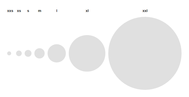 |
components > skeleton > SkeletonRectangle (4)
all-colors-@1x
| Previous |
|---|
 |
all-ratios-@1x
| Previous |
|---|
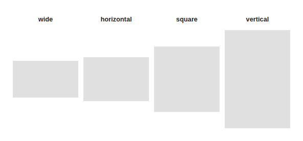 |
all-size-@1x
| Previous |
|---|
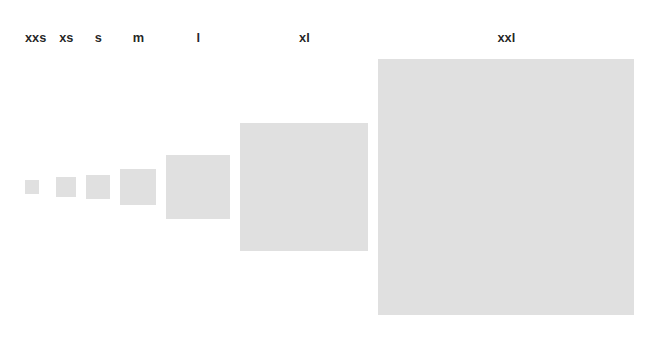 |
all-variants-@1x
| Previous |
|---|
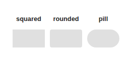 |
components > skeleton > SkeletonTypography (3)
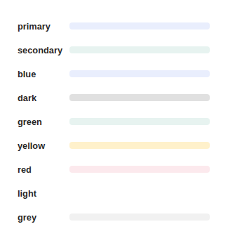
all-colors-@1x
| Previous |
|---|
 |
text-typography-@1x
| Previous |
|---|
 |
width-variations-@1x
| Previous |
|---|
 |
components > table > Table (2)
default-@1x
| Previous |
|---|
 |
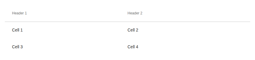
with-header-@1x
| Previous |
|---|
 |
components > table > TableRow (2)
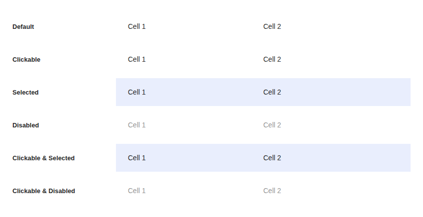
all-states-@1x
| Previous |
|---|
 |
default-@1x
| Previous |
|---|
 |
components > text-field > RawInputText (2)
default-@1x
| Previous |
|---|
 |
with-placeholder-@1x
| Previous |
|---|
 |
components > toolbar > Toolbar (4)
default-@1x
| Previous |
|---|
 |
with-after-@1x
| Previous |
|---|
 |
with-all-@1x
| Previous |
|---|
 |
with-before-@1x
| Previous |
|---|
 |
stories > demos-generated > action-area (1)
demo-1-@1x
| Previous |
|---|
 |
stories > demos-generated > checkbox (1)
default-@1x
| Previous |
|---|
 |
stories > demos-generated > divider (1)
default-@1x
| Previous |
|---|
 |
stories > demos-generated > flag (1)
default-@1x
| Previous |
|---|
 |
stories > demos-generated > grid-column (1)
example-@1x
| Previous |
|---|
 |
stories > demos-generated > image-lightbox (1)
default-@1x
| Previous |
|---|
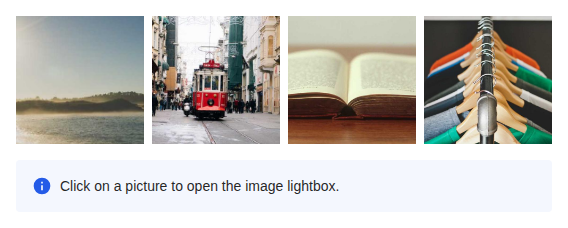 |
stories > demos-generated > lightbox (1)
default-@1x
| Previous |
|---|
 |
stories > demos-generated > notification (1)
default-@1x
| Previous |
|---|
 |
stories > demos-generated > popover-dialog (1)
default-@1x
| Previous |
|---|
 |
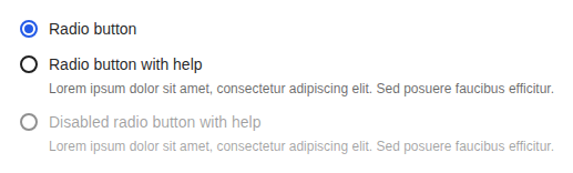
stories > demos-generated > radio-button (1)
default-@1x
| Previous |
|---|
 |
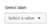
stories > demos-generated > select (1)
single-selection-@1x
| Previous |
|---|
 |
stories > demos-generated > switch (1)
default-@1x
| Previous |
|---|
 |
stories > demos-generated > typography (1)
default-@1x
| Previous |
|---|
 |
(547)
Download all unchanged screenshots (.zip)
- components > alert-dialog > AlertDialog: default-kind-@1x, error-@1x, rich-description-@1x, success-@1x, warning-@1x, with-cancel-@1x
- components > autocomplete > Autocomplete: simple-@1x, with-clear-button-@1x
- components > autocomplete > AutocompleteMultiple: simple-@1x
- components > avatar > Avatar: all-sizes-@1x, all-sizes-with-badge-@1x, avatar-button-@1x, avatar-custom-link-@1x, avatar-link-@1x, default-@1x, with-actions-@1x
- components > badge > BadgeWrapper: with-button-@1x, with-chip-@1x, with-icon-@1x
- components > button > Button: base-@1x, content-sizing-@1x, link-button-@1x, size-and-emphasis-@1x, state-variations-@1x, theming-@1x
- components > button > IconButton: default-@1x, icon-state-variations-@1x, with-image-@1x
- components > checkbox > Checkbox: default-@1x, disabled-@1x, intermediate-state-@1x, label-and-helper-@1x
- components > chip > Chip: chip-button-@1x, chip-link-@1x, color-variants-@1x, default-@1x, disabled-@1x, selected-variants-@1x, theming-@1x, with-after-and-before-@1x
- components > chip > SelectionChipGroup: constrained-space-@1x, custom-render-@1x, default-@1x, disabled-@1x, empty-@1x, in-text-field-@1x, individually-disabled-@1x
- components > combobox > Combobox: combobox-with-avatar-loading-@1x, combobox-with-button-@1x, combobox-with-empty-state-@1x, combobox-with-error-state-@1x, combobox-with-filtered-sections-@1x, combobox-with-link-options-@1x, combobox-with-load-more-@1x, combobox-with-loading-@1x, combobox-with-option-more-info-@1x, combobox-with-option-tooltips-@1x, combobox-with-section-@1x, combobox-with-section-loading-@1x, combobox-with-selection-icon-multiple-@1x, combobox-with-selection-icon-single-@1x, combobox-with-subcomponents-@1x, grid-combobox-with-button-@1x, grid-combobox-with-input-@1x
- components > comment-block > CommentBlock: full-featured-@1x, minimal-@1x, relevant-@1x, thread-@1x
- components > date-picker > DatePicker: default-@1x, locales-variations-@1x, theming-@1x
- components > date-picker > DatePickerField: default-@1x, default-month-@1x, default-value-@1x, disabled-@1x, error-@1x, label-placeholder-and-helper-@1x, restricted-@1x, restricted-empty-@1x
- components > dialog > Dialog: default-@1x, force-divider-@1x, loading-@1x, long-content-@1x, non-modal-@1x, prevent-auto-close-@1x, prevent-close-on-click-@1x, prevent-close-on-escape-@1x, with-confirm-close-@1x, with-header-footer-@1x, with-header-footer-children-@1x
- components > expansion-panel > ExpansionPanel: default-@1x, has-background-@1x, has-header-divider-@1x, hide-children-@1x, nested-@1x
- components > flag > Flag: all-colors-@1x, default-@1x, truncate-@1x, with-icon-@1x
- components > flex-box > FlexBox: gap-sizes-@1x, horizontal-@1x, margin-auto-@1x, no-config-@1x, no-shrink-@1x, vertical-@1x, wrap-@1x
- components > generic-block > GenericBlock: as-a-figure-@1x, as-an-article-@1x, gap-sizes-@1x, horizontal-@1x, horizontal-align-right-bottom-@1x, horizontal-overflow-@1x, sections-in-children-@1x, sections-in-props-@1x, vertical-@1x, vertical-align-center-@1x, vertical-overflow-@1x
- components > heading > Heading: all-levels-@1x, all-typography-@1x, default-@1x, nested-heading-level-provider-@1x
- components > icon > Icon: all-colors-@1x, size-and-shape-@1x
- components > image-block > ImageBlock: full-featured-@1x, with-actions-@1x, with-align-@1x, with-caption-below-@1x, with-caption-over-@1x, with-focus-point-horizontal-@1x, with-focus-point-vertical-@1x, with-tags-@1x
- components > input-label > InputLabel: as-legend-@1x, default-@1x, is-required-@1x, with-custom-typography-@1x
- components > lightbox > Lightbox: image-@1x, image-slideshow-@1x, with-close-button-@1x
- components > link-preview > LinkPreview: all-fields-@1x, big-@1x, default-@1x, title-and-description-@1x
- components > link > Link: all-colors-@1x, all-states-@1x, all-typography-@1x, as-button-@1x, default-@1x, disabled-@1x, in-paragraph-@1x, link-as-@1x, parent-typography-and-color-@1x, with-color-@1x, with-customizable-typography-@1x, with-typography-@1x, wrapping-block-@1x
- components > list > ListItem: action-area-@1x, all-states-@1x, custom-link-@1x, default-@1x
- components > list > ListSection: auto-divider-edge-cases-@1x, clickable-items-@1x, default-@1x, label-variants-@1x
- components > menu-button > MenuButton: default-@1x, variants-@1x, with-link-items-@1x
- components > message > Message: all-kinds-@1x, all-kinds-with-background-@1x, closable-message-@1x, custom-icon-@1x, default-@1x
- components > mosaic > Mosaic: five-thumbnail-@1x, five-thumbnail-clickable-@1x, four-thumbnail-@1x, four-thumbnail-clickable-@1x, one-thumbnail-@1x, one-thumbnail-clickable-@1x, six-thumbnail-@1x, six-thumbnail-clickable-@1x, three-thumbnail-@1x, three-thumbnail-clickable-@1x, two-thumbnail-@1x, two-thumbnail-clickable-@1x
- components > navigation > Navigation: full-featured-@1x, full-featured-horizontal-@1x, item-variants-@1x, theming-@1x
- components > notification > Notifications: error-@1x, info-@1x, info-with-action-@1x, info-without-portal-@1x, success-@1x, warning-@1x
- components > popover > Popover: dark-theme-@1x, fit-to-anchor-width-@1x, height-@1x, placements-@1x, simple-@1x, width-@1x, without-portal-@1x
- components > progress-tracker > ProgressTracker: controlled-@1x, not-controlled-@1x
- components > progress > ProgressCircular: all-sizes-@1x, default-@1x, inline-@1x
- components > radio-button > RadioButton: default-@1x
- components > radio-button > RadioGroup: simple-@1x
- components > select-button > SelectButton: custom-render-@1x, default-@1x, disabled-@1x, error-state-@1x, label-display-modes-@1x, loading-@1x, loading-more-@1x, multiple-selection-@1x, multiple-with-preselected-@1x, with-descriptions-@1x, with-nb-option-message-@1x, with-sections-@1x, with-selected-value-@1x
- components > select-text-field > SelectTextField: custom-render-@1x, default-@1x, disabled-@1x, error-state-@1x, loading-@1x, loading-more-@1x, multiple-disabled-@1x, multiple-selection-@1x, multiple-with-many-chips-@1x, multiple-with-preselected-@1x, no-clear-button-@1x, with-creatable-options-render-@1x, with-descriptions-@1x, with-error-@1x, with-helper-@1x, with-icon-@1x, with-sections-@1x, with-selected-value-@1x
- components > select > Select: disabled-select-@1x, select-success-@1x, select-with-another-field-@1x, select-with-chip-variant-@1x, select-with-clear-button-@1x, select-with-error-@1x, select-with-helper-@1x, select-with-no-data-@1x, simple-select-@1x, simple-select-with-infinite-scroll-@1x
- components > select > SelectMultiple: chips-custom-select-multiple-@1x, chips-select-multiple-@1x, default-select-multiple-@1x, disabled-select-multiple-@1x, select-multiple-with-no-data-@1x, select-within-a-dialog-@1x
- components > side-navigation > SideNavigation: close-mode-hide-@1x, simple-@1x, with-3-levels-@1x, with-3-levels-and-icons-@1x, with-3-levels-and-multi-actions-@1x
- components > side-navigation > SideNavigationItem: emphasis-variants-@1x, items-and-sections-@1x, theming-@1x
- components > slider > Slider: default-@1x, slider-with-exact-divisible-steps-@1x, with-label-and-helper-@1x, with-precision-@1x, with-steps-@1x
- components > slideshow > Slideshow: complex-content-@1x, images-@1x, images-with-auto-play-@1x, images-with-scroll-snap-@1x
- components > slideshow > SlideshowControls: controlling-slideshow-@1x, simple-@1x
- components > switch > Switch: default-@1x, disabled-@1x, label-and-helper-@1x, position-right-@1x
- components > table > TableCell: all-header-states-@1x, clickable-and-sortable-@1x, default-@1x, header-@1x
- components > tabs > TabProvider: default-@1x
- components > text-field > RawInputTextarea: default-@1x, with-minimum-rows-@1x, with-placeholder-@1x
- components > text-field > TextField: clearable-@1x, custom-label-and-helper-@1x, default-@1x, disabled-@1x, error-@1x, label-and-helper-@1x, max-length-@1x, number-field-@1x, placeholder-@1x, textarea-field-@1x, valid-@1x, with-after-element-@1x, with-chips-@1x
- components > text > Text: all-colors-@1x, all-typography-@1x, all-white-space-@1x, base-@1x, long-text-@1x, no-wrap-@1x, truncate-@1x, truncate-multiline-@1x, with-icon-@1x, with-icon-and-explicit-spaces-@1x
- components > thumbnail > Thumbnail: as-button-@1x, as-custom-link-@1x, as-link-@1x, error-fallback-@1x, fill-height-and-ratio-@1x, focus-point-horizontal-@1x, focus-point-vertical-@1x, is-loading-@1x, object-fit-@1x, original-@1x, simple-@1x, square-@1x, vertical-@1x, wide-@1x, with-badge-@1x, with-svg-images-@1x, without-source-@1x
- components > time-picker-field > TimePickerField: default-@1x, disabled-@1x, french-@1x, step-15-@1x, with-bounds-mode-@1x, with-max-time-@1x, with-min-time-@1x, with-value-@1x
- components > tooltip > Tooltip: close-mode-hide-@1x, force-open-@1x, multiline-tooltip-@1x, on-a-button-@1x, on-a-disabled-button-@1x
- components > uploader > Uploader: file-input-@1x, ratio-and-size-@1x, variants-@1x, with-label-@1x, with-label-and-icon-@1x
- components > user-block > UserBlock: as-button-@1x, as-custom-link-@1x, as-link-@1x, avatar-and-custom-name-@1x, avatar-and-name-@1x, avatar-and-name-and-secondary-fields-@1x, avatar-only-@1x, sizes-and-orientations-@1x, with-additional-fields-@1x, with-after-@1x, with-badge-@1x, with-constrained-size-@1x
- stories > demos-generated > autocomplete: default-@1x, multiple-@1x
- stories > demos-generated > avatar: actions-@1x, sizes-@1x
- stories > demos-generated > badge: colors-@1x, icon-@1x, label-@1x, thumbnail-@1x
- stories > demos-generated > button: full-width-@1x, high-emphasis-@1x, low-emphasis-@1x, medium-emphasis-@1x, small-size-@1x, toggled-button-@1x
- stories > demos-generated > card: default-@1x, elevation-@1x
- stories > demos-generated > chip: chip-group-@1x, choice-@1x, default-@1x, dismissible-@1x, filter-@1x, small-@1x
- stories > demos-generated > color: background-color-@1x, font-color-@1x
- stories > demos-generated > comment-block: default-@1x, relevant-@1x, threaded-@1x
- stories > demos-generated > date-picker: default-@1x, input-@1x, restricted-selection-modes-@1x
- stories > demos-generated > dialog: alert-dialog-@1x, confirm-dialog-@1x, default-@1x, processing-state-@1x, sizes-@1x
- stories > demos-generated > dropdown: actions-states-@1x, default-@1x, programmatically-controlled-@1x
- stories > demos-generated > expansion-panel: default-@1x, drag-handle-@1x, examples-@1x, trimmed-@1x
- stories > demos-generated > generic-block: action-section-horizontal-@1x, action-section-vertical-@1x, alignments-horizontal-@1x, alignments-vertical-@1x, anatomy-@1x, content-section-horizontal-@1x, content-section-vertical-@1x, figure-section-@1x, gap-sizes-@1x
- stories > demos-generated > heading: automatic-heading-level-@1x, default-@1x, heading-level-and-typography-@1x
- stories > demos-generated > icon: colors-@1x, shape-@1x, simple-@1x
- stories > demos-generated > image-block: custom-padding-@1x, default-@1x, info-above-@1x, info-alignment-@1x
- stories > demos-generated > inline-list: color-and-typography-@1x, default-@1x, text-wrap-and-overflow-@1x, text-wrap-and-overflow-wrap-@1x
- stories > demos-generated > input-required-legend: default-@1x, in-form-@1x
- stories > demos-generated > link: color-@1x, default-@1x, in-text-@1x, typography-@1x
- stories > demos-generated > link-preview: big-size-@1x, default-@1x
- stories > demos-generated > list: clickable-@1x, item-action-@1x, item-layout-@1x, item-padding-@1x, item-sizes-@1x, list-section-@1x
- stories > demos-generated > menu-button: default-@1x, menu-items-@1x, variants-@1x
- stories > demos-generated > message: closable-@1x, error-@1x, info-@1x, success-@1x, trimmed-@1x, warning-@1x
- stories > demos-generated > mosaic: click-on-thumbnail-@1x, four-images-@1x, more-than-four-images-@1x, three-images-@1x, two-images-@1x
- stories > demos-generated > popover: alignments-@1x, auto-@1x, default-@1x, directed-@1x, matching-width-@1x, offset-@1x
- stories > demos-generated > progress: circular-@1x, linear-@1x
- stories > demos-generated > progress-tracker: default-@1x, error-@1x, helper-@1x, states-@1x
- stories > demos-generated > select-button: custom-trigger-@1x, default-@1x, list-states-@1x, multiple-selection-@1x, with-descriptions-and-sections-@1x
- stories > demos-generated > select-text-field: custom-render-@1x, empty-@1x, list-error-@1x, loading-@1x, loading-more-@1x, multiple-selection-@1x, single-selection-@1x, with-sections-@1x
- stories > demos-generated > side-navigation: default-@1x, emphasis-@1x, nested-items-@1x, states-@1x, with-icon-@1x
- stories > demos-generated > skeleton: animation-and-style-@1x, circle-@1x, rectangle-@1x, typography-@1x
- stories > demos-generated > slider: default-@1x, precision-@1x, step-@1x, without-min-and-max-labels-@1x
- stories > demos-generated > slideshow: autoplay-@1x, default-@1x, group-by-@1x
- stories > demos-generated > spacing: margin-@1x, padding-@1x
- stories > demos-generated > table: clickable-@1x, default-@1x
- stories > demos-generated > tabs: default-@1x, icon-@1x, justify-left-@1x, navigation-@1x
- stories > demos-generated > text: color-and-typography-@1x, default-@1x, text-wrap-and-overflow-@1x
- stories > demos-generated > text-field: chips-@1x, default-@1x, has-error-@1x, helper-@1x, icon-@1x, is-clearable-@1x, is-disabled-@1x, is-required-@1x, is-valid-@1x, max-length-@1x, number-@1x, placeholder-@1x, textarea-@1x, textarea-invalid-@1x, textarea-valid-@1x
- stories > demos-generated > thumbnail: error-state-@1x, error-state-fallback-@1x, loading-state-@1x, ratios-@1x, ratios-contain-@1x, sizes-@1x, sizes-ratios-and-variants-combined-@1x, variants-@1x
- stories > demos-generated > time-picker-field: bounds-@1x, default-@1x, locale-@1x
- stories > demos-generated > toolbar: contextual-icon-button-@1x, default-@1x, dialog-toolbar-@1x, file-list-widget-@1x, media-picker-toolbar-@1x
- stories > demos-generated > tooltip: default-@1x, placement-@1x
- stories > demos-generated > uploader: avatar-@1x, default-@1x, thumbnail-@1x
- stories > demos-generated > user-block: extended-@1x, extra-small-@1x, large-@1x, medium-@1x, small-@1x, vertical-@1x
- utils > action-area > ActionArea: card-example-@1x, overlay-states-@1x
- utils > disabled > DisabledStateProvider: all-components-@1x, disabled-@1x, not-disabled-@1x
components > dialog > DialogHeading (2)
custom-typography-@1x
| Baseline | Current | Diff |
|---|---|---|
 |
 |
 |
default-@1x
| Baseline | Current | Diff |
|---|---|---|
 |
 |
 |
components > link-preview > LinkPreview (4)
all-fields-@1x
| Baseline | Current | Diff |
|---|---|---|
 |
 |
 |
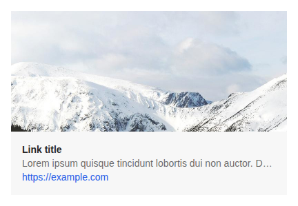
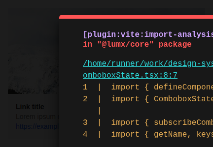
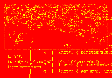
big-@1x
| Baseline | Current | Diff |
|---|---|---|
 |
 |
 |
default-@1x
| Baseline | Current | Diff |
|---|---|---|
 |
 |
 |
title-and-description-@1x
| Baseline | Current | Diff |
|---|---|---|
 |
 |
 |
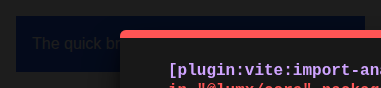
stories > demos-generated > color (2)
background-color-@1x
| Baseline | Current | Diff |
|---|---|---|
 |
 |
 |
font-color-@1x
| Baseline | Current | Diff |
|---|---|---|
 |
 |
 |
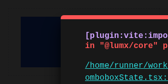
stories > demos-generated > spacing (1)
margin-@1x
| Baseline | Current | Diff |
|---|---|---|
 |
 |
 |
stories > demos-generated > typography (1)
default-@1x
| Baseline | Current | Diff |
|---|---|---|
 |
 |
 |
components > alert-dialog > AlertDialog (6)
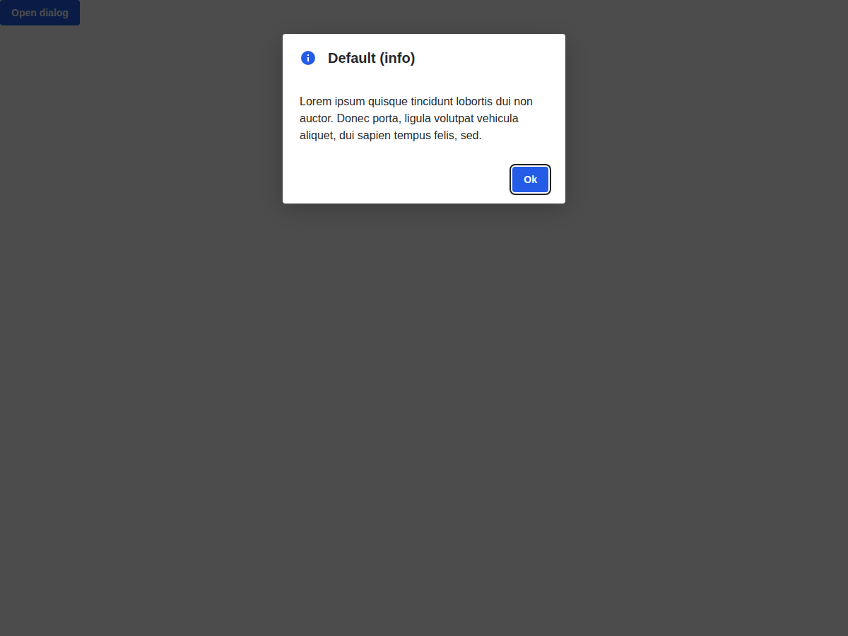
default-kind-@1x
| Previous |
|---|
 |
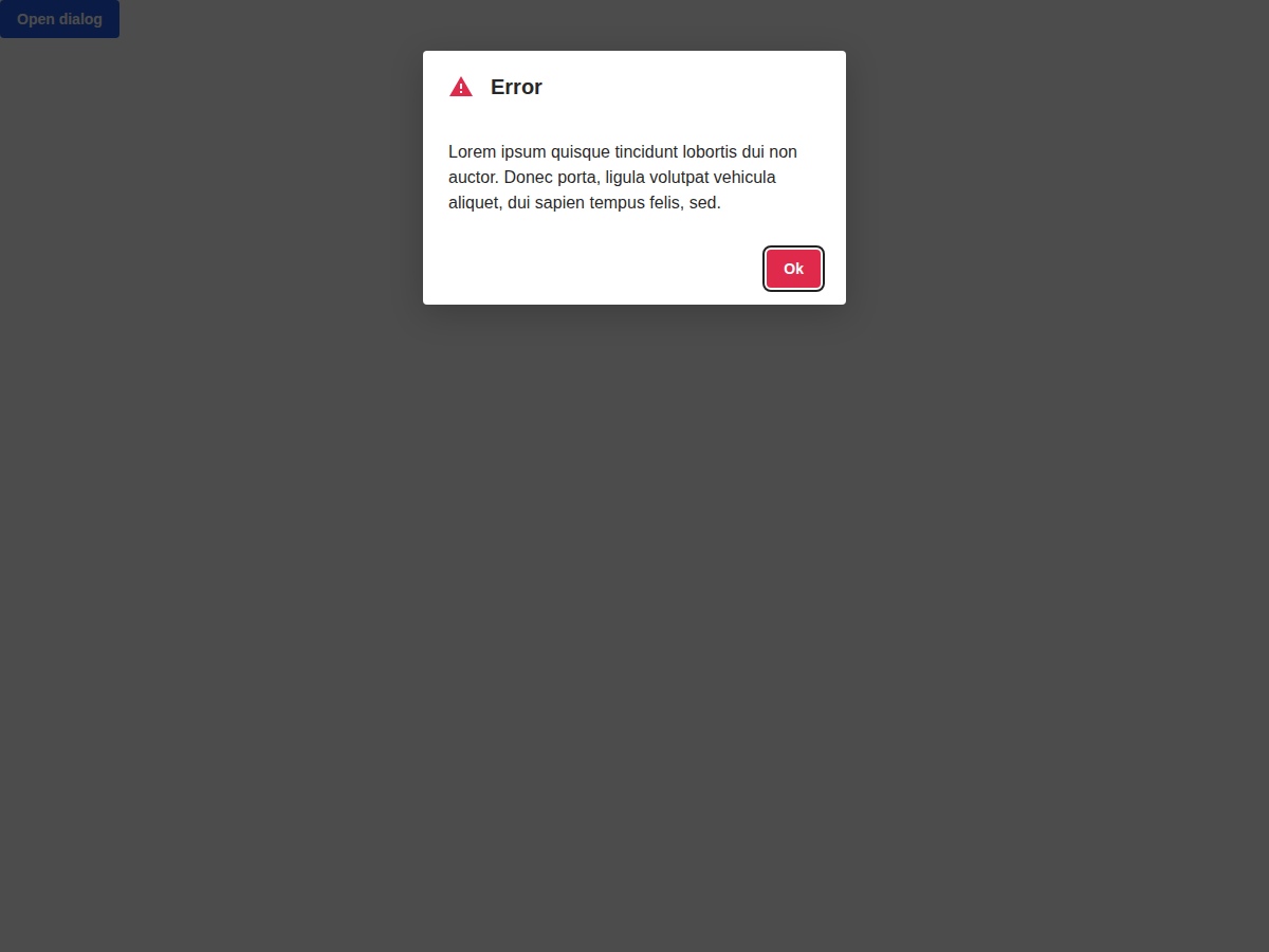
error-@1x
| Previous |
|---|
 |
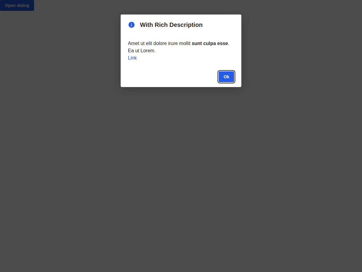
rich-description-@1x
| Previous |
|---|
 |
success-@1x
| Previous |
|---|
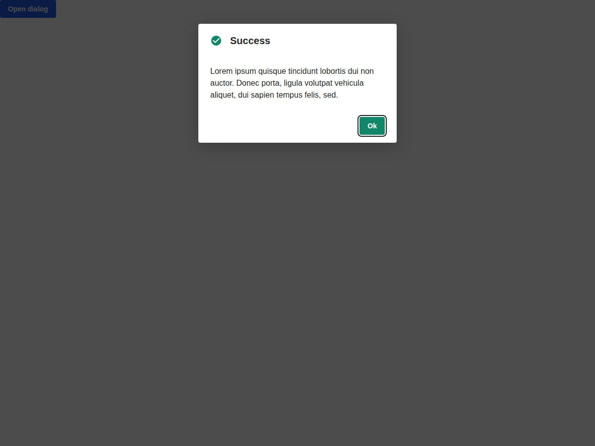 |
warning-@1x
| Previous |
|---|
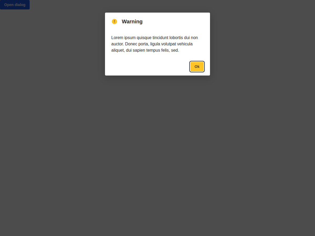 |
with-cancel-@1x
| Previous |
|---|
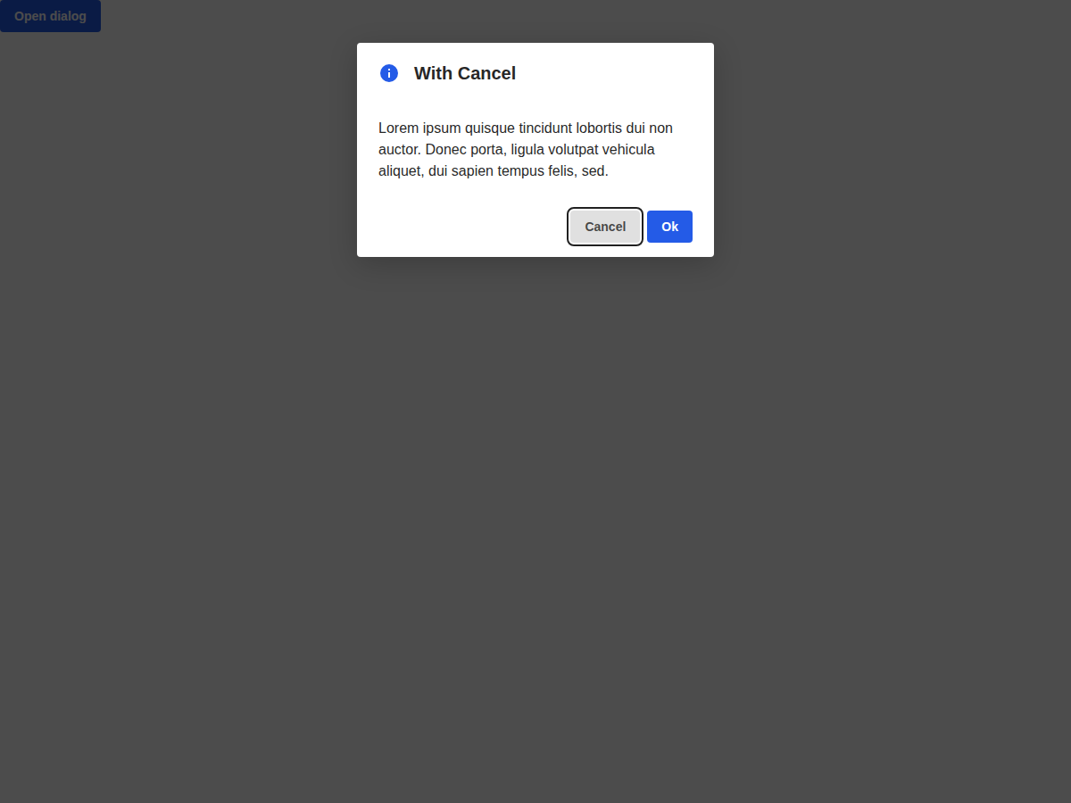 |
components > avatar > Avatar (6)
all-sizes-@1x
| Previous |
|---|
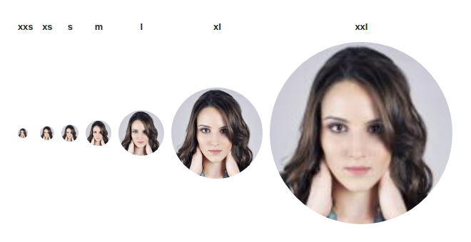 |
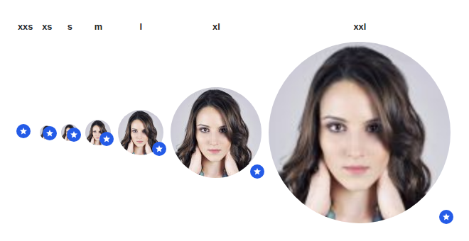
all-sizes-with-badge-@1x
| Previous |
|---|
 |
avatar-button-@1x
| Previous |
|---|
 |
avatar-link-@1x
| Previous |
|---|
 |
default-@1x
| Previous |
|---|
 |
with-actions-@1x
| Previous |
|---|
 |
components > badge > Badge (4)
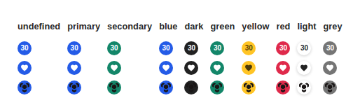
all-colors-@1x
| Previous |
|---|
 |
with-icon-@1x
| Previous |
|---|
 |
with-text-@1x
| Previous |
|---|
 |
with-thumbnail-@1x
| Previous |
|---|
 |
components > badge > BadgeWrapper (2)
with-button-@1x
| Previous |
|---|
 |
with-icon-@1x
| Previous |
|---|
 |
components > button > Button (4)
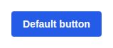
base-@1x
| Previous |
|---|
 |
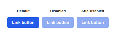
link-button-@1x
| Previous |
|---|
 |
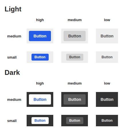
size-and-emphasis-@1x
| Previous |
|---|
 |
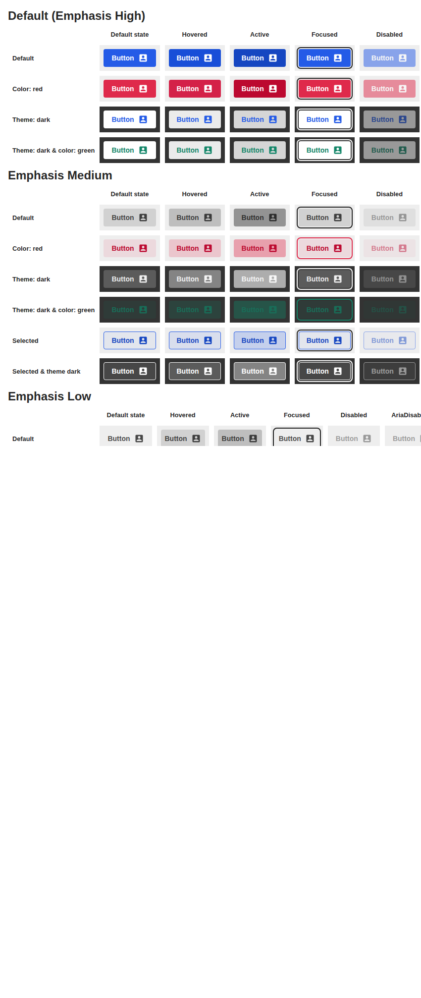
state-variations-@1x
| Previous |
|---|
 |
components > button > ButtonGroup (3)
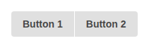
many-buttons-@1x
| Previous |
|---|
 |
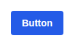
one-button-@1x
| Previous |
|---|
 |
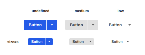
variants-@1x
| Previous |
|---|
 |
components > button > IconButton (3)
default-@1x
| Previous |
|---|
 |
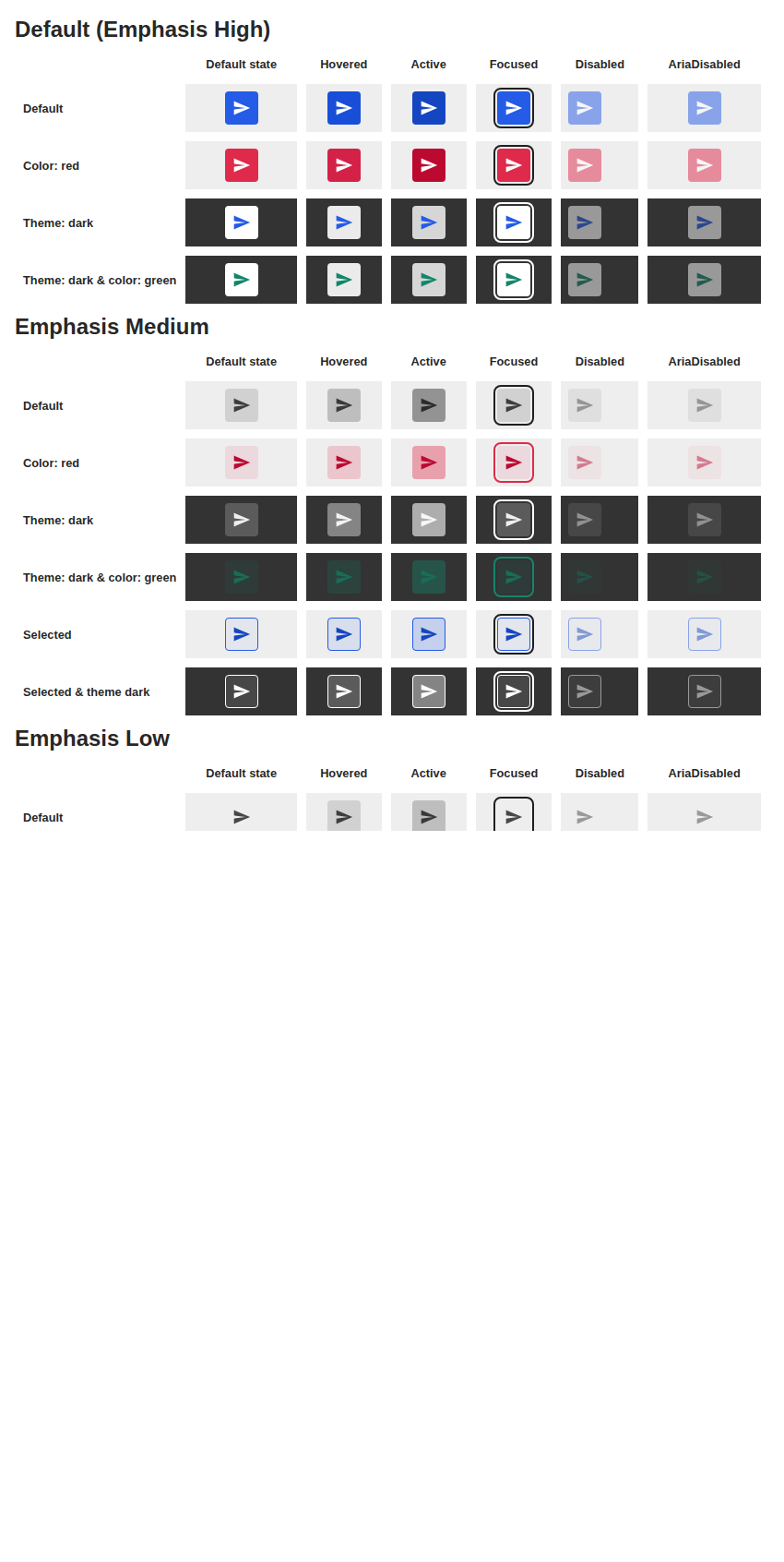
icon-state-variations-@1x
| Previous |
|---|
 |
with-image-@1x
| Previous |
|---|
 |
components > card > Card (3)
as-element-@1x
| Previous |
|---|
 |
default-@1x
| Previous |
|---|
 |
elevation-@1x
| Previous |
|---|
 |
components > checkbox > Checkbox (4)
default-@1x
| Previous |
|---|
 |
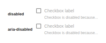
disabled-@1x
| Previous |
|---|
 |
intermediate-state-@1x
| Previous |
|---|
 |
label-and-helper-@1x
| Previous |
|---|
 |
components > chip > Chip (8)
chip-button-@1x
| Previous |
|---|
 |
chip-link-@1x
| Previous |
|---|
 |
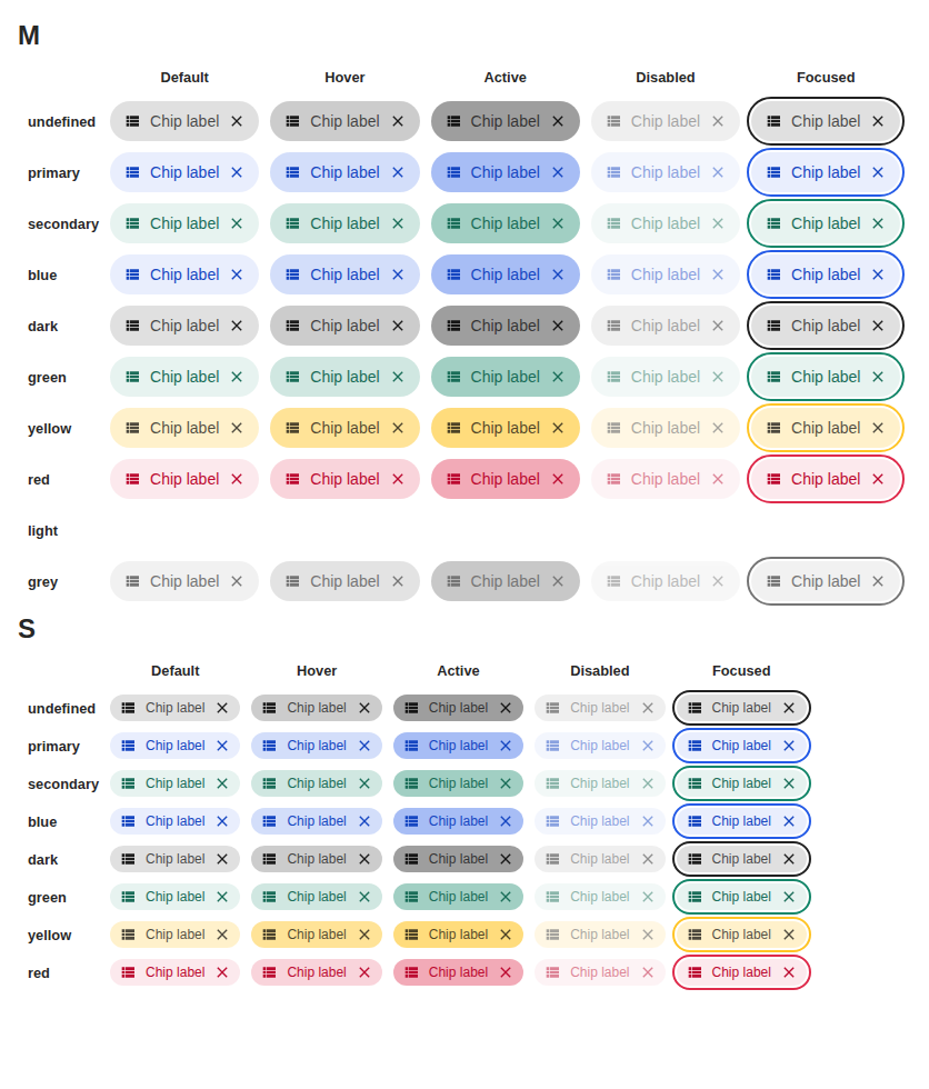
color-variants-@1x
| Previous |
|---|
 |
default-@1x
| Previous |
|---|
 |
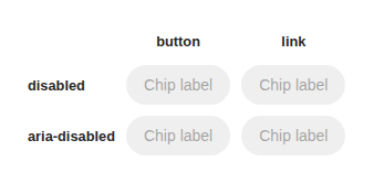
disabled-@1x
| Previous |
|---|
 |
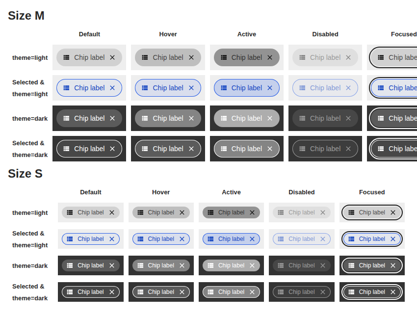
selected-variants-@1x
| Previous |
|---|
 |
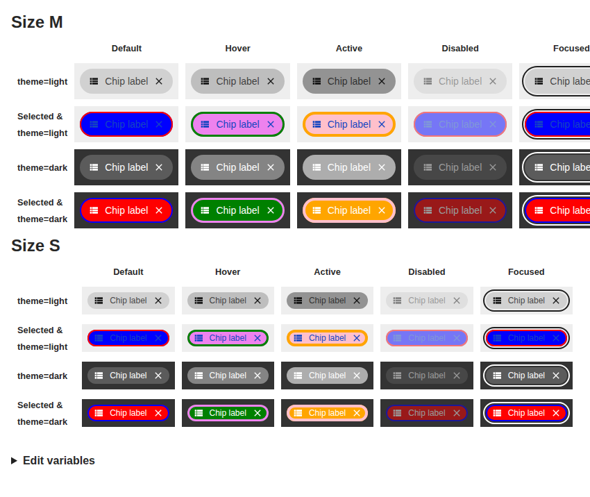
theming-@1x
| Previous |
|---|
 |
with-after-and-before-@1x
| Previous |
|---|
 |
components > chip > ChipGroup (2)
default-@1x
| Previous |
|---|
 |
small-@1x
| Previous |
|---|
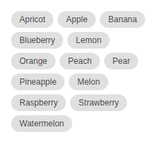 |
components > chip > SelectionChipGroup (7)
constrained-space-@1x
| Previous |
|---|
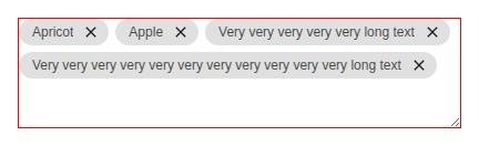 |
custom-render-@1x
| Previous |
|---|
 |
default-@1x
| Previous |
|---|
 |
disabled-@1x
| Previous |
|---|
 |
empty-@1x
| Previous |
|---|
 |
in-text-field-@1x
| Previous |
|---|
 |
individually-disabled-@1x
| Previous |
|---|
 |
components > combobox > Combobox (17)
combobox-with-avatar-loading-@1x
| Previous |
|---|
 |
combobox-with-button-@1x
| Previous |
|---|
 |
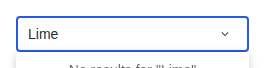
combobox-with-empty-state-@1x
| Previous |
|---|
 |
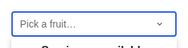
combobox-with-error-state-@1x
| Previous |
|---|
 |
combobox-with-filtered-sections-@1x
| Previous |
|---|
 |
combobox-with-link-options-@1x
| Previous |
|---|
 |
combobox-with-load-more-@1x
| Previous |
|---|
 |
combobox-with-loading-@1x
| Previous |
|---|
 |
combobox-with-option-more-info-@1x
| Previous |
|---|
 |
combobox-with-option-tooltips-@1x
| Previous |
|---|
 |
combobox-with-section-@1x
| Previous |
|---|
 |
combobox-with-section-loading-@1x
| Previous |
|---|
 |
combobox-with-selection-icon-multiple-@1x
| Previous |
|---|
 |
combobox-with-selection-icon-single-@1x
| Previous |
|---|
 |
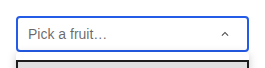
combobox-with-subcomponents-@1x
| Previous |
|---|
 |
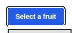
grid-combobox-with-button-@1x
| Previous |
|---|
 |
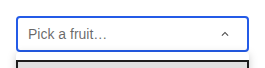
grid-combobox-with-input-@1x
| Previous |
|---|
 |
components > dialog > Dialog (11)
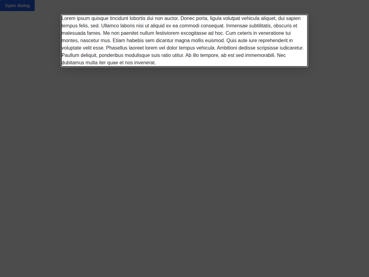
default-@1x
| Previous |
|---|
 |
force-divider-@1x
| Previous |
|---|
 |
loading-@1x
| Previous |
|---|
 |
long-content-@1x
| Previous |
|---|
 |
non-modal-@1x
| Previous |
|---|
 |
prevent-auto-close-@1x
| Previous |
|---|
 |
prevent-close-on-click-@1x
| Previous |
|---|
 |
prevent-close-on-escape-@1x
| Previous |
|---|
 |
with-confirm-close-@1x
| Previous |
|---|
 |
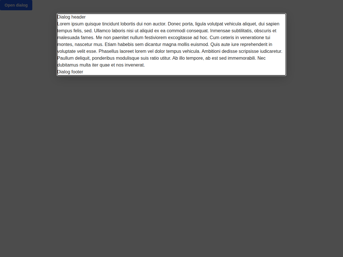
with-header-footer-@1x
| Previous |
|---|
 |
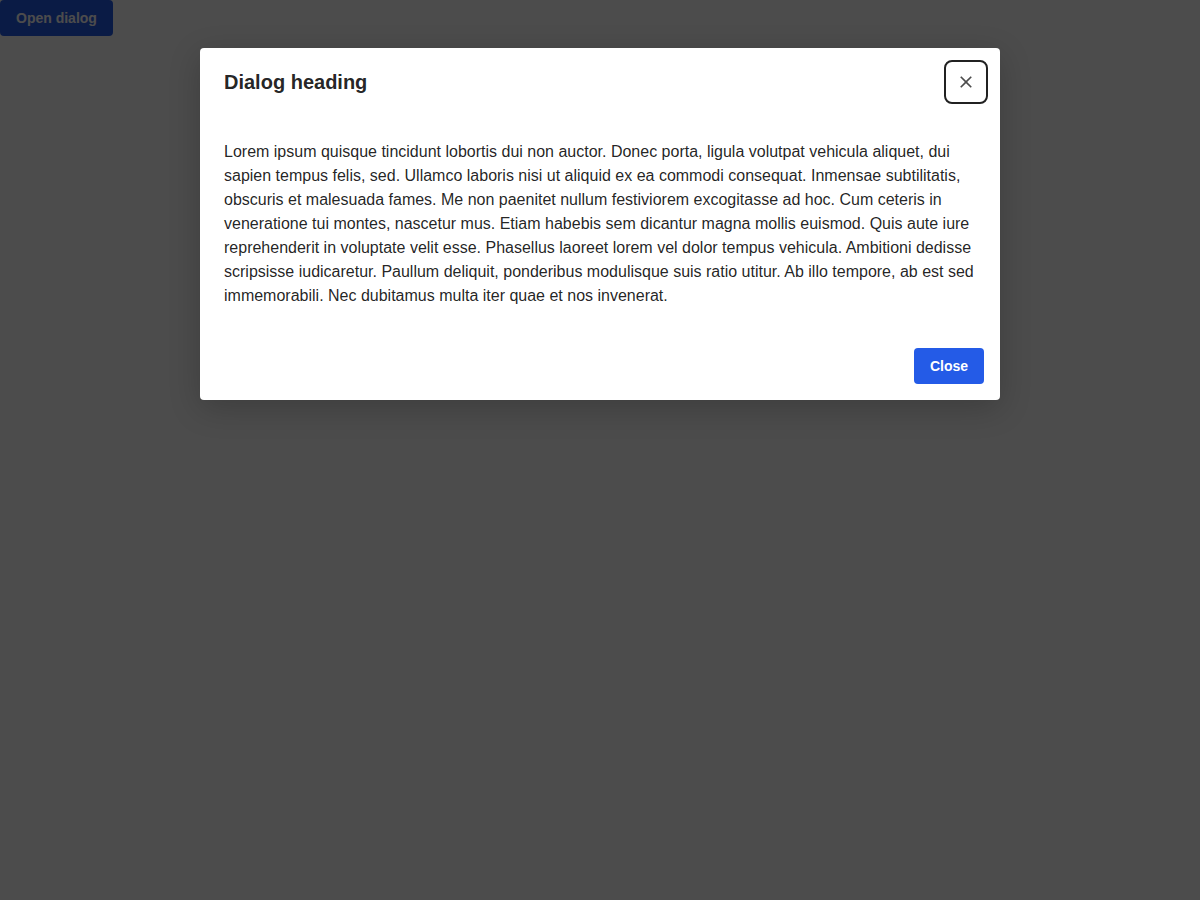
with-header-footer-children-@1x
| Previous |
|---|
 |
components > divider > Divider (1)
default-@1x
| Previous |
|---|
 |
components > drag-handle > DragHandle (2)
all-themes-@1x
| Previous |
|---|
 |
default-@1x
| Previous |
|---|
 |
components > expansion-panel > ExpansionPanel (5)
default-@1x
| Previous |
|---|
 |
has-background-@1x
| Previous |
|---|
 |
has-header-divider-@1x
| Previous |
|---|
 |
hide-children-@1x
| Previous |
|---|
 |
nested-@1x
| Previous |
|---|
 |
components > flag > Flag (4)
all-colors-@1x
| Previous |
|---|
 |
default-@1x
| Previous |
|---|
 |
truncate-@1x
| Previous |
|---|
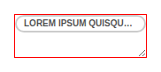 |
with-icon-@1x
| Previous |
|---|
 |
components > flex-box > FlexBox (7)
gap-sizes-@1x
| Previous |
|---|
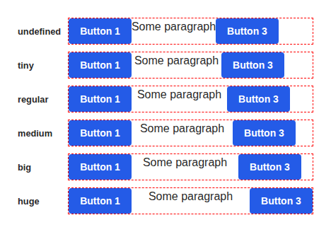 |
horizontal-@1x
| Previous |
|---|
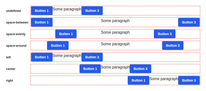 |
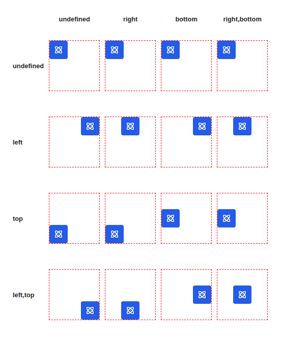
margin-auto-@1x
| Previous |
|---|
 |
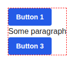
no-config-@1x
| Previous |
|---|
 |
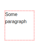
no-shrink-@1x
| Previous |
|---|
 |
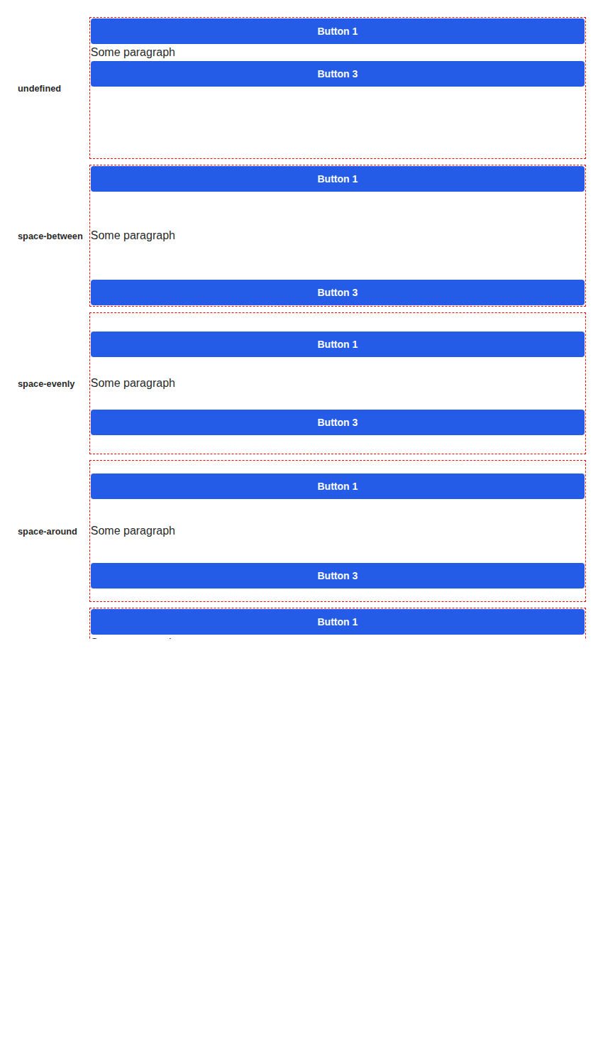
vertical-@1x
| Previous |
|---|
 |
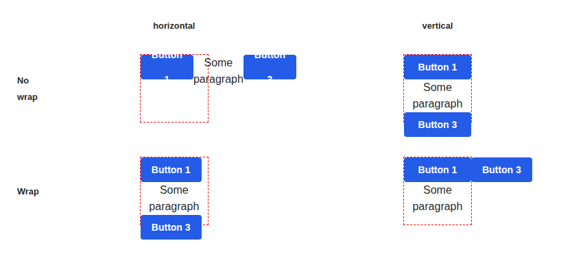
wrap-@1x
| Previous |
|---|
 |
components > generic-block > GenericBlock (11)
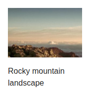
as-a-figure-@1x
| Previous |
|---|
 |
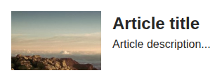
as-an-article-@1x
| Previous |
|---|
 |
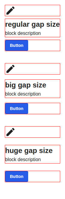
gap-sizes-@1x
| Previous |
|---|
 |
horizontal-@1x
| Previous |
|---|
 |
horizontal-align-right-bottom-@1x
| Previous |
|---|
 |
horizontal-overflow-@1x
| Previous |
|---|
 |
sections-in-children-@1x
| Previous |
|---|
 |
sections-in-props-@1x
| Previous |
|---|
 |
vertical-@1x
| Previous |
|---|
 |
vertical-align-center-@1x
| Previous |
|---|
 |
vertical-overflow-@1x
| Previous |
|---|
 |
components > grid-column > GridColumn (2)
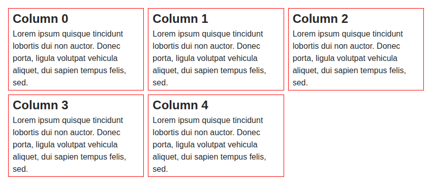
columns-@1x
| Previous |
|---|
 |
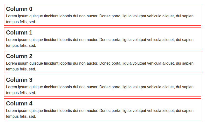
default-@1x
| Previous |
|---|
 |
components > heading > Heading (4)
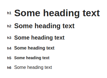
all-levels-@1x
| Previous |
|---|
 |
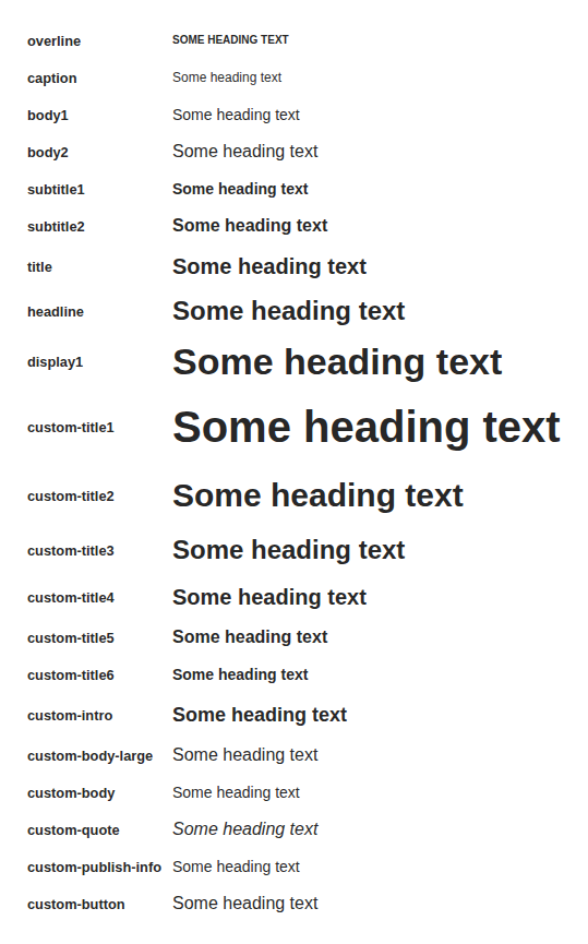
all-typography-@1x
| Previous |
|---|
 |
default-@1x
| Previous |
|---|
 |
nested-heading-level-provider-@1x
| Previous |
|---|
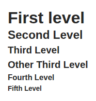 |
components > icon > Icon (3)
all-colors-@1x
| Previous |
|---|
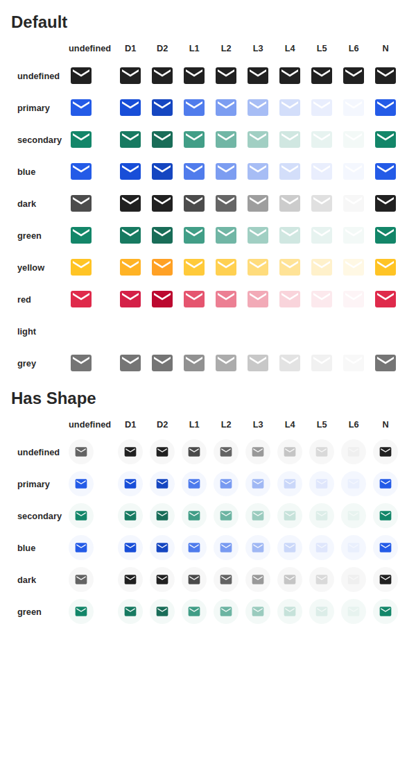 |
inside-text-@1x
| Previous |
|---|
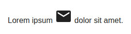 |
size-and-shape-@1x
| Previous |
|---|
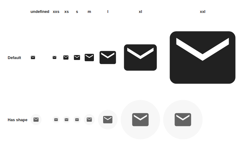 |
components > image-block > ImageBlock (8)
full-featured-@1x
| Previous |
|---|
 |
with-actions-@1x
| Previous |
|---|
 |
with-align-@1x
| Previous |
|---|
 |
with-caption-below-@1x
| Previous |
|---|
 |
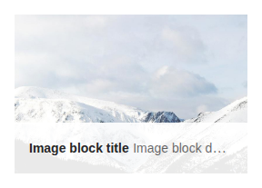
with-caption-over-@1x
| Previous |
|---|
 |
with-focus-point-horizontal-@1x
| Previous |
|---|
 |
with-focus-point-vertical-@1x
| Previous |
|---|
 |
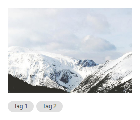
with-tags-@1x
| Previous |
|---|
 |
components > inline-list > InlineList (3)
mixed-no-wrap-and-truncate-@1x
| Previous |
|---|
 |
with-elements-@1x
| Previous |
|---|
 |
wrap-@1x
| Previous |
|---|
 |
components > input-helper > InputHelper (2)
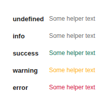
all-kinds-@1x
| Previous |
|---|
 |
default-@1x
| Previous |
|---|
 |
components > input-label > InputLabel (4)
as-legend-@1x
| Previous |
|---|
 |
default-@1x
| Previous |
|---|
 |
is-required-@1x
| Previous |
|---|
 |
with-custom-typography-@1x
| Previous |
|---|
 |
components > input-required-legend > InputRequiredLegend (2)
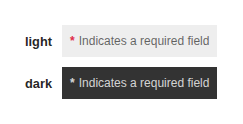
all-themes-@1x
| Previous |
|---|
 |
default-@1x
| Previous |
|---|
 |
components > lightbox > Lightbox (2)
image-@1x
| Previous |
|---|
 |
with-close-button-@1x
| Previous |
|---|
 |
components > link > Link (12)
all-colors-@1x
| Previous |
|---|
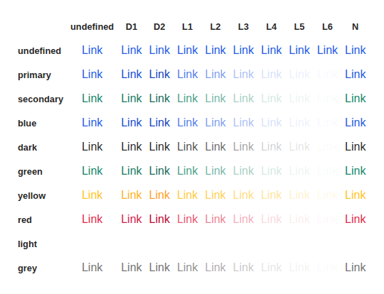 |
all-states-@1x
| Previous |
|---|
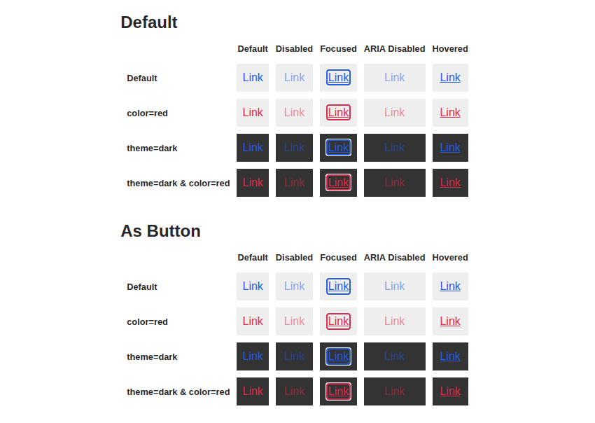 |
all-typography-@1x
| Previous |
|---|
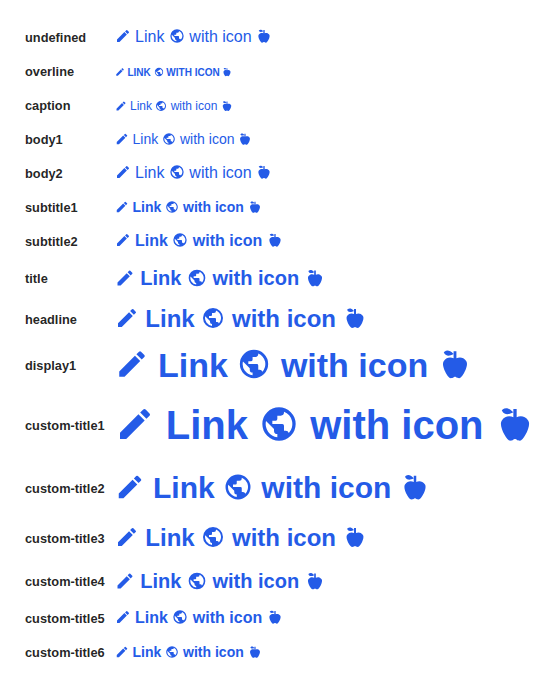 |
as-button-@1x
| Previous |
|---|
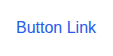 |
default-@1x
| Previous |
|---|
 |
disabled-@1x
| Previous |
|---|
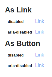 |
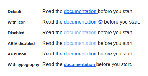
in-paragraph-@1x
| Previous |
|---|
 |
link-as-@1x
| Previous |
|---|
 |
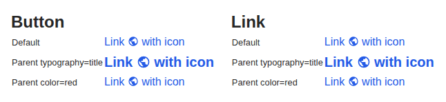
parent-typography-and-color-@1x
| Previous |
|---|
 |
with-color-@1x
| Previous |
|---|
 |
with-customizable-typography-@1x
| Previous |
|---|
 |
with-typography-@1x
| Previous |
|---|
 |
components > list > List (2)
default-@1x
| Previous |
|---|
 |
item-padding-@1x
| Previous |
|---|
 |
components > list > ListDivider (1)
default-@1x
| Previous |
|---|
 |
components > list > ListItem (4)
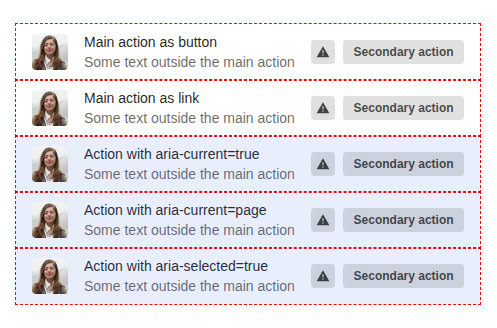
action-area-@1x
| Previous |
|---|
 |
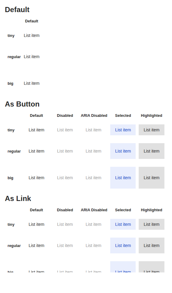
all-states-@1x
| Previous |
|---|
 |
custom-link-@1x
| Previous |
|---|
 |
default-@1x
| Previous |
|---|
 |
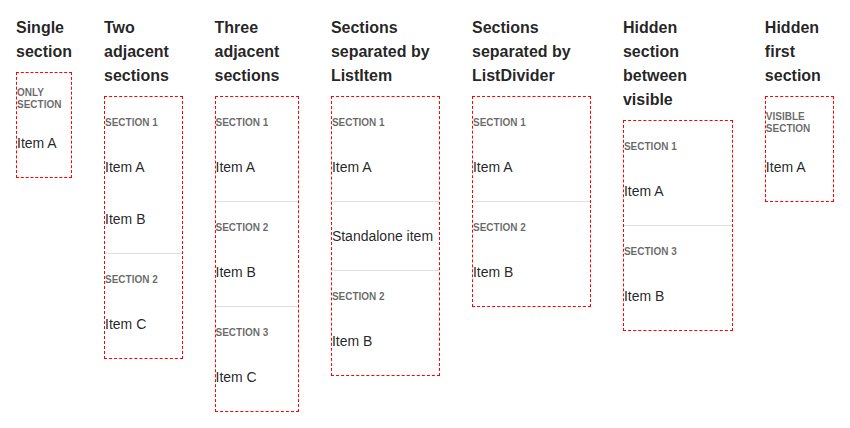
components > list > ListSection (4)
auto-divider-edge-cases-@1x
| Previous |
|---|
 |
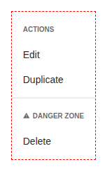
clickable-items-@1x
| Previous |
|---|
 |
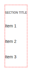
default-@1x
| Previous |
|---|
 |
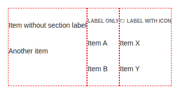
label-variants-@1x
| Previous |
|---|
 |
components > menu-button > MenuButton (3)
default-@1x
| Previous |
|---|
 |
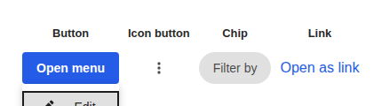
variants-@1x
| Previous |
|---|
 |
with-link-items-@1x
| Previous |
|---|
 |
components > message > Message (5)
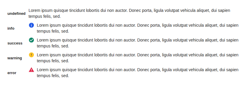
all-kinds-@1x
| Previous |
|---|
 |
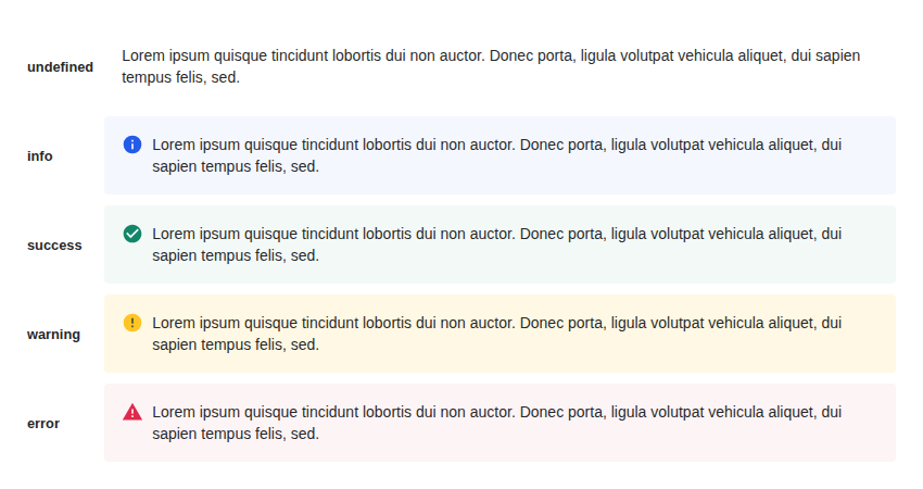
all-kinds-with-background-@1x
| Previous |
|---|
 |
closable-message-@1x
| Previous |
|---|
 |
custom-icon-@1x
| Previous |
|---|
 |
default-@1x
| Previous |
|---|
 |
components > mosaic > Mosaic (12)
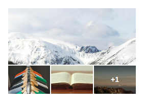
five-thumbnail-@1x
| Previous |
|---|
 |
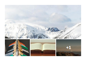
five-thumbnail-clickable-@1x
| Previous |
|---|
 |
four-thumbnail-@1x
| Previous |
|---|
 |
four-thumbnail-clickable-@1x
| Previous |
|---|
 |
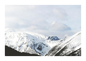
one-thumbnail-@1x
| Previous |
|---|
 |
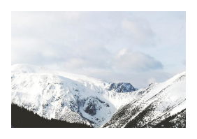
one-thumbnail-clickable-@1x
| Previous |
|---|
 |
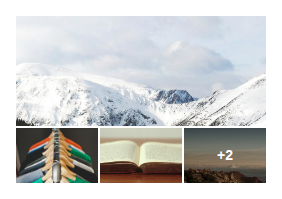
six-thumbnail-@1x
| Previous |
|---|
 |
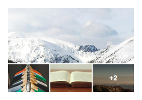
six-thumbnail-clickable-@1x
| Previous |
|---|
 |
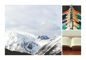
three-thumbnail-@1x
| Previous |
|---|
 |
three-thumbnail-clickable-@1x
| Previous |
|---|
 |
two-thumbnail-@1x
| Previous |
|---|
 |
two-thumbnail-clickable-@1x
| Previous |
|---|
 |
components > popover > Popover (7)
dark-theme-@1x
| Previous |
|---|
 |
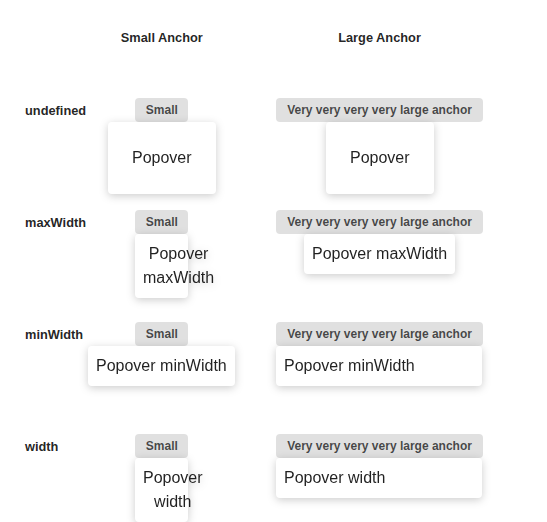
fit-to-anchor-width-@1x
| Previous |
|---|
 |
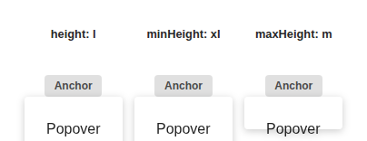
height-@1x
| Previous |
|---|
 |
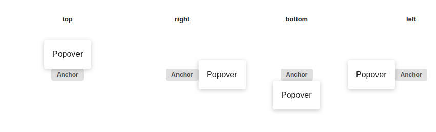
placements-@1x
| Previous |
|---|
 |
simple-@1x
| Previous |
|---|
 |
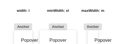
width-@1x
| Previous |
|---|
 |
without-portal-@1x
| Previous |
|---|
 |
components > progress > ProgressCircular (3)
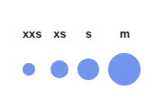
all-sizes-@1x
| Previous |
|---|
 |
default-@1x
| Previous |
|---|
 |
inline-@1x
| Previous |
|---|
 |
components > progress > ProgressLinear (1)
default-@1x
| Previous |
|---|
 |
components > radio-button > RadioButton (3)
default-@1x
| Previous |
|---|
 |
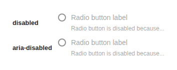
disabled-@1x
| Previous |
|---|
 |
label-and-helper-@1x
| Previous |
|---|
 |
components > radio-button > RadioGroup (1)
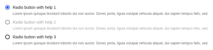
simple-@1x
| Previous |
|---|
 |
components > select-button > SelectButton (13)
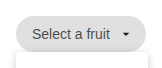
custom-render-@1x
| Previous |
|---|
 |
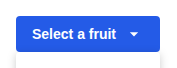
default-@1x
| Previous |
|---|
 |
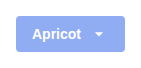
disabled-@1x
| Previous |
|---|
 |
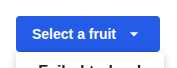
error-state-@1x
| Previous |
|---|
 |
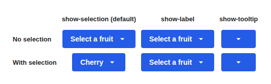
label-display-modes-@1x
| Previous |
|---|
 |
loading-@1x
| Previous |
|---|
 |
loading-more-@1x
| Previous |
|---|
 |
multiple-selection-@1x
| Previous |
|---|
 |
multiple-with-preselected-@1x
| Previous |
|---|
 |
with-descriptions-@1x
| Previous |
|---|
 |
with-nb-option-message-@1x
| Previous |
|---|
 |
with-sections-@1x
| Previous |
|---|
 |
with-selected-value-@1x
| Previous |
|---|
 |
components > select-text-field > SelectTextField (20)
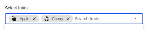
custom-render-@1x
| Previous |
|---|
 |
default-@1x
| Previous |
|---|
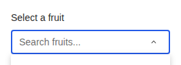 |
disabled-@1x
| Previous |
|---|
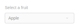 |
error-state-@1x
| Previous |
|---|
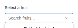 |
loading-@1x
| Previous |
|---|
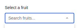 |
loading-more-@1x
| Previous |
|---|
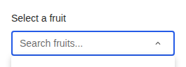 |
multiple-disabled-@1x
| Previous |
|---|
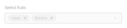 |
multiple-selection-@1x
| Previous |
|---|
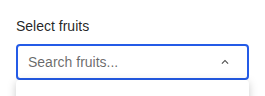 |
multiple-with-many-chips-@1x
| Previous |
|---|
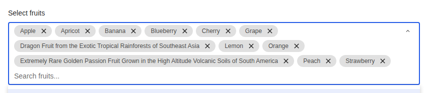 |
multiple-with-preselected-@1x
| Previous |
|---|
 |
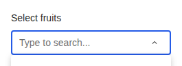
multiple-with-search-@1x
| Previous |
|---|
 |
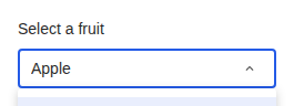
no-clear-button-@1x
| Previous |
|---|
 |
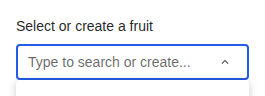
with-creatable-options-@1x
| Previous |
|---|
 |
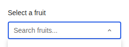
with-descriptions-@1x
| Previous |
|---|
 |
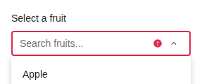
with-error-@1x
| Previous |
|---|
 |
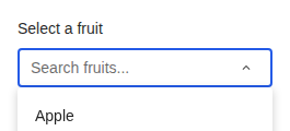
with-helper-@1x
| Previous |
|---|
 |
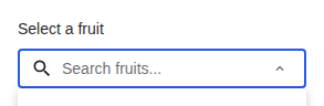
with-icon-@1x
| Previous |
|---|
 |
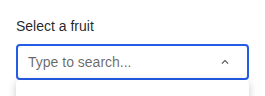
with-search-@1x
| Previous |
|---|
 |
with-sections-@1x
| Previous |
|---|
 |
with-selected-value-@1x
| Previous |
|---|
 |
components > skeleton > SkeletonCircle (2)
all-color-@1x
| Previous |
|---|
 |
all-size-@1x
| Previous |
|---|
 |
components > skeleton > SkeletonRectangle (4)
all-colors-@1x
| Previous |
|---|
 |
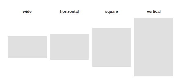
all-ratios-@1x
| Previous |
|---|
 |
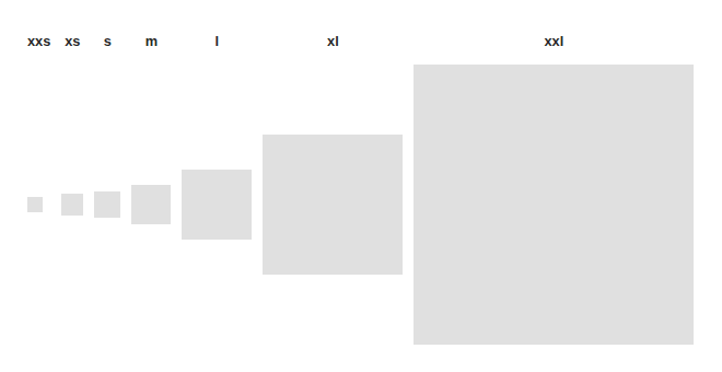
all-size-@1x
| Previous |
|---|
 |
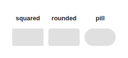
all-variants-@1x
| Previous |
|---|
 |
components > skeleton > SkeletonTypography (3)
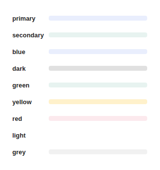
all-colors-@1x
| Previous |
|---|
 |
text-typography-@1x
| Previous |
|---|
 |
width-variations-@1x
| Previous |
|---|
 |
components > switch > Switch (4)
default-@1x
| Previous |
|---|
 |
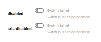
disabled-@1x
| Previous |
|---|
 |
label-and-helper-@1x
| Previous |
|---|
 |
position-right-@1x
| Previous |
|---|
 |
components > table > Table (2)
default-@1x
| Previous |
|---|
 |
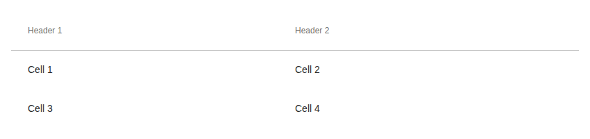
with-header-@1x
| Previous |
|---|
 |
components > table > TableCell (4)
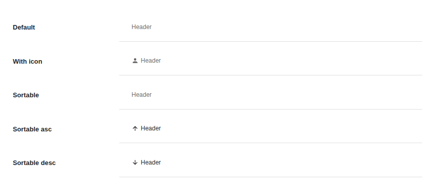
all-header-states-@1x
| Previous |
|---|
 |
clickable-and-sortable-@1x
| Previous |
|---|
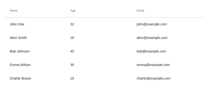 |
default-@1x
| Previous |
|---|
 |
header-@1x
| Previous |
|---|
 |
components > table > TableRow (2)
all-states-@1x
| Previous |
|---|
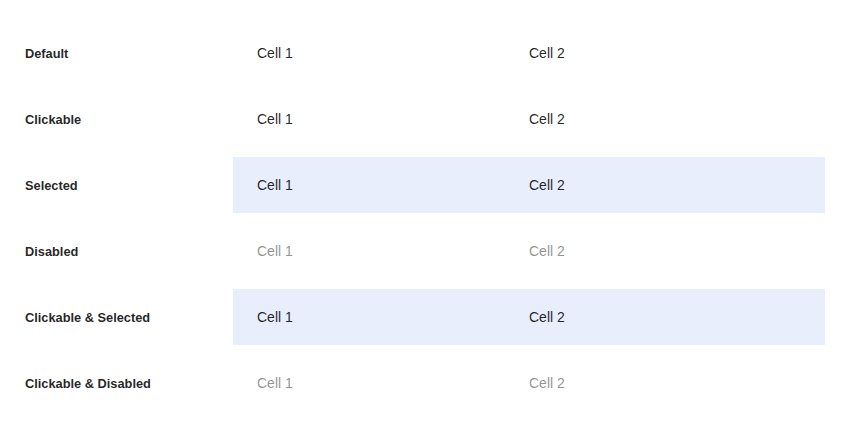 |
default-@1x
| Previous |
|---|
 |
components > tabs > TabProvider (1)
default-@1x
| Previous |
|---|
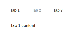 |
components > text-field > RawInputText (2)
default-@1x
| Previous |
|---|
 |
with-placeholder-@1x
| Previous |
|---|
 |
components > text-field > RawInputTextarea (3)
default-@1x
| Previous |
|---|
 |
with-minimum-rows-@1x
| Previous |
|---|
 |
with-placeholder-@1x
| Previous |
|---|
 |
components > text-field > TextField (12)
custom-label-and-helper-@1x
| Previous |
|---|
 |
default-@1x
| Previous |
|---|
 |
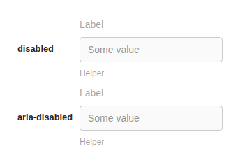
disabled-@1x
| Previous |
|---|
 |
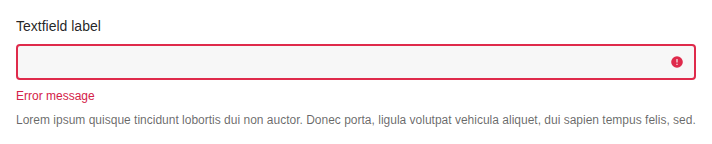
error-@1x
| Previous |
|---|
 |
label-and-helper-@1x
| Previous |
|---|
 |
max-length-@1x
| Previous |
|---|
 |
number-field-@1x
| Previous |
|---|
 |
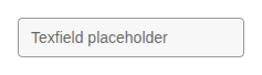
placeholder-@1x
| Previous |
|---|
 |
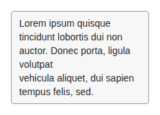
textarea-field-@1x
| Previous |
|---|
 |
valid-@1x
| Previous |
|---|
 |
with-after-element-@1x
| Previous |
|---|
 |
with-chips-@1x
| Previous |
|---|
 |
components > text > Text (10)
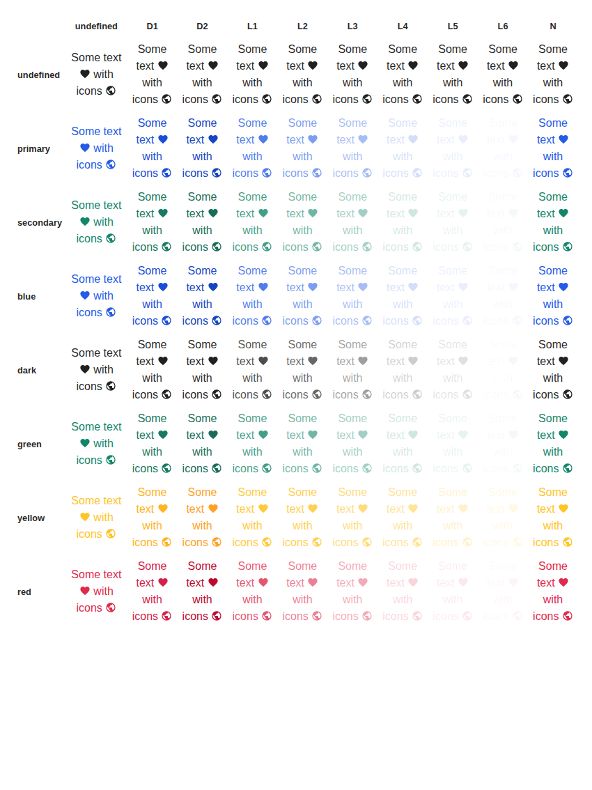
all-colors-@1x
| Previous |
|---|
 |
all-typography-@1x
| Previous |
|---|
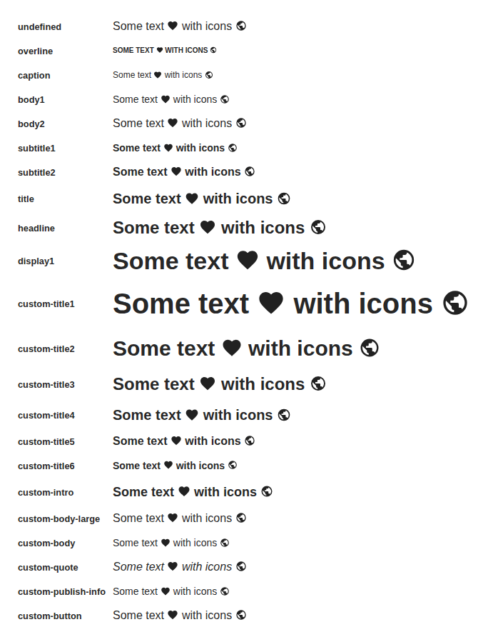 |
all-white-space-@1x
| Previous |
|---|
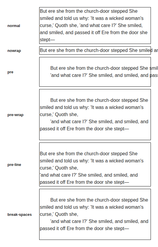 |
base-@1x
| Previous |
|---|
 |
long-text-@1x
| Previous |
|---|
 |
no-wrap-@1x
| Previous |
|---|
 |
truncate-@1x
| Previous |
|---|
 |
truncate-multiline-@1x
| Previous |
|---|
 |
with-icon-@1x
| Previous |
|---|
 |
with-icon-and-explicit-spaces-@1x
| Previous |
|---|
 |
components > thumbnail > Thumbnail (10)
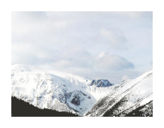
as-button-@1x
| Previous |
|---|
 |
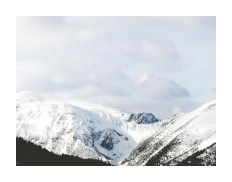
as-link-@1x
| Previous |
|---|
 |
fill-height-and-ratio-@1x
| Previous |
|---|
 |
focus-point-horizontal-@1x
| Previous |
|---|
 |
focus-point-vertical-@1x
| Previous |
|---|
 |
is-loading-@1x
| Previous |
|---|
 |
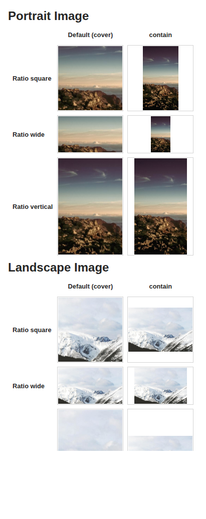
object-fit-@1x
| Previous |
|---|
 |
simple-@1x
| Previous |
|---|
 |
with-svg-images-@1x
| Previous |
|---|
 |
without-source-@1x
| Previous |
|---|
 |
components > time-picker-field > TimePickerField (8)
default-@1x
| Previous |
|---|
 |
disabled-@1x
| Previous |
|---|
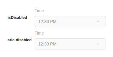 |
french-@1x
| Previous |
|---|
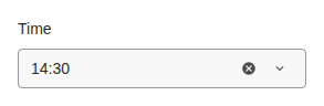 |
step-15-@1x
| Previous |
|---|
 |
with-bounds-mode-@1x
| Previous |
|---|
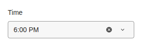 |
with-max-time-@1x
| Previous |
|---|
 |
with-min-time-@1x
| Previous |
|---|
 |
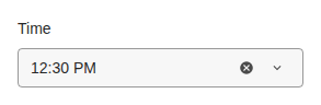
with-value-@1x
| Previous |
|---|
 |
components > toolbar > Toolbar (4)
default-@1x
| Previous |
|---|
 |
with-after-@1x
| Previous |
|---|
 |
with-all-@1x
| Previous |
|---|
 |
with-before-@1x
| Previous |
|---|
 |
components > tooltip > Tooltip (5)
close-mode-hide-@1x
| Previous |
|---|
 |
force-open-@1x
| Previous |
|---|
 |
multiline-tooltip-@1x
| Previous |
|---|
 |
on-a-button-@1x
| Previous |
|---|
 |
on-a-disabled-button-@1x
| Previous |
|---|
 |
components > uploader > Uploader (4)
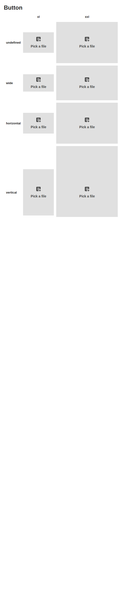
ratio-and-size-@1x
| Previous |
|---|
 |
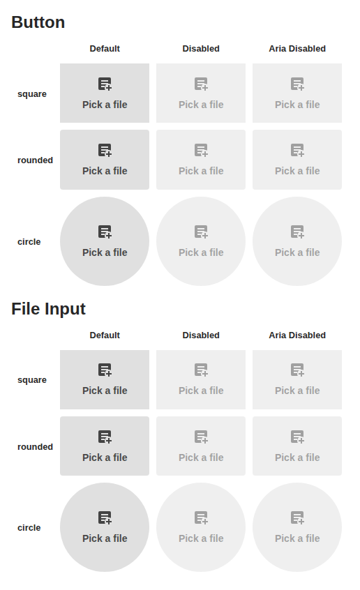
variants-@1x
| Previous |
|---|
 |
with-label-@1x
| Previous |
|---|
 |
with-label-and-icon-@1x
| Previous |
|---|
 |
components > user-block > UserBlock (11)
as-button-@1x
| Previous |
|---|
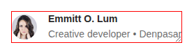 |
as-link-@1x
| Previous |
|---|
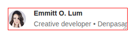 |
avatar-and-custom-name-@1x
| Previous |
|---|
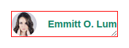 |
avatar-and-name-@1x
| Previous |
|---|
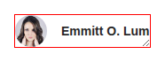 |
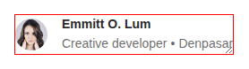
avatar-and-name-and-secondary-fields-@1x
| Previous |
|---|
 |
avatar-only-@1x
| Previous |
|---|
 |
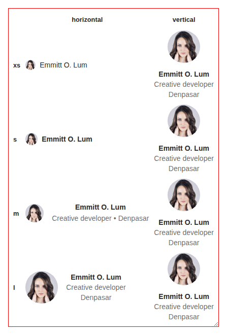
sizes-and-orientations-@1x
| Previous |
|---|
 |
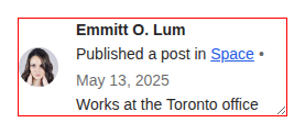
with-additional-fields-@1x
| Previous |
|---|
 |
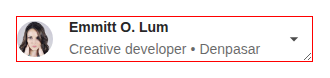
with-after-@1x
| Previous |
|---|
 |
with-badge-@1x
| Previous |
|---|
 |
with-constrained-size-@1x
| Previous |
|---|
 |
stories > demos-generated > action-area (1)
demo-1-@1x
| Previous |
|---|
 |
stories > demos-generated > avatar (2)
actions-@1x
| Previous |
|---|
 |
sizes-@1x
| Previous |
|---|
 |
stories > demos-generated > badge (4)
colors-@1x
| Previous |
|---|
 |
icon-@1x
| Previous |
|---|
 |
label-@1x
| Previous |
|---|
 |
thumbnail-@1x
| Previous |
|---|
 |
stories > demos-generated > button (6)
full-width-@1x
| Previous |
|---|
 |
high-emphasis-@1x
| Previous |
|---|
 |
low-emphasis-@1x
| Previous |
|---|
 |
medium-emphasis-@1x
| Previous |
|---|
 |
small-size-@1x
| Previous |
|---|
 |
toggled-button-@1x
| Previous |
|---|
 |
stories > demos-generated > card (2)
default-@1x
| Previous |
|---|
 |
elevation-@1x
| Previous |
|---|
 |
stories > demos-generated > checkbox (1)
default-@1x
| Previous |
|---|
 |
stories > demos-generated > chip (6)
chip-group-@1x
| Previous |
|---|
 |
choice-@1x
| Previous |
|---|
 |
default-@1x
| Previous |
|---|
 |
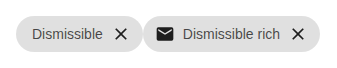
dismissible-@1x
| Previous |
|---|
 |
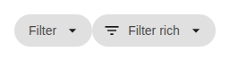
filter-@1x
| Previous |
|---|
 |
small-@1x
| Previous |
|---|
 |
stories > demos-generated > dialog (3)
default-@1x
| Previous |
|---|
 |
processing-state-@1x
| Previous |
|---|
 |
sizes-@1x
| Previous |
|---|
 |
stories > demos-generated > divider (1)
default-@1x
| Previous |
|---|
 |
stories > demos-generated > flag (1)
default-@1x
| Previous |
|---|
 |
stories > demos-generated > generic-block (9)
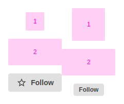
action-section-horizontal-@1x
| Previous |
|---|
 |
action-section-vertical-@1x
| Previous |
|---|
 |
alignments-horizontal-@1x
| Previous |
|---|
 |
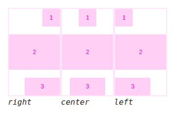
alignments-vertical-@1x
| Previous |
|---|
 |
anatomy-@1x
| Previous |
|---|
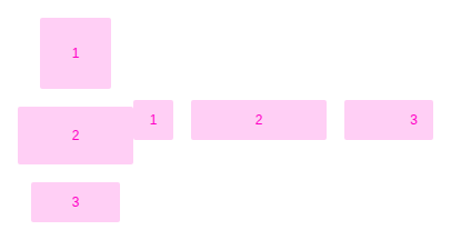 |
content-section-horizontal-@1x
| Previous |
|---|
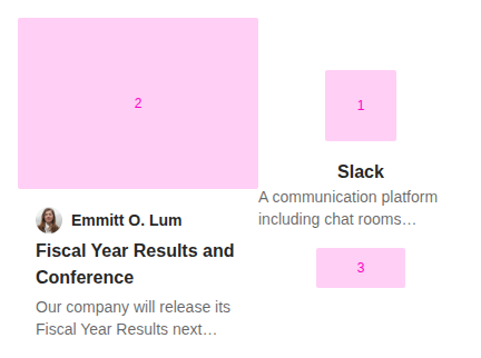 |
content-section-vertical-@1x
| Previous |
|---|
 |
figure-section-@1x
| Previous |
|---|
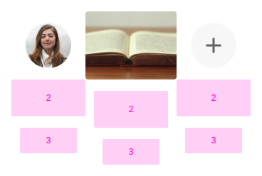 |
gap-sizes-@1x
| Previous |
|---|
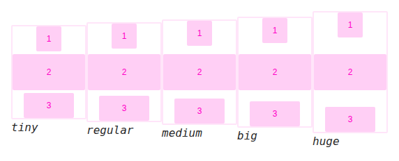 |
stories > demos-generated > grid-column (1)
example-@1x
| Previous |
|---|
 |
stories > demos-generated > heading (3)
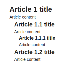
automatic-heading-level-@1x
| Previous |
|---|
 |
default-@1x
| Previous |
|---|
 |
heading-level-and-typography-@1x
| Previous |
|---|
 |
stories > demos-generated > icon (3)
colors-@1x
| Previous |
|---|
 |
shape-@1x
| Previous |
|---|
 |
simple-@1x
| Previous |
|---|
 |
stories > demos-generated > image-block (4)
custom-padding-@1x
| Previous |
|---|
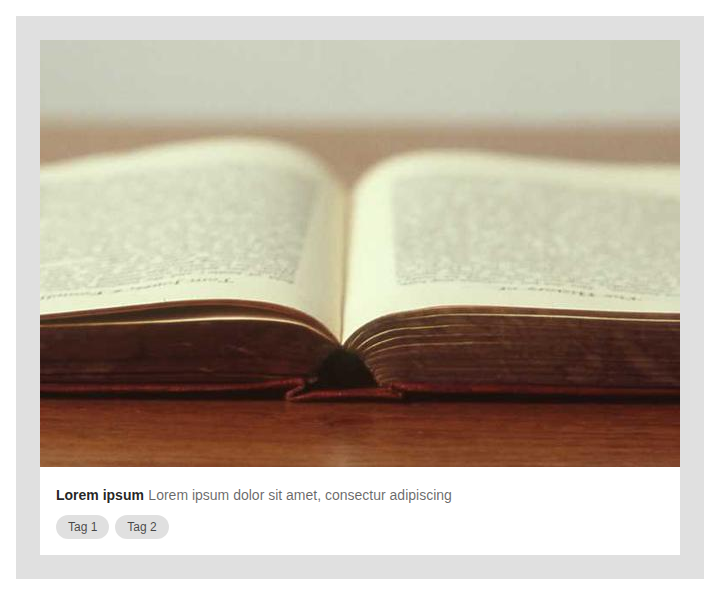 |
default-@1x
| Previous |
|---|
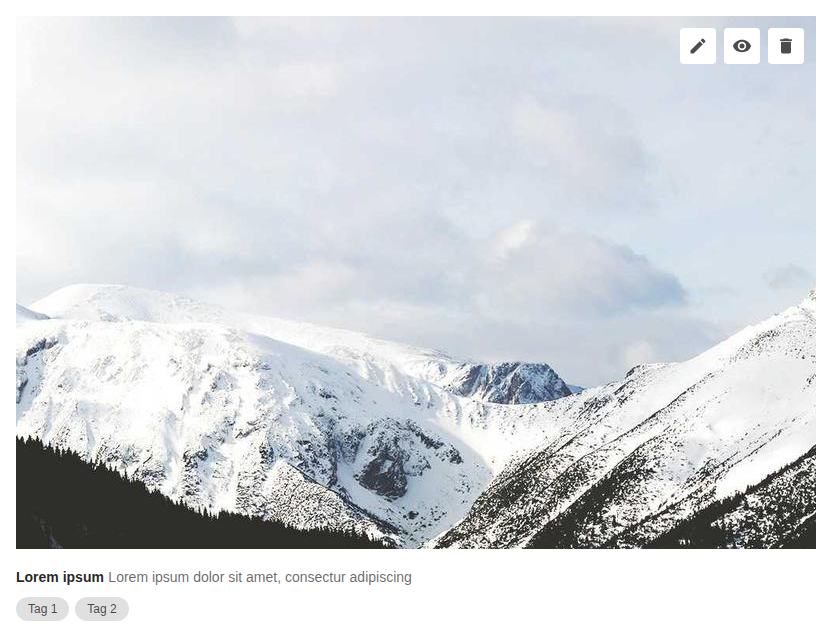 |
info-above-@1x
| Previous |
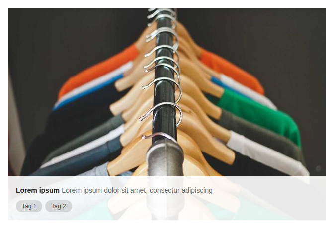
|---|
 |
info-alignment-@1x
| Previous |
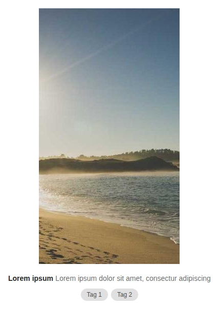
|---|
 |
stories > demos-generated > inline-list (4)
color-and-typography-@1x
| Previous |
|---|
 |
default-@1x
| Previous |
|---|
 |
text-wrap-and-overflow-@1x
| Previous |
|---|
 |
text-wrap-and-overflow-wrap-@1x
| Previous |
|---|
 |
stories > demos-generated > input-required-legend (2)
default-@1x
| Previous |
|---|
 |
in-form-@1x
| Previous |
|---|
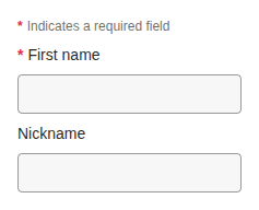 |
stories > demos-generated > lightbox (1)
default-@1x
| Previous |
|---|
 |
stories > demos-generated > link (4)
color-@1x
| Previous |
|---|
 |
default-@1x
| Previous |
|---|
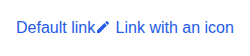 |
in-text-@1x
| Previous |
|---|
 |
typography-@1x
| Previous |
|---|
 |
stories > demos-generated > link-preview (2)
big-size-@1x
| Previous |
|---|
 |
default-@1x
| Previous |
|---|
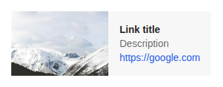 |
stories > demos-generated > list (6)
clickable-@1x
| Previous |
|---|
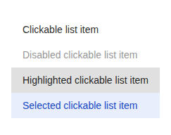 |
item-action-@1x
| Previous |
|---|
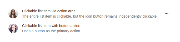 |
item-layout-@1x
| Previous |
|---|
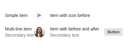 |
item-padding-@1x
| Previous |
|---|
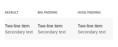 |
item-sizes-@1x
| Previous |
|---|
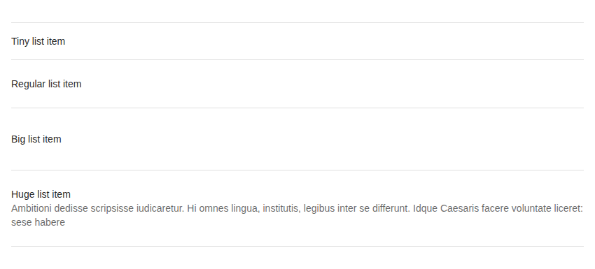 |
list-section-@1x
| Previous |
|---|
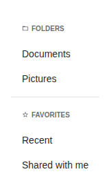 |
stories > demos-generated > menu-button (3)
default-@1x
| Previous |
|---|
 |
menu-items-@1x
| Previous |
|---|
 |
variants-@1x
| Previous |
|---|
 |
stories > demos-generated > message (6)
closable-@1x
| Previous |
|---|
 |
error-@1x
| Previous |
|---|
 |
info-@1x
| Previous |
|---|
 |
success-@1x
| Previous |
|---|
 |
trimmed-@1x
| Previous |
|---|
 |
warning-@1x
| Previous |
|---|
 |
stories > demos-generated > mosaic (5)
click-on-thumbnail-@1x
| Previous |
|---|
 |
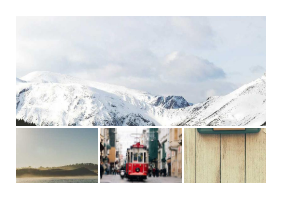
four-images-@1x
| Previous |
|---|
 |
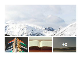
more-than-four-images-@1x
| Previous |
|---|
 |
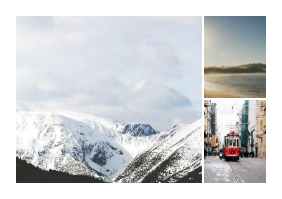
three-images-@1x
| Previous |
|---|
 |
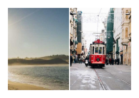
two-images-@1x
| Previous |
|---|
 |
stories > demos-generated > popover (6)
alignments-@1x
| Previous |
|---|
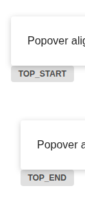 |
auto-@1x
| Previous |
|---|
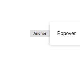 |
default-@1x
| Previous |
|---|
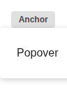 |
directed-@1x
| Previous |
|---|
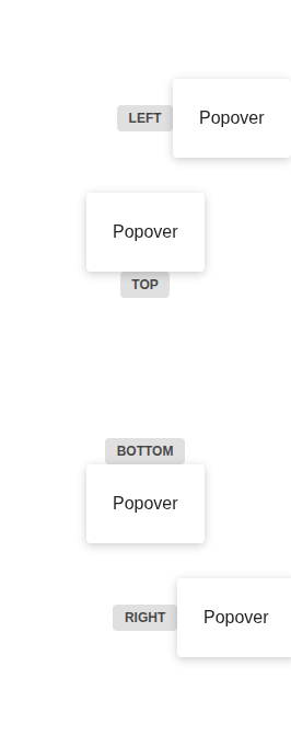 |
matching-width-@1x
| Previous |
|---|
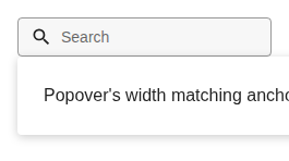 |
offset-@1x
| Previous |
|---|
 |
stories > demos-generated > progress (2)
circular-@1x
| Previous |
|---|
 |
linear-@1x
| Previous |
|---|
 |
stories > demos-generated > radio-button (1)
default-@1x
| Previous |
|---|
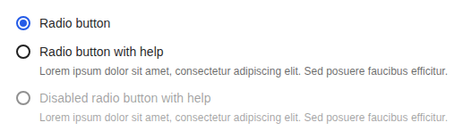 |
stories > demos-generated > select-button (5)
custom-trigger-@1x
| Previous |
|---|
 |
default-@1x
| Previous |
|---|
 |
list-states-@1x
| Previous |
|---|
 |
multiple-selection-@1x
| Previous |
|---|
 |
with-descriptions-and-sections-@1x
| Previous |
|---|
 |
stories > demos-generated > select-text-field (8)
custom-render-@1x
| Previous |
|---|
 |
empty-@1x
| Previous |
|---|
 |
list-error-@1x
| Previous |
|---|
 |
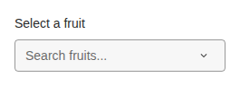
loading-@1x
| Previous |
|---|
 |
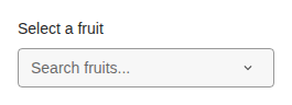
loading-more-@1x
| Previous |
|---|
 |
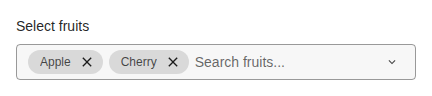
multiple-selection-@1x
| Previous |
|---|
 |
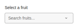
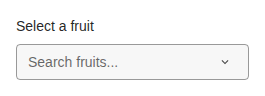
single-selection-@1x
| Previous |
|---|
 |
with-sections-@1x
| Previous |
|---|
 |
stories > demos-generated > skeleton (4)
animation-and-style-@1x
| Previous |
|---|
 |
circle-@1x
| Previous |
|---|
 |
rectangle-@1x
| Previous |
|---|
 |
typography-@1x
| Previous |
|---|
 |
stories > demos-generated > spacing (1)
padding-@1x
| Previous |
|---|
 |
stories > demos-generated > switch (1)
default-@1x
| Previous |
|---|
 |
stories > demos-generated > table (2)
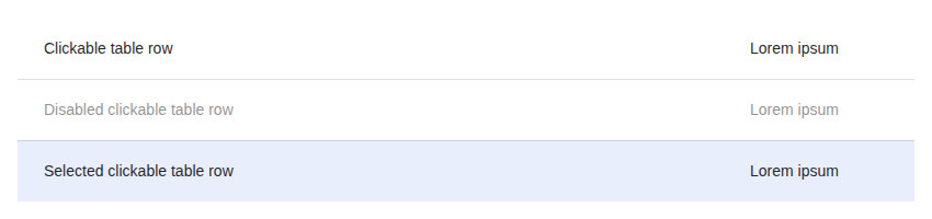
clickable-@1x
| Previous |
|---|
 |
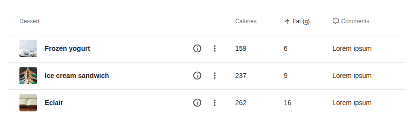
default-@1x
| Previous |
|---|
 |
stories > demos-generated > tabs (4)
default-@1x
| Previous |
|---|
 |
icon-@1x
| Previous |
|---|
 |
justify-left-@1x
| Previous |
|---|
 |
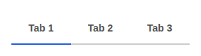
navigation-@1x
| Previous |
|---|
 |
stories > demos-generated > text (3)
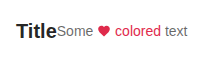
color-and-typography-@1x
| Previous |
|---|
 |
default-@1x
| Previous |
|---|
 |
text-wrap-and-overflow-@1x
| Previous |
|---|
 |
stories > demos-generated > text-field (15)
chips-@1x
| Previous |
|---|
 |
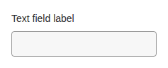
default-@1x
| Previous |
|---|
 |
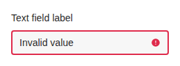
has-error-@1x
| Previous |
|---|
 |
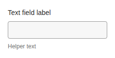
helper-@1x
| Previous |
|---|
 |
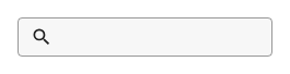
icon-@1x
| Previous |
|---|
 |
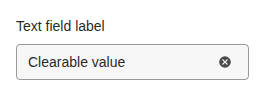
is-clearable-@1x
| Previous |
|---|
 |
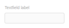
is-disabled-@1x
| Previous |
|---|
 |
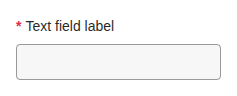
is-required-@1x
| Previous |
|---|
 |
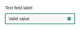
is-valid-@1x
| Previous |
|---|
 |
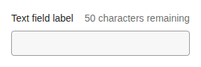
max-length-@1x
| Previous |
|---|
 |
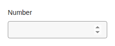
number-@1x
| Previous |
|---|
 |
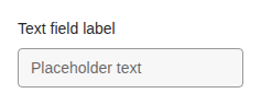
placeholder-@1x
| Previous |
|---|
 |
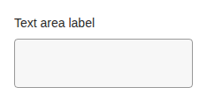
textarea-@1x
| Previous |
|---|
 |
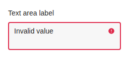
textarea-invalid-@1x
| Previous |
|---|
 |
textarea-valid-@1x
| Previous |
|---|
 |
stories > demos-generated > thumbnail (8)
error-state-@1x
| Previous |
|---|
 |
error-state-fallback-@1x
| Previous |
|---|
 |
loading-state-@1x
| Previous |
|---|
 |
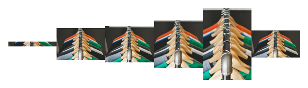
ratios-@1x
| Previous |
|---|
 |
ratios-contain-@1x
| Previous |
|---|
 |
sizes-@1x
| Previous |
|---|
 |
sizes-ratios-and-variants-combined-@1x
| Previous |
|---|
 |
variants-@1x
| Previous |
|---|
 |
stories > demos-generated > time-picker-field (3)
bounds-@1x
| Previous |
|---|
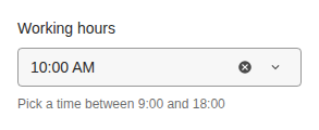 |
default-@1x
| Previous |
|---|
 |
locale-@1x
| Previous |
|---|
 |
stories > demos-generated > toolbar (5)
contextual-icon-button-@1x
| Previous |
|---|
 |
default-@1x
| Previous |
|---|
 |
dialog-toolbar-@1x
| Previous |
|---|
 |
file-list-widget-@1x
| Previous |
|---|
 |
media-picker-toolbar-@1x
| Previous |
|---|
 |
stories > demos-generated > tooltip (2)
default-@1x
| Previous |
|---|
 |
placement-@1x
| Previous |
|---|
 |
stories > demos-generated > uploader (3)
avatar-@1x
| Previous |
|---|
 |
default-@1x
| Previous |
|---|
 |
thumbnail-@1x
| Previous |
|---|
 |
stories > demos-generated > user-block (6)
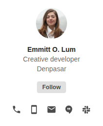
extended-@1x
| Previous |
|---|
 |
extra-small-@1x
| Previous |
|---|
 |
large-@1x
| Previous |
|---|
 |
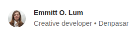
medium-@1x
| Previous |
|---|
 |
small-@1x
| Previous |
|---|
 |
vertical-@1x
| Previous |
|---|
 |
utils > action-area > ActionArea (2)
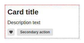
card-example-@1x
| Previous |
|---|
 |
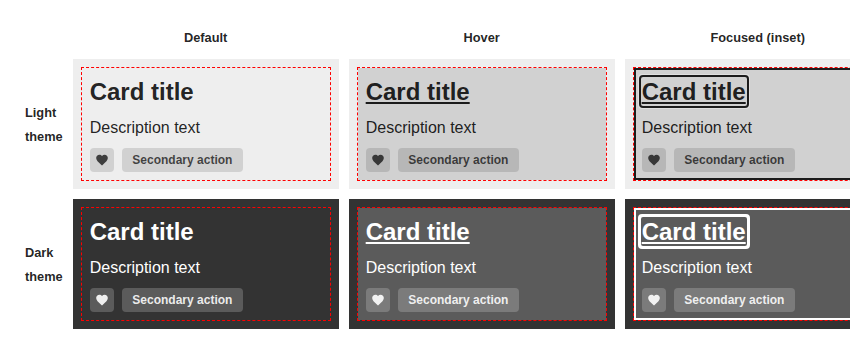
overlay-states-@1x
| Previous |
|---|
 |
components > dialog > DialogHeading (2)
custom-typography-@1x (91.52% diff)
| React | Vue | Diff |
|---|---|---|
 |
 |
 |
default-@1x (93.72% diff)
| React | Vue | Diff |
|---|---|---|
 |
 |
 |
components > link-preview > LinkPreview (4)
all-fields-@1x (94.80% diff)
| React | Vue | Diff |
|---|---|---|
 |
 |
 |
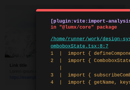
big-@1x (92.08% diff)
| React | Vue | Diff |
|---|---|---|
 |
 |
 |
default-@1x (97.23% diff)
| React | Vue | Diff |
|---|---|---|
 |
 |
 |
title-and-description-@1x (95.44% diff)
| React | Vue | Diff |
|---|---|---|
 |
 |
 |
stories > demos-generated > color (2)
background-color-@1x (94.24% diff)
| React | Vue | Diff |
|---|---|---|
 |
 |
 |
font-color-@1x (94.52% diff)
| React | Vue | Diff |
|---|---|---|
 |
 |
 |
stories > demos-generated > generic-block (3)
alignments-horizontal-@1x (0.90% diff)
| React | Vue | Diff |
|---|---|---|
 |
 |
 |
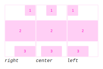
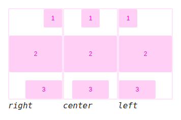
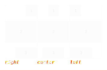
alignments-vertical-@1x (0.64% diff)
| React | Vue | Diff |
|---|---|---|
 |
 |
 |
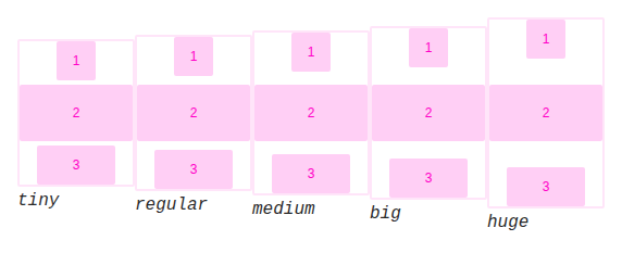
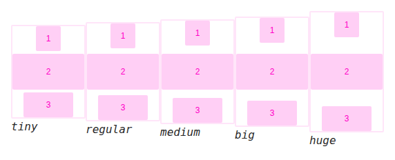
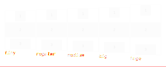
gap-sizes-@1x (0.61% diff)
| React | Vue | Diff |
|---|---|---|
 |
 |
 |
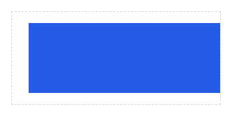
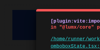
stories > demos-generated > spacing (1)
margin-@1x (95.31% diff)
| React | Vue | Diff |
|---|---|---|
 |
 |
 |
stories > demos-generated > typography (1)
default-@1x (91.00% diff)
| React | Vue | Diff |
|---|---|---|
 |
 |
 |