Skip to content

action button alignment  #39

@mvexel

Description

@mvexel

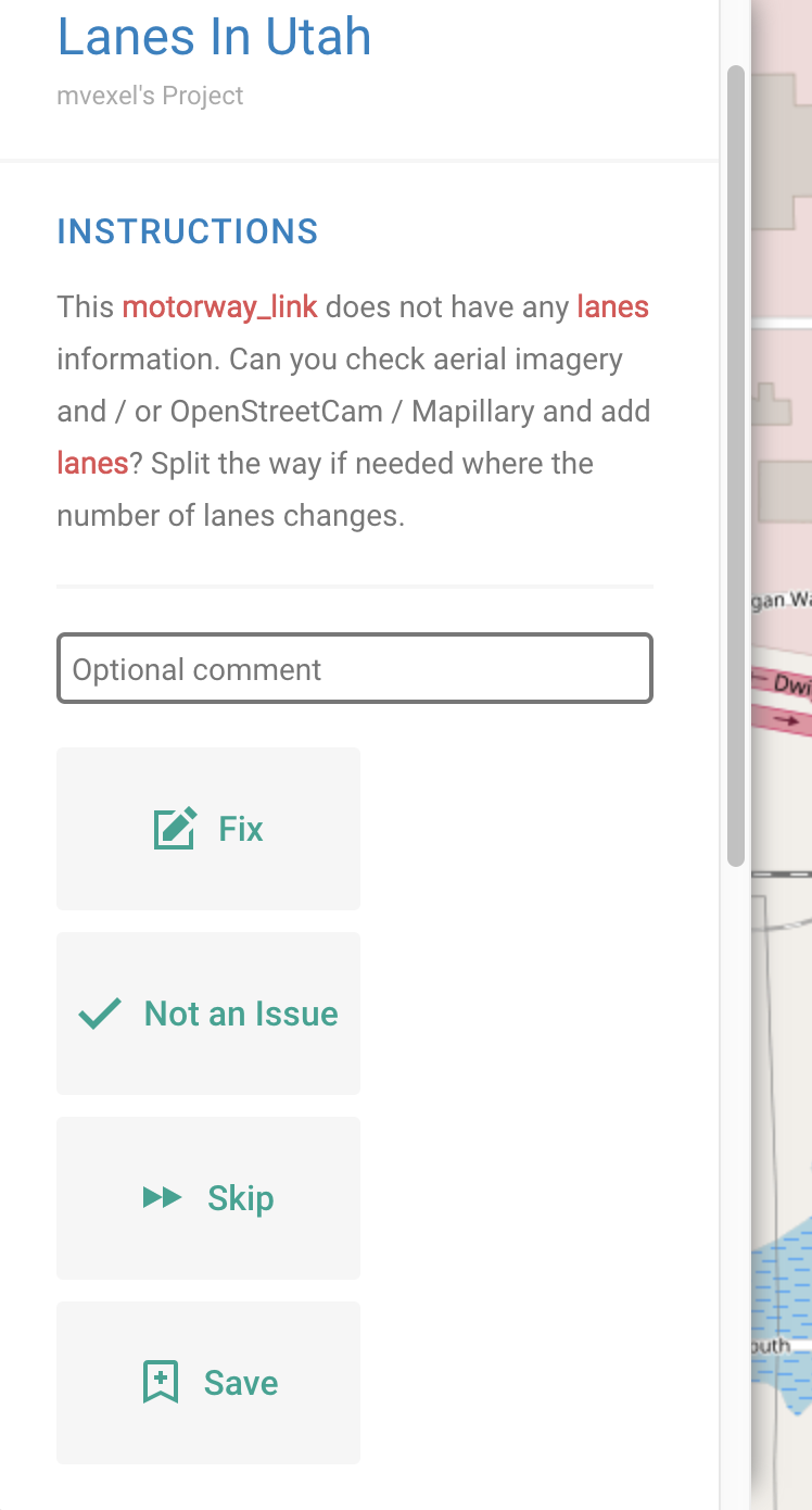
The action buttons are all in one single column leaving white space in the left sidebar:

screenshot 2018-02-02 13 01 41

How about we have the FIX button take up one row full width (and stand out with bolder color or so) and the others next to each other in one row below it? Arguably the FIX button is the most important one and should be the most obvious action to take, visually

Metadata

Metadata

Assignees

No one assigned

    Labels

    UX / UIbugSomething isn't workingfixed in developIssue is fixed in the develop branch

    Type

    No type

    Projects

    No projects

    Milestone

    No milestone

    Relationships

    None yet

    Development

    No branches or pull requests

    Issue actions