This repository was archived by the owner on Mar 4, 2020. It is now read-only.
-
Notifications
You must be signed in to change notification settings - Fork 51
This repository was archived by the owner on Mar 4, 2020. It is now read-only.
[RFC] Toolbar Component #461
Copy link
Copy link
Closed
Labels
vstsPaired with ticket in vstsPaired with ticket in vsts
Description
Feature Request
Overview
The toolbar is a component which houses different tools/buttons. The toolbar can have multiple groups to help organize buttons.
Requirements
- Button Groups
- Button Overflow Flyout
- Sub Menus
- Custom Picker/Popup
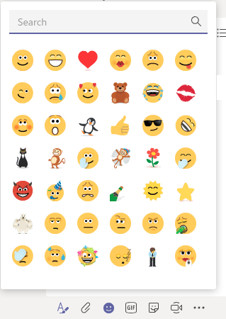
Mock: Toolbar with Custom Picker

Proposed solution
Use the following stardust components to build up the Toolbar:
Menu+MenuItem- For the buttons- For Submenu/Dropdown we could resume the work on Add possibility to render submenu in MenuItem #126:
SubMenu- We can also leverage this
Submenufor the overflow flyout
Popup- For custom pickerGridto layout the Toolbar
interface IToolbarItem {
  name: string;
  /** Type of command item */
  itemType: "button" | "picker";
  /** Primary content - i.e. Button Text*/
  content?: string;
  /** Icon name or shorthand */
  icon?: string | IconShorthand;
  /** Custom picker content to render within the popup */
  pickerContent?: JSX.Element;
  /** Dropdown Items */
  subMenu?: MenuItemShorthand[];
}
interface IToolbarGroup {
name: string;
/** Items to display in the group*/
groupItems: IToolbarItem[];
/** Items to showup in the overflow flyout*/
overflowItems: IToolbarItem[];
/** Group display order override, if set takes precedence over groups without default order */
order?: number;
}Internal structure:
- The main container would be a
Grid - Each column in the grid would host a
ToolbarGroup - Each ToolbarGroup would be a
Menu
Toolbar
render = () => {
  return <Grid content={this.props.groups} />;
};
ToolbarGroup
  render = () => {
    return <Menu
      items={this.props.items}
      renderItem={this.renderItem} />
  }

  renderItem = (_menuItem, { itemType, pickerContent, ...props}) => {
    /**
     * This will decide whether to render a simple MenuItem or Popup
    */
    switch (itemType){
      case "button":
        return <MenuItem {...props} />
      case "popup":
        return <Popup trigger={<MenuItem {...props}}  content={pickerContent} />}
    }
  }
Usage example
<Toolbar groups={[basicFormatting, extraFormatting]} />;

/** Group with only Buttons */
const basicFormatting: IToolbarGroup = {
  name: "BasicFormatting",
  groupItems: [
    { name: "bold", itemType: "button", icon: "bold", onClick: () => console.log("triggered Bold command") },
    { name: "italic", itemType: "button", icon: "italic", onClick: () => console.log("triggered Italic command") },
    { name: "underline", itemType: "button", icon: "underline", onClick: () => console.log("triggered Underline command") }
  ],
  overFlowItems: [
    { name: "subscript", itemType: "button", icon: "subscript", onClick: () => console.log("triggered Subscript command") },
    { name: "superscript", itemType: "button", icon: "superscript", onClick: () => console.log("triggered Superscript command")}
  ]
};

/** Group with a dropdown and a custom picker */
const extraFormatting: IToolbarGroup = {
  name: "ExtraFormatting",
  groupItems: [
    { name: "heading", itemType: "button", submenu: headingSubmenuItems },
    { name: "hyperlink", itemType: "picker", pickerContent: pickerContent }
  ]
};

/** Items in the Submenu  */
const headingSubmenuItems: MenuItemShorthand[] = [
  { key: "Paragraph", content: "Paragraph", onClick: () => console.log("triggered Paragraph command") },
  { key: "Heading1", content: "Heading 1", onClick: () => console.log("triggered Heading1 command") },
  { key: "Monospaced", content: "Heading 2", onClick: () => console.log("triggered Monospaced command") }
];

/** Custom component to be rendered within the Picker, this can be any react component*/
const pickerContent = (
  <div>
    /** ... */
    <button onClick={() => console.log("triggered SomeCommand command")}>
      Some command
    </button>
  </div>
);joperezr and KyleBastien
Metadata
Metadata
Assignees
Labels
vstsPaired with ticket in vstsPaired with ticket in vsts

