1.2.0

Hints that point at the right control, and bars in the chart
Highlights
CoachMarkis a new overlay that points at a control on its own — for a feature that is new, moved or easy to miss. It leaves the page usable and can be anchored byid, so an mStudio extension can place one (#3166).CartesianChart.Baradds bar series, stacked or grouped, plus alayoutprop that turns the chart on its side for horizontal bars (#2880).Badgetakes aContextualHelpdirectly — no trigger to write, no button to style (#3049).Headingplaces aButtonorCopyButtonwritten in its content beside the text, scaled to the heading (#3136).List.Itemgets adependenciesprop so a stable render function can declare the external state it reads (#3139).- Every popover now keeps a gap to the viewport edge, and a
widthyou set reaches the content instead of leaving empty background beside it.
CoachMark
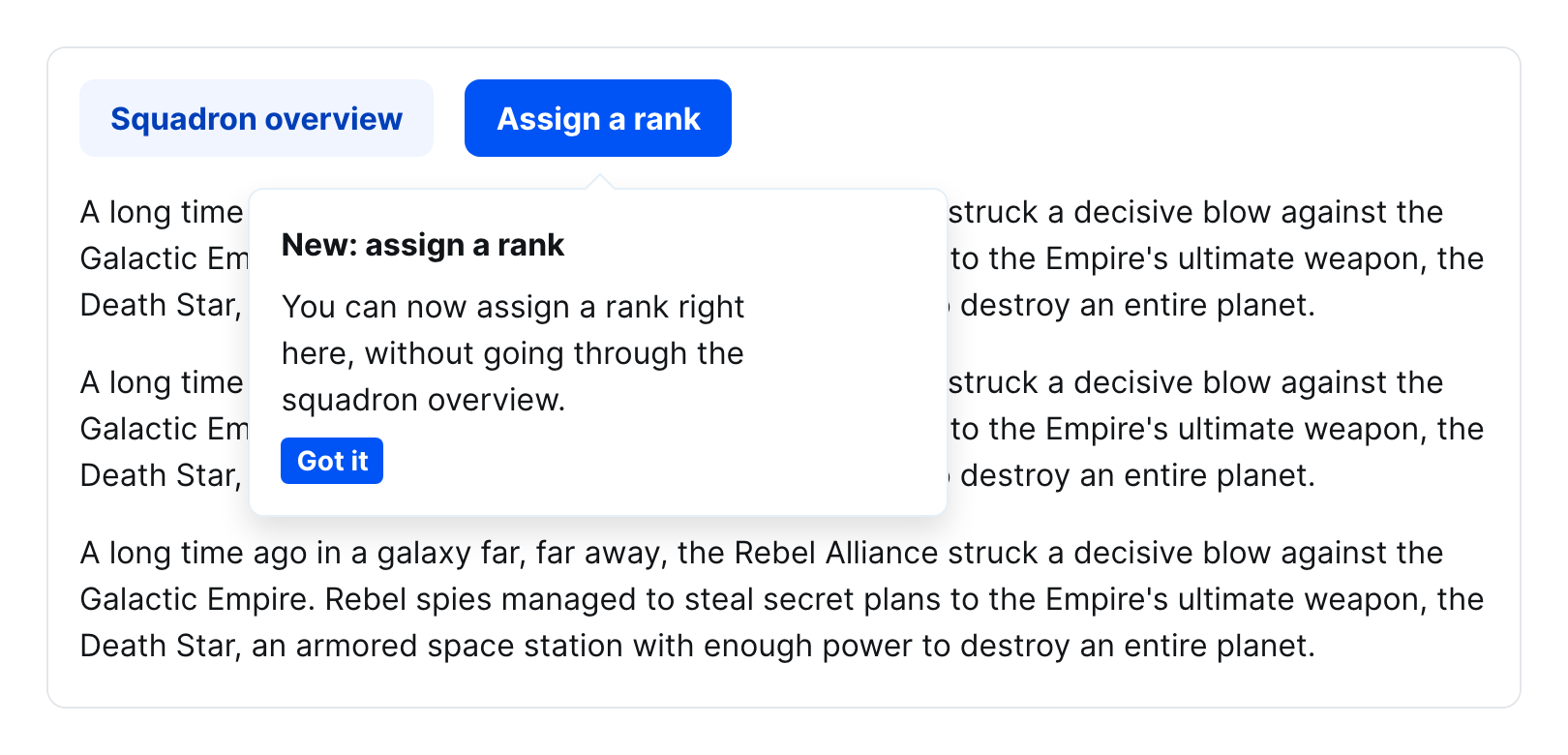
A coach mark points at a control the user did not ask about. It opens on its own and stays out of the way: the page below keeps scrolling, focus is left alone, and the hint rides along with its anchor instead of closing at the first scroll. Write it directly behind the element it points at — it then follows that element in the reading order, and the anchor refers to it through aria-details.
Anchor it with anchorRef where you have a ref, or with anchor where you do not. An mStudio extension renders in a different context than the host, so a ref never arrives, but an id does — the coach mark keeps looking until that element appears, which matters because the host materializes the page in pieces.
The component is remote-capable and marked beta.
const anchor = useRef<HTMLButtonElement>(null);
const controller = useOverlayController("CoachMark", { isDefaultOpen: true });

<Button ref={anchor} onPress={() => controller.open()}>
  Domain verbinden
</Button>

<CoachMark anchorRef={anchor} controller={controller}>
  <Heading>Neu: Domain verbinden</Heading>
  <Text>Du kannst deine Domain jetzt direkt hier verbinden.</Text>
  <Action closeOverlay="CoachMark">
    <Button>Verstanden</Button>
  </Action>
</CoachMark>;
Dismissal is composed, not configured: wrap the button in an Action — Flow never closes an overlay on your behalf.
Bars in CartesianChart
CartesianChart.Bar renders a bar series. Give several bars the same stackId to stack them; leave it off to group them side by side. Bars pick up the categorical color scale and round their outer corners.
The chart's new layout prop decides which axis is the categorical one. "horizontal" (the default) keeps bars growing upwards; "vertical" turns the chart on its side. XAxis and YAxis follow the layout on their own — only the dataKey moves to whichever axis is the categorical one.
<CartesianChart.Chart data={data} height="300px" layout="vertical">
  <CartesianChart.Bar dataKey="Speicherplatz" unit="GB" />
  <CartesianChart.XAxis unit=" GB" />
  <CartesianChart.YAxis dataKey="Projekt" />
  <CartesianChart.Grid vertical horizontal={false} />
  <CartesianChart.Tooltip />
</CartesianChart.Chart>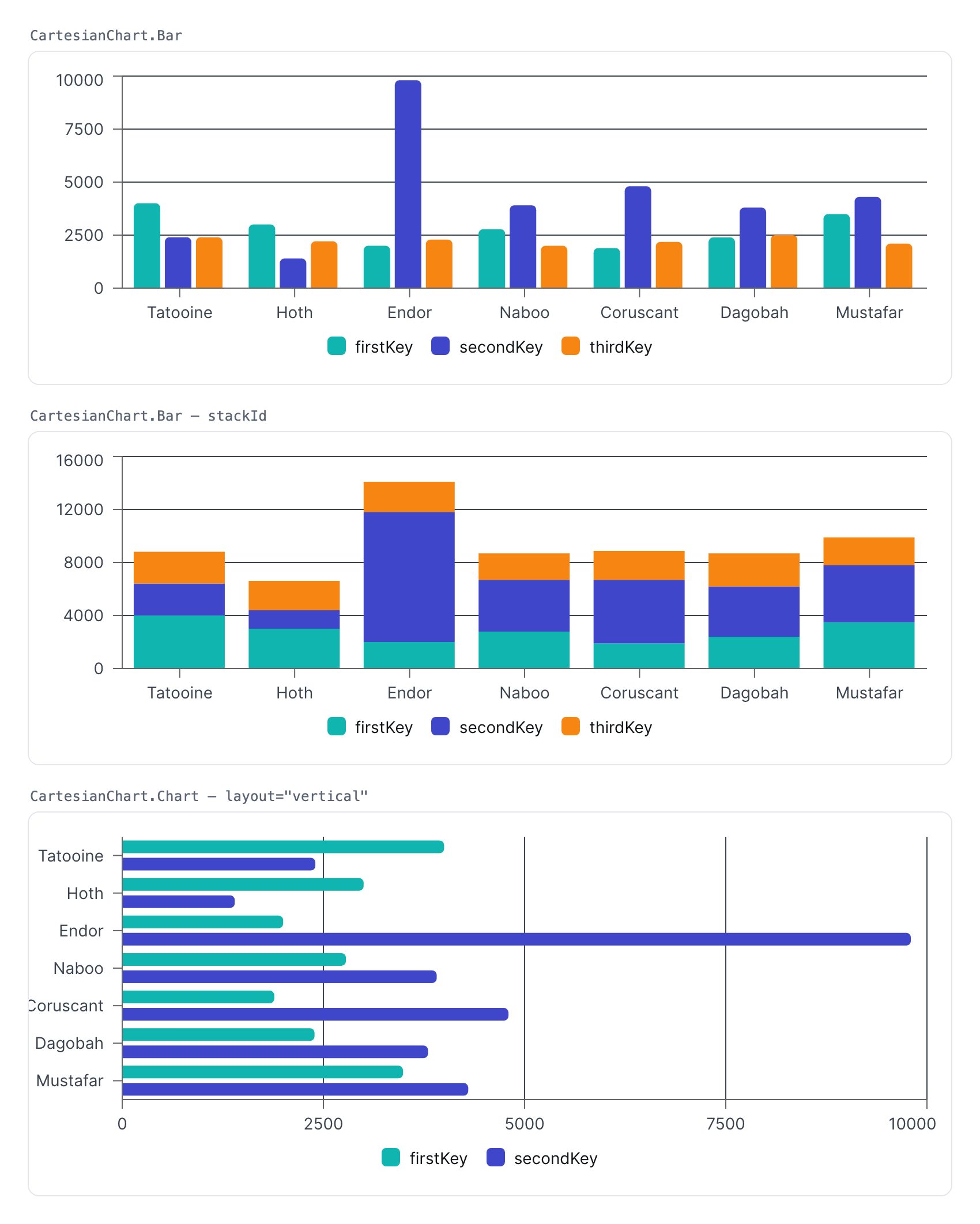
Bar is remote-capable.
Contextual help in a Badge
Write a ContextualHelp into a Badge and the badge supplies the trigger button itself, colored and sized to match:
<Badge>
  <Label>Priorität</Label>
  <Text>Hoch</Text>
  <ContextualHelp>
    <Text>Tickets mit hoher Priorität werden zuerst bearbeitet.</Text>
  </ContextualHelp>
</Badge>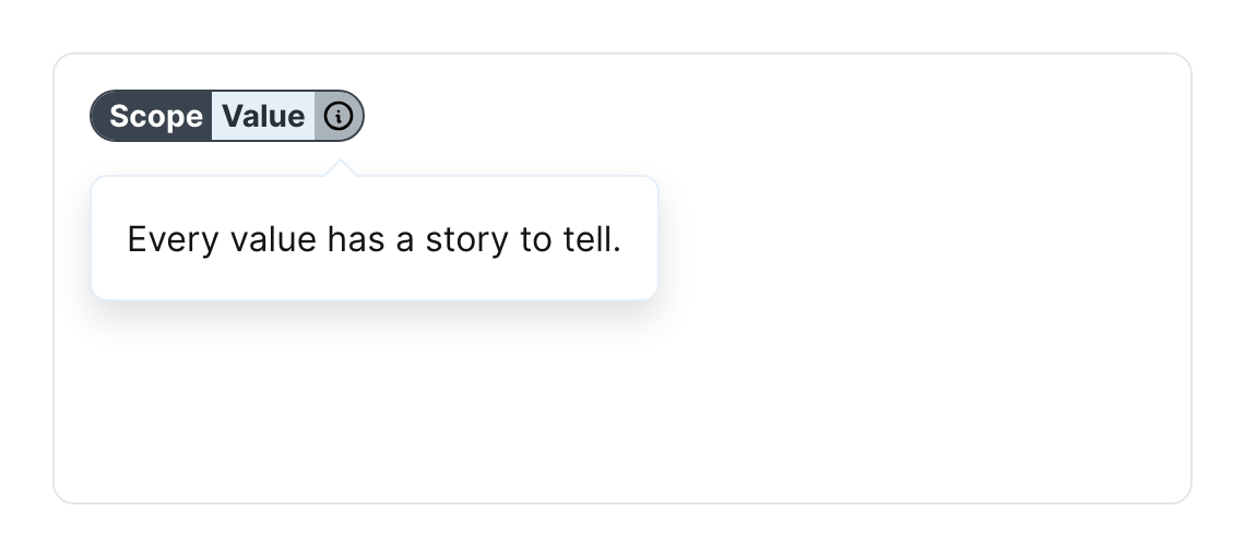
A ContextualHelpTrigger you write out yourself lands in the same place and is styled the same way, so you keep control of the trigger when you need it.
Buttons in a Heading
A Button or CopyButton written in a heading's content is now placed beside the heading text and scaled to the heading's size — m for the two largest sizes, s below.
<Heading>
  my-domain.de
  <CopyButton text="my-domain.de" />
</Heading>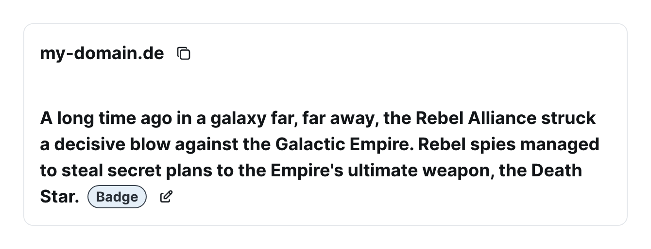
Declaring what a list item reads
A List.Item re-renders when its data changes, or when one of its render functions changes identity — which a function written inline in JSX does on every render. A render function with a stable identity (hoisted out of the component, wrapped in useCallback, or reading from an external store) gave the item no signal at all, so it kept the values it first saw. dependencies is how you give it one:
<List.Item textValue={itemTextValue} dependencies={[selected]}>
  {renderItem}
</List.Item>
A /tunnel entry point
@mittwald/flow-react-components/tunnel re-exports the @mittwald/react-tunnel API through the very module instance Flow uses. The tunnel's context is module-level, so a consumer's own dependency on @mittwald/react-tunnel becomes a second context as soon as the versions diverge, and entries stop finding Flow's providers. Import from this entry point instead of from the package directly (#3176).