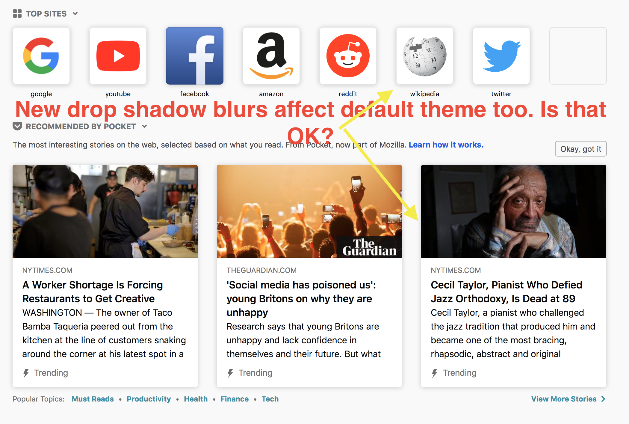
Fix Bug 1453479 - more dark theme updates#4087
Conversation
|
I have a few outstanding questions to Amy still. But maybe getting more eyeballs on this will create more? @Mardak
|
| height: $search-height; | ||
| // The extra 1px is to account for the box-shadow being outside of the element | ||
| // instead of inside. It needs to be like that to not overlap the inner background | ||
| // color of the hover state of the submit button. |
There was a problem hiding this comment.
I tried to reproduce this code comment but I couldnt see a difference? So I removed the horizontal margin so the dropdown is the right width.
There was a problem hiding this comment.
Hmm.. @k88hudson added that comment in #3785.. Doesn't look like either 1px need to be around anymore?
 rlr
force-pushed
the
Bug1453479/dark-theme-updates
branch
from
rlr
force-pushed
the
Bug1453479/dark-theme-updates
branch
from
7ca9af4 to
e60dd22
Compare
|
@Mardak ok, I think this is ready for 👁 👁 . Hopefully the last "major" round of changes for now 😝 #tedious |
rlr
force-pushed
the
Bug1453479/dark-theme-updates
branch
from
8a593ac to
2ae1230
Compare
| --newtab-textbox-border: $grey-90-20; | ||
| --newtab-textbox-color: inherit; | ||
| --newtab-textbox-focus-color: $blue-60; | ||
| --newtab-textbox-focus-boxshadow: 0 0 0 1px $blue-60, 0 0 0 4px rgba($blue-60, 0.3); // sass-lint:disable-line no-color-literals |
There was a problem hiding this comment.
I don't like this but... is there a cleaner solution?
There was a problem hiding this comment.
Are you referring to the duplicate stuff between default and dark? Maybe something like:
diff --git a/system-addon/content-src/styles/_theme.scss b/system-addon/content-src/styles/_theme.scss
index eb04f699..97bccdcc 100644
--- a/system-addon/content-src/styles/_theme.scss
+++ b/system-addon/content-src/styles/_theme.scss
@@ -1 +1,6 @@
+@mixin textbox-focus($color) {
+  --newtab-textbox-focus-color: $color;
+  --newtab-textbox-focus-boxshadow: 0 0 0 1px $color, 0 0 0 4px rgba($color, 0.3); // sass-lint:disable-line no-color-literals
+}
+
 // Default theme
@@ -21,4 +26,3 @@ body {
   --newtab-textbox-border: $grey-90-20;
-  --newtab-textbox-focus-color: $blue-60;
-  --newtab-textbox-focus-boxshadow: 0 0 0 1px $blue-60, 0 0 0 4px rgba($blue-60, 0.3); // sass-lint:disable-line no-color-literals
+  @include textbox-focus($blue-60);

@@ -74,4 +78,3 @@ body {
   --newtab-textbox-border: $grey-10-20;
-  --newtab-textbox-focus-color: $blue-40;
-  --newtab-textbox-focus-boxshadow: 0 0 0 1px $blue-40, 0 0 0 4px rgba($blue-40, 0.3); // sass-lint:disable-line no-color-literals
+  @include textbox-focus($blue-40);
|
Focused search box now looks like this (+ Amy approved):
|
| --newtab-textbox-border: $grey-90-20; | ||
| --newtab-textbox-color: inherit; | ||
| --newtab-textbox-focus-color: $blue-60; | ||
| --newtab-textbox-focus-boxshadow: 0 0 0 1px $blue-60, 0 0 0 4px rgba($blue-60, 0.3); // sass-lint:disable-line no-color-literals |
There was a problem hiding this comment.
Are you referring to the duplicate stuff between default and dark? Maybe something like:
diff --git a/system-addon/content-src/styles/_theme.scss b/system-addon/content-src/styles/_theme.scss
index eb04f699..97bccdcc 100644
--- a/system-addon/content-src/styles/_theme.scss
+++ b/system-addon/content-src/styles/_theme.scss
@@ -1 +1,6 @@
+@mixin textbox-focus($color) {
+  --newtab-textbox-focus-color: $color;
+  --newtab-textbox-focus-boxshadow: 0 0 0 1px $color, 0 0 0 4px rgba($color, 0.3); // sass-lint:disable-line no-color-literals
+}
+
 // Default theme
@@ -21,4 +26,3 @@ body {
   --newtab-textbox-border: $grey-90-20;
-  --newtab-textbox-focus-color: $blue-60;
-  --newtab-textbox-focus-boxshadow: 0 0 0 1px $blue-60, 0 0 0 4px rgba($blue-60, 0.3); // sass-lint:disable-line no-color-literals
+  @include textbox-focus($blue-60);

@@ -74,4 +78,3 @@ body {
   --newtab-textbox-border: $grey-10-20;
-  --newtab-textbox-focus-color: $blue-40;
-  --newtab-textbox-focus-boxshadow: 0 0 0 1px $blue-40, 0 0 0 4px rgba($blue-40, 0.3); // sass-lint:disable-line no-color-literals
+  @include textbox-focus($blue-40);
|
|
||
| &.active { | ||
| background: var(--newtab-element-active-color); | ||
| background: var(--newtab-element-hover-color); |
There was a problem hiding this comment.
Somewhat confusing that .active uses -hover-color.. oh well
There was a problem hiding this comment.
we can rename the css class to 🤔 something.
| height: $search-height; | ||
| // The extra 1px is to account for the box-shadow being outside of the element | ||
| // instead of inside. It needs to be like that to not overlap the inner background | ||
| // color of the hover state of the submit button. |
There was a problem hiding this comment.
Hmm.. @k88hudson added that comment in #3785.. Doesn't look like either 1px need to be around anymore?
| $input-error-border: solid 1px $red-60; | ||
| $input-error-boxshadow: 0 0 0 1px $red-60, 0 0 0 4px rgba($red-60, 0.3); | ||
| $input-focus-boxshadow: 0 0 0 1px $blue-50, 0 0 0 4px rgba($blue-50, 0.3); | ||
| $input-focus-boxshadow: var(--newtab-textbox-focus-boxshadow); |
There was a problem hiding this comment.
If it's just the var, probably just directly use var(--newtab-textbox-focus-boxshadow) and var(--newtab-card-shadow) without the sass variable. Functions wouldn't really be able to do stuff with the value anyway.
| $os-infopanel-arrow-height: 10px; | ||
| $os-infopanel-arrow-offset-end: 6px; | ||
| $os-infopanel-arrow-width: 20px; | ||
| $os-search-focus-shadow-radius: 1px; |
There was a problem hiding this comment.
Is this removal actually desired? It regresses #3745 which said to have 1px for windows.
There was a problem hiding this comment.
I asked Amy explicitly about it. I'll double confirm.
There was a problem hiding this comment.
the UX powers say we can get rid of the windows specific special case 🎉
| --newtab-button-primary-color: $blue-60; | ||
| --newtab-button-secondary-color: inherit; | ||
| --newtab-element-active-color: $grey-20; | ||
| --newtab-element-hover-color: $grey-20; |
There was a problem hiding this comment.
There should be no differentiation from hover and clicking on a context menu item for default theme?
There was a problem hiding this comment.
Oh right, it needs to get darker. 👍
 Mardak
left a comment
Mardak
left a comment
Mardak
left a comment
There was a problem hiding this comment.
Just a bit more cleanup! Thanks
| $shadow-primary: 0 0 0 5px var(--newtab-card-active-outline-color); | ||
| $shadow-secondary: 0 1px 4px 0 $grey-90-10; | ||
| $shadow-secondary: 0 1px 4px 0 $grey-90-20; | ||
| $shadow-card: var(--newtab-card-shadow); |
| // instead of inside. It needs to be like that to not overlap the inner background | ||
| // color of the hover state of the submit button. | ||
| margin: 1px 1px $section-spacing; | ||
| margin: 1px 0 $section-spacing; |
There was a problem hiding this comment.
k88 says if it looks right, then good to go, and from my testing, it seems fine with margin-bottom: $section-spacing;
|
^ I also added |
 rlr
force-pushed
the
Bug1453479/dark-theme-updates
branch
from
rlr
force-pushed
the
Bug1453479/dark-theme-updates
branch
from
e03ee52 to
180d534
Compare
| $input-border-active: solid 1px var(--newtab-textbox-focus-color); | ||
| $input-error-border: solid 1px $red-60; | ||
| $input-error-boxshadow: 0 0 0 1px $red-60, 0 0 0 4px rgba($red-60, 0.3); | ||
| $input-focus-boxshadow: 0 0 0 1px $blue-50, 0 0 0 4px rgba($blue-50, 0.3); |
There was a problem hiding this comment.
Oh, I forgot to note that I think sass allows a custom function where we can pass in a $red-60 or $blue-40/60/$color to generate the 0 0 0 1px $color, 0 0 0 4px rgba($color, 0.3) value.. maybe.......... ?
There was a problem hiding this comment.
It works! And even avoids the disable-line ;)
diff --git a/system-addon/content-src/styles/_theme.scss b/system-addon/content-src/styles/_theme.scss
--- a/system-addon/content-src/styles/_theme.scss
+++ b/system-addon/content-src/styles/_theme.scss
@@ -1,4 +1,8 @@
+@function textbox-shadow($color) {
+  @return 0 0 0 1px $color, 0 0 0 4px rgba($color, 0.3);
+}
+
 @mixin textbox-focus($color) {
   --newtab-textbox-focus-color: $color;
-  --newtab-textbox-focus-boxshadow: 0 0 0 1px $color, 0 0 0 4px rgba($color, 0.3); // sass-lint:disable-line no-color-literals
+  --newtab-textbox-focus-boxshadow: textbox-shadow($color);
 }
@@ -118,3 +122,3 @@ $input-border-active: solid 1px var(--newtab-textbox-focus-color);
 $input-error-border: solid 1px $red-60;
-$input-error-boxshadow: 0 0 0 1px $red-60, 0 0 0 4px rgba($red-60, 0.3);
+$input-error-boxshadow: textbox-shadow($red-60);
 $inner-box-shadow: 0 0 0 1px var(--newtab-inner-box-shadow-color);
3 participants
No description provided.