Please describe the use case(s) for this component
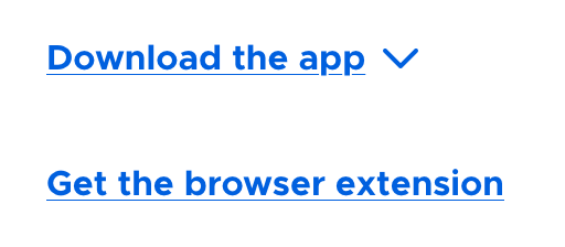
Styles links to stand out as a "call to action".
Please describe the change you wish to see
Right now they are Metropolis with a thick bottom border. We are trying to standardize link styles to be the regular text underline.
Please describe why these changes need to be made
Standardization! Also, we don't want icons in CTAs to be underlined.
Please provide any designs or prototypes of the proposed changes
Please describe where this component is currently in use
There is heavy use of this component because it is in many other components.
Please describe what this component should do in the following conditions
- When set in front of a light background: be link coloured and have the underline dissipear on hover & focus
- When set in front of a dark background: be white instead of link coloured, line behaviour shoudl be the same
- When viewed in a mobile/responsive viewport: no change
Is the development of this component a blocking dependency for other work? Please explain if so
This change was prompted by the /firefox page but a fix is in place there and so the work is not blocking.
Please describe the use case(s) for this component
Styles links to stand out as a "call to action".
Please describe the change you wish to see
Right now they are Metropolis with a thick bottom border. We are trying to standardize link styles to be the regular text underline.
Please describe why these changes need to be made
Standardization! Also, we don't want icons in CTAs to be underlined.
Please provide any designs or prototypes of the proposed changes
Please describe where this component is currently in use
There is heavy use of this component because it is in many other components.
Please describe what this component should do in the following conditions
Is the development of this component a blocking dependency for other work? Please explain if so
This change was prompted by the /firefox page but a fix is in place there and so the work is not blocking.