Skip to content

Create ColorPicker component - #571

Merged
skjnldsv merged 14 commits into
masterfrom
feature/#138/provide-colorpicker
Sep 17, 2019
Merged

Create ColorPicker component#571
skjnldsv merged 14 commits into
masterfrom
feature/#138/provide-colorpicker

Conversation

@marcoambrosini

@marcoambrosini marcoambrosini commented Sep 3, 2019

Copy link
Copy Markdown
Contributor

@skjnldsv skjnldsv added 2. developing Work in progress enhancement New feature or request labels Sep 3, 2019
@marcoambrosini marcoambrosini self-assigned this Sep 4, 2019
@marcoambrosini marcoambrosini added the component Component discussion and/or suggestion label Sep 4, 2019
@skjnldsv

skjnldsv commented Sep 4, 2019

Copy link
Copy Markdown
Contributor

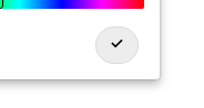
Fixed icon
Capture d’écran_2019-09-04_17-35-56

@marcoambrosini
marcoambrosini force-pushed the feature/#138/provide-colorpicker branch 2 times, most recently from 55ddd02 to 288266e Compare September 6, 2019 10:11
Comment thread src/components/ColorPicker/ColorPicker.vue Outdated
@marcoambrosini

marcoambrosini commented Sep 6, 2019

Copy link
Copy Markdown
Contributor Author

@skjnldsv I don't think there's the need to use the color generator algorithm here. If a user opens this it's because he wants to choose a color so IMO the simple picker should have a selection of nice hard-coded colors only. What do you think?
@nextcloud/designers any suggestion for a selection of 16 nice colors with good contrast for the picker?

@skjnldsv

skjnldsv commented Sep 7, 2019

Copy link
Copy Markdown
Contributor

IMO the simple picker should have a selection of nice hard-coded colors only
@nextcloud/designers any suggestion for a selection of 16 nice colors with good contrast for the picker?

Yes, that is why the colour generator is here. It's generating the exact same colours everytime and that are the one we're using all over nextcloud :)
We could hardcode them, but it's easier to have a function for it that we can update later if we want to tune our nextcloud default colours ;)

@marcoambrosini

marcoambrosini commented Sep 9, 2019

Copy link
Copy Markdown
Contributor Author

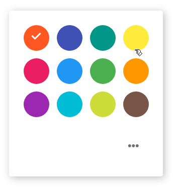
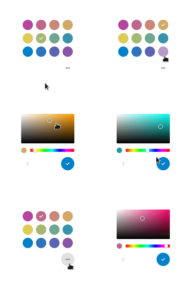
Hey @nextcloud/designers, this is the current state of things, the design has changed since the mock-up so I need some feedback:

  • simple picker:

I took out one line of colors to make things more compact, i think that 12 is more than enough for the simple picker.
Please note that these colors are just placeholders.

Screenshot_20190909_174846

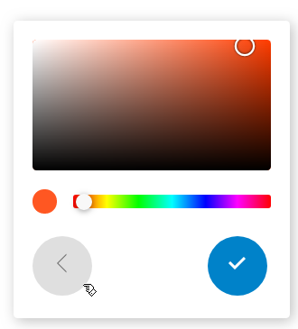
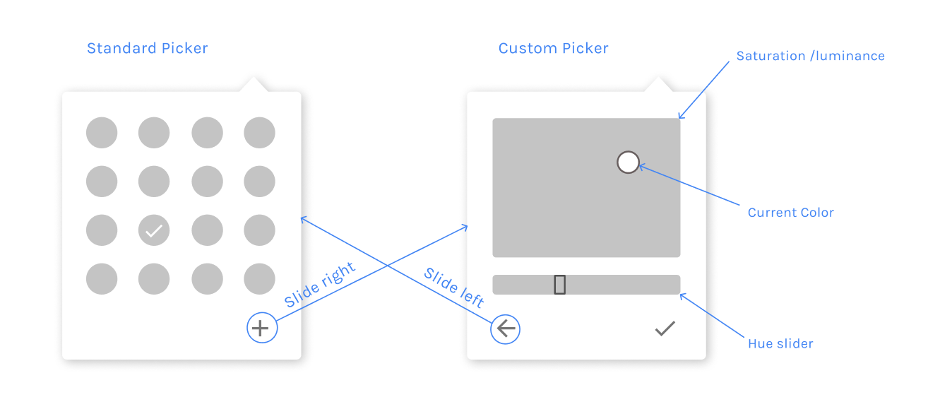
  • advanced picker:

I brought back the 'current color' circle and dropped the idea of using the picker itself as current color indicator.

Screenshot_20190909_174815

for feedbacks and animations check out this video: https://cloud.ma12.co/index.php/s/KaRRTfP9iDExGZ5

What do u think?

@skjnldsv

skjnldsv commented Sep 9, 2019

Copy link
Copy Markdown
Contributor
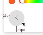
  • Alignment of the buttons is a bit off (uneven margins?)
  • Centering of the button icons is off too (display flex, align-items & justify-content)
  • Animation is great! 👍

@marcoambrosini

Copy link
Copy Markdown
Contributor Author

thanks @skjnldsv!

Alignment of the buttons is a bit off (uneven margins?)

This one is because of the hover state of the 'back' button:

Screenshot_20190909_175859

@skjnldsv

skjnldsv commented Sep 9, 2019

Copy link
Copy Markdown
Contributor

This one is because of the hover state of the 'back' button:

I meant more like this:
64546869-bda0d780-d32b-11e9-9126-92a311c6bb3d

@marcoambrosini

Copy link
Copy Markdown
Contributor Author

got it @skjnldsv, it was a margin coming from the server's css.
All fixed :)

@skjnldsv

skjnldsv commented Sep 9, 2019

Copy link
Copy Markdown
Contributor

Peek 09-09-2019 19-28

```
<Popover>
<ColorPicker value="" @update:value="doSomething" />
<ColorPicker value="#someHexColor" @update:value="doSomething" />

Copy link
Copy Markdown
Contributor

Choose a reason for hiding this comment

The reason will be displayed to describe this comment to others. Learn more.

Maybe also add an example with a simple v-model?

@jancborchardt

Copy link
Copy Markdown
Contributor

Great stuff @ma12-co! :) Agree with @skjnldsv’s points:

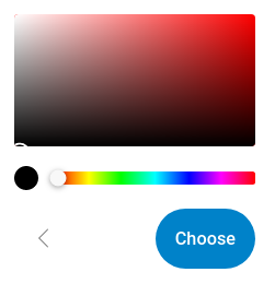
  • The button having a checkmark like on the colors is confusing. We should use text there only, either "Choose" or "Pick". We use "Choose" elsewhere like the file picker so I’d prefer that, and it’s also more commonly used in other software.
  • The first color picker view with the color list also needs a primary confirm button. Otherwise I don’t know how to confirm the color (unless it gets confirmed by clicking on it directly and the popup closes – does Google do that?)
  • So in the first picker view, the 3-dot icon could be on the bottom left instead, which would make the "go to details" and "go back" symmetric, you can just click in the same place.

@marcoambrosini

Copy link
Copy Markdown
Contributor Author

Thanks @jancborchardt!

The button having a checkmark like on the colors is confusing. We should use text there only, either "Choose" or "Pick".

I'll try this and we'll see how it looks :)

unless it gets confirmed by clicking on it directly and the popup closes

Nice catch! this is indeed the intended behavior but it's not properly implemented atm!

So in the first picker view, the 3-dot icon could be on the bottom left instead, which would make the "go to details" and "go back" symmetric, you can just click in the same place.

makes sense :)

@marcoambrosini

Copy link
Copy Markdown
Contributor Author

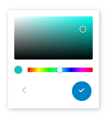
@jancborchardt, everything updated, I'm not a fan of the 'choose' text instead of the checkmark button though, I think it takes up a lot of space and it's a bit invasive.. Here it is:

Screenshot_20190910_164952

@skjnldsv

Copy link
Copy Markdown
Contributor

I think it takes up a lot of space and it's a bit invasive

Agreed, shall we move to a white bg and primary border?

@georgehrke

Copy link
Copy Markdown
Contributor

Agreed, shall we move to a white bg and primary border?

Or just emit the change event on change, not only on save and get rid of that button completely?

@skjnldsv

Copy link
Copy Markdown
Contributor

Or just emit the change event on change, not only on save and get rid of that button completely?

I actually think it's nice to wait for a validation. On android I found both use cases:

  1. the popup closes and the user see the changes instantly
  2. the popup stays and the ui in the background updates so you get a preview of what you did.

I actually like the (2), like the calendar for example, you could update the whole ui accordingly and let the user change colours until it fits. I always have to click a few colours to see how well it matches with the other calendars that I have :)

It gives you a little better sense of control over the setting. ALso, on mobile, clicking outside cannot be the only way to quit a popup, so if you want to cancel, you'll need a button for it. Choose is fine if the user did not changed anything.

@georgehrke

Copy link
Copy Markdown
Contributor

@ma12-co Somehow I'm too stupid to test this. Could you push an example branch to https://github.com/skjnldsv/vueexample?

I added a ColorPicker component inside a Popover, also set :open="true" on the popover, but somehow i can't see anything and the corresponding div in the Chrome inspector is empty.

@skjnldsv

Copy link
Copy Markdown
Contributor

I added a ColorPicker component inside a Popover, also set :open="true" on the popover, but somehow i can't see anything and the corresponding div in the Chrome inspector is empty.

The popover component is not here yet, just use a standard ColorPicker with a v-model on a default value.

@marcoambrosini

Copy link
Copy Markdown
Contributor Author

Sorry @georgehrke, that's totally my fault. Docs are a misleading as we still don't have the popover component. And the colorpicker now works properly only with v-model
Please use this app.vue for testing

Signed-off-by: Marco Ambrosini <marcoambrosini@pm.me>
@marcoambrosini
marcoambrosini force-pushed the feature/#138/provide-colorpicker branch from cd367a1 to 5d30440 Compare September 15, 2019 20:00
@skjnldsv

Copy link
Copy Markdown
Contributor

@ma12-co please rebase and squash :)

@skjnldsv skjnldsv added 3. to review Waiting for reviews and removed 2. developing Work in progress labels Sep 16, 2019
marcoambrosini and others added 8 commits September 17, 2019 11:16
Signed-off-by: Marco Ambrosini <marcoambrosini@pm.me>
Signed-off-by: John Molakvoæ (skjnldsv) <skjnldsv@protonmail.com>
Signed-off-by: Marco Ambrosini <marcoambrosini@pm.me>
@marcoambrosini
marcoambrosini force-pushed the feature/#138/provide-colorpicker branch from 5d30440 to 47ce301 Compare September 17, 2019 09:17
@marcoambrosini

Copy link
Copy Markdown
Contributor Author

Done!

Signed-off-by: Marco Ambrosini <marcoambrosini@pm.me>
@skjnldsv
skjnldsv merged commit 70b0d55 into master Sep 17, 2019
@skjnldsv
skjnldsv deleted the feature/#138/provide-colorpicker branch September 17, 2019 21:32
@georgehrke

Copy link
Copy Markdown
Contributor

🎉

@skjnldsv skjnldsv added this to the 0.13.0 milestone Oct 3, 2019
Sign up for free to join this conversation on GitHub. Already have an account? Sign in to comment

Labels

3. to review Waiting for reviews component Component discussion and/or suggestion enhancement New feature or request

Projects

None yet

Development

Successfully merging this pull request may close these issues.

Provide color picker

4 participants