While there are many tools that can be used to perform quick analysis of large-scale data, data analysis in itself is not an intuitive process. For instance, what type of chart to use for visualizing fields that contain data of a particular type such as date and numeric ranges? Perhaps for a beginner data analyst and for a lot users of Kibana this is not obvious. In an effort to simplify the process of visualizing and exploring your data in an intuitive manner, Elastic introduced Kibana Lens. Kibana Lens is a new and interactive way to quickly explore, easily visualize data, and instantly generate rich and powerful visualizations that help to gather insights from data.
In this tutorial, I will demonstrate different ways you can explore and analyze data using Kibana Lens which is a new feature in Kibana. After the end of this tutorial, you will be able to ingest data into Elasticsearch and analyze it using basic drag and drop actions inside Kibana Lens.
The data I chose to analyze contains different types of energy production and quantities worldwide across the years. The data contains the total energy production between 1990 and 2014 among several countries. Using the Kibana Lens interface we would like to answer simple questions such as:
- Which countries have been producing a certain kind of energy over the years?
- We also want to find out which of a specific set of coutries is leading the production of a certain type of energy like solar, nuclear or wind?
You might be thinking that in order to answer these questions it may requiree some kind of special querying of your data. Indeed it does, but with Kibana Lens, the process of data exploration and analyzing is simplified. In fact, you don't need to know any kind of query language to visualize the data. All you need to do is drag and drop your fields into a pane and watch your data get converted into beautifully rendered visualizations. Kibana Lens suggests a certain visualization based on the field you want to visualize.
The original data we are going to use for our analysis can be obtained from here. The data is provided in a csv format. I will convert that data into json objects and index them into Elasticsearch so that I can generate visualizations using Kibana.
Even though the data ingesting part is not the focus of this tutorial, I have provided a notebook that helps to demonstrate how to process the raw data and ingest it into Elasticsearch using our official python client. This tutorial assumes that you have the latest version of Elasticsearch and Kibana already running on your machine, which is 7.5 at the time of this post.
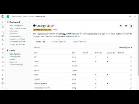
Before indexing the data into Elasticsearch, I created the following mapping to make sure that the year field is of the proper type (i.e., date). The values for this date field are important because they will be used to generate a few useful visualizations that help us to answer a few questions about the data in the context of time.
Before indexing the data, use the Kibana developer console to create an index with the following mapping:
PUT energy_stats
{
  "mappings": {
    "properties": {
      "year": {
        "type": "date",
        "format": "yyyy-MM-dd HH:mm:ss"
      }
    }
  }
}
Once you have created the mapping, you can utilize this notebook directly to ingest the data into Elasticsearch using bulk operations.
The next step is to perform the analysis with Kibana Lens but before proceeding I highly recommend that you take a look at this short and excellent overview of Kibana Lens:
The analysis I want to perform is similar to the excellent work done by Victor Torres in this Kaggle notebook. If you quickly check out his excellent work, you will see that there is a lot of data trasformations that you need to perform to answer very basic questions from the data. Using Kibana Lens, you will notice that the process of exploring and visualizing the data is subtantially simplified. You will basically be doing advanced data analysis with very little knowledge of your data or advanced knowledge of a query/programming language.
Kibana Lens is a new feature in the Elastic Stack, embedded inside Kibana, which offers a drag and drog feature that simplifies the process of composing visualizations using the data stored in Elasticsearch. Kibana Lens aims to provide users with an easy-to-use interface for visualizing data while following visualization best practices.
Previously, users had to possess advanced knowledge of the structure of the data and the types of queries that needed to be used to generate the different visualizations. With Kibana Lens, the idea is to allow users to generate visualizations without the need to understand the type of queries that need to be sent to Elasticsearch to generate the required data for the visualization.
Assuming the data has been ingested properly and you have Kibana up and running, we are ready to get some quick insights about our data. As it is commonly known, in order to visualize the data, we rely on Elasticsearch aggregation requests. Previously, when visualizing in Kibana you needed to know the type of aggregation or grouping that you need to perform on your data before you generate visualizations. A problem some first-time users of Kibana face is that they don't really understand their data and they have no knowledge of how aggregations work.
When you use Kibana Lens, we avoid the need to know of aggregations and what type of grouping we need to choose to generate the visualization. All we do is drag and drop the field into the visualization pane and Kibana recommends a few visualizations that are suitable to visualize those field values. You can easily keep adding fields and breaking down your data further.
Before we get started with Kibana Lens, we need to setup a few things. You need to create an index pattern and then select the option to create a Kibana Lens visualization. The video below shows the steps once you are inside Kibana:
And here is a very quick overview of the Kibana Lens interface:
1. Filter: With filters we can manually limit the analysis to a specific subset of the data given a criteria
2. Index Pattern: If you have created your index pattern, you are able to select it from the dropdown menu in Kibana Lens so that you can focus the analysis on the proper dataset
3. Fields: Once you have selected your index pattern, Kibana Lens provide you a list of available fields which can be dragged into the visualization pane
4. Search: As with any filter, search can also be used to limit the analysis to a subset of the data that meets a search criteria
5. Time Filter: It is always recommended to set the appropriate time range for which you want to conduct the analysis
6. Visualization Pane: This is where all the visualization magic happens
7. Visualization Type: As you drag fields into the visualization pane, Kibana Lens suggests the available visualization types that are possible with those fields
8. Configuration Panel: In this panel you can also drag your fields to customize your visualizations. It is also possible to create a special type of grouping of your data based on a specific field in the "Break down by" section.
Finally, let's do some data analysis. Here is a question worth investigating:
**1. What is the total wind production over the years, categorized by the European Union and other countries such as the US, Canada, Brazil, Japan and China?
In order to help us with the analysis of specific regions or countries, we are going to create a few filters. Below I demonstrate how to create a filter representing the data coming from the Europe Union (EU) countries. Note that the EU is represented by a few countries just to keep the analysis simple.
I also created a few filters representing different energy sources (e.g., wind, solar, nuclear, etc.). See the figure below for an example:
And below is the final list of filters I will be using to do the analysis. Notice how I created one filter representing the "Rest of World". This is because I want to analyze all those countries at once. Individual filters implicity use an "AND" operation, so if I had a seperate filter for each country in the "Rest of World" group I wouldn't be able to perform the analysis on all of the countries together as there is no data that comes from all the countries at once.
Now for the fun part! Let's create a visualization that represents the total wind production for the countries in the rest of the world group. Using the power of filters, I can easily enable the "Rest of World" and "wind_electricity" filters and disable the rest. Once I have the right filters enabled, I can start to drag and drop the fields I want to visualize. Take a look at how easily I created the visualization representing the total wind production for countries in the "Rest of World" group across time:
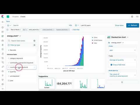
Wow! With just a couple of drag and drop actions I was able to replicate the same graph that Victor Torres generated in his amazing python notebook. It took less effort (in terms of coding) to generate my chart but this is exactly the strength of Kibana Lens. Anyone with a bit of curiousity can begin to explore data without needing to know the details of the underlying queries. Kibana Lens simplifies the analysis process and lowers the barrier to entry for doing powerful data analysis.
Below is a line chart showing the wind production quantities for the European countries, which are seperated using the "EU" filter:
I could continue do different types of analyses here. For insance, if I wanted to analyze solar, wind or nuclear energy production for specific countries or regions, I just need to leverage my filters.
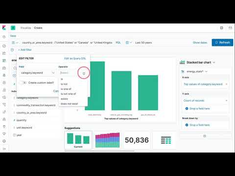
We can also analyze all three types of energy sources by certain countries. For instance, let's look at a few countries like Canada, UK, and US:
Note that the data lives in Elasticsearch which means that I can transform my data using ingest pipelines similar to what you would do using pandas data frames. Once the data is transformed we can perform even more advanced and interesting analysis. For instance, the raw data doesn't include any additional information that gives you the ability to easily group countries by regions such as Europe and Asia -- this is why I had to manually create seperate filters. I can easily create my own grouping using a script processor and then perform an even broader analysis by regions. I leave this as an exercise or potentional future post.
Happy Analyzing!