I think the light-gray is very difficult to see 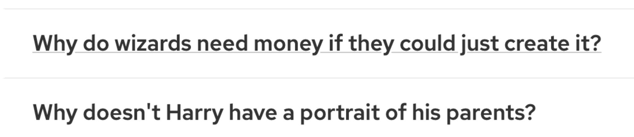 The contrast ratio is 1.7:1 which fails AA accessibility rating. suggesting ui-link blue for underline 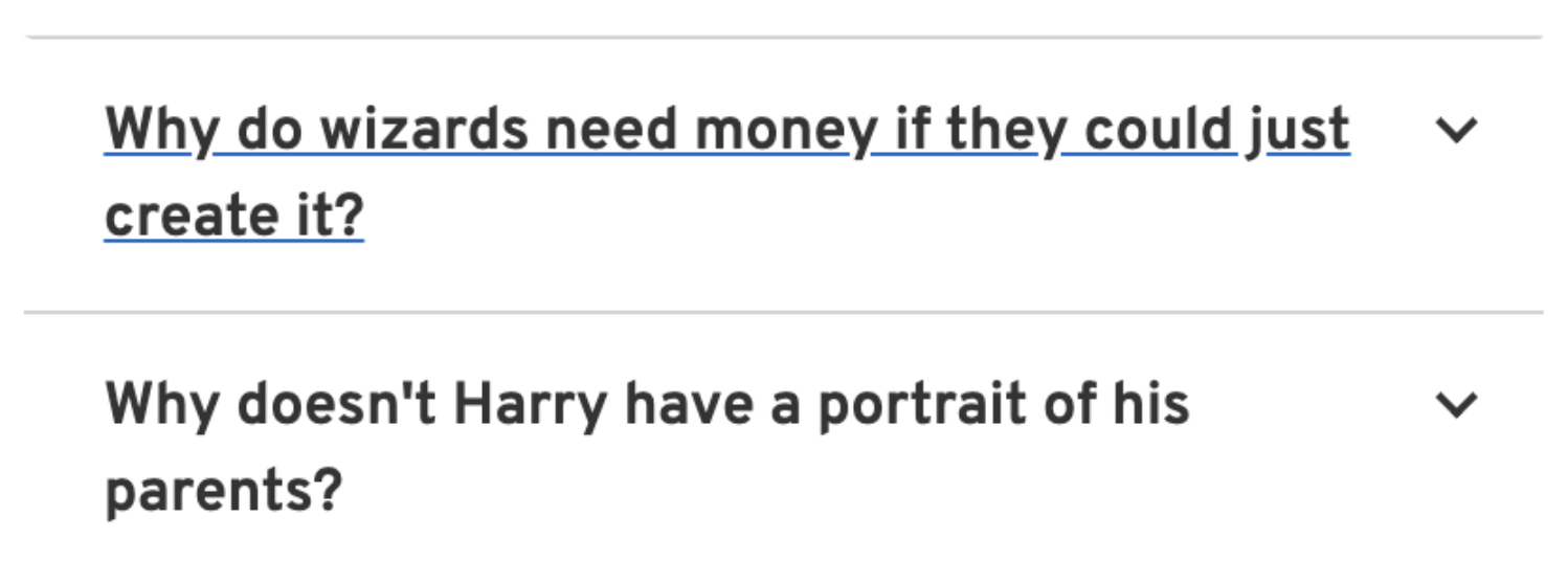
I think the light-gray is very difficult to see

The contrast ratio is 1.7:1 which fails AA accessibility rating.
suggesting ui-link blue for underline
