Timeline Component! 🔮 #700
Conversation
|
This pull request is being automatically deployed with ZEIT Now (learn more). 🔍 Inspect: https://zeit.co/primer/primer-components/ct3tu11dh |
 simurai
added
the
fr-skip
simurai
added
the
fr-skip
 BinaryMuse
left a comment
BinaryMuse
left a comment
BinaryMuse
left a comment
There was a problem hiding this comment.
Thanks for tackling this! Added a few notes.
Co-Authored-By: Michelle Tilley <binarymuse@github.com>
BinaryMuse
left a comment
BinaryMuse
left a comment
There was a problem hiding this comment.
Just a few more notes, which I'll consolidate here:
- The TypeScript types and the JS types still don't quite agree; since these components are wrappers around existing components, we can use their
propTypesdirectly, similar to how we inherit their props in the TS definitions (and drop the associated system prop definitions). - Similarly, since these components already inherit from types that implement system props, including e.g.
${FLEX}in their style definition will duplicate some CSS, which you can see in the snapshots. Also, the tests should be updated to ensure all the implemented system props work (so accidental changes in inheritance that break components will also break tests). - Finally, to avoid the
${props => props.theme.whatever}pattern, wrap the conditional styles in thecsshelper, which enables use of the standardget(...)pattern.
So as to not ping-pong you back and forth with requested changes, here's a diff that implements these. Feel free to use as much or as little of it as you like.
diff --git a/src/Timeline.js b/src/Timeline.js
index f9dae873..a38f6373 100644
--- a/src/Timeline.js
+++ b/src/Timeline.js
@@ -1,7 +1,7 @@
 import React from 'react'
 import PropTypes from 'prop-types'
-import styled from 'styled-components'
-import {COMMON, FLEX, get} from './constants'
+import styled, {css} from 'styled-components'
+import {get} from './constants'
 import theme from './theme'
 import Box from './Box'
 import Flex from './Flex'
@@ -12,16 +12,15 @@ const Timeline = styled(Flex)`
   flex-direction: column;
   ${props =>
     props.clipSidebar &&
-    `.Timeline-Item:first-child {
-    padding-top: 0;
-  }
-
-  .Timeline-Item:last-child {
-    padding-bottom: 0;
-  }
-`}
-  ${COMMON};
-  ${FLEX};
+    css`
+      .Timeline-Item:first-child {
+        padding-top: 0;
+      }
+
+      .Timeline-Item:last-child {
+        padding-bottom: 0;
+      }
+    `}
 `

 Timeline.Item = styled(Flex).attrs(props => ({
@@ -43,24 +42,22 @@ Timeline.Item = styled(Flex).attrs(props => ({

   ${props =>
     props.condensed &&
-    `
-    padding-top: ${props.theme.space['1']};
-    padding-bottom: 0;
-    &:last-child {
-      padding-bottom: ${props.theme.space['3']};
-    }
-
-    .TimelineItem-Badge {
-      height: 16px;
-      margin-top: ${props.theme.space['2']};
-      margin-bottom: ${props.theme.space['2']};
-      color: ${props.theme.colors.gray[4]};
-      background-color: ${props.theme.colors.white};
-      border: 0;
-    }
-  `}
-  ${COMMON};
-  ${FLEX};
+    css`
+      padding-top: ${get('space.1')};
+      padding-bottom: 0;
+      &:last-child {
+        padding-bottom: ${get('space.3')};
+      }
+
+      .TimelineItem-Badge {
+        height: 16px;
+        margin-top: ${get('space.2')};
+        margin-bottom: ${get('space.2')};
+        color: ${get('colors.gray.4')};
+        background-color: ${get('colors.white')};
+        border: 0;
+      }
+    `}
 `

 const TimelineBadgeInternal = styled(Flex).attrs(props => ({
@@ -78,7 +75,6 @@ const TimelineBadgeInternal = styled(Flex).attrs(props => ({
   border: 2px solid ${get('colors.white')};
   border-radius: 50%;
   flex-shrink: 0;
-  ${COMMON};
 `

 Timeline.Badge = props => {
@@ -117,8 +113,7 @@ Timeline.propTypes = {
   children: PropTypes.node,
   clipSidebar: PropTypes.bool,
   theme: PropTypes.object,
-  ...COMMON.propTypes,
-  ...FLEX.propTypes
+  ...Flex.propTypes
 }

 Timeline.Item.defaultProps = {
@@ -129,8 +124,7 @@ Timeline.Item.propTypes = {
   children: PropTypes.node,
   condensed: PropTypes.bool,
   theme: PropTypes.object,
-  ...COMMON.propTypes,
-  ...FLEX.propTypes
+  ...Flex.propTypes
 }

 Timeline.Badge.defaultProps = {
@@ -140,7 +134,7 @@ Timeline.Badge.defaultProps = {
 Timeline.Badge.propTypes = {
   children: PropTypes.node,
   theme: PropTypes.object,
-  ...COMMON.propTypes
+  ...Flex.propTypes
 }

 Timeline.Body.defaultProps = {
@@ -150,7 +144,7 @@ Timeline.Body.defaultProps = {
 Timeline.Body.propTypes = {
   children: PropTypes.node,
   theme: PropTypes.object,
-  ...COMMON.propTypes
+  ...Box.propTypes
 }

 Timeline.Break.defaultProps = {
@@ -160,7 +154,7 @@ Timeline.Break.defaultProps = {
 Timeline.Break.propTypes = {
   children: PropTypes.node,
   theme: PropTypes.object,
-  ...COMMON.propTypes
+  ...Box.propTypes
 }

 export default Timeline
diff --git a/src/__tests__/Timeline.js b/src/__tests__/Timeline.js
index 5391fd5e..eea146c3 100644
--- a/src/__tests__/Timeline.js
+++ b/src/__tests__/Timeline.js
@@ -1,7 +1,7 @@
 import React from 'react'
 import Timeline from '../Timeline'
 import {render, rendersClass} from '../utils/testing'
-import {COMMON} from '../constants'
+import {COMMON, FLEX, LAYOUT} from '../constants'
 import {render as HTMLRender, cleanup} from '@testing-library/react'
 import {axe, toHaveNoViolations} from 'jest-axe'
 import 'babel-polyfill'
@@ -10,6 +10,8 @@ expect.extend(toHaveNoViolations)
 describe('Timeline', () => {
   it('implements system props', () => {
     expect(Timeline).toImplementSystemProps(COMMON)
+    expect(Timeline).toImplementSystemProps(FLEX)
+    expect(Timeline).toImplementSystemProps(LAYOUT)
   })

   it('should have no axe violations', async () => {
@@ -35,6 +37,8 @@ describe('Timeline', () => {
 describe('Timeline.Item', () => {
   it('implements system props', () => {
     expect(Timeline.Item).toImplementSystemProps(COMMON)
+    expect(Timeline.Item).toImplementSystemProps(FLEX)
+    expect(Timeline.Item).toImplementSystemProps(LAYOUT)
   })

   it('should have no axe violations', async () => {
@@ -64,6 +68,7 @@ describe('Timeline.Item', () => {
 describe('Timeline.Badge', () => {
   it('implements system props', () => {
     expect(Timeline.Badge).toImplementSystemProps(COMMON)
+    expect(Timeline.Badge).toImplementSystemProps(LAYOUT)
   })

   it('should have no axe violations', async () => {
diff --git a/src/__tests__/__snapshots__/Timeline.js.snap b/src/__tests__/__snapshots__/Timeline.js.snap
index 96dfb5ca..606a8e9c 100644
--- a/src/__tests__/__snapshots__/Timeline.js.snap
+++ b/src/__tests__/__snapshots__/Timeline.js.snap
@@ -9,10 +9,6 @@ exports[`Timeline renders 1`] = `
   -webkit-flex-direction: column;
   -ms-flex-direction: column;
   flex-direction: column;
-  display: -webkit-box;
-  display: -webkit-flex;
-  display: -ms-flexbox;
-  display: flex;
 }

 <div
@@ -30,10 +26,6 @@ exports[`Timeline renders with clipSidebar prop 1`] = `
   -webkit-flex-direction: column;
   -ms-flex-direction: column;
   flex-direction: column;
-  display: -webkit-box;
-  display: -webkit-flex;
-  display: -ms-flexbox;
-  display: flex;
 }

 .c0 .Timeline-Item:first-child {
@@ -78,10 +70,6 @@ exports[`Timeline.Badge renders 1`] = `
   -webkit-flex-shrink: 0;
   -ms-flex-negative: 0;
   flex-shrink: 0;
-  display: -webkit-box;
-  display: -webkit-flex;
-  display: -ms-flexbox;
-  display: flex;
 }

 <div
@@ -99,10 +87,6 @@ exports[`Timeline.Item renders 1`] = `
   position: relative;
   padding: 16px 0;
   margin-left: 16px;
-  display: -webkit-box;
-  display: -webkit-flex;
-  display: -ms-flexbox;
-  display: flex;
 }

 .c0::before {
@@ -133,10 +117,6 @@ exports[`Timeline.Item renders with condensed prop 1`] = `
   margin-left: 16px;
   padding-top: 4px;
   padding-bottom: 0;
-  display: -webkit-box;
-  display: -webkit-flex;
-  display: -ms-flexbox;
-  display: flex;
 }

 .c0::before {
|
Thanks for the diff, @BinaryMuse! That was super helpful - I switched to using the I don't think that I am able to get rid of the |
|
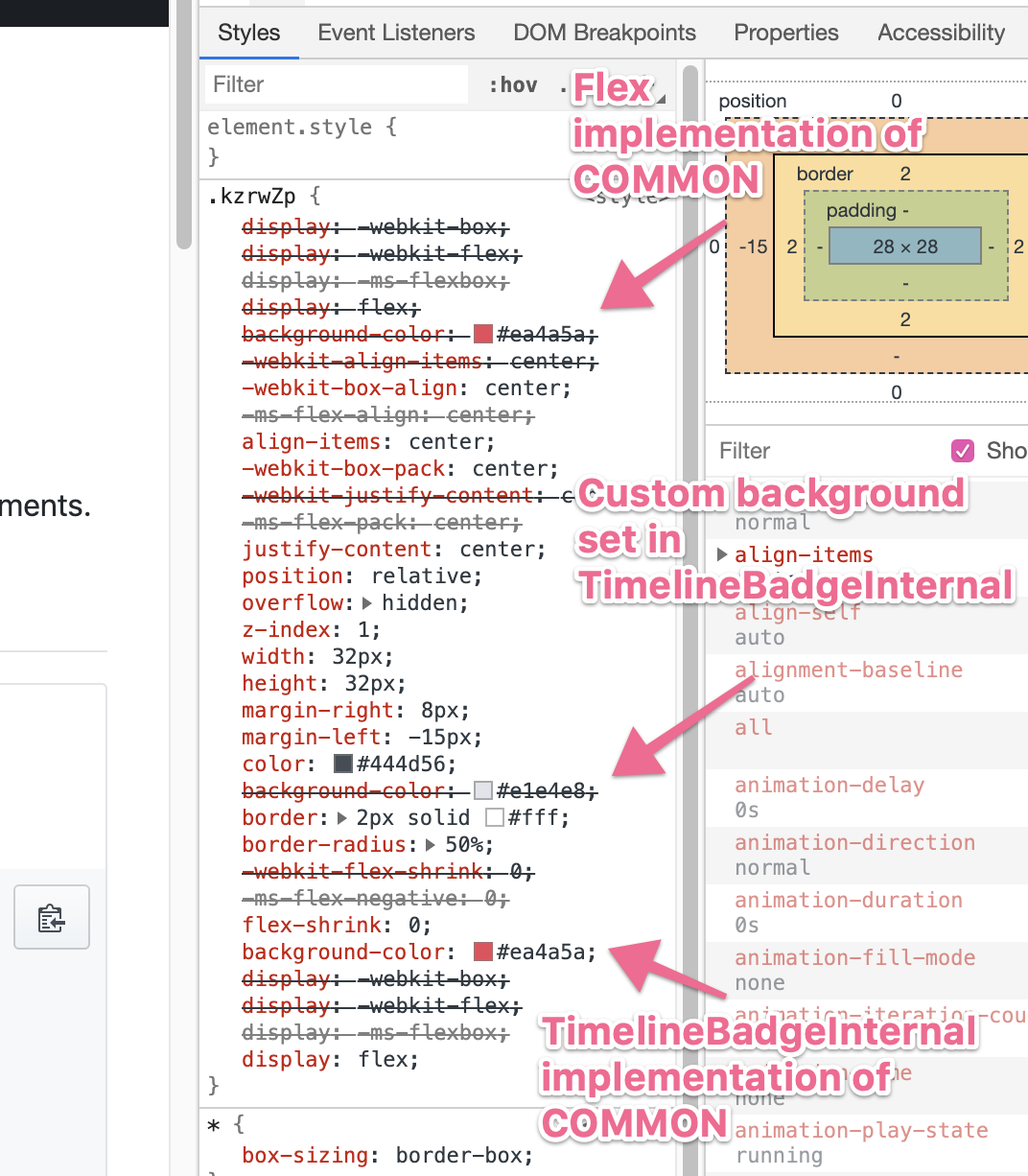
edit: I refer to @dmarcey I did some digging and figured out the reason that you need to continue to include them is because the css that you add to
Here's how that looks in the styles produced: One solution for this particular case is to set the default value for the This has been something lingering in the back of my mind regarding extending components from other components 😬 It sort of breaks down whenever you have "default" styles that override system styles like we do for padding and background color here. We could opt to never extend components within the library to avoid this. Curious if you have any ideas! |
|
Ok messed around a bit with this today and I think this should work as an alternative! :) I moved most of the styles in the styled components function into the You could take this even further and completely remove the need for using any custom styles by doing this: The amount of props used in the |
|
This could lead to a recommendation for designing components/extending components: "Any styles that correspond to styled-system props should be applied via props instead of custom styles to ensure that styled-system props are applied properly in the consuming application" |
Adds a Timeline component
Closes #677
Screenshots
Merge checklist
index.d.ts) if necessary