Skip to content

Conversation

@BinaryMuse
Copy link
Contributor

@BinaryMuse BinaryMuse commented Feb 27, 2020

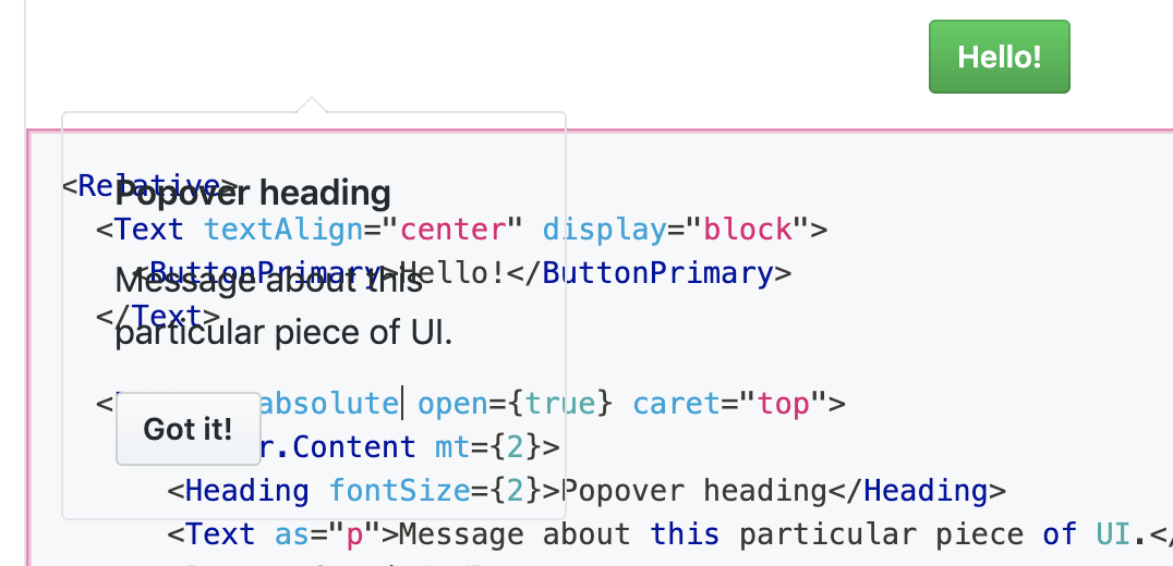
Here's an initial stab at the Popover component.

Since a consumer may want to control the absolute positioning of the component as well as the styling of the content of the component, I opted to split this into Popover and Popover.Content. Popover takes all the functional props; Popover.Component is just a highly-styled BorderBox.

I've also taken a stab at a more complex interactive example in the docs, based on primer/doctocat#123, which allows one to preview every caret position in the same demo.

I would expect a component like this in a React component library to allow one to specify a target that the popover would "stick" to, but the version in primer/css doesn't allow that so I decided to start here.

This is still WIP but would love to get 💭s on the API/props and the example.

Closes #590

Merge checklist

  • Added or updated TypeScript definitions (index.d.ts) if necessary
  • Added/updated tests
  • Added/updated documentation
  • Tested in Chrome
  • Tested in Firefox
  • Tested in Safari
  • Tested in Edge

@vercel
Copy link

vercel bot commented Feb 27, 2020

This pull request is being automatically deployed with ZEIT Now (learn more).
To see the status of your deployment, click below or on the icon next to each commit.

🔍 Inspect: https://zeit.co/primer/primer-components/8ddfgchem
✅ Preview: https://primer-components-git-mkt-popover-component.primer.now.sh

@vercel vercel bot temporarily deployed to Preview February 27, 2020 22:20 Inactive
@vercel vercel bot temporarily deployed to Preview February 27, 2020 22:59 Inactive
@emplums emplums added the minor release new features label Mar 5, 2020
@emplums
Copy link

emplums commented Mar 6, 2020

Some feedback!

  • I really like the demo you've created for all the different caret positions, I'd love to have more of these interactive kinds of things in our documentation!

  • I think we'll want to apply a default background color to the popover, I noticed that when the relative prop isn't set you can see through the element:
    image

  • Regarding the relative prop - I think for most cases the user would want a popover to be positioned absolutely so that the popover doesn't cause shifting in the page when it's opened & closed. I think the position-relative utility is used in the Primer CSS docs just so that it looks good in a live editor, but that seems like an edge case. We might want to remove relative as a prop on Popover and opt to have the user wrap the Popover in a Relative component if they really want to position it relatively so as to keep the props API minimal.

  • It looks like you've opted to have the user manage the open state. I'm on the fence about whether or not it would make sense for us to manage the openstate on our end + the focus management so that we can have more control over a11y best practices when people are using this. We could have some sort of PopoverTarget HOC that handles the state 🤔 What do you think? My first reaction is to leave it to the user for now.

P.S. I would love to discuss this topic when we do our virtual mini-summit: "How much interactivity should we strive for in Primer Components?" I'm not sure what decision to make on the Popover for this because I'm not sure if we're at a consensus about this topic yet. Historically we've opted for minimal interactivity/state management in our components, but I'm starting to feel like we could have more impact if we added some interactivity in cases like these.

@BinaryMuse
Copy link
Contributor Author

BinaryMuse commented Mar 25, 2020

  • have the user wrap the Popover in a Relative component if they really want to position it relatively

Since absolutely positioned elements are removed from the document flow, without the prop there would be no way to position it relatively without wrapping it and overriding the style. I'd be down for removing it if I could find another good solution, but none come to mind.

  • It looks like you've opted to have the user manage the open state

Keeping this controlled as per our discussion.

@vercel vercel bot temporarily deployed to Preview March 25, 2020 19:10 Inactive
@vercel vercel bot temporarily deployed to Preview March 25, 2020 19:18 Inactive
@vercel vercel bot temporarily deployed to Preview March 25, 2020 19:29 Inactive
@vercel vercel bot temporarily deployed to Preview March 25, 2020 19:36 Inactive
@vercel vercel bot temporarily deployed to Preview March 25, 2020 19:41 Inactive
@BinaryMuse BinaryMuse requested a review from emplums March 25, 2020 19:42
@BinaryMuse
Copy link
Contributor Author

@emplums This is ready for a second look 👀

@vercel vercel bot temporarily deployed to Preview March 25, 2020 21:41 Inactive
@BinaryMuse
Copy link
Contributor Author

@emplums The system props thing makes sense, thanks for elaborating. I think I got everything in the right place to allow the proper overrides without allowing the user to break the component. I also added the forgotten system props docs and updated the typings. I believe I've addressed all your feedback. Feel free to merge if you feel good about the current state!

@BinaryMuse BinaryMuse changed the base branch from master to minor March 25, 2020 21:48
Copy link

@emplums emplums left a comment

Choose a reason for hiding this comment

The reason will be displayed to describe this comment to others. Learn more.

Looks great! 🙌 ✨ 🙌

@vercel vercel bot temporarily deployed to Preview March 26, 2020 23:10 Inactive
@BinaryMuse BinaryMuse merged commit 223616e into minor Mar 26, 2020
@BinaryMuse BinaryMuse deleted the mkt/popover-component branch March 26, 2020 23:14
Sign up for free to join this conversation on GitHub. Already have an account? Sign in to comment

Labels

minor release new features

Projects

None yet

Development

Successfully merging this pull request may close these issues.

🔮[New Component] Popover Component

3 participants