TinyMaterialDesign Tutorial
- Introduction
- Actions
- Selection & input
- Progress & feedback
- Containment
- Navigation
- Text input
- Layouts
- Building and running the examples
TinyMaterialDesign is a header-only Arduino/C++ library that implements the
most important Material Design 3 GUI components
on top of TinyGPU - TinyGPU
supplies the pixel surfaces (ISurface<RGB_T>) and the touch input stack
(TouchDriver/GestureDetector); TinyMaterialDesign supplies the widgets
and draws them.
Everything here is a template over RGB_T (RGB565/RGB666/RGB888),
matching TinyGPU's own convention - pick whichever pixel format matches your
panel and every widget, theme, and helper follows.
-
Widget<RGB_T>is the base class every control derives from. It owns aBoundsrect,visible/enabledflags, and implementsdraw()(and, for interactive controls,onGesture()/update()). -
MaterialTheme<RGB_T>bundles aColorScheme(Material 3 color roles), shape (corner radius) tokens, an 8px spacing unit, and 4 typography roles backed by TinyGPU's bitmap fonts.defaultTheme()/defaultDarkTheme()and named seed-hue presets (blueTheme(),greenTheme(),redTheme(),orangeTheme(), each with a*DarkTheme()counterpart) are ready to use out of the box - seeTheme/MaterialTheme.h. -
Screen<RGB_T>owns your widgets, draws them each frame, and routes gesture events to the right one. Widgets added viaaddWidget()scroll as a group when content is taller than the surface;addFixedWidget()pins a widget (anAppBar, a bottomKeyboard/NavigationBar) to its own screen position regardless of scroll.presentDialog()shows any widget modally (Dialog,Drawer,Menu,BottomSheetall use this).Screenis itself aContainer-addWidget()is justScreen's own name forContainer::addChild()- plus the extra things only the one root needs: the fixed layer, modal dialogs, and writing to a real display. For a list too large to keep every widget resident at once, see Container - Virtualized content section -Screen's ownsetContentProvider()is the same idea.
App<RGB_T> bundles the board's display/touch driver, a Surface to draw
into, a GestureDetector wired up to route every gesture to a Screen,
and the Screen itself - everything a sketch needs besides its own widgets
and a board, down to a constructor plus begin()/update():
LCDBoardGuitionESP32_LVGL_2_4Display board;
App<RGB565> app(board);

void setup() {
  app.begin();                       // starts the board/display/surface
  app.screen().addWidget(myButton);  // register widgets via app.screen()
}

void loop() {
  app.update();  // touch input, animations, and a redraw - only if dirty
}-
App's constructor takes anytinygpu::LCDBoard&- a non-owning reference, same convention as everywhere else in this library - already constructed and expected to outlive theApp. Pass whichever concreteLCDBoardmatches your hardware, e.g.LCDBoardGuitionESP32_LVGL_2_4Displayfor a real ESP32 panel orLCDBoardDesktopSDLfor a desktop preview window. -
app.screen()returns theScreen<RGB_T>&to register widgets on. -
app.theme()returns the activeMaterialTheme<RGB_T>(pass a different one asApp's second constructor argument) - handy for reading a color role directly, e.g. for a widget's ownsetColorOverride(). -
app.width()/app.height()return the display's size in pixels, read from the board - use these instead of declaring your ownkWidth/kHeightfor widgetBoundsmath. -
begin()falls back toScreen::drawDirect()'s small-per-widget-buffer rendering automatically if the full-screen framebuffer can't be allocated (a classic ESP32 without PSRAM can fail this even with plenty of free heap - seeScreen::drawDirect()'s doc comment for why). Same widgets, samescreen()API either way;app.usesDirectRender()reports which path is active, mainly for logging. - Only one
Appmay exist at a time (perRGB_T): its gesture callbacks are plain C function pointers under the hood, soApproutes them through a static self-pointer rather than a capturing lambda. Every sketch this replaces only ever had oneScreen/GestureDetectorpair as globals anyway, so this isn't a new restriction in practice. - Not used by
kitchen-sink.ino/esp32-radio.ino, which hand-assemble their own board/surface/display/gestures/Screeninstead, since they need more than one board type or extra wiringAppdoesn't cover.
Every example below (and every sketch under examples/controls/) follows
the same shape - construct an App, register widgets, then call
begin()/update():
#include <TinyMaterialDesign.h>

LCDBoardGuitionESP32_LVGL_2_4Display board;
App<RGB565> app(board);

// ... one or more widgets declared here, e.g.:
// Button<RGB565> demoButton(Bounds((app.width() - 120) / 2, (app.height() - 40) / 2, 120, 40), "Tap me");

void setup() {
  app.begin();

  // ... wire callbacks, app.screen().addWidget()/addFixedWidget()/presentDialog() ...
}

void loop() {
  app.update();   // polls touch, advances animations, and redraws - only if
                   // something actually changed, so an idle frame is cheap
}
App bundles the board's display/touch driver, a Surface to draw into, a
GestureDetector wired to a Screen, and the Screen itself - see
App in the Core Concepts section below for what it replaces and
why. LCDBoardGuitionESP32_LVGL_2_4Display is used throughout this tutorial
as a concrete stand-in for "whichever LCDBoard matches your hardware" -
swap in LCDBoardDesktopSDL for a desktop preview window, or any other
LCDBoard from TinyGPU/Boards/ for different real hardware.
The per-control sections below only show the parts that differ - the
widget's own declaration and its setup() wiring - and link to the full,
runnable sketch under examples/controls/<name>/. Every screenshot was
rendered directly from that same sketch's widget setup, at the library's
reference 240x320 size.
A tappable pill-shaped control that triggers a single action, in one of five Material 3 styles: Filled, Tonal, Outlined, Text, and Elevated. Tapping it grows a ripple from the tap point (see theme.enableRipple) as touch feedback.
Guidelines
- Use Filled for the single highest-emphasis action on a screen (e.g. "Submit"); it has the strongest visual weight.
- Use Tonal for a secondary, still-prominent action that shouldn't compete with a Filled button on the same screen.
- Use Outlined or Text for lower-emphasis actions, typically alongside a Filled/Tonal button (e.g. Dialog's Cancel/OK pair).
- Use Elevated sparingly - its drop shadow implies it floats above the surface, which reads oddly if everything around it does too.
- Set
enabled = falserather than removing the widget to show a temporarily unavailable action; disabled buttons are drawn dimmed and stop reacting to taps.
// --- Button (the control under test) --------------------------------------
Button<RGB565> demoButton(Bounds((app.width() - 120) / 2, (app.height() - 40) / 2, 120, 40), "Tap me");

// setup():
demoButton.onClick = []() { printf("Button tapped\n"); };
app.screen().addWidget(demoButton);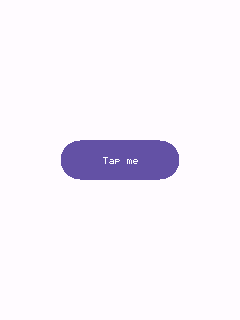
Full sketch: examples/controls/button/button.ino
A circular tap target hosting one vector glyph from Draw/Icons.h (or any function matching IconPainter). kStandard is a flat toolbar-style icon; kFilled/kTonal add a colored, elevated circular background.
Guidelines
- Use
kStandardfor app bar / toolbar icons that sit directly on the surface color. - Use
kFilled/kTonalfor a smaller status-dependent circular action (e.g. a play/stop toggle) - pair withsetColorOverride()to recolor it live (green while idle, red while active). - For a dedicated Floating Action Button (bigger, with its own elevation shadow and an optional label), use
Fab.h'sFloatingActionButton/FABinstead. -
setThemeTint()lets a container (AppBar) push ambient colors onto an IconButton it hosts, without the button needing its own explicit override.
// --- IconButton (the control under test) -----------------------------------
IconButton<RGB565> demoIconButton(Bounds((app.width() - 56) / 2, (app.height() - 56) / 2, 56, 56),
                                  drawPlus<RGB565>, IconButtonVariant::kFilled);

// setup():
demoIconButton.onClick = []() { printf("Icon button tapped\n"); };
app.screen().addWidget(demoIconButton);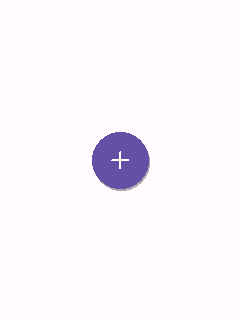
Full sketch: examples/controls/icon-button/icon-button.ino
The Floating Action Button: a circular (or pill-shaped "extended" form, when constructed with a label) elevated button for a screen's single primary action.
Guidelines
- Give a screen at most one FAB - it represents the primary action, not one of several.
- Use the circular form (40x40 small / 56x56 regular / 96x96 large) when space is tight; use the extended pill form (icon + label) when the action benefits from a text hint.
- Pick
FabColor::kPrimary(the default) for most cases;kSurfacereads as lower-emphasis when a screen already has strong primary-colored content elsewhere.
// --- FloatingActionButton / FAB (the control under test) -------------------
FAB demoFab(Bounds((app.width() - 140) / 2, (app.height() - 56) / 2, 140, 56), drawPlus<RGB565>, "Add");

// setup():
demoFab.onClick = []() { printf("FAB tapped\n"); };
app.screen().addWidget(demoFab);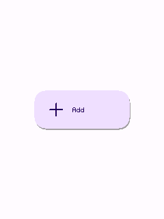
Full sketch: examples/controls/fab/fab.ino
A small rounded-rect label, optionally a toggle ("filter chip") rather than a one-shot action ("assist chip").
Guidelines
- Set
selectable = truefor filter/choice chips the user toggles (a color-scheme picker, as inkitchen-sink.ino); leave itfalsefor a chip that just firesonClickonce, like a small action button. - Group several selectable chips together for a compact multi/single-choice filter row -
Chipdoesn't coordinate mutual exclusion itself (wire that inonChange, as needed).
// --- Chip (the control under test) -------------------------------------------
Chip<RGB565> demoChip(Bounds((app.width() - 100) / 2, (app.height() - 32) / 2, 100, 32), "Filter",
                      /*selectable=*/true);

// setup():
demoChip.onChange = [](bool selected) { printf("Chip: %s\n", selected ? "selected" : "unselected"); };
app.screen().addWidget(demoChip);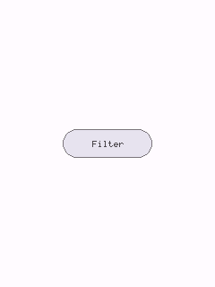
Full sketch: examples/controls/chip/chip.ino
A square box toggled by tap, for one independent on/off choice (as opposed to RadioButton's mutually-exclusive choice within a group).
Guidelines
- Use for choices that are independent of each other ("Enable notifications") - use
RadioButton/RadioGroupinstead when only one of several options can be selected. - Pair with a
Labelplaced to its right rather than relying on the checkbox's own (nonexistent) text - tapping the label itself doesn't toggle the box unless you wire that yourself.
// --- Checkbox (the control under test) --------------------------------------
Checkbox<RGB565> demoCheckbox(Bounds((app.width() - 24) / 2, (app.height() - 24) / 2, 24, 24), true);

// setup():
demoCheckbox.onChange = [](bool checked) { printf("Checkbox: %s\n", checked ? "checked" : "unchecked"); };
app.screen().addWidget(demoCheckbox);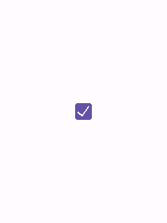
Full sketch: examples/controls/checkbox/checkbox.ino
A track-and-thumb toggle, Material's alternative to Checkbox for a single on/off setting - conventionally used for settings that take effect immediately, rather than ones a form is later submitted with.
Guidelines
- Prefer
SwitchoverCheckboxfor settings screens ("Dark theme", "Wi-Fi") where the change applies right away; preferCheckboxinside forms/lists with an explicit submit step. - Only tap-to-toggle is implemented (no drag-to-slide yet).
// --- Switch (the control under test) ----------------------------------------
Switch<RGB565> demoSwitch(Bounds((app.width() - 48) / 2, (app.height() - 28) / 2, 48, 28));

// setup():
demoSwitch.onChange = [](bool value) { printf("Switch: %s\n", value ? "on" : "off"); };
app.screen().addWidget(demoSwitch);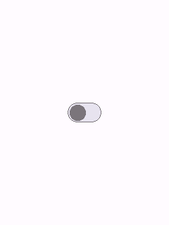
Full sketch: examples/controls/switch/switch.ino
One radio button never deselects itself on tap (radio semantics); RadioGroup (not itself a Widget) coordinates a set of them so selecting one deselects the rest.
Guidelines
- Always use at least 2
RadioButtons together via aRadioGroupin real usage - a lone one (as shown here) can only ever become selected, never deselected, which is correct radio behavior but not a meaningful choice on its own. - Each button still needs
app.screen().addWidget()'d individually -RadioGrouponly wires the mutual-exclusion logic, it doesn't register anything withScreen.
// --- RadioButton (the control under test) -----------------------------------
// A lone RadioButton never deselects itself on tap (radio semantics) -
// mutual exclusion across a group is RadioGroup's job, not shown here.
RadioButton<RGB565> demoRadio(Bounds((app.width() - 24) / 2, (app.height() - 24) / 2, 24, 24));

// setup():
demoRadio.onSelected = []() { printf("Radio selected\n"); };
app.screen().addWidget(demoRadio);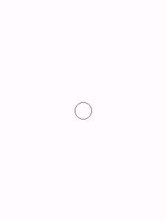
Full sketch: examples/controls/radio-button/radio-button.ino
A draggable track-and-thumb control over a [minValue, maxValue] range. Tapping the track jumps the thumb there; dragging tracks the finger continuously, even past the slider's own bounds once a drag has started.
Guidelines
- Reports
isDraggable() == true- make sureScreen::isDraggableAt()is wired toGestureDetector::isDraggable(as every example here does) or dragging won't be recognized. - Show the live value next to the slider (a
Labelupdated fromonChange) so the current setting is legible without needing to inspect the thumb position precisely.
// --- Slider (the control under test) ----------------------------------------
Slider<RGB565> demoSlider(Bounds(20, (app.height() - 24) / 2, app.width() - 40, 24), 0.0f, 100.0f, 40.0f);

// setup():
demoSlider.onChange = [](float value) { printf("Slider: %d\n", static_cast<int>(value)); };
app.screen().addWidget(demoSlider);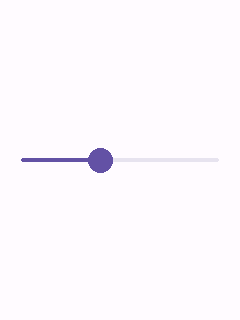
Full sketch: examples/controls/slider/slider.ino
A row of segments sharing one pill-shaped outline - Material's "segmented button", for choosing among a small set of related options shown side by side. Single-select (radio-like, the default) or multi-select via setMultiSelect(true).
Guidelines
- Use for 2-5 closely related, mutually-visible options (view toggles like "Day / Week / Month"); use
Chipfilter rows instead once the option count grows or wrapping is needed. -
onChangereports a bitmask, not an index - a single-select bar always has exactly one bit set.
// --- SegmentedButton (the control under test) -------------------------------
SegmentedButton<RGB565> demoSegmented(Bounds(20, (app.height() - 36) / 2, app.width() - 40, 36));

// setup():
demoSegmented.addSegment("Day");
demoSegmented.addSegment("Week");
demoSegmented.addSegment("Month");
demoSegmented.onChange = [](uint32_t mask) { printf("Segmented selection mask: %u\n", mask); };
app.screen().addWidget(demoSegmented);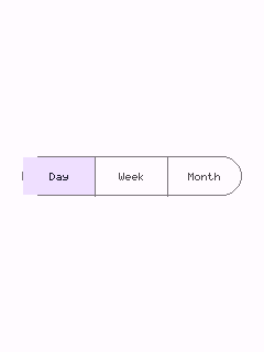
Full sketch: examples/controls/segmented-button/segmented-button.ino
A small, non-interactive status marker - either a plain dot (no text set) or a filled pill holding a short count/label ("3", "9+"). Typically overlaid on the corner of another widget's bounds.
Guidelines
- Position it yourself over whatever it's badging (e.g. the top-right corner of an
IconButton's bounds) -Badgehas no notion of an anchor widget, it just draws at its ownbounds. - Use the dot form for "something changed, no count available"; use the text form once a specific count is meaningful.
// --- Badge (the control under test) -----------------------------------------
// Non-interactive - typically overlaid on a corner of another widget (e.g.
// an IconButton's bounds); shown centered on its own here.
Badge<RGB565> demoBadge(Bounds((app.width() - 24) / 2, (app.height() - 24) / 2, 24, 24), "5");

// setup():
app.screen().addWidget(demoBadge);
Full sketch: examples/controls/badge/badge.ino
A horizontal progress bar, determinate (value in [0,1]) or indeterminate (a segment sweeps back and forth, driven by update()).
Guidelines
- Use determinate whenever real progress is knowable (a download's byte count); reserve indeterminate for genuinely unknown-duration waits.
- Indeterminate mode costs a redraw every frame it's visible - see
Widget::update()'s dirty-tracking doc comment.
// --- LinearProgressIndicator (the control under test) -----------------------
LinearProgressIndicator<RGB565> demoProgress(Bounds(20, (app.height() - 8) / 2, app.width() - 40, 8), 0.0f,
                                             /*indeterminate=*/true);

// setup():
app.screen().addWidget(demoProgress);
Full sketch: examples/controls/linear-progress-indicator/linear-progress-indicator.ino
A circular "spinner" ring - the same determinate/indeterminate split as LinearProgressIndicator, drawn as an arc via ISurface::drawArc.
Guidelines
- Prefer this over the linear form when horizontal space is tight but a compact square is available (e.g. centered over a loading screen).
-
setThickness()controls the ring's stroke width independent of its diameter.
// --- CircularProgressIndicator (the control under test) ---------------------
CircularProgressIndicator<RGB565> demoProgress(Bounds((app.width() - 48) / 2, (app.height() - 48) / 2, 48, 48),
                                               0.0f, /*indeterminate=*/true);

// setup():
app.screen().addWidget(demoProgress);
Full sketch: examples/controls/circular-progress-indicator/circular-progress-indicator.ino
A transient bottom message bar with an optional single text action, that hides itself automatically after its duration. Not modal - add once with Screen::addFixedWidget() and drive its lifetime with show()/dismiss().
Guidelines
- Use for a brief, non-blocking confirmation ("Saved", "Message deleted" + "Undo") - never for anything the user must act on before continuing (use
Dialogfor that). - Starts invisible (
visible = false) so an idleSnackbarcosts nothing extra -Screenalready skips invisible widgets.
// --- Snackbar (the control under test) ---------------------------------------
Snackbar<RGB565> demoSnackbar(Bounds(16, app.height() - 64, app.width() - 32, 48));

// setup():
demoSnackbar.onAction = []() { printf("Snackbar action tapped\n"); };
app.screen().addFixedWidget(demoSnackbar);
demoSnackbar.show("Saved", "Undo");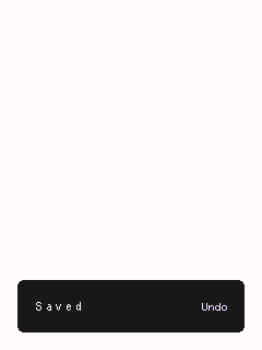
Full sketch: examples/controls/snackbar/snackbar.ino
A small floating label shown briefly above an anchor widget. Not hover-driven (this library targets touchscreens) - call showFor(anchorBounds, text) yourself, typically from a long-press.
Guidelines
- Call
showFor()only after the tooltip has been registered withScreen(it measures text using its own theme, which is only set once added) - as this example's comment notes. - Keep the shown duration short (the default is 1.5s); a tooltip that lingers stops feeling like a hint.
// --- Tooltip (the control under test) -----------------------------------------
Tooltip<RGB565> demoTooltip;

// setup():
// showFor() measures text using the theme, so the widget must already be
// registered (and so themed) with Screen before calling it.
app.screen().addFixedWidget(demoTooltip);
demoTooltip.showFor(Bounds(app.width() / 2 - 10, app.height() / 2 - 10, 20, 20), "Hint text",
                    /*durationMs=*/60000);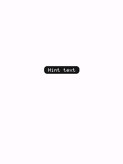
Full sketch: examples/controls/tooltip/tooltip.ino
A persistent, non-modal inline message with text actions - Material's "banner", e.g. pinned below an app bar for a system-level notice.
Guidelines
- Use for information that stays relevant until explicitly addressed ("You're offline") - unlike
Snackbar, aBannerdoesn't auto-dismiss. - Toggle
visibleyourself (Bannerisn't presented modally) - typically in response to whatever condition it's reporting on. -
setActionProvider()is available as a callback-driven alternative toaddAction()- see Container - Virtualized content section (not usually needed for a banner's handful of actions, but available for consistency).
// --- Banner (the control under test) -----------------------------------------
// Pinned to the bottom edge (see addFixedWidget() below) rather than just
// under an app bar, so it reads as a persistent bottom-of-screen notice.
Banner<RGB565> demoBanner(Bounds(0, app.height() - 80, app.width(), 80), "You're offline. Check your connection.");

// setup():
app.screen().addFixedWidget(demoBanner);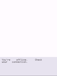
Full sketch: examples/controls/banner/banner.ino
An elevated rounded-rect container with an optional title and word-wrapped body text - the general-purpose content container.
Guidelines
- Set
elevated = falsefor a flat card when it sits inside another already-elevated surface (avoids stacking shadows). - For a tappable, image-backed variant (station/genre tiles), use
MediaCardinstead.
// --- Card (the control under test) ------------------------------------------
Card<RGB565> demoCard(Bounds(20, (app.height() - 140) / 2, app.width() - 40, 140), "TinyMaterialDesign",
                      "A simple elevated card with a title and word-wrapped body text.");

// setup():
app.screen().addWidget(demoCard);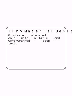
Full sketch: examples/controls/card/card.ino
A tappable card with a thumbnail image and a caption - e.g. one tile in a grid of stations/genres. Pair with GridLayout (Core/GridLayout.h) to lay out several of these in a wrapping grid.
Guidelines
- The image is any
TinyGPU::ISurface<RGB_T>you already have (a decoded BMP/JPEG, ...) -MediaCardonly blits it viadrawSprite(), it doesn't fetch or decode anything itself. - There's no image scaling - pre-size the image to fit the card's image area before handing it to
setImage().
// --- MediaCard (the control under test) ---------------------------------------
MediaCard<RGB565> demoMediaCard(Bounds((app.width() - 140) / 2, (app.height() - 140) / 2, 140, 140), "Jazz");

// setup():
demoMediaCard.onClick = []() { printf("Media card tapped\n"); };
app.screen().addWidget(demoMediaCard);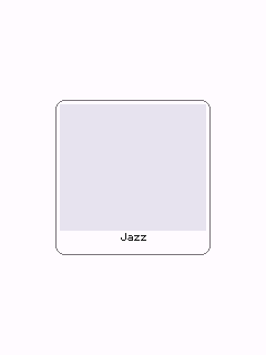
Full sketch: examples/controls/media-card/media-card.ino
A horizontally paged, drag-to-swipe row of items (typically MediaCard), with a snap-to-item animation and a page-dot indicator - Material's "carousel", e.g. a row of featured stations.
Guidelines
- Use for a small set of visually rich, browsable items where swiping feels natural (featured content, a short gallery) - for a large scrolling list, prefer
Screen's own vertical scrolling over paging horizontally. - Reports
isDraggable() == truelikeSlider- make sureScreen::isDraggableAt()is wired toGestureDetector::isDraggable(as every example here does) or swiping won't be recognized. - Each item's
boundsis authored in the carousel's own content space (seeCarousel::itemRect()) and overwritten byaddItem()- don't rely on whateverBoundsyou originally constructed the item with. -
setCurrentIndex()pages programmatically (e.g. from external next/previous buttons); a plain tap on an item still forwards through to it (its ownonClick, if any) when not mid-drag. - For a station/genre list too large to keep every
MediaCardresident at once,setItemProvider()replacesaddItem()with a callback-driven pool - see Container - Virtualized content section. It re-appliesitemRect(index)to whatever the callback returns on every fetch, since a pooled item may have just served a different index.
// --- Carousel (the control under test) ---------------------------------------
// Items' own bounds are overwritten by addItem() (see Carousel::itemRect())
// - the Bounds() passed to each MediaCard here is just a placeholder.
Carousel<RGB565> demoCarousel(Bounds(0, (app.height() - 150) / 2, app.width(), 150), 120, 12);
MediaCard<RGB565> carouselItemA(Bounds(), "Jazz");
MediaCard<RGB565> carouselItemB(Bounds(), "Rock");
MediaCard<RGB565> carouselItemC(Bounds(), "Pop");

// setup():
demoCarousel.addItem(carouselItemA);
demoCarousel.addItem(carouselItemB);
demoCarousel.addItem(carouselItemC);
demoCarousel.onPageChange = [](int page) { printf("Carousel page: %d\n", page); };
app.screen().addWidget(demoCarousel);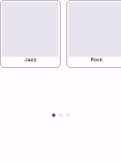
Full sketch: examples/controls/carousel/carousel.ino
A widget that holds child widgets and scrolls its own content vertically once it overflows its own bounds - the nestable counterpart to Screen's own scrolling. Unlike the layout calculators above (which only compute rects and are consumed before construction), Container is a real Widget: it owns a child list, and since it's a Widget itself, one Container can hold another, nesting arbitrarily deep.
Guidelines
- Children are registered with
addChild(), not owned (same non-owning-reference convention asDialog's actions orDrawer's items) - author each child'sBoundsstarting at/near the container's ownbounds.y, exactly as you would forScreen::addWidget(). - Give the
Containerits ownBoundsshorter than its children's combined height to make it scroll; if everything fits, scrolling never engages, same asScreen. - A child scrolled partially past the container's own edge is cropped to it, not drawn in full or skipped, and a
Slidernested inside one (at any nesting depth) is still correctly recognized as draggable byScreen::isDraggableAt(). Scrolling itself is still vertical-only, one axis, same asScreen. - Add it to
Screenthe same way as any other widget (addWidget()/addFixedWidget()); it forwards gestures and scroll internally to whichever child (or nestedContainer) they land on. - For a list too large to keep every child
Widgetresident in memory, see the Container - Virtualized content chapter.
// --- Container (the control under test) ---------------------------------------
// Shorter than its children's combined height, so it scrolls; nestedPanel is
// itself a Container, showing that they nest.
Container<RGB565> demoContainer(Bounds(0, 0, app.width(), 260));
Button<RGB565> buttonA(Bounds(20, 16, app.width() - 40, 48), "Button A");
Container<RGB565> nestedPanel(Bounds(20, 136, app.width() - 40, 120));
Card<RGB565> nestedCard(Bounds(0, 0, app.width() - 40, 100), "Nested", "Lives inside nestedPanel.");

// setup():
nestedPanel.addChild(nestedCard);
demoContainer.addChild(buttonA);
demoContainer.addChild(nestedPanel);
app.screen().addWidget(demoContainer);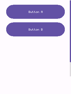
Full sketch: examples/controls/container/container.ino
addChild() needs every item's Widget to exist and stay resident for as long as it's registered - fine for a screenful of content, but not for a list of thousands of rows on a board with a few hundred KB of RAM. setChildProvider() is the alternative: instead of a stored list, you give a Container two callbacks -
- a count function returning how many logical items there are (it can be huge - the callback is the only thing that scales, not memory), and
- an at(index) function returning a reference to the
Widgetrepresenting that index.
The point is that at() doesn't have to construct a new object per index - the usual approach is a small fixed pool of real widgets (4-15, say) that at() repositions and relabels for whichever index is asked for, the same "recycler" pattern list views use everywhere. Setting a provider takes over completely: any children already added via addChild() are ignored while it's active.
The example below is a real, runnable sketch: a Container that reports 10,000 rows and scrolls through all of them, backed by a pool of only 12 real ListItem widgets - roughly a thousand-to-one reduction versus what addChild()-ing 10,000 ListItems (each owning a std::string title and a std::function callback) would cost.
// --- Virtualized list (the control under test) ------------------------------
constexpr int32_t kAppBarHeight = 56;
constexpr int32_t kRowHeight = 40;
constexpr int kLogicalCount = 10000;  // how many rows the list *reports*
constexpr size_t kPoolSize = 12;      // how many ListItem widgets actually exist

AppBar<RGB565> appBar(Bounds(0, 0, app.width(), kAppBarHeight), "10,000 Rows");
Container<RGB565> bigList(Bounds(0, kAppBarHeight, app.width(), app.height() - kAppBarHeight));
ListItem<RGB565> pool[kPoolSize];  // whichever ~8 rows are visible reuse these 12

// setup():
// O(1) content-height/scroll-range math instead of visiting all 10,000
// logical rows on every frame - see Container::setUniformItemHeight().
bigList.setUniformItemHeight(kRowHeight);

bigList.setChildProvider(
    []() { return kLogicalCount; },
    [](int index) -> Widget<RGB565>& {
      ListItem<RGB565>& item = pool[static_cast<size_t>(index) % kPoolSize];
      item.bounds = Bounds(bigList.bounds.x, bigList.bounds.y + index * kRowHeight,
                           bigList.bounds.w, kRowHeight);
      char label[24];
      snprintf(label, sizeof(label), "Row %d", index);
      item.setTitle(label);
      item.onClick = [index]() { printf("Row %d tapped\n", index); };
      return item;
    });

app.screen().addFixedWidget(appBar);
app.screen().addWidget(bigList);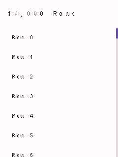
Full sketch: examples/controls/virtualized-list/virtualized-list.ino
Guidelines
- Every provider-returned widget is themed automatically the moment it's fetched (there's no fixed set to cascade
setTheme()to ahead of time), so you don't need to callsetTheme()on pool widgets yourself. -
at()is called once per index per pass (draw, hit-test, gesture dispatch, andcontentHeight()'s scroll-range calculation all call it independently) - keep it cheap, especially with a large count. CallsetUniformItemHeight()(as the example does) if every row is the same height, socontentHeight()/clampScroll()become an O(1) calculation instead of fetching and measuring all 10,000 rows on every single frame. -
Caution with continuous gestures: a drag/scroll latches the
Widget*at()returned at the gesture's start and keeps calling methods on it through the rest of the gesture (kChanged/kEnded). Don't let your pool reassign that same slot to a different index while a gesture is still in progress, or the drag will end up operating on the wrong logical item. - Available the same way on
Screen(setContentProvider(), for the root scrollable area),Dialog/Banner(setActionProvider()),Carousel(setItemProvider(), which also re-appliesitemRect(index)to whateverat()returns on every fetch), andDrawer/BottomSheet/Menu(setItemProvider(), which just forwards to their own internalContainer).
A tappable row: optional leading icon + title, with a selected state. The building block for Drawer, but usable standalone for any settings-style list.
Guidelines
- Selected items draw as a filled pill (Material's navigation-drawer look); unselected items are flat.
-
setTypographyRole()lets a dense list (many rows, e.g. inside aDrawer) usekLabelinstead of the defaultkBody.
// --- ListItem (the control under test) ---------------------------------------
ListItem<RGB565> demoListItem(Bounds(20, (app.height() - 48) / 2, app.width() - 40, 48), "Settings");

// setup():
demoListItem.onClick = []() { printf("List item tapped\n"); };
app.screen().addWidget(demoListItem);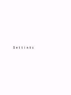
Full sketch: examples/controls/list-item/list-item.ino
A themed hairline that separates content into sections. Orientation follows the bounds' aspect ratio: wider-than-tall draws horizontal, taller-than-wide draws vertical.
Guidelines
- Use sparingly - Material 3 leans on spacing and grouping over explicit rules; reach for a
Dividermainly between logically distinct sections of a scrolling list.
// --- Divider (the control under test) ---------------------------------------
Divider<RGB565> demoDivider(Bounds(20, (app.height() - 2) / 2, app.width() - 40, 2));

// setup():
app.screen().addWidget(demoDivider);
Full sketch: examples/controls/divider/divider.ino
Non-interactive themed text at one of four typography roles (kHeadline/kTitle/kBody/kLabel), left- or center-aligned.
Guidelines
- Pick the typography role for the text's semantic weight, not just its size -
kTitlefor section headers,kBodyfor regular copy,kLabelfor compact captions/chips-adjacent text. -
setColor()overrides the defaultonSurfacecolor when a label needs to stand out (a status message in the theme's error/primary color, say).
// --- Label (the control under test) -----------------------------------------
Label<RGB565> demoLabel(Bounds(20, (app.height() - 24) / 2, app.width() - 40, 24), "Hello, Material Design!",
                        TypographyRole::kTitle, TextAlign::kCenter);

// setup():
app.screen().addWidget(demoLabel);
Full sketch: examples/controls/label/label.ino
A top app bar: a title plus optional leading/trailing icon widgets (typically IconButton), registered via Screen::addFixedWidget() so it stays pinned to the top regardless of scroll position.
Guidelines
- Attach
leading/trailingdirectly as pointer fields (seeleadingRect()/trailingRect()) - do not also add them toScreenseparately, or they'd be hit-tested twice. - Use
setColorOverride()to recolor just the bar (e.g. to reflect the active theme's primary color) without affecting the rest of the screen.
// --- AppBar (the control under test) -----------------------------------------
// leading/trailing are plain pointer fields (see AppBar::leading/trailing) -
// the IconButtons themselves are declared here and positioned/attached in
// setup(), the same pattern kitchen-sink.ino uses.
AppBar<RGB565> demoAppBar(Bounds(0, 0, app.width(), 48), "App Bar");
IconButton<RGB565> appBarMenu;
IconButton<RGB565> appBarAdd;

// setup():
appBarMenu = IconButton<RGB565>(demoAppBar.leadingRect(), drawMenu<RGB565>);
demoAppBar.leading = &appBarMenu;
appBarMenu.onClick = []() { printf("Menu tapped\n"); };

appBarAdd = IconButton<RGB565>(demoAppBar.trailingRect(), drawPlus<RGB565>);
demoAppBar.trailing = &appBarAdd;
appBarAdd.onClick = []() { printf("Add tapped\n"); };

// Demonstrates setColorOverride(): recolors just this bar to the theme's
// primary color, independent of the rest of the screen.
demoAppBar.setColorOverride(theme.colors.primary, theme.colors.onPrimary);

app.screen().addFixedWidget(demoAppBar);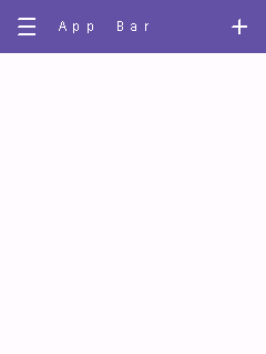
Full sketch: examples/controls/app-bar/app-bar.ino
A row of evenly-spaced exclusive-selection labels (primary tabs), with a sliding indicator under the selected one.
Guidelines
- Use for 2-5 top-level views of equally-important content within one screen; prefer
NavigationBarfor app-wide destinations instead of in-screen view switching. - Tabs are plain strings added via
addTab(), not separate child widgets.
// --- TabBar (the control under test) -----------------------------------------
TabBar<RGB565> demoTabs(Bounds(0, (app.height() - 40) / 2, app.width(), 40));

// setup():
demoTabs.addTab("One");
demoTabs.addTab("Two");
demoTabs.addTab("Three");
demoTabs.onChange = [](int index) { printf("Tab selected: %d\n", index); };
app.screen().addWidget(demoTabs);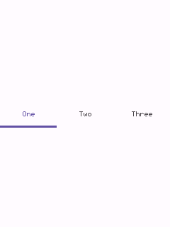
Full sketch: examples/controls/tab-bar/tab-bar.ino
A bottom navigation bar: 3-5 exclusive destinations, each an icon with a label underneath and a pill highlight behind the selected one. Pin it with Screen::addFixedWidget().
Guidelines
- Use for an app's top-level, always-visible destinations (3-5 of them); for a tablet/landscape layout prefer
NavigationRailinstead. - Keep labels short - they're drawn at the theme's
kLabeltypography role, meant for a word or two, not a phrase.
// --- NavigationBar (the control under test) ----------------------------------
NavigationBar<RGB565> demoNavBar(Bounds(0, app.height() - 64, app.width(), 64));

// setup():
demoNavBar.addDestination(drawPlus<RGB565>, "Add");
demoNavBar.addDestination(drawMinus<RGB565>, "Remove");
demoNavBar.addDestination(drawMenu<RGB565>, "More");
demoNavBar.onChange = [](int index) { printf("Nav destination: %d\n", index); };
app.screen().addFixedWidget(demoNavBar);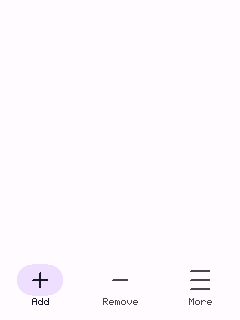
Full sketch: examples/controls/navigation-bar/navigation-bar.ino
A narrow vertical column of 3-7 exclusive destinations - the tablet/landscape counterpart of NavigationBar, pinned to a screen edge via Screen::addFixedWidget().
Guidelines
- Use in place of
NavigationBaron wider/landscape layouts where a side column reads more naturally than a bottom bar.
// --- NavigationRail (the control under test) ---------------------------------
NavigationRail<RGB565> demoNavRail(Bounds(0, 0, 72, app.height()));

// setup():
demoNavRail.addDestination(drawPlus<RGB565>, "Add");
demoNavRail.addDestination(drawMinus<RGB565>, "Remove");
demoNavRail.addDestination(drawMenu<RGB565>, "More");
demoNavRail.onChange = [](int index) { printf("Nav destination: %d\n", index); };
app.screen().addFixedWidget(demoNavRail);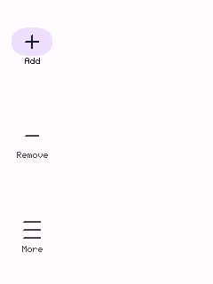
Full sketch: examples/controls/navigation-rail/navigation-rail.ino
A modal side navigation panel holding a list of items (typically ListItem), shown like a Dialog via Screen::presentDialog().
Guidelines
- Use for an app's top-level navigation destinations, opened from an app bar's leading menu icon (see
kitchen-sink.ino). - Wire
onScrimTaptoapp.screen().dismissDialog()for tap-outside-to-close, and dismiss from each item's ownonClicktoo. - The item area scrolls automatically once items overflow the panel's height (it's a
Containerunder the hood - seeCore/Container.h), andsetItemProvider()is available as a callback-driven alternative toaddItem()for a long settings-style list - see Container - Virtualized content section.
// --- Drawer (the control under test) -----------------------------------------
Drawer<RGB565> demoDrawer(Bounds(0, 0, 220, app.height()));
ListItem<RGB565> drawerItem;

// setup():
drawerItem = ListItem<RGB565>(demoDrawer.itemRect(0), "Home");
drawerItem.setSelected(true);
drawerItem.onClick = []() {
  printf("Drawer item tapped\n");
  app.screen().dismissDialog();
};
demoDrawer.addItem(drawerItem);
demoDrawer.onScrimTap = []() { app.screen().dismissDialog(); };

// Shown immediately (no separate trigger control) - see Screen::presentDialog().
app.screen().presentDialog(demoDrawer);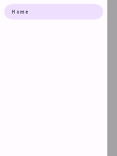
Full sketch: examples/controls/drawer/drawer.ino
A popover list of items (typically ListItem), anchored near whatever opened it. Same modal-presentation shape as Dialog/Drawer, but - unlike them - does not dim the rest of the screen, since a menu is a lightweight popover, not a heavyweight interruption.
Guidelines
- Use for a small, contextual set of choices (a dropdown from a Button, a long-press context menu) - for full-screen navigation use
Drawerinstead. - Wire
onOutsideTaptoapp.screen().dismissDialog()for the expected tap-outside-to-close behavior. - Like
Drawer, the item area is aContainerunder the hood - it scrolls automatically if items overflow, andsetItemProvider()is available as a callback-driven alternative toaddItem()- see Container - Virtualized content section.
// --- Menu (the control under test) -------------------------------------------
Menu<RGB565> demoMenu(Bounds((app.width() - 160) / 2, (app.height() - 40) / 2, 160, 40));
ListItem<RGB565> menuItem;

// setup():
menuItem = ListItem<RGB565>(demoMenu.itemRect(0), "Option 1");
menuItem.onClick = []() {
  printf("Menu item tapped\n");
  app.screen().dismissDialog();
};
demoMenu.addItem(menuItem);
demoMenu.onOutsideTap = []() { app.screen().dismissDialog(); };

// Shown immediately (no separate trigger control) - see Screen::presentDialog().
app.screen().presentDialog(demoMenu);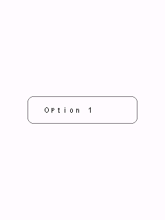
Full sketch: examples/controls/menu/menu.ino
A modal alert: full-screen scrim + centered card + title + wrapped message + action widgets (typically Button). Shown with Screen::presentDialog().
Guidelines
- Always give a Dialog at least one action wired to
app.screen().dismissDialog()- without one there's no way for the user to close it (this example omits that follow-up wiring for brevity beyond the one OK action shown). - Reserve dialogs for choices that truly need to interrupt the user - for a transient, non-blocking status message use
Snackbarinstead. -
setActionProvider()is available as a callback-driven alternative toaddAction()- see Container - Virtualized content section (not usually needed for a dialog's handful of actions, but available for consistency).
// --- Dialog (the control under test) -----------------------------------------
Dialog<RGB565> demoDialog(Bounds(20, (app.height() - 160) / 2, app.width() - 40, 160), "Hello",
                          "This is a simple modal dialog with one action.");
Button<RGB565> dialogOk(Bounds(0, 0, 80, 36), "OK");

// setup():
dialogOk.bounds = demoDialog.actionRect(0, 1);
dialogOk.onClick = []() {
  printf("Dialog OK tapped\n");
  app.screen().dismissDialog();
};
demoDialog.addAction(dialogOk);

// Shown immediately (no separate trigger control) - see Screen::presentDialog().
app.screen().presentDialog(demoDialog);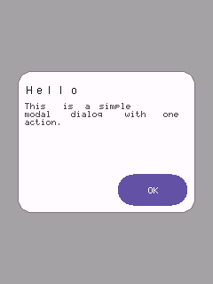
Full sketch: examples/controls/dialog/dialog.ino
A modal panel sliding up from the bottom edge, full width, with rounded top corners and a drag-handle bar - Material's "modal bottom sheet". Holds a list of items the same non-owning way Drawer holds its items.
Guidelines
- Use for a focused set of actions/options related to the current context (a share sheet, a "more options" panel) - prefer
Dialogfor a yes/no-style interruption instead. -
itemRect()is theme-independent by design, so items can be constructed at global scope before the sheet has ever been given a theme - the same patternDrawer::itemRect()uses. - Like
Drawer, the item area is aContainerunder the hood - it scrolls automatically if items overflow, andsetItemProvider()is available as a callback-driven alternative toaddItem()- see Container - Virtualized content section.
// --- BottomSheet (the control under test) ------------------------------------
BottomSheet<RGB565> demoSheet(Bounds(0, app.height() - 160, app.width(), 160), "Options");
ListItem<RGB565> sheetItem;

// setup():
sheetItem = ListItem<RGB565>(demoSheet.itemRect(0), "Share");
sheetItem.onClick = []() {
  printf("Bottom sheet item tapped\n");
  app.screen().dismissDialog();
};
demoSheet.addItem(sheetItem);
demoSheet.onScrimTap = []() { app.screen().dismissDialog(); };

// Shown immediately (no separate trigger control) - see Screen::presentDialog().
app.screen().presentDialog(demoSheet);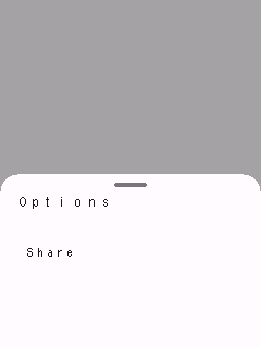
Full sketch: examples/controls/bottom-sheet/bottom-sheet.ino
A single-line text input box. Only holds and displays text and focus state - it has no idea how to turn touches into characters; pair with Keyboard (see that example) for actual typing.
Guidelines
- Wire a
Keyboardviakeyboard.manage(field)to let the user actually type - a loneTextField(as shown here) can still be focused/tapped, but nothing routes keystrokes into it. - Text longer than the box draws past its right edge rather than scrolling/clipping - fine for short inputs, not for long free-form text (use
TextAreafor that).
// --- TextField (the control under test) ---------------------------------------
// Tap to focus (a blinking cursor appears); pair with a Keyboard (see the
// keyboard example) to actually type into it.
TextField<RGB565> demoField(Bounds(20, (app.height() - 48) / 2, app.width() - 40, 48), "Name", "Your name");

// setup():
demoField.onSubmit = []() { printf("Submitted: %s\n", demoField.text().c_str()); };
app.screen().addWidget(demoField);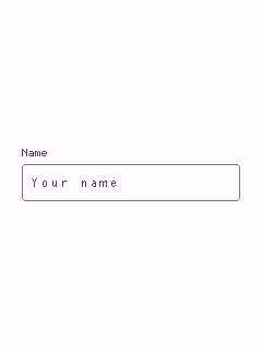
Full sketch: examples/controls/text-field/text-field.ino
The multi-line, word-wrapped counterpart to TextField - same TextInputTarget interface, same need for a Keyboard to drive actual typing.
Guidelines
- Use for longer free-form text (notes, descriptions); use
TextFieldfor short single-line values (names, search terms). - On a
Keyboard, Enter inserts a literal newline here (unlikeTextField, where Enter submits) - Done still closes the keyboard regardless of field type.
// --- TextArea (the control under test) ---------------------------------------
// Tap to focus (a blinking cursor appears); pair with a Keyboard (see the
// keyboard example) to actually type into it.
TextArea<RGB565> demoArea(Bounds(20, (app.height() - 140) / 2, app.width() - 40, 140), "Notes",
                          "Write something...");

// setup():
app.screen().addWidget(demoArea);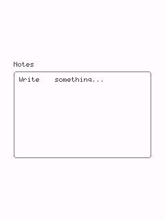
Full sketch: examples/controls/text-area/text-area.ino
A pill-shaped search input: leading magnifier glyph, typed text, and a trailing "x" clear glyph shown once there's something to clear. Implements TextInputTarget the same way TextField does.
Guidelines
- Pair with a
Keyboard(viamanage()) for actual typing, same asTextField/TextArea- omitted here to keep this a single-control demo. - The trailing clear glyph only appears once
text()is non-empty, and tapping it clears the field without needing a separate button.
// --- SearchBar (the control under test) ---------------------------------------
// Tap to focus (a blinking cursor appears); pair with a Keyboard to
// actually type into it - omitted here to keep this a single-control demo.
SearchBar<RGB565> demoSearch(Bounds(20, (app.height() - 48) / 2, app.width() - 40, 48), "Search");

// setup():
demoSearch.onSubmit = []() { printf("Search submitted: %s\n", demoSearch.text().c_str()); };
app.screen().addWidget(demoSearch);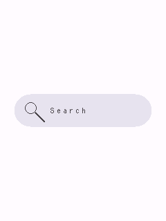
Full sketch: examples/controls/search-bar/search-bar.ino
An on-screen QWERTY keyboard that drives one text input (TextField or TextArea) at a time. A single instance can serve any number of fields via manage(field).
Guidelines
- Add it to
Screenafter every field it manages, so it draws (and hit-tests) on top of them while shown. - Enter and Done are deliberately separate: Enter always inserts a literal newline; Done always means "finished editing" and hides the keyboard.
- This example forces it visible directly (no managed field) purely to keep it a single-control demo - keys still respond, they just have nowhere to insert characters.
// --- Keyboard (the control under test) ---------------------------------------
// Normally shown/targeted via a TextField's/TextArea's onFocus (see
// Keyboard::manage()); forced visible here directly so this stays a
// single-control demo - keys still respond, they just have no field to
// insert characters into.
Keyboard<RGB565> demoKeyboard(Bounds(0, app.height() - 190, app.width(), 190));

// setup():
demoKeyboard.visible = true;
app.screen().addFixedWidget(demoKeyboard);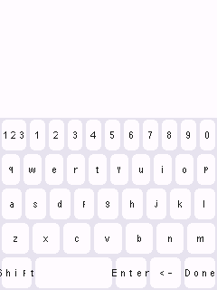
Full sketch: examples/controls/keyboard/keyboard.ino
None of these are widgets. TinyMaterialDesign deliberately has no auto-layout
container - every widget always gets an explicit Bounds, set once, that it
never recomputes itself. A layout class is a small calculator you use
before constructing/positioning widgets: it turns a container Bounds
plus a few numbers into the Bounds for each item, and you assign those
yourself.
GridLayout grid(Bounds(16, 56, 308, 400), 90, 110);
for (size_t i = 0; i < cards.size(); ++i) cards[i].bounds = grid.cellRect(i);
They own nothing, allocate nothing, and hold no widget pointers - just plain
arithmetic on Bounds, which keeps them free on memory-constrained boards
and safe to recompute every frame if a container resizes. Pick the one that
matches the arrangement you need; several can be combined (e.g. SplitLayout
to carve out a pane, then GridLayout inside it).
If you actually need a widget that owns a scrollable/nestable set of
children rather than just computing where to put them, see
Container in the Containment chapter - it's a real Widget,
not a calculator, and is the one exception to "no widget owns its children"
in this list.
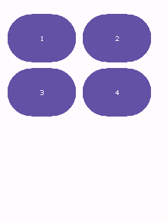
Wraps a row of equal-size cells to fit a container's width - the classic "N cards per row" grid (station/genre tiles, a dashboard of MediaCards).
Guidelines
- As many columns as fit the container's width are used automatically; you don't specify a column count.
- Rows are not clipped to the container's height - use
totalHeight(count)to size a scroll area.
// --- GridLayout (the control under test) ------------------------------------
GridLayout demoGrid(Bounds(10, 20, app.width() - 20, app.height() - 40), /*cellWidth=*/100, /*cellHeight=*/70);
Button<RGB565> cellA(Bounds(), "1");
Button<RGB565> cellB(Bounds(), "2");
Button<RGB565> cellC(Bounds(), "3");
Button<RGB565> cellD(Bounds(), "4");
Button<RGB565>* cells[] = {&cellA, &cellB, &cellC, &cellD};

// setup():
for (size_t i = 0; i < 4; ++i) {
  cells[i]->bounds = demoGrid.cellRect(static_cast<int>(i));
  app.screen().addWidget(*cells[i]);
}
Header: Core/GridLayout.h
Full sketch: examples/layouts/grid-layout/grid-layout.ino
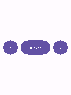
Splits a container into equal or weighted slices along one axis - a row of buttons, a column of stacked panels.
Guidelines
- Default is an equal split of
countitems minus spacing gutters. - Pass a
weightsarray to give some items more of the remaining space than others (weights are relative, not required to sum to 1).
// --- LinearLayout (the control under test) ----------------------------------
LinearLayout demoRow(Bounds(10, (app.height() - 48) / 2, app.width() - 20, 48), LayoutAxis::Horizontal);
Button<RGB565> buttonA(Bounds(), "A");
Button<RGB565> buttonB(Bounds(), "B (2x)");
Button<RGB565> buttonC(Bounds(), "C");

// setup():
float weights[] = {1.0f, 2.0f, 1.0f};
buttonA.bounds = demoRow.itemRect(0, weights, 3);
buttonB.bounds = demoRow.itemRect(1, weights, 3);
buttonC.bounds = demoRow.itemRect(2, weights, 3);
app.screen().addWidget(buttonA);
app.screen().addWidget(buttonB);
app.screen().addWidget(buttonC);
Header: Core/LinearLayout.h
Full sketch: examples/layouts/linear-layout/linear-layout.ino
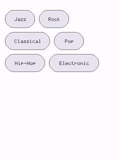
Packs items of varying width left-to-right, wrapping to a new row when one would overflow - a chip/tag group whose item count and widths aren't known up front.
Guidelines
- Each item reports its own width/height to
next(); calls must be made in order since each one advances an internal cursor. - Call
reset()to run the same set of items again, andtotalHeight()after a full pass to size a scroll area.
// --- FlowLayout (the control under test) ------------------------------------
FlowLayout demoFlow(Bounds(10, 20, app.width() - 20, app.height() - 40));
Chip<RGB565> chipJazz(Bounds(), "Jazz");
Chip<RGB565> chipRock(Bounds(), "Rock");
Chip<RGB565> chipClassical(Bounds(), "Classical");
Chip<RGB565> chipPop(Bounds(), "Pop");
Chip<RGB565> chipHipHop(Bounds(), "Hip-Hop");
Chip<RGB565> chipElectronic(Bounds(), "Electronic");
Chip<RGB565>* chips[] = {&chipJazz, &chipRock, &chipClassical, &chipPop, &chipHipHop, &chipElectronic};
constexpr int32_t kChipWidths[] = {60, 60, 90, 60, 80, 100};

// setup():
for (size_t i = 0; i < 6; ++i) {
  chips[i]->bounds = demoFlow.next(kChipWidths[i], /*height=*/36);
  app.screen().addWidget(*chips[i]);
}
Header: Core/FlowLayout.h
Full sketch: examples/layouts/flow-layout/flow-layout.ino
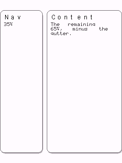
Divides a container into two panes along one axis - a nav/content or master/detail split on a larger display.
Guidelines
- Construct with a fixed pixel size for the first pane, or use
SplitLayout::ratio(...)for a proportional split (e.g. 0.3f for 30/70). - The second pane fills the remainder minus the gutter.
// --- SplitLayout (the control under test) -----------------------------------
Card<RGB565> navCard(Bounds(), "Nav", "35%");
Card<RGB565> contentCard(Bounds(), "Content", "The remaining 65%, minus the gutter.");

// setup():
SplitLayout demoSplit =
    SplitLayout::ratio(Bounds(0, 20, app.width(), app.height() - 40), LayoutAxis::Horizontal, 0.35f);
navCard.bounds = demoSplit.firstRect();
contentCard.bounds = demoSplit.secondRect();
app.screen().addWidget(navCard);
app.screen().addWidget(contentCard);
Header: Core/SplitLayout.h
Full sketch: examples/layouts/split-layout/split-layout.ino
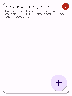
Positions a single rect relative to a corner or edge of a container - a FAB pinned to the bottom-right, a badge pinned to the top-right corner of an avatar.
Guidelines
-
margininsets the anchored rect from the container edge; pass0to flush it against the edge. - Combine with
Screen's ownBoundsto anchor relative to the whole screen rather than a widget.
// --- AnchorLayout (the control under test) ----------------------------------
Card<RGB565> backgroundCard(Bounds(10, 10, app.width() - 20, app.height() - 20), "AnchorLayout",
                            "Badge anchored to my corner; FAB anchored to the screen's.");
Badge<RGB565> cornerBadge(Bounds(), "3");
FAB demoFab(Bounds(), drawPlus<RGB565>);

// setup():
AnchorLayout cardAnchor(backgroundCard.bounds);
cornerBadge.bounds = cardAnchor.rect(Anchor::TopRight, 24, 24);

AnchorLayout screenAnchor(Bounds(0, 0, app.width(), app.height()), /*margin=*/16);
demoFab.bounds = screenAnchor.rect(Anchor::BottomRight, 56, 56);

app.screen().addWidget(backgroundCard);
app.screen().addWidget(cornerBadge);
app.screen().addWidget(demoFab);
Header: Core/AnchorLayout.h
Full sketch: examples/layouts/anchor-layout/anchor-layout.ino
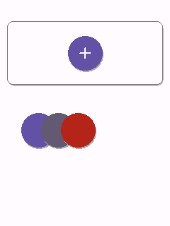
StackLayout actually bundles two unrelated, single-purpose helpers under one name - it's not "arrange these into a row/column" (that's LinearLayout), it's "place one rect relative to another rect it sits on top of or overlaps":
-
centered(width, height)- centers one rect in the middle of a container. Use this for an icon centered inside a bigger button/panel. -
offset(index, width, height)- places theindex-th of a series of same-size rects, each shiftedoverlapSteppixels from the previous one, starting at the container's(x, y)origin. This is the classic "overlapping avatar stack" you see in group chats or "shared with" lists: a handful of profile pictures fanned out so each shows a sliver of itself peeking out from behind the next.
A single StackLayout instance is normally used for just one of these, not both - the example below constructs two separate instances only because it's demonstrating both methods in one sketch.
Guidelines
-
centered()ignoresoverlapStepentirely - that constructor argument only matters tooffset(). -
offset()never reads the container'swidth/height, only itsx/yorigin - so when you're only usingoffset(), it's fine (and clearer) to construct theStackLayoutwith a0x0container size, as in the second snippet below; there's no "real" container to speak of, just a starting point. -
offset()'s "overlap" is a fixed pixel step along x, not a percentage - pick a step smaller thanwidthto actually get visual overlap (e.g.width=48, overlapStep=28leaves each chip showing ~28px of itself before the next one covers the rest).
// --- StackLayout: centered() --------------------------------------------------
// One icon, centered inside a larger card.
Card<RGB565> panel(Bounds(10, 30, app.width() - 20, 90), nullptr, nullptr);
IconButton<RGB565> centeredIcon(Bounds(), drawPlus<RGB565>, IconButtonVariant::kFilled);

// setup():
StackLayout iconStack(panel.bounds);
centeredIcon.bounds = iconStack.centered(48, 48);
// --- StackLayout: offset() -----------------------------------------------------
// Three plain colored circles (standing in for profile pictures), each
// shifted 28px from the last, fanning out from (30, 160) into an
// overlapping row - a circular IconButton is what sells the "avatar
// stack" look here; the same offsets applied to a rectangular Button
// would just look like clipped corners instead.
IconButton<RGB565> avatarA(Bounds(), nullptr, IconButtonVariant::kFilled);
IconButton<RGB565> avatarB(Bounds(), nullptr, IconButtonVariant::kFilled);
IconButton<RGB565> avatarC(Bounds(), nullptr, IconButtonVariant::kFilled);
IconButton<RGB565>* avatars[] = {&avatarA, &avatarB, &avatarC};
// setup():
// Only the (30, 160) origin matters here - width/height are ignored by
// offset(), so they're left at 0 rather than a real container size.
StackLayout avatarStack(Bounds(30, 160, 0, 0), /*overlapStep=*/28);
RGB565 avatarColors[] = {theme.colors.primary, theme.colors.secondary, theme.colors.error};
for (size_t i = 0; i < 3; ++i) {
avatars[i]->bounds = avatarStack.offset(static_cast<int>(i), 48, 48);
avatars[i]->setColorOverride(avatarColors[i], theme.colors.onPrimary);
}Header: Core/StackLayout.h
Full sketch: examples/layouts/stack-layout/stack-layout.ino
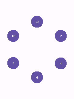
Places item rects evenly spaced around a circle - dial/menu items on a round display, where rectilinear packing doesn't match the screen shape.
Guidelines
- Angle 0 points up (12 o'clock) and items are placed clockwise, like a clock face; rotate the whole ring with
startDegrees. -
radiusis measured from the container's center to each item's center point.
// --- RadialLayout (the control under test) ----------------------------------
RadialLayout demoDial(Bounds(0, 40, app.width(), app.width()), /*radius=*/90);
Button<RGB565> item0(Bounds(), "12");
Button<RGB565> item1(Bounds(), "2");
Button<RGB565> item2(Bounds(), "4");
Button<RGB565> item3(Bounds(), "6");
Button<RGB565> item4(Bounds(), "8");
Button<RGB565> item5(Bounds(), "10");
Button<RGB565>* items[] = {&item0, &item1, &item2, &item3, &item4, &item5};

// setup():
for (size_t i = 0; i < 6; ++i) {
  items[i]->bounds = demoDial.itemRect(static_cast<int>(i), 6, /*width=*/40, /*height=*/40);
  app.screen().addWidget(*items[i]);
}
Header: Core/RadialLayout.h
Full sketch: examples/layouts/radial-layout/radial-layout.ino
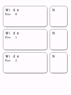
A grid with independently-sized columns and rows, for dashboards mixing wide/narrow columns or short/tall rows - GridLayout assumes uniform cells, TableLayout doesn't.
Guidelines
- Column widths and row heights are supplied as plain arrays, sized to
columnCount/rowCount. - Use
totalWidth()/totalHeight()to size the container that holds the table.
// --- TableLayout (the control under test) -----------------------------------
constexpr int32_t kColumnWidths[] = {150, 60};
constexpr int32_t kRowHeights[] = {70, 70, 70};
TableLayout demoTable(Bounds(10, 20, app.width() - 20, app.height() - 40), kColumnWidths, 2, kRowHeights, 3);

Card<RGB565> wide0(Bounds(), "Wide", "Row 0");
Card<RGB565> narrow0(Bounds(), "N", nullptr);
Card<RGB565> wide1(Bounds(), "Wide", "Row 1");
Card<RGB565> narrow1(Bounds(), "N", nullptr);
Card<RGB565> wide2(Bounds(), "Wide", "Row 2");
Card<RGB565> narrow2(Bounds(), "N", nullptr);

// setup():
wide0.bounds = demoTable.cellRect(0, 0);
narrow0.bounds = demoTable.cellRect(0, 1);
wide1.bounds = demoTable.cellRect(1, 0);
narrow1.bounds = demoTable.cellRect(1, 1);
wide2.bounds = demoTable.cellRect(2, 0);
narrow2.bounds = demoTable.cellRect(2, 1);

app.screen().addWidget(wide0);
app.screen().addWidget(narrow0);
app.screen().addWidget(wide1);
app.screen().addWidget(narrow1);
app.screen().addWidget(wide2);
app.screen().addWidget(narrow2);
Header: Core/TableLayout.h
Full sketch: examples/layouts/table-layout/table-layout.ino
cmake -B build -S .
cmake --build build --target button   # or any other control's directory name
./build/examples/controls/button/button
See examples/kitchen-sink for all of the
original widgets combined into one scrollable screen, and
examples/controls/README.md for the full
one-sketch-per-widget list.