Frontpage design update - Stage 1 - 100K edition.#415
Conversation


 scragly
requested review from
jb3 and
lemonsaurus
and removed request for
fiskenslakt and
kwzrd
scragly
requested review from
jb3 and
lemonsaurus
and removed request for
fiskenslakt and
kwzrd

 lemonsaurus
left a comment
lemonsaurus
left a comment
lemonsaurus
left a comment
There was a problem hiding this comment.
I like this quite a bit. It looks good, the code is great, overall a solid PR.
I have only two pieces of feedback, but they're not showstoppers.
-
I think we should get rid of the Discord cutout element in the top right now that we have this design. We'd probably be better off just having the More dropdown in the top right and adding the Discord link as a normal navbar item alongside Reddit and so on.
-
This PR has a slightly lower comment-to-code ratio than would be ideal. Which is to say, the comment-to-code ratio appears to be 0-100. CSS and HTML are allowed to have comments, too!
After updating the frontpage and creating an fixed-aspect-ratio style pair, I found I could just reuse them in the timeline to fix the inconsistent responsive aspect ratio that was occurring there.

Some img src values also were not quoted; while this can work fine, it can break if the url has spaces or certain characters and is inconsistent with the rest of the project.

|
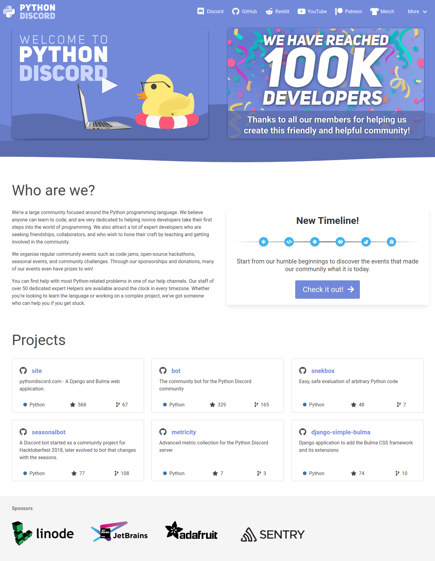
The PR has been updated taking into account comments you've made here @lemonsaurus as well as some from @MarkKoz in-server. I have updated the sources to include more comments, while also going through and cleaning up general structure/organisation and removing unused styles. The discord link has been changed to be the first nav item, and a normal one now. I had to add some style overrides for the dropdown in order to get it to not slip off the ride side of the canvas when being viewed. Some tweaks have been made with the wave-hero cards/columns, including preventing them from pushing directly against the edge of the canvas when viewed at the smaller resolutions and increased the spacing between each column. While I was working on the styles, I edited the repo cards to have a more consistent or improved styling:
I moved the pair of classes that fixed the frontpage iframe to a 16:9 aspect ratio to the base.css file, as I noticed this wasn't really fixed properly in the timeline page and so could be used directly to solve that problem. This is a screenshot of the current iteration: |

 jb3
left a comment
jb3
left a comment
jb3
left a comment
There was a problem hiding this comment.
Jolly good stuff.
This works well locally on desktop and mobile, and I think it's a great redesign of the front page!


 Den4200
left a comment
Den4200
left a comment
Den4200
left a comment
There was a problem hiding this comment.
Great job, this looks phenomenal!
One thing that stands out to me though is how the footer icons in the repository cards are spread out and centered. I'm used to it all being left aligned and close to each other, like a normal GitHub card:
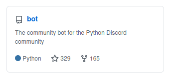
I think I'd rather have the icons left aligned and close together, but I also wouldn't particularly mind it either way.
Everything is looks great!
jb3
left a comment
jb3
left a comment
There was a problem hiding this comment.
Thinking about it, I think removing the explicit CTA is not a great idea from a UX perspective. I think that the new navbar item isn't as clear as the old CTA. I think I'd rather have the explicit dark blurple CTA, but this is the opposite of what @lemonsaurus thinks, so I'd like to discuss whether removing that is a good idea.
 ghost
added
the
s: waiting for author
ghost
removed
the
s: waiting for author
ghost
added
the
s: waiting for author
ghost
removed
the
s: waiting for author
|
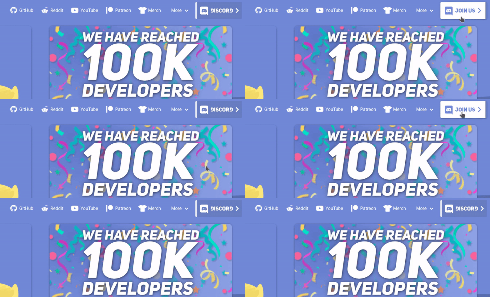
I have removed the standard Discord navbar item and added a Discord button back where the old CTA was, but redesigned. Now, it's a proper button shape, instead of assuming it will fill the shape of the standard nav. It also has a sliding animation for some fun and to encourage interaction/clicking.
I also changed the youtube thumbnail image to reference a local copy, rather than hotlink to youtube's one. |
jb3
left a comment
jb3
left a comment
There was a problem hiding this comment.
Looking good!
Some minor things on the CTA.
For whatever reason Safari is not picking up the font information in the SVG file. Maybe we should bake this into the SVG as curves instead if we cannot guarantee browser compatibility.

It does work on Chrome, Edge, etc. fine.
Is it possible to make the white take up the whole of the button when hovering instead of leaving a blurple slither at the end, it works for the neutral state with the white but less so with the blurple.
ghost
added
the
s: waiting for author
|
I totally forgot to convert the text to objects, thanks for checking it! And yep, it can be adjusted to remove the blue line. |
ghost
removed
the
s: waiting for author


4 participants


This PR is to apply the first stage of the frontpage design update.
The following things have been done:
Wave Hero
There is a new wave hero section in the top part of the frontpage. The layered waves are inspired by the Welcome to Python Discord video's thumbnail, and are slowly animated with CSS.
Video Thumbnail
The embedded video iframe has been changed so it will only load the youtube video embed on clicking on it for the first time. This allows for a cleaner thumbnail design to be used instead of the default youtube embed with forced title, channel details, etc.
100K Banner
The new 100K member banner has been added to the image assets and places within the wave hero section.
Timeline Showcase
To the right of the normal frontpage text, there's a card showcasing the new timeline page. This can be changed in future, but suits the current goal of promoting the new page.
The small mini-timeline items grow in size on hovering on each one, giving a little bit of a fun dynamic to what would otherwise be a relatively simple card. If I had more time, I may have considered making something much more involved and graphically pleasing, but most of the time I dedicated to getting the hero section working responsively.
Mobile-only Message
When viewing the page on mobile, there's too little horizontal space to have the wave hero section work properly with all it's content, so we instead have that section hide itself, and we use a simple bulma message element to show any temporary promotional messages we wish to make.
GIF Preview
Here's an animated GIF that shows the moving waves, the new video thumb and it's hover effect and the hover effect of the mini-timeline element.