Conversation
|
cc @apreshill 🧁 |
|
Other properties worth considering:
In a separate PR, I think we should also work on a plan for the structure of the overall file because the comments don't always seem to align with the contents, there's duplication (e.g. |
|
Currently my PR breaks the padding-left of TOC active elements. |
|
I need to find
|
|
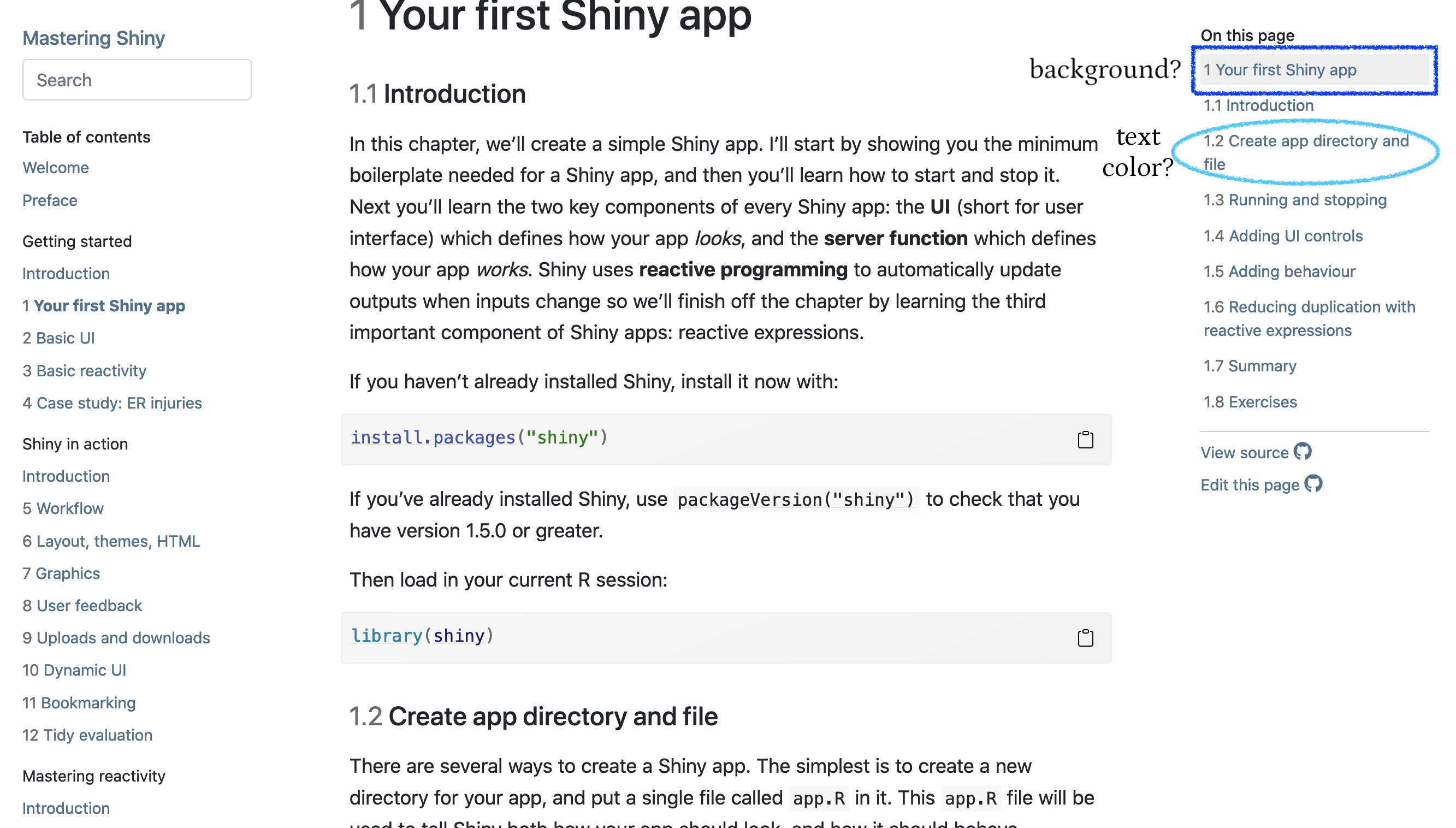
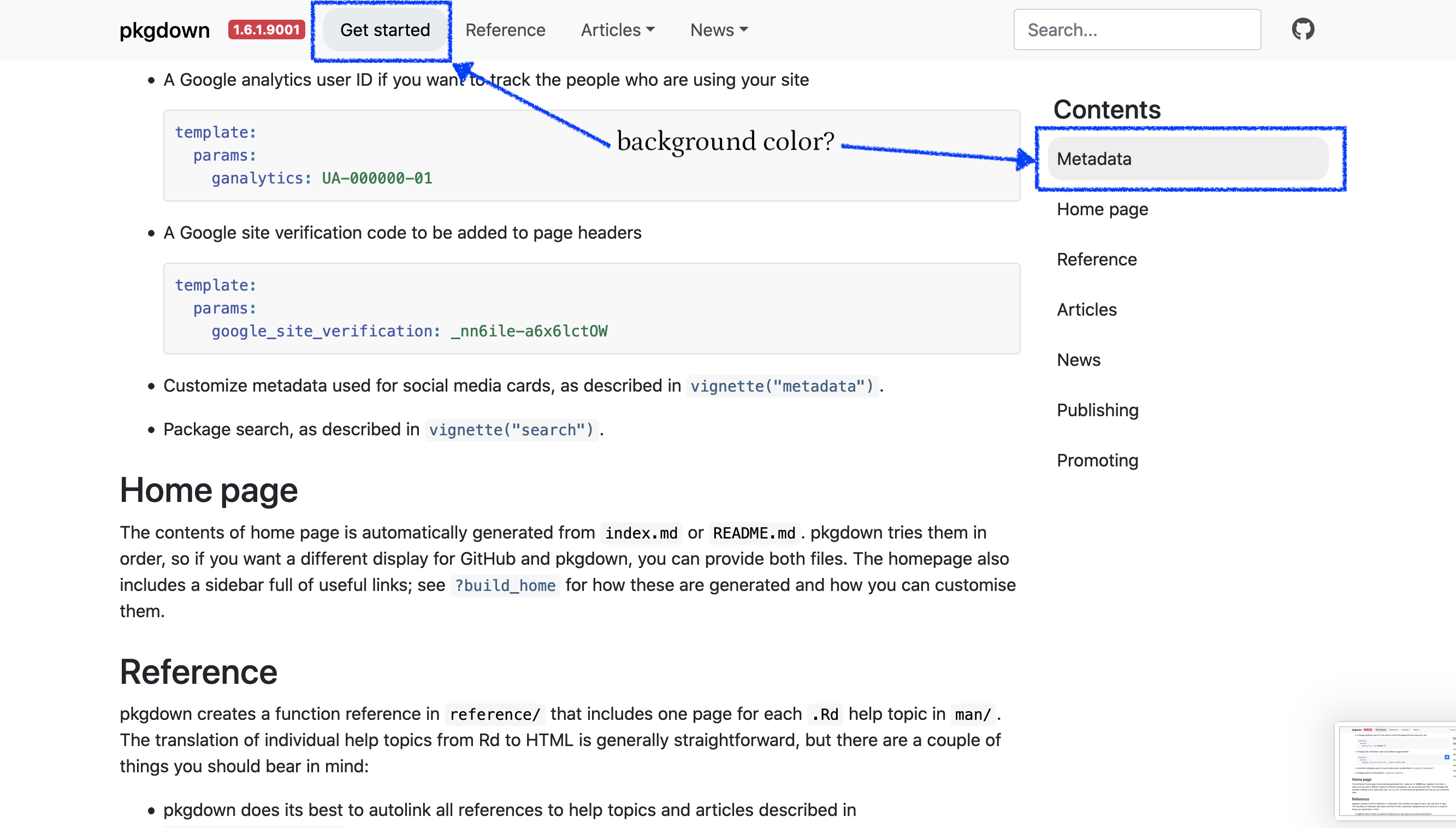
Reg 3 and 4 now if secondary is not set component-active-bg defaults to a mix of fg and bg. So I think I tackle all your items @apreshill and will wait to hear from @cpsievert on how I could use bslib in a better way. |
|
A question for @apreshill: when using only fg and bg, the links remain blue as they depend on primary. Do we want some sort of mix when primary is not set by the user? |
|
Also, the code colors remain not that easy to theme, but this could be the topic of a further PR one day. |
| width: max(100%, 20rem); | ||
| background-color: #fff; | ||
| border: 1px solid var(--gray); | ||
| width: Max(100%, 20rem); |
There was a problem hiding this comment.
Why the capital Max()? Is it somehow different from max()?
There was a problem hiding this comment.
Answered in rstudio/sass#92 (slowly getting to your feedback, very useful, thanks a ton already)
| pkgdown_bslib_defaults <- function() { | ||
| list(`navbar-nav-link-padding-x` = "1rem") | ||
| list( | ||
| `navbar-nav-link-padding-x` = "1rem", | ||
| `primary` = "#0054AD", | ||
| `secondary` = "#e9ecef", | ||
| `navbar-bg` = "#f8f9fa", | ||
| `border-width` = "1px", | ||
| `code-bg` = "#f8f8f8", | ||
| `code-color` = "#333", | ||
| `fu-color` = "#4758AB", | ||
| `border-radius` = "1rem" | ||
| ) | ||
| } |
There was a problem hiding this comment.
I prefer putting these variable definitions in the Sass code (with !default flags). That way it's:
- Easier to reason about the Sass code
- The Sass can be then we (pre-)compiled in a standalone fashion
There was a problem hiding this comment.
@cpsievert Good points but I am not sure how to do that. The code below does not work because I'm using bs_add_rules which seems to ignore variables. How should I best combine the sass code with the bslib theme?
sass_code <- "$primary: pink !default;"
bs_theme <- bslib::bs_theme(version = 4)
new_css <- sass::sass_partial(sass_code, bs_theme)
bs_theme <- bslib::bs_add_rules(bs_theme, new_css)
bslib::bs_get_variables(bs_theme, "$primary")
#>   primary
#> "#007bff"
Created on 2021-07-13 by the reprex package (v2.0.0)
There was a problem hiding this comment.
Exploring in maelle/bslib-stuff#1 (comment)
| "component-active-bg" = "mix($body-color, $body-bg, 5%)", | ||
| .where = "declarations" |
There was a problem hiding this comment.
One of the downsides of the .where = "declarations" approach is that this new value for $component-active-bg won't "cascade" to it's dependents (which is why you've ended up needing to repeat this code for $dropdown-link-active-bg).
In these sort of cases, it'll be cleaner to do something like:
cols <- bs_get_variables(theme, c("bg", "fg"))
theme <- bs_theme(theme, "component-active-bg" = sprintf("mix(%s, %s, 5%)", cols$fg, cols$bg))
Also, BTW, calls to bs_get_variables() are expensive, so you'll be better off computing all the variables you need in one call (e.g., bs_get_variables(theme, c("bg", "fg", "primary", ...)))
There was a problem hiding this comment.
Yes, I've been wondering a lot about the .where = "declarations".
Do you have a working example for your pseudo-code?
library("bslib")
#>
#> Attachement du package : 'bslib'
#> L'objet suivant est masqué depuis 'package:utils':
#>
#>     page
theme <- bs_theme(version = 4)
cols <- bs_get_variables(theme, c("bg", "fg"))
theme <- bs_theme(theme, "component-active-bg" = sprintf("mix(%s, %s, 5%)", cols$fg, cols$bg))
#> Error in validate_layer_param(defaults, "defaults"): `sass_layer(defaults)` can not contain another `sass_bundle()` object.
#> Found:
#> /* Sass Bundle: _root, _reboot, _type, _images, _code, _grid, _tables, _forms, _buttons, _transitions, _dropdown, _button-group, _input-group, _custom-forms, _nav, _navbar, _card, _breadcrumb, _pagination, _badge, _jumbotron, _alert, _progress, _media, _list-group, _close, _toasts, _modal, _tooltip, _popover, _carousel, _spinners, _utilities, _print, bs3compat, nav_spacer */
#> @import "/home/maelle/R/x86_64-pc-linux-gnu-library/4.1/bslib/lib/bs4/scss/_deprecated.scss";
#> @import "/home/maelle/R/x86_64-pc-linux-gnu-library/4.1/bslib/lib/bs4/scss/_functions.scss";
#> @import "/home/maelle/R/x86_64-pc-linux-gnu-library/4.1/bslib/sass-utils/color-contrast.scss";
#>
#>
#>
#> @import "/home/maelle/R/x86_64-pc-linux-gnu-library/4.1/bslib/bs3compat/_defaults.scss";
#> @import "/home/maelle/R/x86_64-pc-linux-gnu-library/4.1/bslib/lib/bs4/scss/_variables.scss";
#> $bootstrap-version: 4;
#> @import "/home/maelle/R/x86_64-pc-linux-gnu-library/4.1/bslib/lib/bs4/scss/_mixins.scss";
#> @import "/home/maelle/R/x86_64-pc-linux-gnu-library/4.1/bslib/bs3compat/_declarations.scss";
#> @import "/home/maelle/R/x86_64-pc-linux-gnu-library/4.1/bslib/lib/bs4/scss/_root.scss";
#> @import "/home/maelle/R/x86_64-pc-linux-gnu-library/4.1/bslib/lib/bs4/scss/_reboot.scss";
#> @import "/home/maelle/R/x86_64-pc-linux-gnu-library/4.1/bslib/lib/bs4/scss/_type.scss";
#> @import "/home/maelle/R/x86_64-pc-linux-gnu-library/4.1/bslib/lib/bs4/scss/_images.scss";
#> @import "/home/maelle/R/x86_64-pc-linux-gnu-library/4.1/bslib/lib/bs4/scss/_code.scss";
#> @import "/home/maelle/R/x86_64-pc-linux-gnu-library/4.1/bslib/lib/bs4/scss/_grid.scss";
#> @import "/home/maelle/R/x86_64-pc-linux-gnu-library/4.1/bslib/lib/bs4/scss/_tables.scss";
#> @import "/home/maelle/R/x86_64-pc-linux-gnu-library/4.1/bslib/lib/bs4/scss/_forms.scss";
#> @import "/home/maelle/R/x86_64-pc-linux-gnu-library/4.1/bslib/lib/bs4/scss/_buttons.scss";
#> @import "/home/maelle/R/x86_64-pc-linux-gnu-library/4.1/bslib/lib/bs4/scss/_transitions.scss";
#> @import "/home/maelle/R/x86_64-pc-linux-gnu-library/4.1/bslib/lib/bs4/scss/_dropdown.scss";
#> @import "/home/maelle/R/x86_64-pc-linux-gnu-library/4.1/bslib/lib/bs4/scss/_button-group.scss";
#> @import "/home/maelle/R/x86_64-pc-linux-gnu-library/4.1/bslib/lib/bs4/scss/_input-group.scss";
#> @import "/home/maelle/R/x86_64-pc-linux-gnu-library/4.1/bslib/lib/bs4/scss/_custom-forms.scss";
#> @import "/home/maelle/R/x86_64-pc-linux-gnu-library/4.1/bslib/lib/bs4/scss/_nav.scss";
#> @import "/home/maelle/R/x86_64-pc-linux-gnu-library/4.1/bslib/lib/bs4/scss/_navbar.scss";
#> @import "/home/maelle/R/x86_64-pc-linux-gnu-library/4.1/bslib/lib/bs4/scss/_card.scss";
#> @import "/home/maelle/R/x86_64-pc-linux-gnu-library/4.1/bslib/lib/bs4/scss/_breadcrumb.scss";
#> @import "/home/maelle/R/x86_64-pc-linux-gnu-library/4.1/bslib/lib/bs4/scss/_pagination.scss";
#> @import "/home/maelle/R/x86_64-pc-linux-gnu-library/4.1/bslib/lib/bs4/scss/_badge.scss";
#> @import "/home/maelle/R/x86_64-pc-linux-gnu-library/4.1/bslib/lib/bs4/scss/_jumbotron.scss";
#> @import "/home/maelle/R/x86_64-pc-linux-gnu-library/4.1/bslib/lib/bs4/scss/_alert.scss";
#> @import "/home/maelle/R/x86_64-pc-linux-gnu-library/4.1/bslib/lib/bs4/scss/_progress.scss";
#> @import "/home/maelle/R/x86_64-pc-linux-gnu-library/4.1/bslib/lib/bs4/scss/_media.scss";
#> @import "/home/maelle/R/x86_64-pc-linux-gnu-library/4.1/bslib/lib/bs4/scss/_list-group.scss";
#> @import "/home/maelle/R/x86_64-pc-linux-gnu-library/4.1/bslib/lib/bs4/scss/_close.scss";
#> @import "/home/maelle/R/x86_64-pc-linux-gnu-library/4.1/bslib/lib/bs4/scss/_toasts.scss";
#> @import "/home/maelle/R/x86_64-pc-linux-gnu-library/4.1/bslib/lib/bs4/scss/_modal.scss";
#> @import "/home/maelle/R/x86_64-pc-linux-gnu-library/4.1/bslib/lib/bs4/scss/_tooltip.scss";
#> @import "/home/maelle/R/x86_64-pc-linux-gnu-library/4.1/bslib/lib/bs4/scss/_popover.scss";
#> @import "/home/maelle/R/x86_64-pc-linux-gnu-library/4.1/bslib/lib/bs4/scss/_carousel.scss";
#> @import "/home/maelle/R/x86_64-pc-linux-gnu-library/4.1/bslib/lib/bs4/scss/_spinners.scss";
#> @import "/home/maelle/R/x86_64-pc-linux-gnu-library/4.1/bslib/lib/bs4/scss/_utilities.scss";
#> @import "/home/maelle/R/x86_64-pc-linux-gnu-library/4.1/bslib/lib/bs4/scss/_print.scss";
#> .table th[align=left] { text-align: left; }
#> .table th[align=right] { text-align: right; }
#> .table th[align=center] { text-align: center; }
#> @import "/home/maelle/R/x86_64-pc-linux-gnu-library/4.1/bslib/bs3compat/_rules.scss";
#> @import "/home/maelle/R/x86_64-pc-linux-gnu-library/4.1/bslib/nav-spacer/nav-spacer.scss";
#> /* *** */
#>
#> Other Sass Bundle information:
#> List of 2
#>  $ html_deps       :List of 1
#>   ..$ :List of 10
#>   .. ..$ name      : chr "bs3compat"
#>   .. ..$ version   : chr "0.2.5.9002"
#>   .. ..$ src       :List of 1
#>   .. .. ..$ file: chr "bs3compat/js"
#>   .. ..$ meta      : NULL
#>   .. ..$ script    : chr [1:3] "transition.js" "tabs.js" "bs3compat.js"
#>   .. ..$ stylesheet: NULL
#>   .. ..$ head      : NULL
#>   .. ..$ attachment: NULL
#>   .. ..$ package   : chr "bslib"
#>   .. ..$ all_files : logi TRUE
#>   .. ..- attr(*, "class")= chr "html_dependency"
#>  $ file_attachments: Named chr "/home/maelle/R/x86_64-pc-linux-gnu-library/4.1/bslib/lib/bs3/assets/fonts"
#>   ..- attr(*, "names")= chr "fonts"
Created on 2021-07-13 by the reprex package (v2.0.0)
There was a problem hiding this comment.
Change that last line to bs_add_variables(theme, "component-active-bg" = paste0("mix(", cols[["fg"]], ",", cols[["bg"]], ",", "5%)"))
| bs_theme <- bslib::bs_add_variables( | ||
| bs_theme, | ||
| "border-color" = "mix($body-color, $body-bg, 20%)", | ||
| .where = "declarations" |
There was a problem hiding this comment.
Avoid the .where = "declarations" (see https://github.com/r-lib/pkgdown/pull/1682/files#r664795030)
| bs_theme <- bslib::bs_add_variables( | ||
| bs_theme, | ||
| "dropdown-link-hover-bg" = "mix($body-color, $body-bg, 5%)", | ||
| .where = "declarations" |
There was a problem hiding this comment.
Avoid the .where = "declarations" (see https://github.com/r-lib/pkgdown/pull/1682/files#r664795030)
| if (is.null(pkg$meta[["template"]]$bslib$`navbar-light-active-color`)) { | ||
| bs_theme <- bslib::bs_add_variables( | ||
| bs_theme, | ||
| "navbar-light-active-color" = default_prim_color | ||
| ) | ||
| } |
There was a problem hiding this comment.
I'm pretty sure you can avoid all the if (is.null()) checking as long as you:
- Collect all the values you need (see https://github.com/r-lib/pkgdown/pull/1682/files#r664795030)
- Define variables with
!defaultflags - Add in the template config after your variables
Here's some simplified psuedo-code:
pkgdown_vars <- list(foo = "bar !default")
theme <- bs_add_variables(theme, !!!pkgdown_vars)
theme <- bs_add_variables(theme, !!!pkg$meta$template$bslib)| "component-active-bg" = as.character( | ||
| bslib::bs_get_variables(bs_theme, "secondary") | ||
| ) |
There was a problem hiding this comment.
What's the rationale behind this? It seems like it could be quite surprising if $primary doesn't impact $component-active-bg
There was a problem hiding this comment.
Hi @cpsievert- we went back and forth on this a lot, and really appreciate your input as we are both newer to Bootstrap than you are. Part of our rationale was that we wanted to keep the navbar and sidebar TOC active background colors the same, and having $primary cascade as the active background color to both of those elements felt a little aggressive (especially as it needs to be dark enough to get enough color contrast with text for link colors to meet accessibility guidelines).
The pkgdown dev site (https://pkgdown.r-lib.org/dev/articles/pkgdown.html) and bookdown::bs4_book follow this pattern, where the active background color is more of a shaded accent color and not suitable for text but good as a bg color.
We mapped those specific elements to $component-active-bg but perhaps that was the wrong BS4 variable to use? What variables do you think would be least surprising to map onto these elements?
There was a problem hiding this comment.
Ah ok, thanks for the detailed explanation. Is there any reason why those styles couldn't use $secondary directly instead of $component-active-bg? Also it might be worth having the foreground active styles default to color-contrast($secondary) so that one could set a dark bg color and have the contrasting 'just work'
There was a problem hiding this comment.
Actually thinking about this a bit more it might make a bit more sense to use $list-group-active-bg since semantically list groups are very close to TOC
This comment was marked as outdated.
This comment was marked as outdated.
Sorry, something went wrong.
There was a problem hiding this comment.
Summing up discussion with @cpsievert here (pls correct me if I'm wrong!).
Some of these elements we'd like for users to be able to customize simply may not have existing Bootstrap variables that make sense.
For example, $nav-pills-link-active-bg may not make sense to apply to the navbar, b/c a user could just want to add this as an element to a page outside of the navbar and then they could not make it look different than the navbar (which has a background color). In this case, we may want to create a new but non-Bootstrap variable in the pkgdown.scss file at the top to define it with a Bootstrap variable as a default like:
# new variable: default is a bootstrap variable
$navbar-active-bg: $secondary !default;
$navbar-active-color: color-contrast($secondary);
The main challenge then is that a user can only know the variable name here with our docs- you wouldn't be able to use Bootstrap to figure out how to customize. There doesn't need to be R code involved here- these variable declarations can live entirely in pkgdown.scss.
A "rule" we could adopt is:
The fg color will always be set after the bg color, and defaults to a color-contrast of the bg color.
If we also create a custom variable for the fg color (like above, with $navbar-active-color), users could still override that default variable (again, assuming they have access to docs and aren't trying to use Bootstrap to figure out the right variable name).
On the other hand, $list-group-active-bg would make more sense for the sidebar TOC.
The way these 3 kinds of variables (Bootstrap variables, pkgdown variables, and user-provided variables) get layered together is here: #1735 (comment)
TODO: @apreshill will make a list of the variables we'd like to use from Bootstrap, and the missing ones we need to add.
There was a problem hiding this comment.
Another advantage of defining pkgdown's own variables is that the logic is simpler: they are either set by pkgdown with !default or set by the user, whereas currently there are cases where we want to differentiate between set by BS / set by pkgdown / set by the user (the cases where if a variable is not set by the user, we have some sort of new variable inheritance).
Co-authored-by: Carson Sievert <cpsievert1@gmail.com>
|
@cpsievert Thanks a ton for looking into this. I've made a smaller project https://github.com/maelle/bslib-stuff/blob/master/script.R where I'm wondering how to correctly combine the sass partials into the bslib theme. (to use I also wasn't able to apply #1682 (comment) I think that once these three aspects work I can figure out the rest of the comments. Thanks for your patience! |
|
Thanks for the reprex -- this should have the fixes you're looking for maelle/bslib-stuff#1 |


Related to #1678
Fix #1686
Fix #1697
Fix #1698