Fix #2961: Scale logo size on home page with screen size #3346
Conversation
This file contains hidden or bidirectional Unicode text that may be interpreted or compiled differently than what appears below. To review, open the file in an editor that reveals hidden Unicode characters.
Learn more about bidirectional Unicode characters
dottybot
reviewed
Oct 18, 2017
Member
 dottybot
left a comment
dottybot
left a comment
dottybot
left a comment
There was a problem hiding this comment.
Hello, and thank you for opening this PR! 🎉
All contributors have signed the CLA, thank you! ❤️
Have an awesome day! ☀️
Contributor
|
Awesome! LGTM :) |
felixmulder
approved these changes
Oct 18, 2017
Sign up for free
to join this conversation on GitHub.
Already have an account?
Sign in to comment
4 participants
Add this suggestion to a batch that can be applied as a single commit.
This suggestion is invalid because no changes were made to the code.
Suggestions cannot be applied while the pull request is closed.
Suggestions cannot be applied while viewing a subset of changes.
Only one suggestion per line can be applied in a batch.
Add this suggestion to a batch that can be applied as a single commit.
Applying suggestions on deleted lines is not supported.
You must change the existing code in this line in order to create a valid suggestion.
Outdated suggestions cannot be applied.
This suggestion has been applied or marked resolved.
Suggestions cannot be applied from pending reviews.
Suggestions cannot be applied on multi-line comments.
Suggestions cannot be applied while the pull request is queued to merge.
Suggestion cannot be applied right now. Please check back later.
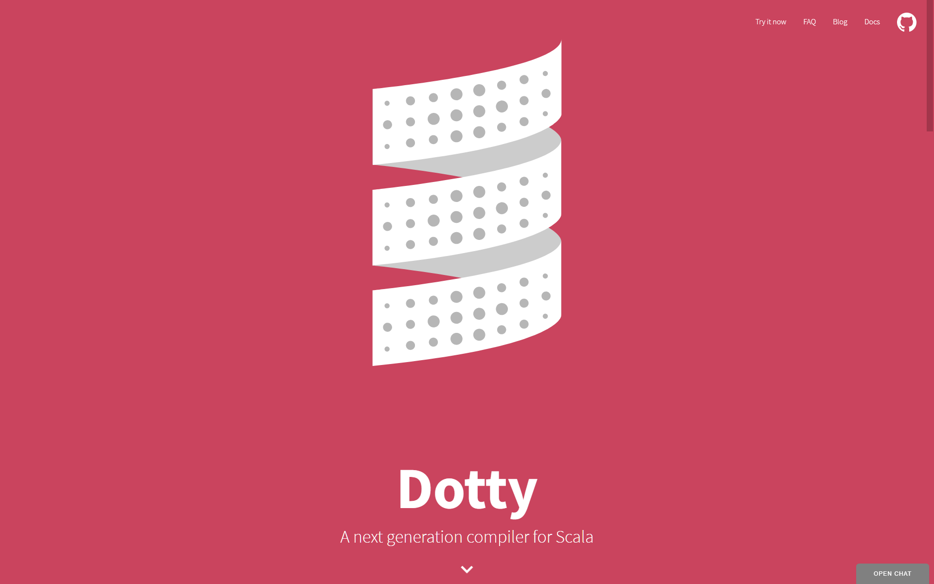
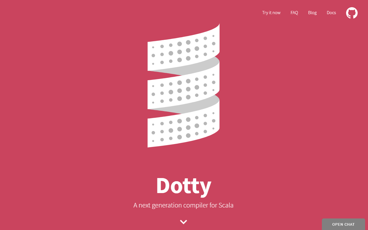
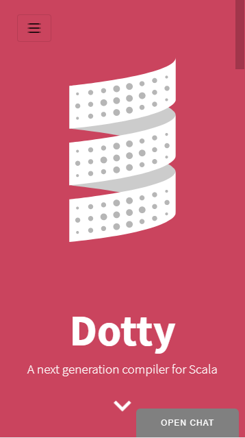
Changes the logo and slogan styling to scale based on screen height. This produces more suitable results on different screen sizes.
Also adds a height threshold to show mobile UI (previously, a wide but short window would not trigger the mobile UI, so the site wouldn't look very good viewing landscape on a phone).
1920x1200px (computer, high-res)
1280x800px (computer, low-res)
360x640px (phone, portrait)
640x360px (phone, landscape)
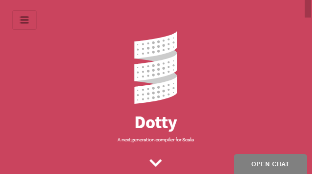
I've tested this change with many other different screen sizes within Chrome as well, with good results.