Repository navigation
Reading the Results
What each figure on the page means, and which ones are worth acting on.

| What it is | |
|---|---|
| Download / upload | Bandwidth in each direction, at the 90th percentile of samples |
| Latency, idle | Median round trip on an unloaded link |
| Latency, loaded | Median round trip while saturating down and up |
| Jitter | Variation in round trip |
| Packet loss | Fraction of a UDP burst that never came back through the relay |
The loaded-minus-idle difference is the number to watch. It is bufferbloat made visible: a link that adds 80 ms of latency the moment it is busy will feel bad on a call regardless of how many megabits it moves. The two small figures under Latency are the loaded readings, arrowed by direction.
On a LAN the absolute latency figures are largely browser quantisation — see Troubleshooting — but the difference between idle and loaded remains meaningful even when both are near the resolution floor. The page says so under the ratings when the readings sit at that floor, rather than presenting them as precise.

The row of chevrons under the controls is one chevron per request the profile will issue, grouped and coloured by stage: blue for latency, orange for download, purple for upload, red for packet loss. Adjacent stages of the same type alternate shade, so three downloads in a row do not read as one block.
It is drawn before the run starts, so the shape of the work is visible up front — you can see that a run is mostly latency pings, or that the large transfers have not begun.
Above the strip, a line names the stage that is running right now, in that stage's colour, with the payload it is moving. Its spinner follows the engine's own running state: pausing stops it, and a finished run hides it rather than leaving it turning.
Hovering a chevron gives the stage's payload size, its request count, its position in the profile, and — once it has finished — what it measured:

A stage marked warm-up is the engine's initial probe. It is exempt from
loaded_request_min_duration and its samples are left out of the bandwidth
figures entirely, so it reports no measurement — by design, not by failure.
Each direction is drawn as a filled area over its samples, with the reported 90th percentile marked. Hovering a point gives that individual request:
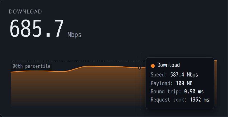
Speed, payload size, round trip, and how long the request took. The gap between "Speed" here and the headline figure is the difference between one sample and the percentile across all of them.
The curve is a monotone cubic (Fritsch–Carlson), not an ordinary spline. The distinction matters: a cardinal or Catmull-Rom spline overshoots between points, so a link ramping from nothing to 900 Mbps would be drawn dipping below zero on the way up and peaking above the fastest sample ever recorded. This curve is constrained to stay within the range of each pair of samples, so it smooths without inventing.

Three use cases — streaming, gaming and video calls — scored by the engine from
latency, jitter, packet loss, bandwidth and the loaded-latency increase, then
bucketed bad | poor | average | good | great. The thresholds are the engine's
own; we do not override them.
They can be absent. Every rating needs a usable loaded-latency figure, and on a very fast path the browser may not be able to resolve one. The page says so rather than showing an empty panel — see Troubleshooting, which is also where the Firefox caveat lives.
The headline bandwidth number is a single percentile, which says nothing about consistency — and consistency is what exposes a failing cable, a duplex mismatch or a saturated uplink. A link averaging 940 Mbps by holding steady and one averaging 940 Mbps by alternating between 500 and 1300 are very different networks, and only the second is a problem.
So the detail section draws a box plot per measurement:
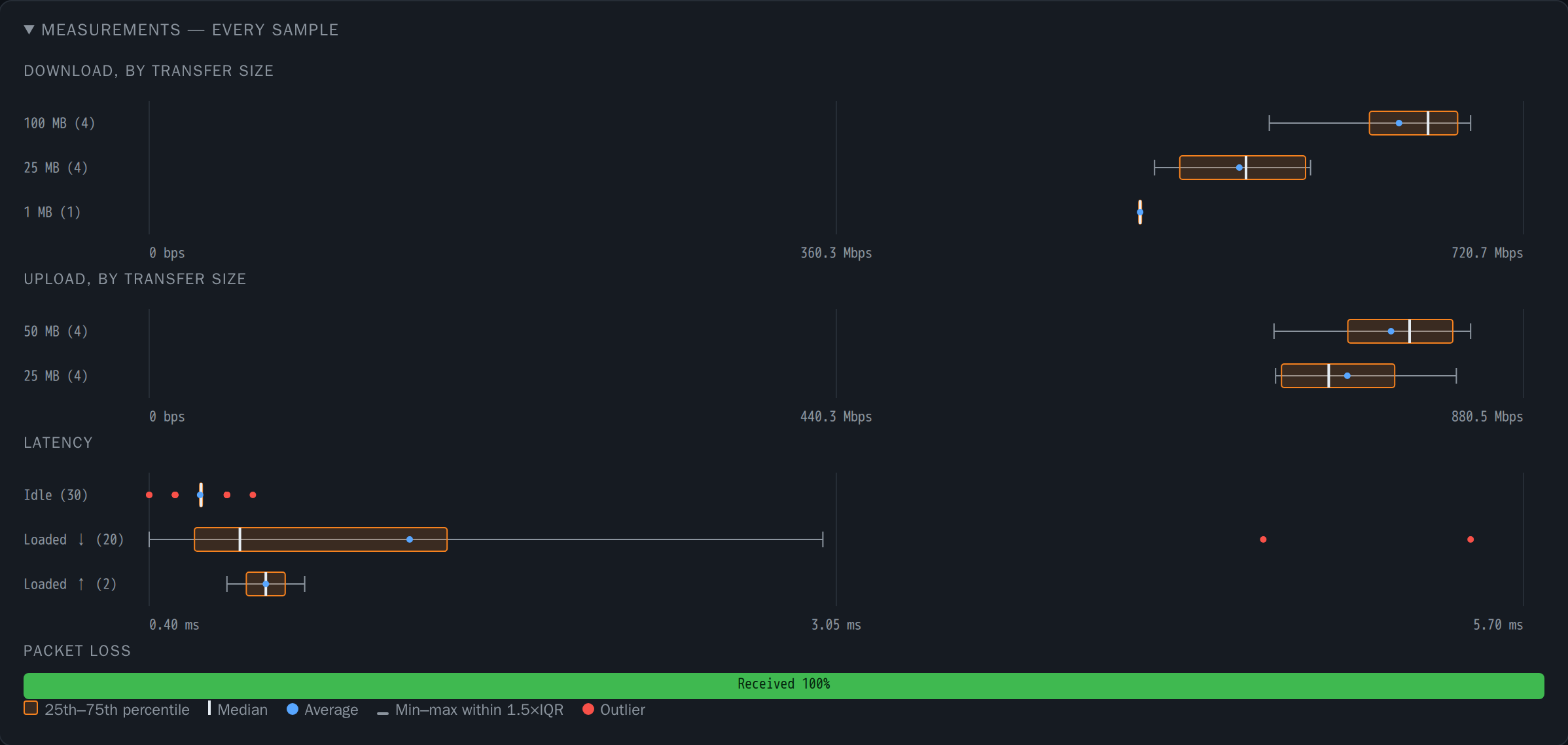
- Box — 25th to 75th percentile. A narrow box means a consistent link.
- Line in the box — median.
- Dot — the average. An average well away from the median means the distribution is skewed, usually by a few slow samples.
- Whiskers — the furthest samples still within 1.5×IQR of the box. They stop at a real sample, never at the fence, so nothing is invented.
- Dots beyond the whiskers — outliers. One slow request in a run of twenty is exactly the symptom worth chasing.
Hovering anywhere along a row — not just on the marks — gives the full summary in words:
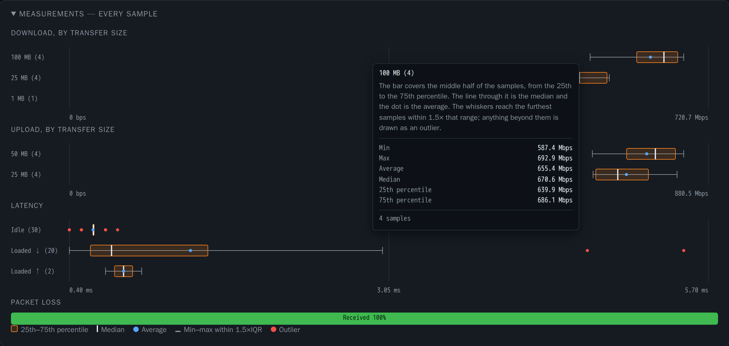
What the box and whiskers mean, then the minimum, maximum, average, median and the two quartiles, each named rather than abbreviated, and how many samples it is drawn from.
Each transfer size gets its own row. A small transfer spends most of its time on round-trip overhead rather than moving data, so its throughput is legitimately lower — pooling sizes into one distribution would make a perfectly healthy link look wildly inconsistent.
Compare rows of the same size across runs, not rows of different sizes within one run.
Linear interpolation between closest ranks — the "type 7" definition, the same one NumPy and Excel use by default. A figure shown here is what you get checking it in a spreadsheet.
A separate, on-demand measurement, and deliberately not comparable to the download figure above it.

The same link, measured twice: 670 Mbps through the engine, 1.01 Gbps across four parallel streams. Neither is wrong.
The engine issues one request at a time and reads every response through
r.text(), decoding the whole payload into a JavaScript string. That
faithfully represents what a single transfer experiences, and it is bounded by
single-stream TCP plus main-thread decoding rather than by the link.
The raw harness pulls several streams at once and discards bytes through the streaming reader, so nothing materialises the payload. It answers a different question: what the link carries when several things use it at once.
Expect the raw figure to be substantially higher — close to 2× on a 1 GbE link is normal. That gap is the engine's design showing, not a fault, and neither number is "the real one": they measure different things.
If you want to know whether the backend is the limit, take the browser out of the picture entirely:
curl -s -o /dev/null -w '%{speed_download} bytes/s\n' \
'https://HOST/__down?bytes=2000000000'- Download and upload near the link rate, with a narrow box and few outliers.
- Loaded latency within a millisecond or two of idle.
- Packet loss at 0%.
- Jitter at or below the browser's timing resolution.
Widening boxes over time, or outliers appearing where there were none, are worth investigating before the average moves — which is the point of keeping history.
See also: History and Metrics · Configuration · Troubleshooting · Engine Contract