Repository navigation
Feature Presets
preset picks a ready-made look in one line. Each preset is a bundle of the existing styling options, so you can still override any of them.
Config key: preset: default | ios | material | glass | minimal | rail
type: custom:tabdeck-card
preset: ios
tabs: [ ... ]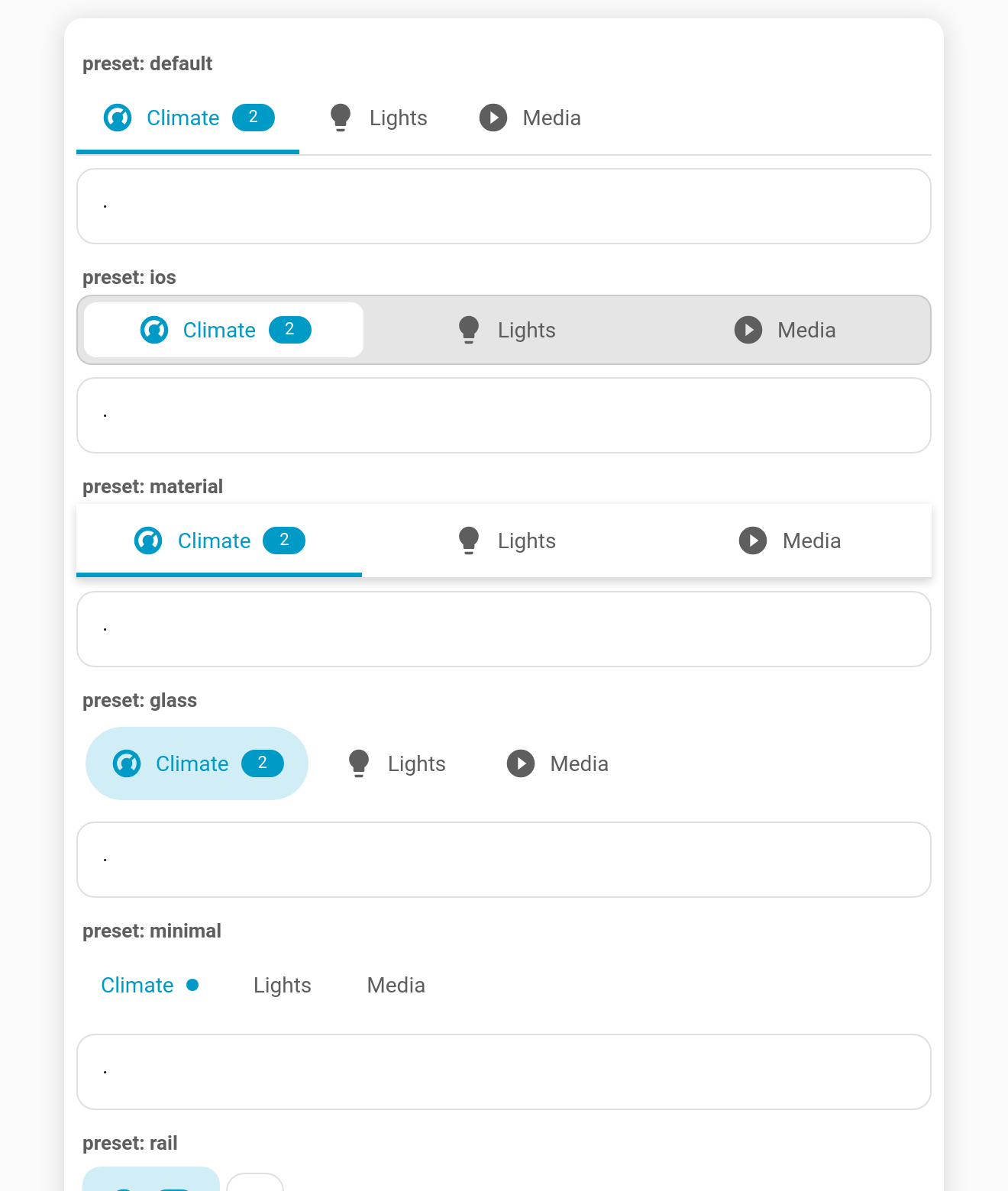
| Preset | What it sets |
|---|---|
default |
The stock look: underline, start-aligned, both. Handy in the editor to reset. |
ios |
segmented on a grey track, justify, 8 px radius, 36 px tabs. |
material |
underline, justify, elevation. |
glass |
pill, sticky, translucent frosted bar (color-mix background + --tabdeck-bar-backdrop: blur(12px)). |
minimal |
text style, labels only, dot badges. |
rail |
position: left, rail style, icons only. |
Every preset sets the same group of keys: position, style, align, tab_display, badge_display, indicator_size, indicator_radius, elevation, sticky, bar_background, plus any preset styles variables.
In YAML, anything you set explicitly wins over the preset, and styles are merged:
preset: glass
style: segmented                   # keep glass's frosted sticky bar, but segmented
styles:
--tabdeck-accent: orange # merged with glass's --tabdeck-bar-backdropStyle preset is the first field. Choosing one writes its values into the fields below (so you can see and tweak them) and swaps any preset styles variables, while keeping your own. Afterwards, editing a field simply overrides it.
--tabdeck-bar-backdrop sets a backdrop-filter on the bar (e.g. blur(12px)). When a sticky bar has a custom bar_background, the area behind it is now transparent, so translucent or blurred bars really show the content scrolling underneath.