Repository navigation
Feature Templated Fields
A tab's icon, name, subtitle, color and accent can each be a Home Assistant Jinja template. Home Assistant renders it and the tab updates live as states change. For example, a garage tab can show an open-door icon in red while the door is open.
Per-tab keys: icon, name, subtitle, color, accent. Any value containing {{ or {% is treated as a template.
type: custom:tabdeck-card
tabs:
  - name: >-
      {{ 'Garage (open)' if is_state('cover.garage_door', 'open') else 'Garage' }}
    icon: >-
      {{ 'mdi:garage-open' if is_state('cover.garage_door', 'open') else 'mdi:garage' }}
    color: >-
      {{ 'var(--error-color)' if is_state('cover.garage_door', 'open') else '' }}
    card:
      type: tile
      entity: cover.garage_door
  - name: Climate
    subtitle: "{{ states('sensor.living_room_temperature') }} °C"
    icon: mdi:thermostat
    card: { ... }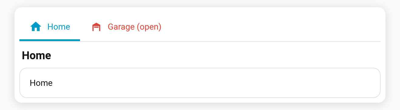
- Templates are rendered server-side over the websocket (the same engine as template badges), and update the moment their inputs change.
- An empty result (e.g. the
else ''branch above) counts as unset:colorfalls back to the normal colour, andiconshows no icon. - While a template is still rendering (the first moment after load), the field is treated as unset.
- Plain strings (no
{{/{%) behave exactly as before, and nothing is subscribed. - The content header shows the rendered name and subtitle.
-
remember: urlanddefault_tab: <name>match the tab's configured name. If you use either with a templated name, prefer an index (default_tab: 1,#tab=1). - The editor's live preview shows templated fields as placeholders. They render on the dashboard.