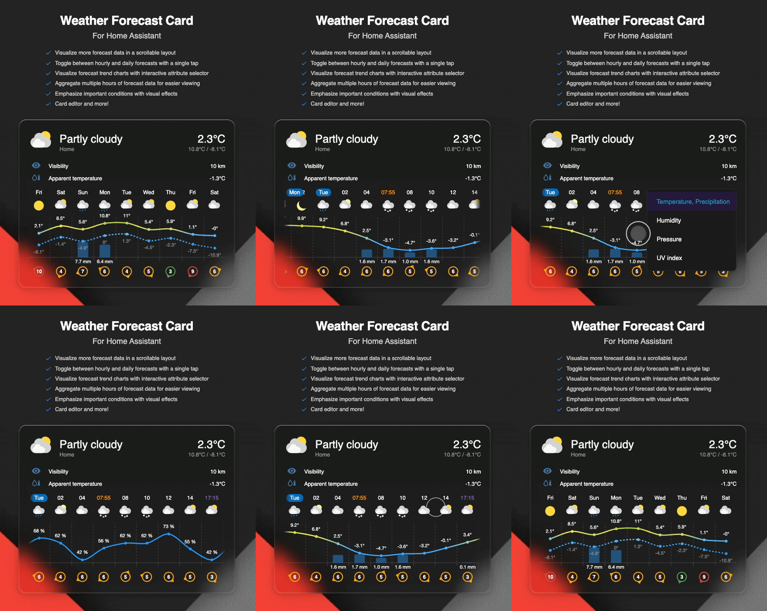



A custom weather card for Home Assistant that displays current weather and forecast in a scrollable horizontal list or chart.
Note
This card is under active development and primarily built for my personal use cases but if you find it useful, feel free to use and share feedback!
While rebuilding my Home Assistant dashboard, I wanted a weather card with features from several existing custom cards as there wasn't a single card available that would satisfy my requirements. This led me to create this custom card, bringing together the best aspects of popular weather cards plus extras like horizontal scrolling and tap‑to‑toggle between hourly and daily forecasts.
This card takes inspiration from Weather Forecast Extended Card, Weather Chart Card, and the built-in Home Assistant Weather Forecast Card.
Key features:
- Scrollable forecast – Visualize more forecast data in a scrollable layout
- Toggle views – Switch between hourly and daily forecasts with a tap
- Visualize precipitation – See precipitation amounts for each forecast entry
- Chart mode – Visualize forecast trend charts with interactive attribute selector
- Extra attributes – Display extra attributes, like wind direction, wind bearing, or precipitation probability
- Group hourly data - Aggregate multiple hours of forecast data for easier viewing
- Custom icons – Use your own weather icons
- Customizable actions – Configure tap, hold, and double-tap behaviors
- Sun times - Visualize sunrise and sunset
- Condition effects - Add a special touch with animated weather effects
- Card editor - Configure the card directly in the UI. No YAML required
The card is available in HACS (Home Assistant Community Store). Use the following link to directly go to the repository in HACS:

Or manually:
- Open Home Assistant
- Go to Settings → Devices & Services → HACS
- Search for "Weather Forecast Card"
- Click "Download"
You can now add the card to your dashboard by clicking "Edit dashboard" from the top right corner. You may need to clear your browser cache.
- Download the latest
weather-forecast-card.jsfrom the releases page - Copy it to your
config/wwwfolder - Add the resource to your Lovelace configuration:
resources:
  - url: /local/weather-forecast-card.js
type: module- Restart Home Assistant
| Name | Type | Default | Description |
|---|---|---|---|
type |
string |
Required | custom:weather-forecast-card |
entity |
string |
Required | The weather entity id (e.g., weather.home). |
name |
string |
optional | Custom name to display. Defaults to the entity's friendly name. |
show_current |
boolean |
true |
Show current weather conditions. |
show_forecast |
boolean |
true |
Show forecast section. |
default_forecast |
string |
daily |
Default forecast to view (daily or hourly). |
forecast_types |
string |
both |
Which forecast types to subscribe to: both, daily, or hourly. Loading only the forecast you display reduces websocket load, which can prevent slowdowns on low-power devices (e.g. wall tablets). |
icons_path |
string |
optional | Path to custom icons. For example, /local/img/my-custom-weather-icons. See Custom Weather Icons for more details. |
show_condition_effects |
boolean/array |
optional | Enable animated weather condition effects. Set to true for all conditions or provide an array of specific effects. See Weather Condition Effects. |
show_moon_phase |
boolean |
true |
When the moon effect is shown, shades the moon to match the current lunar phase based on your Home Assistant location. Set to false to always show a full moon. |
current |
object |
optional | Current weather configuration options. See Current Object. |
forecast |
object |
optional | Forecast configuration options. See Forecast Object. |
forecast_action |
object |
optional | Actions for the forecast area. See Forecast Actions. |
tap_action |
object |
optional | Defines the type of action to perform on tap for the main card. Action defaults to more-info. See Home Assistant Actions. |
hold_action |
object |
optional | Defines the type of action to perform on hold for the main card. See Home Assistant Actions. |
double_tap_action |
object |
optional | Defines the type of action to perform on double click for the main card. See Home Assistant Actions. |
The current object controls the display of current weather information and attributes.
| Name | Type | Default | Description |
|---|---|---|---|
temperature_entity |
string |
optional | Bring your own temperature entity to override the temperature from the main weather entity. Note: The root level temperature_entity is deprecated but still supported and will be migrated automatically when editing the card using the card editor. |
show_attributes |
boolean/string/array |
optional | Display weather attributes below current conditions. Set to true to show all available attributes, false to hide all, a single attribute name (e.g., "humidity"), or an array of attribute names or objects. Objects can override the value entity, label and icon, or display an arbitrary entity. See Custom Attributes for advanced configuration. |
secondary_info_attribute |
string/object |
optional | Controls which secondary info is displayed below current temperature. Supports all available weather attributes. Can also be an object { name?, entity?, icon? } to source the value from a custom entity (see Custom Attributes; note that label is not rendered for secondary info). If not set, or if the given attribute is not available in the weather entity, it will default to temperature extrema (high/low) if available, if not available then precipitation and if precipitation isn't available then humidity. |
temperature_precision |
number |
optional | Number of decimal places to display for temperature values (0-2). Applies to current temperature, high/low temperatures, and temperature-related attributes like dew point and apparent temperature. |
attributes_layout |
string |
default |
Layout of the attributes list. default is a full-width vertical list (icon + label + value, one per line). compact is a fixed two-column grid of icon + value chips: labels are dropped (kept as a hover tooltip), and the right column is mirrored so icons sit against both card edges. |
Available attributes:
humidity- Relative humidity percentagepressure- Atmospheric pressurewind_speed- Wind speed with direction (if available)wind_gust_speed- Wind gust speedvisibility- Visibility distanceozone- Ozone leveluv_index- UV indexdew_point- Dew point temperatureapparent_temperature- Feels like temperaturecloud_coverage- Cloud coverage percentage
Note
Attributes are only rendered if the data is available from your weather entity (or custom sensor entity if configured). If an attribute is not provided by your weather integration, it will not be displayed even if configured.
Similar to the current.temperature_entity option, each displayed attribute can be customized. You can override an attribute's value with a custom sensor entity (useful when your weather integration doesn't provide it, or when you have a more accurate local sensor), give it a custom label or icon, or display an arbitrary entity that isn't a standard weather attribute.
Object format for attributes:
| Property | Type | Description |
|---|---|---|
name |
string |
Optional. A known weather attribute (e.g., humidity, pressure). Omit it for an entity-only item that displays a custom entity's state. |
entity |
string |
Optional. Entity ID to source the value from instead of the weather entity. Required when name is omitted. |
label |
string |
Optional. Custom label shown instead of the derived attribute name or the entity's friendly name. |
icon |
string |
Optional. Custom icon (e.g., mdi:weather-windy) shown instead of the default attribute or entity icon. |
Note
Each item must have a name, an entity, or both. An entity-only item (no name) is displayed as an "arbitrary" attribute: its value is the entity's state and its label defaults to the entity's friendly name unless you set label.
Configuration examples:
# Simple array of attribute names (uses weather entity values)
current:
  show_attributes:
    - humidity
    - pressure
    - wind_speed
# Object format with custom entities
current:
show_attributes:
- name: humidity
entity: sensor.outdoor_humidity
- name: pressure
entity: sensor.barometer
- name: wind_speed # No entity specified, uses weather entity# Mixed format (strings and objects)
current:
show_attributes:
- humidity # Uses weather entity
- name: pressure
entity: sensor.custom_pressure
- wind_speed # Uses weather entity# Custom label and icon
current:
show_attributes:
- name: wind_speed
label: Wind
icon: mdi:weather-windy# Arbitrary entities (no weather attribute name), shows the entity state
current:
show_attributes:
- entity: sensor.pollen_count
label: Pollen
icon: mdi:flower
- entity: sensor.uv_today # label defaults to the entity's friendly name
- humidity # Standard weather attribute alongside custom ones# Compact two-column layout (icon + value chips, no labels)
current:
attributes_layout: compact
show_attributes:
- humidity
- pressure
- wind_speed
- visibilityTip
The card editor supports this too. When you select standard attributes, the "Attribute entities" section provides an entity selector (with device class filtering) plus optional label and icon fields for each. Arbitrary entity attributes can be added and removed under the "Custom entity attributes" section.
| Name | Type | Default | Description |
|---|---|---|---|
extra_attribute |
string | optional | The extra attribute to show below the weather forecast. Currently supports precipitation_probability, wind_direction, wind_bearing and uv_index. |
hourly_group_size |
number | 1 |
Number of hours to group together in hourly forecast. Group data will be aggregated per forecast attribute. |
hourly_slots |
number | optional | Limit the number of hourly forecast entries to show. Defaults to unlimited. Value must be greater than 0. |
daily_slots |
number | optional | Limit the number of daily forecast entries to show. Defaults to unlimited. Value must be greater than 0. |
mode |
string | simple |
Forecast display mode. simple: Horizontal scrollable list of forecast entries. chart: Visualize temperature and precipitation trends on a line/bar chart. |
scroll_to_selected |
boolean | true |
Automatically scrolls to the first hourly forecast of the selected date when switching to hourly view, and returns to the first daily entry when switching back. |
show_sun_times |
boolean | true |
Displays sunrise and sunset times in the hourly forecast, and uses specific icons to visualize clear night conditions. |
temperature_precision |
number | optional | Number of decimal places to display for temperature values (0-2). Applies to forecast temperatures shown in chart mode. Due to the layout limitations, this setting is not affecting simple mode which uses fixed precision of 0. |
use_color_thresholds |
boolean | true |
Replaces solid temperature lines with a gradient based on actual values when using forecast chart mode. Colors transition at fixed intervals: -10° (Cold), 0° (Freezing), 8° (Chilly), 18° (Mild), 26° (Warm), and 34° (Hot). These thresholds are specified in degrees Celsius (°C). |
show_attribute_selector |
boolean | false |
Displays a settings icon in the top-right corner of the chart for quick access to the attribute selector. The attribute selector is also accessible via hold action by default. See Chart Attribute Selector. |
default_chart_attribute |
string | temperature_and_precipitation |
The weather attribute to display by default in chart mode. See Chart Attribute Selector for available values. |
Important
Canvas width limit: To ensure cross-browser compatibility and prevent rendering issues, the canvas width is capped at 16384 pixels in chart mode. At a standard item width of 50px, this supports approximately 320 entries (roughly two weeks of data) which is more than enough to cover reliable weather data from most forecast services. Any data exceeding this limit will be truncated.
Actions support standard Home Assistant card actions. However, two additional actions have been defined:
toggle-forecast- Toggles the forecast between daily and hourly viewsselect-forecast-attribute- Opens the attribute selector dropdown in chart mode (default hold action)
Forecast actions have the following options
| Name | Type | Default action | Description |
|---|---|---|---|
tap_action |
object |
toggle-forecast |
Defines the type action to perform on tap. See Home Assistant Actions. |
hold_action |
object |
select-forecast-attribute |
Defines the type of action to perform on hold. See Home Assistant Actions. |
double_tap_action |
object |
none |
Defines the type of action to perform on double click. See Home Assistant Actions. |
When using chart mode (mode: chart), an interactive attribute selector allows switching between different weather data visualizations.
Available chart attributes:
temperature_and_precipitation- Default dataset visualizing temperature curves (high/low) and precipitation barsapparent_temperature- Visualizes apparent temperature as line graphhumidity- Visualizes relative humidity as a line graphpressure- Visualizes atmospheric pressure as line graphuv_index- Visualizes UV index as a bar graph. Decimal values are rounded to integers as per WHO international standards for public health reporting, ensuring clear risk-category communication.
Note
Attributes are only shown in the selector if the data is available from your weather entity. If an attribute is not provided by your weather integration, it will not appear in the dropdown.
Note
Currently, only chart mode supports selecting the weather attribute.
Usage:
The attribute selector can be accessed via:
- Hold action (default): Press and hold on the chart area to open the attribute dropdown. This works by default without any additional configuration.
- Settings icon: Set
show_attribute_selector: trueto display a settings icon in the top-right corner of the chart for quick access.
Example configuration with settings icon:
type: custom:weather-forecast-card
entity: weather.home
forecast:
  mode: chart
show_attribute_selector: truetype: custom:weather-forecast-card
entity: weather.home
current:
show_attributes:
- humidity
- pressure
- wind_speed
forecast:
mode: chart
extra_attribute: wind_directionThe card supports animated visual effects that respond to current weather conditions, adding an immersive layer to your weather display. These effects are rendered as background animations behind the card content.
Warning
Performance Note: Weather animations utilize CSS processing, which can increase CPU usage. On low-powered devices, or when displaying multiple cards simultaneously, this may cause UI sluggishness. If performance drops, consider disabling animations or selecting only the most essential effects.
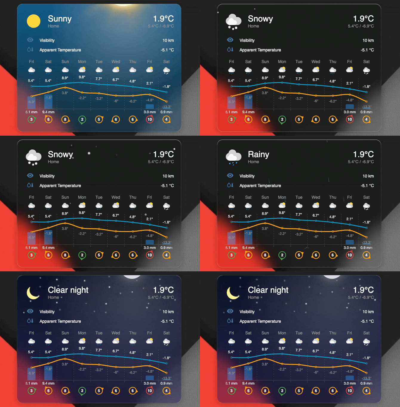
Enable weather effects using the show_condition_effects option:
Enable all effects:
type: custom:weather-forecast-card
entity: weather.home
show_condition_effects: true
Enable specific effects only:
type: custom:weather-forecast-card
entity: weather.home
show_condition_effects:
  - rain
  - snow
  - lightning
Disable all effects (default):
type: custom:weather-forecast-card
entity: weather.home
show_condition_effects: falseThe card provides seven different effect types that can be individually enabled or disabled:
| Effect Type | Description | Weather Conditions Applied |
|---|---|---|
rain |
Animated raindrops falling with realistic wind drift. Droplet angle and speed adapt to wind conditions from weather data. Includes splash effects on landing. | rainy, pouring, lightning-rainy |
snow |
Snowflakes falling with smooth sinusoidal drift patterns. Each flake follows a unique non-linear trajectory with varying sizes, opacity, and depths for realistic parallax effects. | snowy, snowy-rainy |
lightning |
Dramatic lightning flash sequences with multiple strikes and residual flickers, creating an authentic storm atmosphere. | lightning, lightning-rainy |
sky |
Visually pleasing gradient sky background that adapts to time of day if sun times are enabled. Renders a soft overcast deck for cloudy. |
sunny, clear-night, cloudy, partlycloudy |
sun |
Animated sun with rotating rays positioned at the top of the card. Creates a warm, dynamic daytime atmosphere. Automatically switches to moon effect after sunset if sun times are shown. | sunny, partlycloudy |
moon |
Photorealistic moon using a NASA lunar surface image, glowing above animated twinkling stars scattered across the card. By default it is shaded to match the current lunar phase for your location, with the glow following the sunlit limb (disable phase shading with show_moon_phase: false). Stars have randomized positions, sizes, and twinkle animations for a serene nighttime atmosphere. |
clear-night, partlycloudy/sunny (with sun times) |
cloud |
Soft, realistic clouds drifting across the sky, their speed influenced by wind. cloudy shows a fuller grey deck over an overcast sky; partlycloudy shows a few lighter clouds alongside the sun or moon. Clouds are dimmed at night. |
cloudy, partlycloudy |
You can use your own custom weather icons by specifying the icons_path configuration option.
- Place your custom weather icon files in a directory accessible to Home Assistant (e.g.,
/local/img/weather-icons/) - Name your icons to match the weather conditions (see Icon Naming below)
- Set the
icons_pathin your card configuration
Icons should be named after the weather condition states used by Home Assistant. Note that if suntimes are enabled (with config forecast.show_sun_times), few extra condition icons need to be defined in addition to the standard Home Assistant weather conditions. Icon mappings is as follows:
| Weather Condition | Icon Filename | Notes |
|---|---|---|
clear-night |
clear-night.svg |
Night variant (custom when sun is down) |
cloudy |
cloudy.svg |
|
fog |
fog.svg |
|
hail |
hail.svg |
|
lightning |
lightning.svg |
|
lightning-rainy |
lightning-rainy.svg |
|
partlycloudy |
partlycloudy.svg |
|
| - | partlycloudy-night.svg |
Night variant (custom when sun is down) |
pouring |
pouring.svg |
|
rainy |
rainy.svg |
|
snowy |
snowy.svg |
|
snowy-rainy |
snowy-rainy.svg |
|
sunny |
sunny.svg |
|
windy |
windy.svg |
|
windy-variant |
windy-variant.svg |
|
exceptional |
exceptional.svg |
Used when state doesn't mape to any known state |
Note
Only SVG format is currently supported.
Example configuration with custom icons:
type: custom:weather-forecast-card
entity: weather.home
icons_path: /local/img/weather-icons
This will load icons from /local/img/weather-icons/sunny.svg, /local/img/weather-icons/rainy.svg, etc.
The card can be customized using Home Assistant theme variables. Most colors, sizes, and visual elements can be overridden by defining CSS variables in your theme configuration.
Add these variables to your Home Assistant theme to customize the card's appearance:
| Variable Name | Default | Description |
|---|---|---|
weather-forecast-card-wind-low-color |
var(--success-color, #43a047) |
Wind indicator color for low wind speeds |
weather-forecast-card-wind-medium-color |
var(--warning-color, #ffa600) |
Wind indicator color for medium wind speeds |
weather-forecast-card-wind-high-color |
var(--error-color, #db4437) |
Wind indicator color for high wind speeds |
weather-forecast-card-temp-cold-color |
#2196f3 |
Temperature color for cold conditions. Used when use_color_thresholds is true |
weather-forecast-card-temp-freezing-color |
#4fb3ff |
Temperature color for freezing conditions. Used when use_color_thresholds is true |
weather-forecast-card-temp-chilly-color |
#ffeb3b |
Temperature color for chilly conditions. Used when use_color_thresholds is true |
weather-forecast-card-temp-mild-color |
#4caf50 |
Temperature color for mild conditions. Used when use_color_thresholds is true |
weather-forecast-card-temp-warm-color |
#ff9800 |
Temperature color for warm conditions. Used when use_color_thresholds is true |
weather-forecast-card-temp-hot-color |
#f44336 |
Temperature color for hot conditions. Used when use_color_thresholds is true |
weather-forecast-card-chart-temp-low-line-color |
#2196f3 |
Default chart line color for low temperature. Corresponds to cold threshold color. |
weather-forecast-card-chart-temp-high-line-color |
#ff9800 |
Default chart line color for high temperature. Corresponds to warm threshold color. |
weather-forecast-card-chart-humidity-line-color |
var(--blue-color, #2196f3) |
Chart line color for humidity attribute in chart mode |
weather-forecast-card-chart-pressure-line-color |
var(--cyan-color, #00bcd4) |
Chart line color for pressure attribute in chart mode |
weather-forecast-card-chart-uv-bar-color |
var(--amber-color, #ffc107) |
Fallback chart bar color for UV index when value is missing/unknown; normal UV bars use weather-forecast-card-uv-*-color |
weather-forecast-card-uv-low-color |
#289500 |
UV index bar color for low risk level (0-2) |
weather-forecast-card-uv-moderate-color |
#f7e400 |
UV index bar color for moderate risk level (3-5) |
weather-forecast-card-uv-high-color |
#f85900 |
UV index bar color for high risk level (6-7) |
weather-forecast-card-uv-very-high-color |
#d8001d |
UV index bar color for very high risk level (8-10) |
weather-forecast-card-uv-extreme-color |
#6b49c8 |
UV index bar color for extreme risk level (11+) |
weather-forecast-card-chart-font-size |
12px |
Font size for chart labels. Can be a number or in pixels. Chart height and padding scale automatically. |
weather-forecast-card-chart-label-color |
var(--primary-text-color, #000) |
Default color for chart labels |
weather-forecast-card-chart-temp-high-label-color |
var(--chart-label-color) |
Chart label color for high temperature |
weather-forecast-card-chart-temp-low-label-color |
var(--secondary-text-color, #9b9b9b) |
Chart label color for low temperature |
weather-forecast-card-chart-precipitation-label-color |
var(--chart-label-color) |
Chart label color for precipitation |
weather-forecast-card-chart-grid-color |
Color mix 15% opaque text | Chart grid line color |
weather-forecast-card-precipitation-bar-color |
Color mix 40% blue | Precipitation bar color |
weather-forecast-card-sunrise-color |
var(--orange-color, #ff9800) |
Sunrise time indicator color |
weather-forecast-card-sunset-color |
var(--purple-color, #926bc7) |
Sunset time indicator color |
weather-forecast-card-day-indicator-color |
#056bb8 |
Background color for day indicator badge |
weather-forecast-card-day-indicator-text-color |
#ffffff |
Text color for day indicator badge |
weather-forecast-card-current-conditions-icon-size |
64px |
Size of the current weather condition icon |
weather-forecast-card-forecast-conditions-icon-size |
28px |
Size of forecast weather condition icons |
Note
Chart attribute colors: When visualizing UV index with chart mode, the bar groupings follow the Global Solar UV Index (UVI) risk categories (0–2, 3–5, 6–7, 8–10, 11+). The default bar colors are theme-configurable values (see the table above) and are not an official WHO color standard.
Customize the appearance of animated weather effects when show_condition_effects is enabled:
| Variable Name | Default | Description |
|---|---|---|
weather-forecast-card-effects-sun-size |
140px |
Size of the animated sun |
weather-forecast-card-effects-sun-spin-duration |
100s |
Duration of the sun ray rotation animation |
weather-forecast-card-effects-sun-color |
Light: #facc15 / Dark: #fbbf24 |
Color of the sun |
weather-forecast-card-effects-sun-ray-color |
Light: rgba(253, 224, 71, 0.4) / Dark: rgba(251, 191, 36, 0.5) |
Color of the sun rays |
weather-forecast-card-effects-moon-size |
100px |
Size of the moon |
weather-forecast-card-effects-moon-image |
NASA lunar surface image (embedded) | Moon surface image. Override with a url(...), e.g. url(/local/my-moon.png) |
weather-forecast-card-effects-moon-color |
rgba(220, 220, 230, 1) |
Fallback color behind the moon image |
weather-forecast-card-effects-moon-shadow-color |
rgba(28, 32, 54, 0.6) (light) / rgba(8, 10, 24, 0.72) (dark) |
Color of the moon's unlit phase shadow |
weather-forecast-card-effects-moon-glow-color |
rgba(214, 224, 255, 0.5) (light) / rgba(214, 224, 255, 0.55) (dark) |
Color of the moon's glow (halo follows the lit limb) |
weather-forecast-card-effects-star-color |
#ffffff |
Color of the stars in night sky |
weather-forecast-card-effects-snow-color |
Light: #cbd5e1 / Dark: #ffffff |
Color of snowflakes |
weather-forecast-card-effects-rain-color |
Light: #2563eb / Dark: #6cb4ee |
Color of rain drops |
weather-forecast-card-effects-drop-height |
20px |
Height of individual rain drops |
weather-forecast-card-effects-sky-visibility |
visible |
Visibility of sky gradient background (visible/hidden) |
weather-forecast-card-effects-clear-sky-color |
Light: rgba(30, 130, 230, 0.6) / Dark: rgba(3, 105, 161, 0.8) |
Day clear sky gradient primary color |
weather-forecast-card-effects-clear-sky-accent |
Light: rgba(100, 180, 240, 0.45) / Dark: rgba(7, 89, 133, 0.6) |
Day clear sky gradient accent color |
weather-forecast-card-effects-clear-sky-horizon |
Light: rgba(210, 235, 255, 0.3) / Dark: rgba(12, 74, 110, 0.4) |
Day clear sky gradient horizon color |
weather-forecast-card-effects-clear-night-sky-color |
Light: rgba(49, 46, 129, 0.7) / Dark: rgba(10, 15, 40, 0.85) |
Night clear sky gradient primary color |
weather-forecast-card-effects-clear-night-sky-accent |
Light: rgba(88, 28, 135, 0.55) / Dark: rgba(20, 30, 80, 0.6) |
Night clear sky gradient accent color |
weather-forecast-card-effects-clear-night-horizon |
Light: rgba(236, 72, 153, 0.4) / Dark: rgba(40, 25, 100, 0.4) |
Night clear sky gradient horizon color |
weather-forecast-card-effects-overcast-sky-color |
Light: rgba(118, 132, 148, 0.42) / Dark: rgba(60, 70, 82, 0.55) |
Day overcast (cloudy) sky gradient primary color |
weather-forecast-card-effects-overcast-sky-accent |
Light: rgba(152, 165, 180, 0.34) / Dark: rgba(78, 89, 102, 0.45) |
Day overcast sky gradient accent color |
weather-forecast-card-effects-overcast-sky-horizon |
Light: rgba(196, 206, 216, 0.24) / Dark: rgba(102, 113, 126, 0.3) |
Day overcast sky gradient horizon color |
weather-forecast-card-effects-overcast-night-color |
Light: rgba(38, 44, 56, 0.8) / Dark: rgba(16, 20, 28, 0.88) |
Night overcast sky gradient primary color |
weather-forecast-card-effects-overcast-night-accent |
Light: rgba(55, 62, 76, 0.65) / Dark: rgba(30, 36, 47, 0.7) |
Night overcast sky gradient accent color |
weather-forecast-card-effects-overcast-night-horizon |
Light: rgba(78, 86, 100, 0.45) / Dark: rgba(48, 55, 68, 0.5) |
Night overcast sky gradient horizon color |
weather-forecast-card-effects-cloud-color |
Light: #f4f7fb / Dark: #dfe6ee |
Base color of the drifting clouds |
weather-forecast-card-effects-text-shadow |
0 1px 2px rgba(0, 0, 0, 0.5), 0 0 4px rgba(0, 0, 0, 0.35) |
Legibility shadow on the current state and temperature so they stay readable over the drifting clouds (cloudy / partlycloudy). Applied in dark theme only, where light text sits over light clouds; in light theme the dark text already has enough contrast so no shadow is drawn. Set to none to disable |
weather-forecast-card-effects-text-shadow-secondary |
0 1px 2px rgba(0, 0, 0, 0.55) |
Legibility shadow on the smaller secondary text (entity name and secondary info). A tighter shadow than the primary one to keep small text crisp. Applied in dark theme only. Set to none to disable |
Note
Weather effects variables support both light and dark themes. Colors automatically adjust based on your theme's dark mode setting, with separate default values optimized for each mode.
Add any of the variables to your themes to customize the card:
my-custom-theme:
  # Weather Forecast Card customization
  weather-forecast-card-chart-temp-high-line-color: "#ff5722"

  # Chart visualization colors
  weather-forecast-card-chart-humidity-line-color: "#1976d2"
  weather-forecast-card-chart-pressure-line-color: "#0097a7"
  weather-forecast-card-uv-low-color: "#00ff00"

  # Weather Forecast Card effects customization
  weather-forecast-card-effects-sun-color: "#fbbf24"
Note
These variables are applied through Home Assistant's theme system. Make sure to reload your theme after making changes.
The card uses Home Assistant's font size variables. You can customize these via your theme or using card-mod.
Available font size variables:
| Variable | Default | Used For |
|---|---|---|
--ha-font-size-3xl |
28px |
Current weather conditions and temperature |
--ha-font-size-xl |
20px |
Current weather conditions and temperature (smaller screens), secondary info icon, chart header |
--ha-font-size-l |
16px |
Wind speed text in wind indicators |
--ha-font-size-m |
14px |
Forecast labels, current weather attributes, forecast primary time labels |
--ha-font-size-s |
12px |
Forecast secondary time labels, simple forecast precipitation amount |
Theme example:
my-custom-theme:
  # Adjust font sizes globally for all cards
  ha-font-size-3xl: 32px
  ha-font-size-l: 18px
Card-mod example:
Configure font size for all elements:
type: custom:weather-forecast-card
entity: weather.home
card_mod:
  style: |
    ha-card {
      /* Larger current conditions and temperature */
      --ha-font-size-3xl: 38px;
      --ha-font-size-xl: 30px;
      /* Larger forecast temperatures (simple mode) */
      --ha-font-size-m: 16px;
      /* Make simple forecast items wider to avoid text overflow */
      --forecast-item-width: 75px;
    }
Or if you want more granular control:
type: custom:weather-forecast-card
entity: weather.home
card_mod:
  style: |
    ha-card {
      /* Make simple forecast items wider to avoid text overflow */
      --forecast-item-width: 70px;
    }
    /* Affects only font sizes in the current weather section */
    .wfc-current-weather {
      /* Larger current conditions and temperature */
      --ha-font-size-3xl: 38px;
      --ha-font-size-xl: 30px;
    }
    /* Affects only forecast section */
    .wfc-forecast {
      /* Forecast header and temperatures font (simple mode) */
      --ha-font-size-m: 20px;
    }
Note
Chart labels use a dedicated variable weather-forecast-card-chart-font-size (default 12px) which can be set via themes. See the Theme Variables table above.
This repo is MIT Licensed