Barplot
The barplot visualization renders one horizontal, stacked bar per dataset. Each bar is divided into chunks, one for each category present in that dataset, and the same category keeps the same colour and the same position across every bar, which makes the bars directly comparable to one another. A legend below or beside the plot names each category.
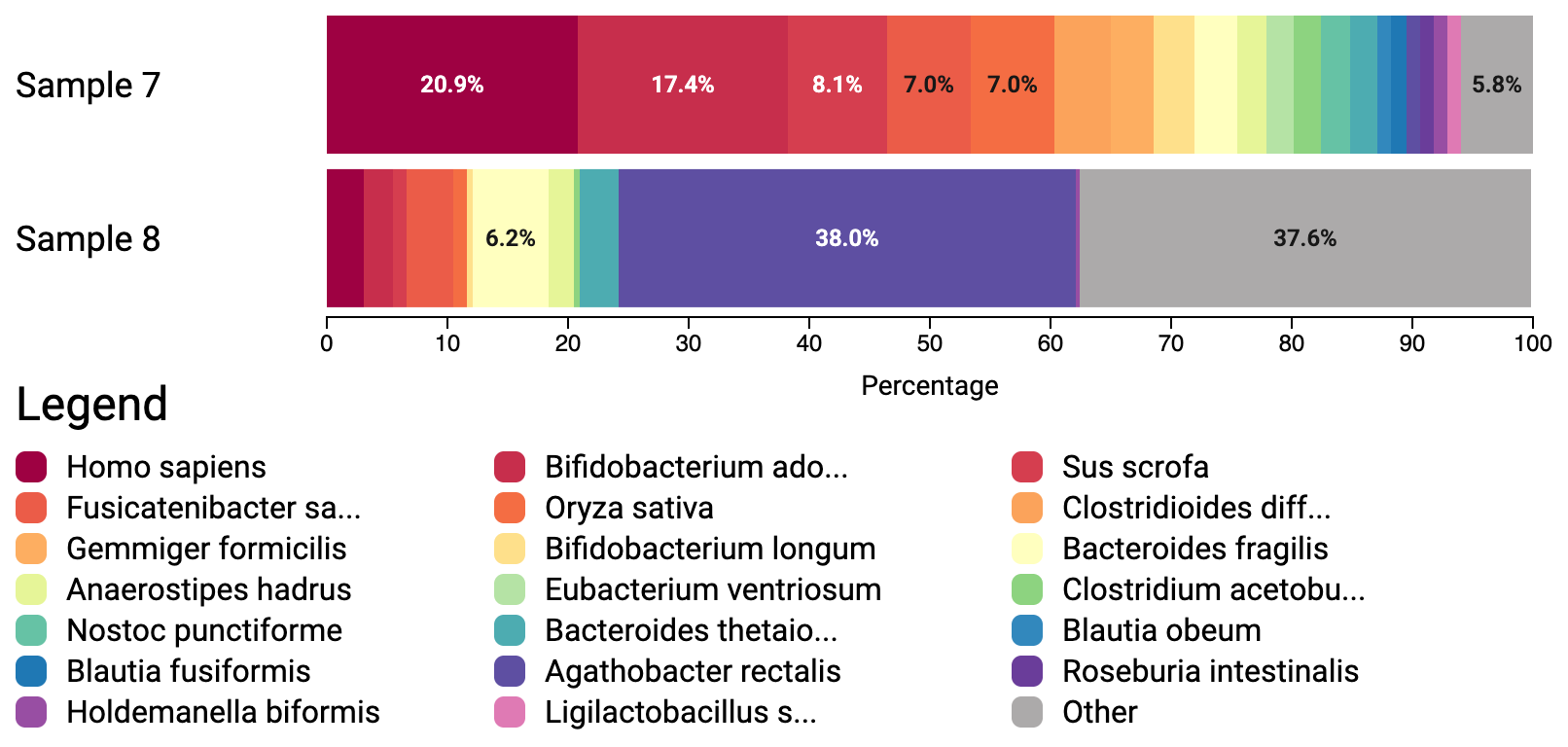 A live example of this visualization is available, and its source is in
 examples/barplot-taxonomy.html.
The barplot is rendered as an SVG and can thus be exported as an SVG file.
Two preprocessing steps happen before anything is drawn. First, the categories are sorted by their size in the first bar, and that order is then imposed on all the other bars, so a category occupies the same slot everywhere. Second, when maxItems is set, only that many categories survive; everything else in every bar is summed into a single trailing Other category. Setting maxItems to undefined keeps all categories and produces no Other group.
When displayMode is "relative", the counts of each bar are rescaled to percentages of that bar's own total, so bars with very different totals still occupy the full width.
The constructor of the Barplot class automatically starts rendering the barplot upon invocation and has the following signature:
-
element: HTMLElement: TheHTMLElementin which the barplot should be rendered. -
data: Bar[]: One entry per bar. See below for the shape of aBar. -
options: BarplotSettings(optional): Can be used to configure the barplot before rendering. See below for all the options that are currently supported.
Unlike the treeview, treemap and sunburst, the barplot does not take hierarchical data. It takes a flat list of bars, each holding a flat list of items:
interface BarItem {
    label: string,
    counts: number
}

interface Bar {
    items: BarItem[],
    label: string
}-
Bar.labelis the name of the dataset and is what gets drawn in front of the bar whenshowBarLabelis enabled. -
BarItem.labelidentifies a category. Items sharing a label across different bars are treated as the same category, and are what gets colour-matched and aligned. -
BarItem.countsis the absolute count. A category may be absent from a bar entirely; the tooltip reportsNot presentfor it.
const data = [
    { label: "Sample 7", items: [{ label: "Blautia obeum", counts: 1 }, { label: "Oryza sativa", counts: 6 }] },
    { label: "Sample 8", items: [{ label: "Blautia obeum", counts: 4 }] },
];-
width: number(optional, default = 800): Total width of the visualization in pixels. -
height: number(optional, default = 800): Total height of the visualization in pixels. -
orientation: "horizontal" | "vertical"(optional, default = "vertical"): Where the legend goes. Inhorizontalmode the legend sits to the right of the plot area; inverticalmode it sits below the plot. -
barHeight: number(optional, default = 75): Height of a single bar in pixels. -
className: string(optional, default = "barplot"): Class name used internally for the rendered element. -
maxItems: number | undefined(optional, default = 20): Show only thenlargest categories and collect the rest into a singleOthercategory. Size is judged by the values in the first bar. Passundefinedto show every category and disable theOthergroup. -
font: string(optional, default ="\"Roboto\", sans-serif"): Font used for the titles and labels in the visualization. -
displayMode: "absolute" | "relative"(optional, default = "relative"): Whether to display the raw counts or each count as a percentage of its bar's total. -
showBarLabel: boolean(optional, default = true): Show the name of the dataset in front of its bar? -
barLabelWidth: number(optional, default = 150): Width in pixels reserved for the bar labels. -
showValuesInBars: boolean(optional, default = true): Show the count values inside the bar chunks themselves? Values are only drawn for chunks that are wide enough to hold them, so enabling this does not guarantee a label on every chunk. -
valuesInBarsFontSize: number(optional, default = 12): Size in pixels of the values drawn inside the bars. -
enableTooltips: boolean(optional, default = true): Show tooltips when hovering over a chunk of a bar? -
highlightOnHover: boolean(optional, default = true): Highlight the hovered chunk in every bar, and the corresponding entry in the legend? -
chart: BarplotChartSettings(optional): Settings for the chart area. See below. -
legend: BarplotLegendSettings(optional): Settings for the legend area. See below.
-
padding: VisualizationPadding(optional, default ={ top: 10, right: 10, bottom: 10, left: 10 }): Padding around the chart part of the visualization, excluding the legend area.
-
padding: VisualizationPadding(optional, default ={ top: 10, right: 10, bottom: 10, left: 10 }): Padding around the legend area. -
titleFontSize: number(optional, default = 24): Size in pixels of the legend title. -
labelFontSize: number(optional, default = 16): Size in pixels of the legend labels. -
symbolSize: number(optional, default = 16): Size in pixels of the coloured square in front of each legend entry. -
columns: number(optional, default = 3): Number of columns the legend is laid out in. -
width: number(optional, default = 300): Maximum width of the legend in pixels, used inhorizontalorientation only. Inverticalorientation the legend spans the full width of the visualization. The available width is divided overcolumns. -
rowSpacing: number(optional, default = 5): Spacing in pixels between successive legend rows. -
columnSpacing: number(optional, default = 20): Minimum spacing in pixels between successive legend columns.
-
mouseIn(optional, default = no-op): Called when the pointer starts to hover an item in the barplot. Returns nothing and takes 4 parameters:-
bars: Bar[]: All bars used in this visualization. -
barIndex: number: Index of the hovered bar. -
itemIndex: number: Index of the hovered item within that bar. -
mousePosition: { x: number, y: number }: Pointer position, in client coordinates.
-
-
mouseMove(optional, default = no-op): Called when the pointer moves while already over an item. Same 4 parameters asmouseIn. -
mouseOut(optional, default = no-op): Called when the pointer leaves an item it was previously over. Takes 3 parameters:bars,barIndexanditemIndex. -
getTooltip(optional, default = generic tooltip function): Returns the HTML to use as tooltip for the hovered chunk. By default it wraps the results ofgetTooltipTitleandgetTooltipText. Returns a string of HTML and receives 3 parameters:-
bars: Bar[]: All bars used in this visualization. -
barIndex: number: Index of the hovered bar. -
itemIndex: number: Index of the hovered item within that bar. NOTE: Be very cautious in passing user input directly as a result of this function. Please always sanitize the user's input before returning it, as this might lead to reflected XSS-attacks.
-
-
getTooltipTitle(optional, default = the label of the hovered item): Returns the text used for the tooltip's title. Returns a string and receives the same 3 parameters asgetTooltip. NOTE: Be very cautious in passing user input directly as a result of this function. Please always sanitize the user's input before returning it, as this might lead to reflected XSS-attacks. -
getTooltipText(optional, default = the hovered category's value in every bar): Returns the text used for the tooltip's body. The default lists the hovered category's count for each bar in turn, formatted according todisplayMode, and reportsNot presentfor bars that lack the category. Returns a string and receives the same 3 parameters asgetTooltip. NOTE: Be very cautious in passing user input directly as a result of this function. Please always sanitize the user's input before returning it, as this might lead to reflected XSS-attacks.