2299 duplicate mobile menu items #2300
Merged
Conversation
This file contains hidden or bidirectional Unicode text that may be interpreted or compiled differently than what appears below. To review, open the file in an editor that reveals hidden Unicode characters.
Learn more about bidirectional Unicode characters
phanan
reviewed
Sep 16, 2019
| -webkit-transform: translate(-280px, 0) | ||
| transform: translate(-280px, 0) | ||
| .sidebar-inner | ||
| padding: 50px 10px 10px 20px |
There was a problem hiding this comment.
Can we take this opportunity to increase the bottom padding of .sidebar-inner to something like 60px as well? The current value (10px) makes it almost possible to tap the last menu item on mobile devices.
There was a problem hiding this comment.
@phanan I've updated the bottom padding to 30px since the 60px was to account for the header and it would create too much gap.
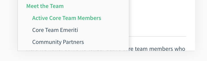
Here is what it looks like on mobile with the changes I just pushed.

Let me know if you think we still need more space!
Sign up for free
to join this conversation on GitHub.
Already have an account?
Sign in to comment
2 participants
Add this suggestion to a batch that can be applied as a single commit.
This suggestion is invalid because no changes were made to the code.
Suggestions cannot be applied while the pull request is closed.
Suggestions cannot be applied while viewing a subset of changes.
Only one suggestion per line can be applied in a batch.
Add this suggestion to a batch that can be applied as a single commit.
Applying suggestions on deleted lines is not supported.
You must change the existing code in this line in order to create a valid suggestion.
Outdated suggestions cannot be applied.
This suggestion has been applied or marked resolved.
Suggestions cannot be applied from pending reviews.
Suggestions cannot be applied on multi-line comments.
Suggestions cannot be applied while the pull request is queued to merge.
Suggestion cannot be applied right now. Please check back later.
Ended up fixing a few issues here:
Feedback welcome if I misinterpreted any original design intentions.