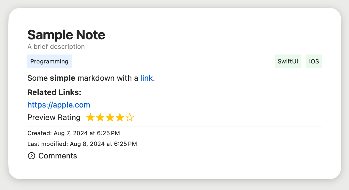
Cards are a classic design pattern, perfect for mobile devices.
They create personalized experiences by pulling together individual content pieces. Mobile tech and data access have pushed the web towards aggregated content instead of linked pages.
Cards shine on different screen sizes. On phones, stack them vertically like an activity stream. On tablets, flip to stack horizontally. Use fixed or variable heights to fit your design.
Make your app dynamic and responsive with SwiftUI card models and supporting views.
- Note Model
- Note and Component Views
- The typical round-rectangle background with drop shadow
- a Nuemorphic styled bacground
- CardStockStyle
- Improved Markdown support
- Image inclusion and placement
- Suggestions from our Audience
- Flip Card
- Support Attachments
- Person
- Gravatar
- Contact (iOS/macOS)
- Place/Venue
- Photo
- Web Sites
- Github Project
- Swift Package Index Project
- Movie
- Book - Goodreads, Affiliate Purchase, PDF
- Media
- YouTube
- Wikipedia Entry
- RSS/ATOM Item
- Bibliographic Citation
- ArXiv Paper
See swiftgen.yml https://github.com/SwiftGen/SwiftGen/blob/stable/Documentation/ConfigFile.md
https://uxdesign.cc/8-best-practices-for-ui-card-design-898f45bb60cc
AttributedString: Making Text More Beautiful Than Ever https://fatbobman.com/en/posts/attributedstring/
Why Your Cards Need a Footer for Metadata Data design for faster scanning https://uxmovement.medium.com/why-your-cards-need-a-footer-for-metadata-c0a19cc5154d