Action Card
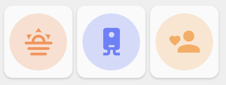
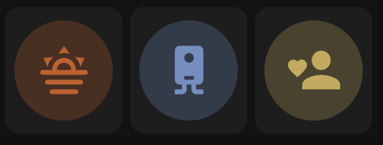
Action Card is a compact square card for activating scenes, scripts, automations, buttons, input buttons, input booleans, cameras, and other action-like entities.
| Light theme | Dark theme |
|---|---|
 |
 |
type: custom:orbit-action-cardtype: custom:orbit-action-card
main_entity: scene.movie_time
color: blueWhen a single or grouped Action Card entity is unavailable, its normal icon remains visible with a small exclamation badge.
Default tap actions are selected from the entity domain.
| Domain | Default tap action |
|---|---|
scene |
scene.turn_on |
script |
script.turn_on |
automation |
automation.trigger |
button |
button.press |
input_button |
input_button.press |
input_boolean |
toggle |
| Other toggle-capable domains | toggle |
| Other domains |
toggle / fallback action |
Hold action defaults to more-info.
Double tap action defaults to none.
type: custom:orbit-action-card
wrap: true
actions_per_row: 3
separate_cards: true
entities:
  - entity: scene.movie_time
    color: blue
    icon: mdi:movie-open
  - entity: script.good_night
    color: purple
    icon: mdi:weather-night
  - entity: automation.motion_lights
    color: amber
    icon: mdi:motion-sensor
Use separate_cards: true to add a small gap and make each grouped action read as its own card.
tap_action:
  action: call-service
  service: scene.turn_on
  service_data:
    entity_id: scene.movie_time

hold_action:
  action: more-info

double_tap_action:
  action: none
Grouped entities items support the same action keys inside each item:
type: custom:orbit-action-card
wrap: true
actions_per_row: 3
entities:
  - entity: scene.movie_time
    tap_action:
      action: call-service
      service: scene.turn_on
      service_data:
        entity_id: scene.movie_time
    hold_action:
      action: more-info
    double_tap_action:
action: noneicon_source: entityOptions:
-
entityuses the entity/domain icon. -
customusesicon. -
templaterendersiconas a Home Assistant Jinja template.
icon_source: custom
icon: mdi:movie-openicon_source: template
icon: >-
{{ 'mdi:script-text-play' if is_state('script.good_night', 'on')
else 'mdi:script-text' }}For multi-colour SVGs:
icon_svg_color_override: falseThe color field also accepts a native Home Assistant Jinja template:
color: >-
{{ 'green' if is_state('script.good_night', 'on') else 'blue' }}| Option | Description |
|---|---|
main_entity |
Required for a single Action Card. Entity to activate. |
entities |
Optional grouped action item list. Each item supports entity, colour, icon, and action options. |
wrap |
Grouped mode only. Allows actions to wrap onto additional rows. |
actions_per_row |
Grouped mode only. Number of actions per row. Defaults to 3. |
separate_cards |
Grouped mode only. Adds spacing and individual item backgrounds. |
color |
Base card/icon colour or Jinja template. Defaults to theme. |
icon_source |
entity, custom, or template. |
icon |
Optional icon override or icon template. |
icon_svg_color_override |
YAML-only SVG colour override. |
tap_action |
Optional tap action override. Defaults by entity domain. |
hold_action |
Optional hold action override. Defaults to more-info. |
double_tap_action |
Optional double tap action override. Defaults to none. |
The Action Card editor includes quick filters inside the entity picker:
- All
- Automations
- Buttons
- Cameras
- Scenes
- Scripts
All keeps the picker unrestricted.