Status Badge
Orbit Status Badge is an entity-compatible Home Assistant badge with Orbit colours, icons, area/domain counts, active-entity controls, and live Home Assistant templates.
Status Badge was added in Orbit Cards 1.1.0.
type: custom:orbit-status-badge
entity: binary_sensor.front_door_contact_sensor
It can be used anywhere Home Assistant accepts badges, including dashboard badge rows and Heading card badges. Entity is the default state, so an existing Entity badge can usually be converted by changing only its type.
Home Assistant exposes two badge types: Badge (LovelaceBadge) and Heading badge (LovelaceHeadingBadge). These placement types are separate from Orbit's Header and Badge display modes described below.
| Light theme | Dark theme |
|---|---|
 |
 |
| Light theme | Dark theme |
|---|---|
 |
 |
The example above combines Area Count and Entity-style status badges in a Home Assistant Heading card.
| Mode | Use for |
|---|---|
| Header | A normal Home Assistant badge with optional icon, state, and name. This is the default. |
| Badge | A circular icon-only badge for card overlays, especially inside an Orbit Deck Card. |
Badge mode writes:
display_style: badgeSet its background with card_color. Badge mode can be always visible, follow an entity's active state, or use active/inactive templates to control visibility and styling.
Entity is the default Header state:
type: custom:orbit-status-badge
entity: lock.front_door
Native Entity badge options are supported, including entity, name, icon, color, show_name, show_state, show_icon, show_entity_picture, state_content, time_format, and tap/hold/double-tap actions.
Entity badges open more-info on tap by default. The editor's Displayed elements and State content controls use Home Assistant's native selectors.
Area Count counts active entities of a selected domain in one or more areas:
type: custom:orbit-status-badge
state_source: area_count
area: landing
domain: light
state_source: area_count is required for Area Count badges.
Select Multiple in the visual editor to combine areas. A single area is stored as a string; multiple areas are stored as a list:
area:
  - kitchen
  - dining_room
domain: light
Supported domains include lights, switches, fans, covers, locks, media players, climate entities, binary sensors, and sensors.
Switches, binary sensors, and sensors require at least one device-class selection so semantically different entities are not counted together. Select multiple device classes in the editor to combine related types in one count:
# Sockets
domain: switch
device_class: outlet

# Motion sensors
domain: binary_sensor
device_class: motion

# Motion and occupancy sensors combined
domain: binary_sensor
device_class:
  - motion
  - occupancy
When one device class is selected, device_class is stored as a string. Multiple selections are stored as a list, and an entity is included when it matches any selected class.
Lights do not need a device-class filter. Area Count can also be placed inside a Heading card:
type: heading
heading: Room Trends
icon: mdi:chart-line
badges:
  - type: custom:orbit-status-badge
    state_source: area_count
    area: landing
domain: lightFor numeric sensor device classes, the editor provides an Above/Below threshold for each selected class. A sensor is counted as active when its value is above the configured threshold, or at or below it when Below is selected:
state_source: area_count
area: utility_room
domain: sensor
device_class:
  - power
  - signal_strength
thresholds:
  power:
    value: 1000
    direction: above
  signal_strength:
    value: -70
    direction: below
Signal strength uses the clearer Stronger/Weaker labels in the editor; these are stored as above and below. Power thresholds are stored and compared in watts, with mW, W, kW, MW, GW, and TW sensor values converted automatically. Other numeric classes use the unit reported by Home Assistant.
The default numeric rule is Above 0, except signal strength, which defaults to Weaker than or equal to 0. Non-numeric sensor classes such as date, enum, timestamp, and uptime are counted when their state is available rather than by a numeric threshold.
Selecting the battery device class provides a percentage threshold. Battery percentage sensors at or below the threshold are active; the default is 20%:
state_source: area_count
area: house
domain: sensor
device_class: battery
threshold: 15
Orbit associates battery entities by Home Assistant device. When a device has a percentage sensor, that sensor is preferred. A binary low-battery sensor is used only when that device has no percentage sensor. This works when battery is selected from either the Sensor or Binary sensor domain.
Entities hidden in Home Assistant are excluded from Area Count by default. The editor's Hide control can also exclude entities carrying selected Home Assistant labels:
hide:
  - hidden
  - low
  - label: maintenance
  - label: diagnostic
For battery counts, low excludes binary low-battery fallback sensors. The editor exposes this as Low sensors and explains that these fallbacks are only used when a device has no percentage sensor.
Remove hidden in the editor to include Home Assistant-hidden entities. Because specifying hide replaces the default, include hidden explicitly when combining it with low or label filters. To apply no hide filters, use:
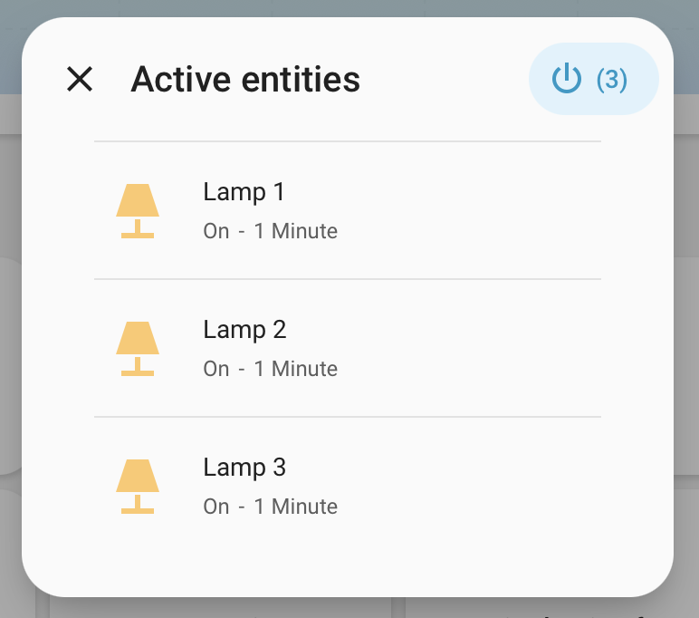
hide: []Area Count badges use the Current state tap action by default. It opens a dialog containing the active entities:
| Light theme | Dark theme |
|---|---|
 |
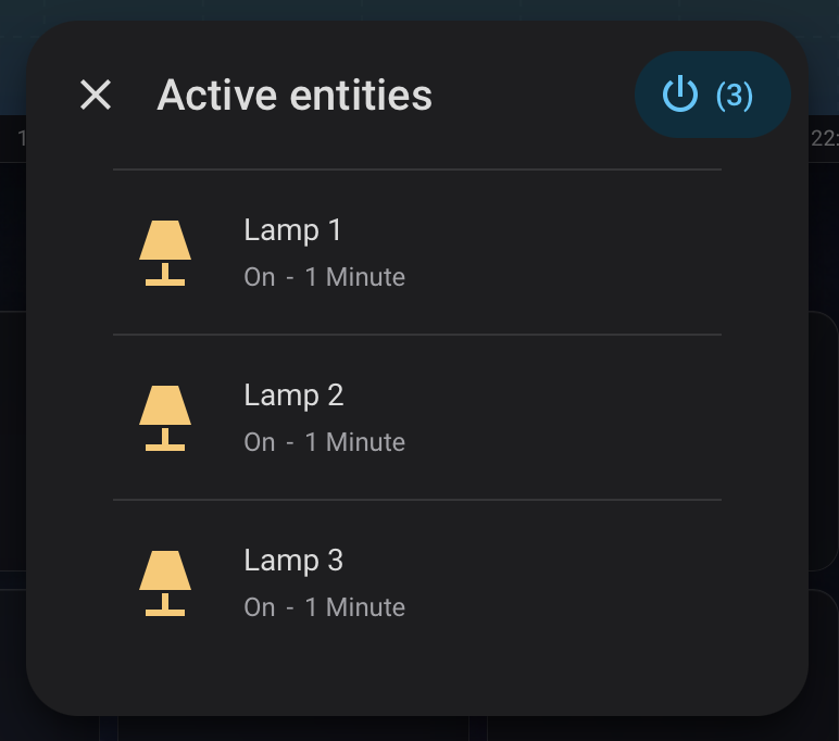 |
The screenshots show the earlier dialog layout and Active entities title. Current development builds add the area line and group turn-off confirmation, and use the localized Currently {state} title described below.
The dialog:
- uses a localized Currently {state} title based on the active state, or Current state when there are no active entities;
- sorts active entities by their localized display name;
- shows each entity's area, current state, and how long it has been active;
- opens
more-infowhen an entity's details are selected; - offers individual off, close, or lock controls when supported;
- offers a group control when at least two entities share the same supported service;
- asks for confirmation before a group
turn_offaction.
The supported direct controls are lights, switches, fans, media players, and climate entities (turn_off), covers (close_cover), and locks (lock).
To replace the default dialog action, configure a normal tap_action.
Template state uses Home Assistant's native Jinja renderer. The result updates automatically when referenced entities change.
type: custom:orbit-status-badge
state_source: template
name: Net power
state_template: >-
  {{ (states('sensor.consumer_unit_power') | float(0)
      - states('sensor.boiler_power') | float(0)) | round(2) }} kW
active_template: >-
  {{ (states('sensor.consumer_unit_power') | float(0)
      - states('sensor.boiler_power') | float(0)) > 50 }}
name_template: >-
  {{ 'High usage' if states('sensor.consumer_unit_power') | float(0) > 50
     else 'Net power' }}
The templates have separate jobs:
-
state_templatesupplies the displayed value. -
active_templatecontrols active/inactive colour and icon selection. -
name_templatesupplies a live Template source for the composed Name picker.
When active_template is omitted, active detection recognizes numeric zero/non-zero and true/false results, then applies Home Assistant-style domain rules when entity context is available. The Template name source remains Not configured until name_template is set.
Badge mode always includes an optional Entity picker. The selected entity supplies native icon, colour, name, entity picture, and action context even when visibility is set to Always or Template.
Always-visible Badge mode:
type: custom:orbit-status-badge
display_style: badge
entity: light.kitchen
card_color: primary-color
Show Badge mode only while the entity is active:
type: custom:orbit-status-badge
display_style: badge
card_visibility: state
entity: binary_sensor.front_door
Template visibility supports separate active and inactive conditions:
type: custom:orbit-status-badge
display_style: badge
card_visibility: template
state_source: template
entity: sensor.consumer_unit_power
active_template: >-
  {{ states('sensor.consumer_unit_power') | float(0) > 50 }}
inactive_template: >-
  {{ states('sensor.consumer_unit_power') | float(0) <= 50 }}
A truthy active_template shows active styling. A truthy inactive_template shows inactive styling. The badge is hidden when neither is truthy, and active takes priority when both are truthy.
Badge mode is icon only, so display and name templates are not used.
The default State colour option follows Home Assistant state colours. For an Entity badge, Orbit resolves the entity's exact state, domain, and device class before using Home Assistant's domain and global active/inactive fallbacks. Lights also use their current RGB colour when available. Heading badges use the same native state and device-class colour resolution unless a custom colour is configured.
color_on: amber
color_off: grey
icon_source: custom
icon: mdi:door
icon_on: mdi:door-open
icon_off: mdi:door-closed
Colour and icon controls also have Template modes:
color_source: template
color: >-
  {{ 'red' if is_state('binary_sensor.front_door', 'on') else 'grey' }}
icon_source: template
icon: >-
  {{ 'mdi:door-open' if is_state('binary_sensor.front_door', 'on')
     else 'mdi:door-closed' }}
Badge mode uses card_color for its background. MDI, bundled orbit: icons, and local image/SVG icons are supported. See Shared Concepts for colour formats and icon paths.
Default tap actions depend on the state source:
| State | Default tap action |
|---|---|
| Entity | more-info |
| Area Count | Current state |
| Template | none |
All state types support tap, hold, and double-tap actions:
tap_action:
  action: navigate
  navigation_path: /dashboard-security
hold_action:
  action: more-info
double_tap_action:
  action: none
Current activity is also available for any interaction:
hold_action:
  action: current-activity
It opens Home Assistant's logbook for the previous 24 hours. For Area Count, a Current/All selector switches between active matching entities and all entities matched by the configured area, domain, device classes, thresholds, and hide filters. Current state remains the default Area Count tap action and provides the details/control dialog.
| Option | Description |
|---|---|
display_style |
Omit for Header mode; use badge for compact icon-only mode. |
state_source |
entity, area_count, or template. Entity is the default. |
entity |
Header Entity state, or Badge mode icon/colour/name/action context and State visibility source. |
area, domain, device_class
|
Area Count filters. area accepts a string or list. One or more device classes are required for switches, binary sensors, and sensors; use a string or list. |
threshold |
Battery percentage threshold from 0 to 100. Defaults to 20. |
thresholds |
Numeric sensor rules keyed by device class, each containing value and direction: above or below. |
hide |
Area Count exclusions. Supports hidden, battery fallback low, and { label: label_id } entries. Hidden entities are excluded by default. |
state_template |
Native Jinja template for the displayed Template-state value. |
active_template |
Native Jinja template for active styling or Badge mode active visibility. |
inactive_template |
Badge mode native Jinja template for inactive visibility and styling. |
name_template |
Native Jinja template exposed to the composed Name picker. |
card_visibility |
Badge mode only: omit for always, or use state or template. |
card_color |
Badge mode background colour. |
name, state_content
|
Native name and state-content configuration. |
show_name, show_state, show_icon, show_entity_picture
|
Header-mode displayed elements. |
time_format |
Native time formatting option. |
color_source, color
|
Template colour mode and its Jinja template. |
color_on, color_off
|
Active and inactive icon colours in Custom mode. |
icon_source, icon, icon_on, icon_off
|
Domain/entity, custom, template, and state-specific icons. |
tap_action, hold_action, double_tap_action
|
Badge interactions. Supports Current state and current-activity. |