Screenshots
This page collects the current Orbit Cards screenshots used by the wiki.
| Light theme | Dark theme |
|---|---|
 |
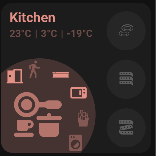 |
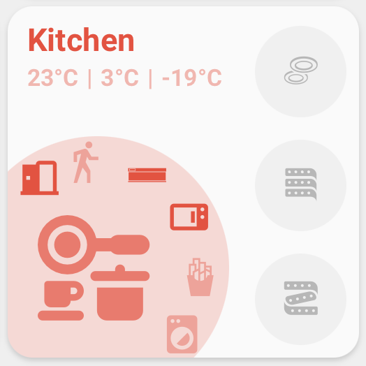
The Area Card shows an area-focused layout with an area name, status row, large area icon, side buttons, curved buttons, and optional action button.
| Light theme | Dark theme |
|---|---|
 |
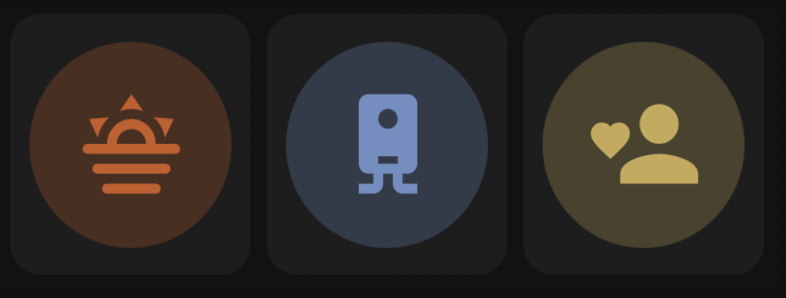 |
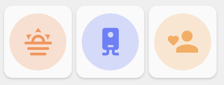
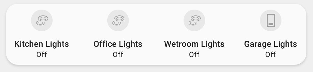
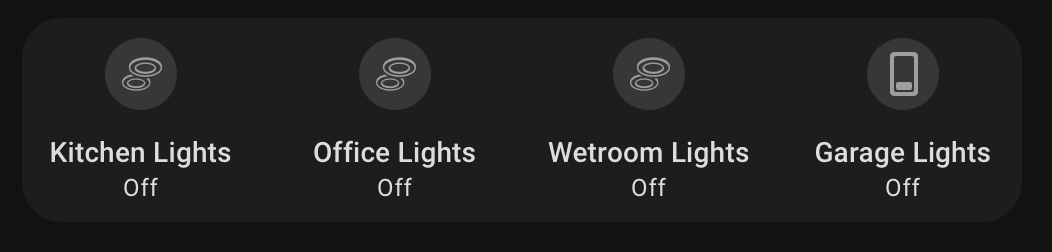
These screenshots show grouped Action Card layouts in light and dark themes.
| Light theme | Dark theme |
|---|---|
 |
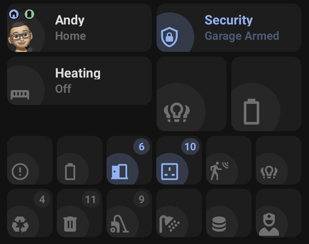 |
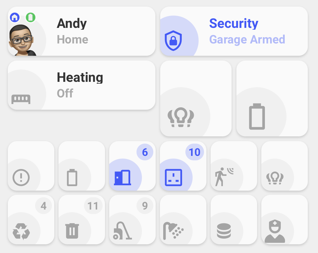
These screenshots show Person, Standard, single Icon only, and grouped Icon only Status Card layouts in both light and dark themes.
| Light theme | Dark theme |
|---|---|
 |
 |
These examples show Orbit Status Badges using Home Assistant's Badge type.
| Light theme | Dark theme |
|---|---|
 |
 |
These Heading cards show several Orbit Status Badges together, including an active Area Count.
| Light theme | Dark theme |
|---|---|
 |
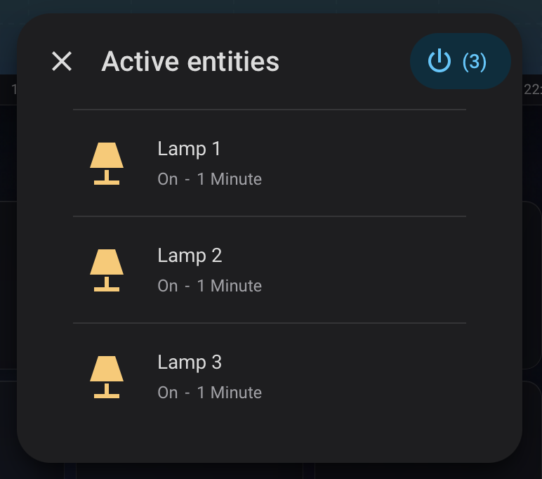 |
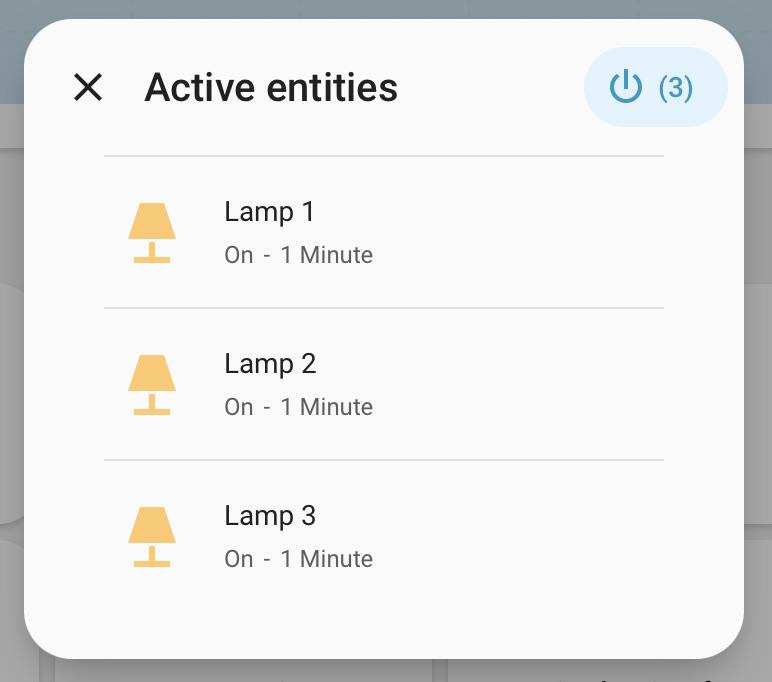
Tapping an Area Count opens the Current state dialog. Current development builds show each active entity's area, state, and duration, plus supported individual and group controls, and request confirmation before a group turn-off. These captures retain the earlier Active entities title and do not yet show the added area line; current builds use a localized Currently {state} title.
| Light theme | Dark theme |
|---|---|
 |
 |
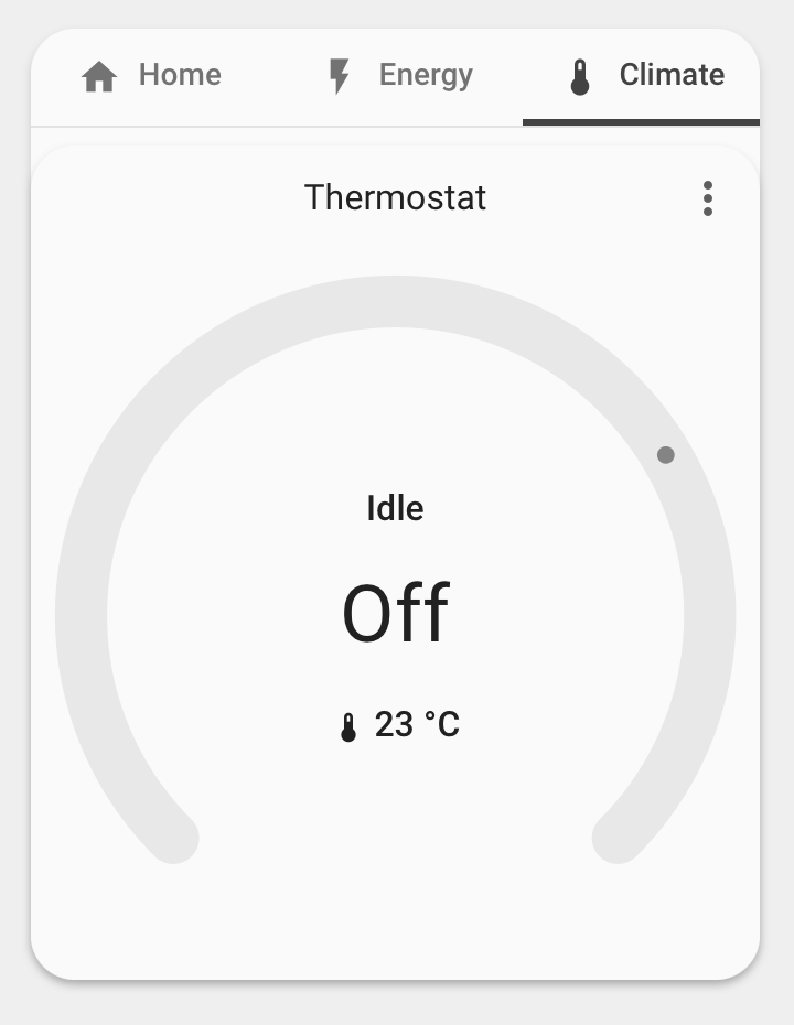
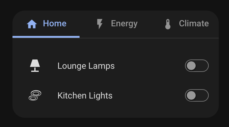
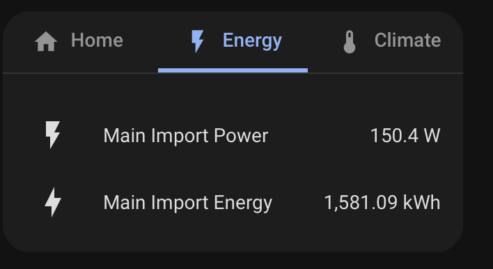
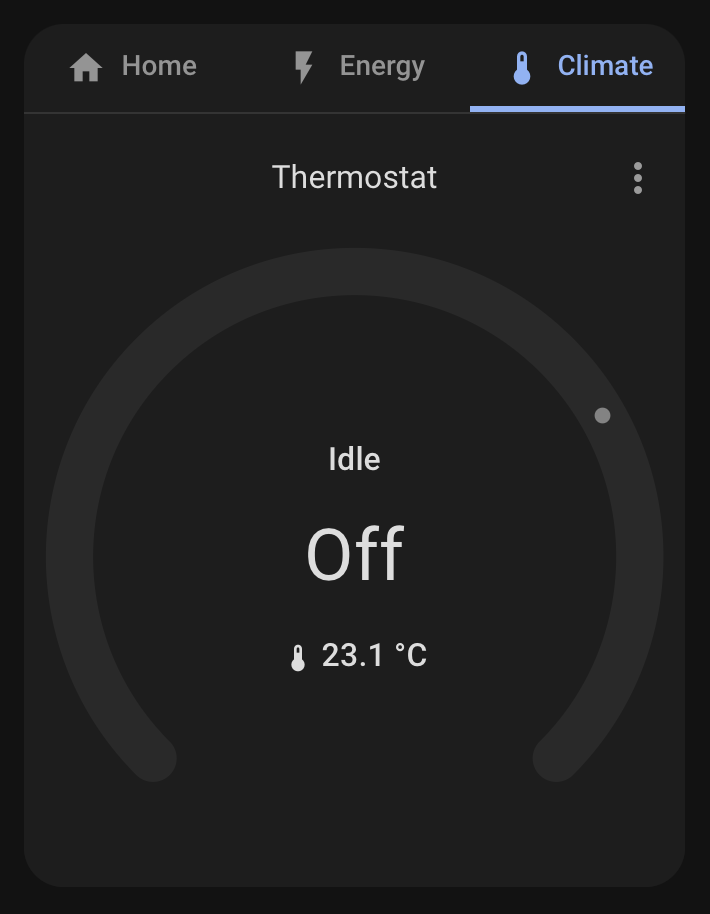
| Home | Energy | Climate |
|---|---|---|
 |
 |
 |
 |
 |
 |
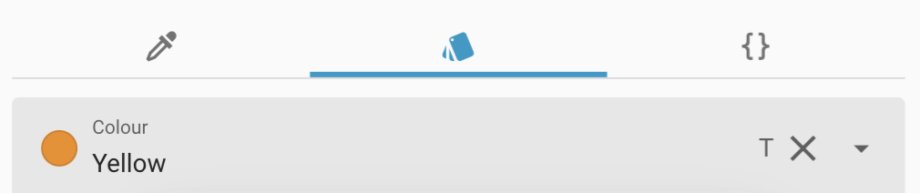
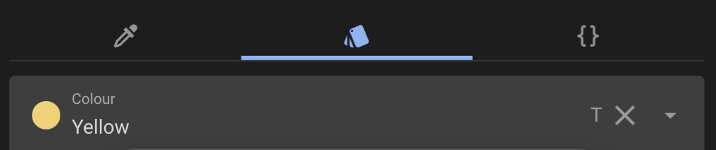
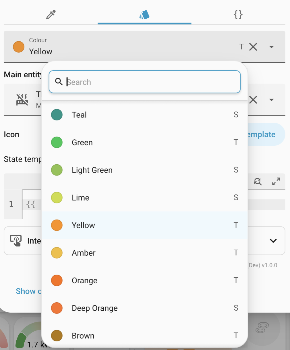
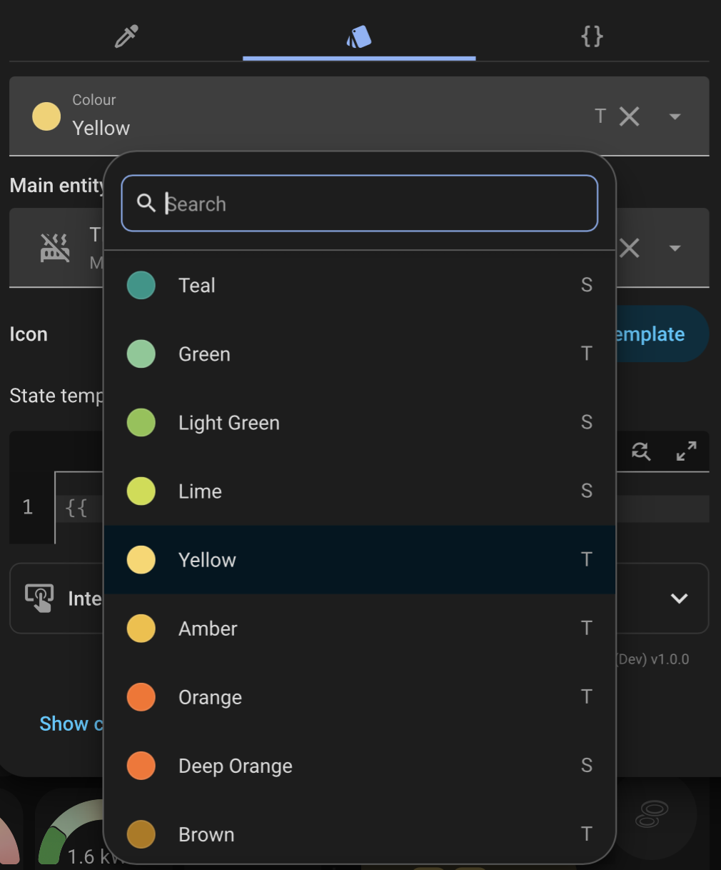
| Light theme | Dark theme |
|---|---|
 |
 |
 |
 |
| Light theme | Dark theme |
|---|---|
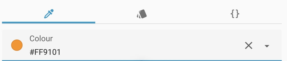 |
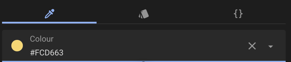 |
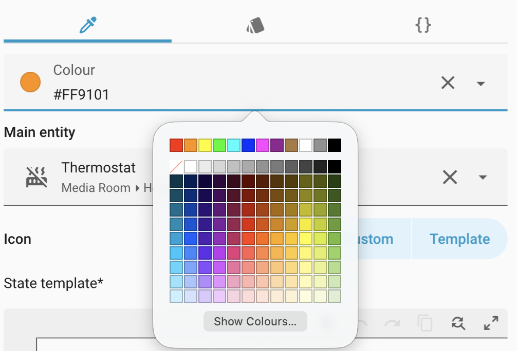 |
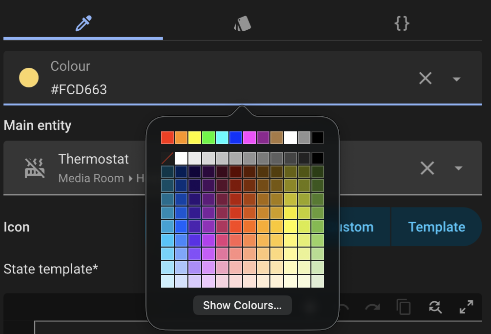 |
| Light theme | Dark theme |
|---|---|
 |
 |
 |
 |
 |
 |
Useful extra captures for the wiki:
- Deck Card visual editor, Setup tab.
- Deck Card visual editor, Card tab.
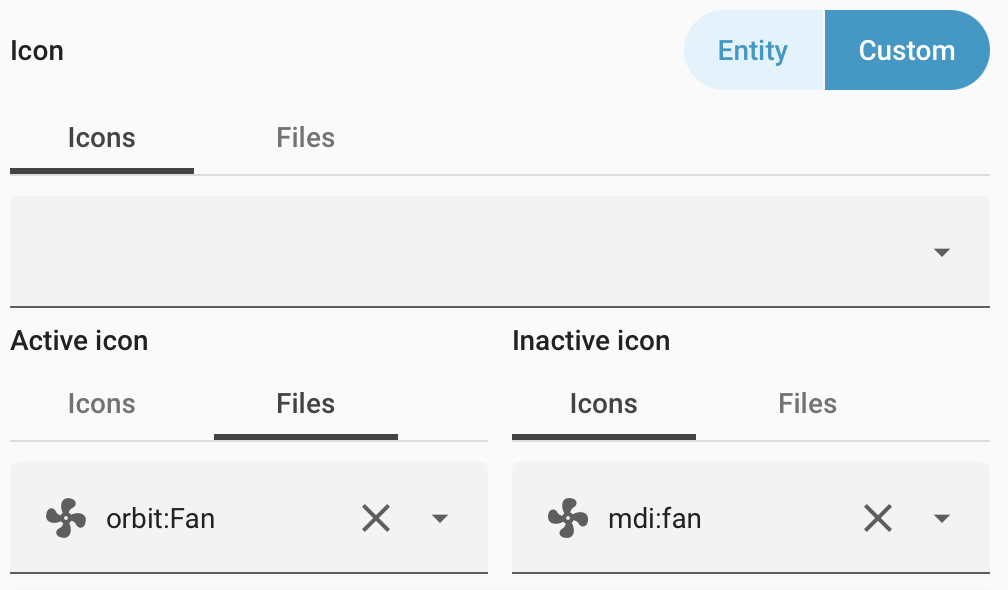
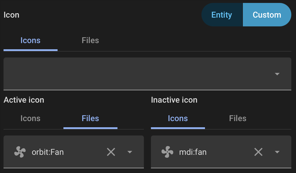
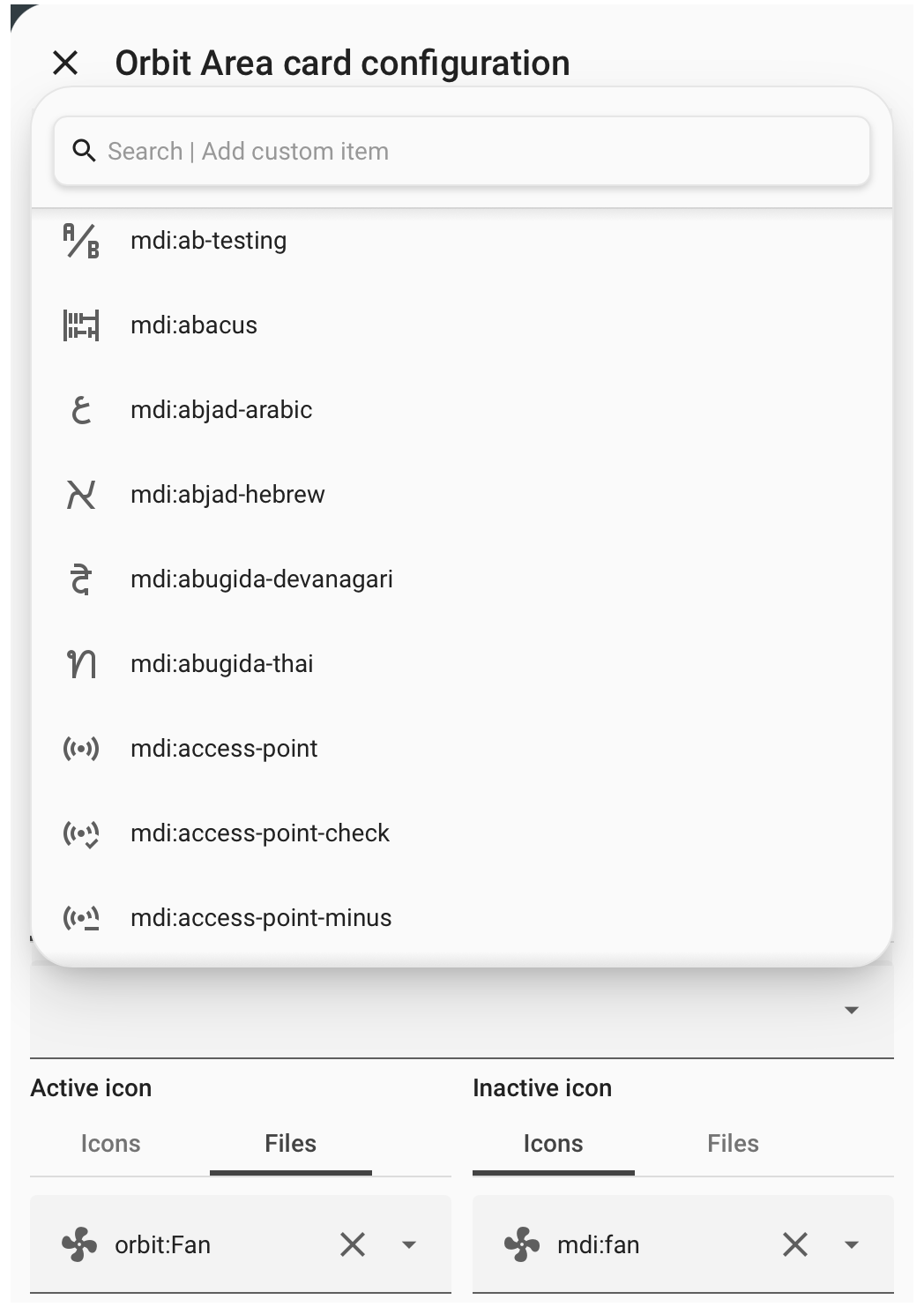
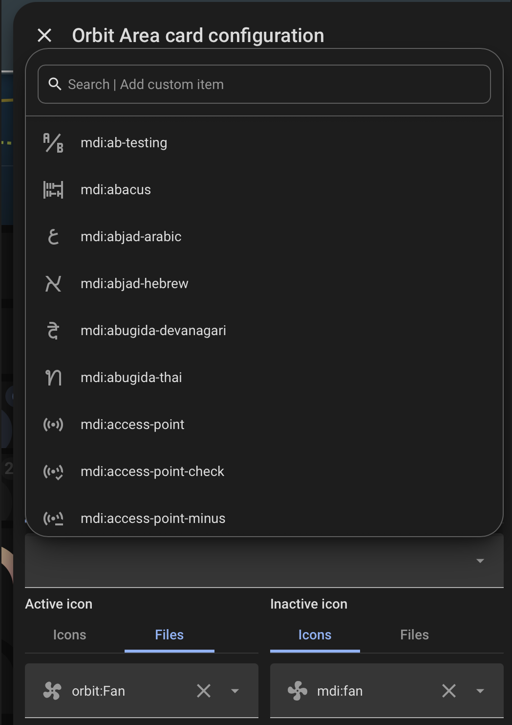
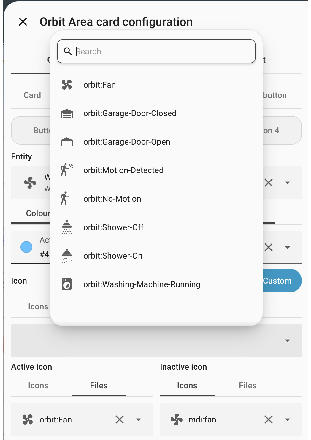
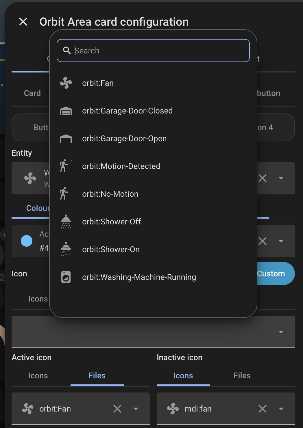
- Area Card visual editor, Card tab.
- Area Card visual editor, Interactions section.