Status Card
Status Card shows entity, area-count, or template state in a visual summary card.
| Light theme | Dark theme |
|---|---|
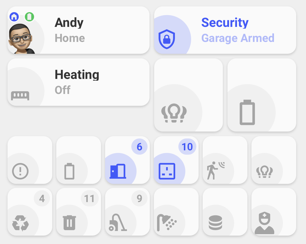 |
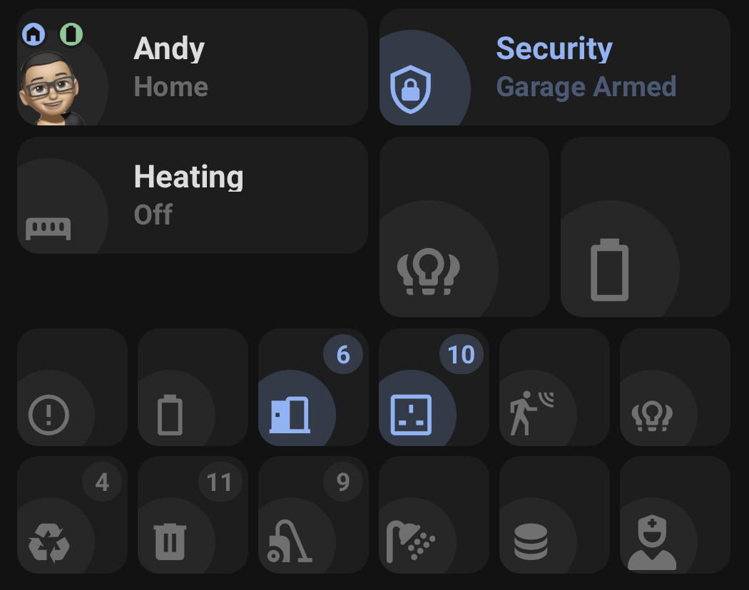 |
type: custom:orbit-status-card| Mode | Use for |
|---|---|
standard |
Wide status summary card with name, icon, and status text. |
icon_only |
Compact square icon card with an optional state/count badge. |
person |
Person card with picture, tracker status, zone badge, ETA, and battery badges. |
Standard and Icon only modes support Entity, Area Count, and Template state types. Person mode uses an Entity state.
Unavailable Entity states keep their normal icon and show a small exclamation badge.
Entity is the default state type:
type: custom:orbit-status-card
mode: standard
state_source: entity
entity: sensor.heating_state
name: Heating
color_on: red
color_off: theme
tap_action:
  action: navigate
  navigation_path: /dashboard-heating/heating-control
entity_tap_action:
  action: more-info
Standard Entity state displays the entity state beneath the configured or resolved name. New visual-editor configs store state_source: entity explicitly; omitting it remains compatible and resolves to Entity.
Name priority is:
-
name_templatewhen configured -
namewhen configured - Entity friendly name
- Entity id
Status
Colour priority is:
-
color_on/color_off, or a colour template - Entity colour where available
- Theme fallback
Area Count shows how many active entities from a selected domain are in one or more areas:
type: custom:orbit-status-card
mode: standard
state_source: area_count
area:
  - kitchen
  - dining_room
domain: light
name: Lights on
color_on: amber
color_off: theme
The count is active when it is greater than zero.
Switch, binary-sensor, and sensor counts require one or more device_class values. The same battery and numeric-sensor thresholds and hide filters used by Status Badge are supported:
state_source: area_count
area: kitchen
domain: binary_sensor
device_class:
  - motion
  - occupancy
hide:
  - hidden
  - label: maintenance
See Status Badge#Sensor Thresholds, Status Badge#Battery Thresholds, and Status Badge#Hide Filters for the shared Area Count rules and YAML.
Area Count uses the selected domain as its default icon source. When no name is configured, Status Card uses the selected device-class name, or the domain name when no device class is required.
The card defaults to Current activity, while the icon defaults to Current state. Current activity shows a 24-hour Home Assistant logbook and can switch between currently active matches and all matching entities. Current state shows active entity areas, states, durations, supported individual/group controls, and confirmation before a group turn-off.
Template state displays the rendered state_template value:
type: custom:orbit-status-card
mode: standard
state_source: template
name: Net power
state_template: >-
  {{ (states('sensor.consumer_unit_power') | float(0)
      - states('sensor.boiler_power') | float(0)) | round(2) }} kW
label_template: >-
  {{ 'High usage' if states('sensor.consumer_unit_power') | float(0) > 50
     else 'Normal usage' }}
active_template: >-
  {{ states('sensor.consumer_unit_power') | float(0) > 50 }}
inactive_template: >-
  {{ states('sensor.consumer_unit_power') | float(0) <= 50 }}
icon_source: custom
icon: mdi:transmission-tower
state_template supplies the rendered state and is also the active-state fallback. label_template optionally replaces the displayed status text without changing the rendered state used for active detection. active_template and inactive_template take priority for active/inactive colours and icons.
Template active detection recognizes numeric zero/non-zero and true/false values, then applies Home Assistant-style domain rules when an optional entity supplies context. For example, a cover is inactive when closed, a lock when locked, and a person when not_home.
Template state does not require an entity. Referenced entities are tracked automatically through Home Assistant's native Jinja renderer.
An optional entity supplies template context, native icon/name and action context. If no State or Label template is configured, Template state falls back to that entity's formatted state or label attribute.
A single Icon only card can use any supported state type:
type: custom:orbit-status-card
mode: icon_only
state_source: entity
entity: sensor.number_of_lights_on
icon: mdi:lightbulb-group
color_on: amber
color_off: theme
Icon only mode shows the state or count in a compact badge. Numeric 0 is hidden.
Use entities to place multiple Icon only items inside one Status Card. Each item owns its state-source configuration, so Entity, Area Count, and Template items can be mixed in the same group:
type: custom:orbit-status-card
mode: icon_only
wrap: true
items_per_row: 3
separate_cards: false
entities:
  - state_source: entity
    entity: sensor.unavailable_entities
    icon: mdi:alert-circle-outline
    color_on: red

  - state_source: area_count
    area: kitchen
    domain: light
    color_on: amber

  - state_source: template
    state_template: >-
      {{ states('sensor.consumer_unit_power') | float(0) | round(0) }}
    active_template: >-
      {{ states('sensor.consumer_unit_power') | float(0) > 50 }}
    icon: mdi:flash
    color_on: blue
Use separate_cards: true to add spacing and give each grouped item its own card surface.
When an Icon only group is edited, Area Count settings are stored on the individual entities item rather than on the group root.
Each item can also keep its own interactions, including advanced popup actions:
entities:
  - state_source: entity
    entity: sensor.number_of_lights_on
    color_on: amber
    icon: mdi:lightbulb-group
    entity_tap_action:
      action: popup
      popup_title: Lights
      popup_content:
        type: tile
        entity: light.living_room
Template items can be displayed as separate collection-day cards:
type: custom:orbit-status-card
mode: icon_only
wrap: true
items_per_row: 3
separate_cards: true
entities:
  - state_source: template
    entity: sensor.recycle_collection
    color_on: blue
    label_template: >-
      {{ state_attr('sensor.recycle_collection', 'daysTo') }}
    state_template: >-
      {{ state_attr('sensor.recycle_collection', 'daysTo') | int < 2 }}
  - state_source: template
    entity: sensor.rubbish_collection
    color_on: green
    label_template: >-
      {{ state_attr('sensor.rubbish_collection', 'daysTo') }}
    state_template: >-
{{ state_attr('sensor.rubbish_collection', 'daysTo') | int < 2 }}type: custom:orbit-status-card
mode: person
entity: person.andrew
tracker_entity: device_tracker.andrew_phone
eta_entity: sensor.andrew_eta
battery_entity_1: sensor.andrew_phone_battery
battery_entity_2: sensor.andrew_watch_battery
tap_action:
action: more-info
entity_tap_action:
action: nonePerson mode uses:
-
entityas the person entity - Person entity picture as the main image
- Entity icon fallback when no picture is available
-
tracker_entityfor location/status -
eta_entityappended when the tracker is nothome - A zone badge based on the active Home Assistant zone
- Up to two battery badges
-
nameorname_templateto override the card name -
state_templateto override active/inactive detection
Battery badge taps always open more-info for the battery entity.
Status Card uses Home Assistant's native Jinja renderer and updates automatically when referenced entities change.
| State type | Template behaviour |
|---|---|
| Entity | Native entity state and Home Assistant active rules. name_template controls the card name. |
| Area Count | Templates are not used; the count and active state come from the matching area entities. |
| Template |
state_template supplies state and fallback active detection; label_template can replace displayed text; active_template and inactive_template take priority. name_template controls the card name. |
| Person |
state_template controls active/inactive detection. name_template controls the card name. |
New templates should include Jinja delimiters. Legacy bare expressions are migrated when the card is loaded in the visual editor.
Status Card uses Home Assistant-style domain rules for template state where entity context exists, with sensible generic handling for numeric and boolean results.
Status Card supports card and icon interactions:
| Mode/source | Default card tap | Default icon tap |
|---|---|---|
| Standard Entity | navigate |
more-info |
| Icon only Entity | more-info |
Same as card |
| Person | more-info |
Same as card |
| Template | more-info |
Same as card |
| Area Count | current-activity |
Current state |
tap_action:
  action: more-info
hold_action:
  action: none
double_tap_action:
  action: none

entity_tap_action:
  action: more-info
entity_hold_action:
  action: none
entity_double_tap_action:
  action: none
Grouped entities items support the same action keys inside each item.
For Area Count, the card defaults to Current activity and the icon defaults to Current state. Grouped items use the selected item's entities. Both custom actions are available for tap, hold, and double-tap interactions:
tap_action:
  action: current-activity
entity_tap_action:
  action: Current state
Current activity embeds Home Assistant's logbook for the previous 24 hours. Its Current/All scope selector switches between active matching entities and every entity matched by the Area Count filters.
| Option | Description |
|---|---|
mode |
standard, icon_only, or person. Defaults to standard. |
state_source |
entity, area_count, or template. Entity is the default. Standard and Icon only modes only. |
entity |
Entity state source entity. Person mode uses it as the person entity. Template state can optionally use it for native icon, name fallback, and action context. |
area |
Area Count area id or list of area ids. |
domain |
Area Count entity domain. |
device_class |
Area Count device-class filter. Required for switch, binary-sensor, and sensor domains; accepts a string or list. |
threshold |
Area Count battery percentage threshold. Defaults to 20. |
thresholds |
Area Count numeric sensor rules keyed by device class. |
hide |
Area Count exclusions. Supports hidden, battery fallback low, and { label: label_id } entries. |
name |
Optional plain text or composed card name. |
name_template |
Native Jinja template for the displayed card name. |
state_template |
Template-state rendered state and fallback active detection; Person-mode active-state override. |
label_template |
Template-state displayed status override. |
active_template |
Template-state active condition. |
inactive_template |
Template-state inactive condition. |
entities |
Icon only mode only. Optional grouped status-item list; each item can use its own state source. |
wrap |
Icon only group only. Allows grouped items to wrap onto additional rows. |
items_per_row |
Icon only group only. Number of items per row when wrapping. Defaults to 3. |
separate_cards |
Icon only group only. Adds spacing and individual card backgrounds. |
tracker_entity |
Person mode only. Tracker used for location/status. |
eta_entity |
Person mode only. Optional ETA entity. |
battery_entity_1 |
Person mode only. First battery badge. |
battery_entity_2 |
Person mode only. Second battery badge. |
color_source |
custom or template. Template mode renders color. |
color |
Jinja colour template when color_source: template. |
color_on |
Active colour override in Custom mode. |
color_off |
Inactive colour override in Custom mode. |
icon_source |
entity, custom, or template; Area Count also supports domain and uses it by default. |
icon |
Base custom icon or Jinja icon template. |
icon_on |
Custom icon used when active. |
icon_off |
Custom icon used when inactive. |
icon_svg_color_override |
YAML-only base SVG colour override. |
icon_on_svg_color_override |
YAML-only active SVG colour override. |
icon_off_svg_color_override |
YAML-only inactive SVG colour override. |
tap_action |
Card tap action. |
hold_action |
Card hold action. |
double_tap_action |
Card double-tap action. |
entity_tap_action |
Icon tap action. |
entity_hold_action |
Icon hold action. |
entity_double_tap_action |
Icon double-tap action. |
See Shared Concepts#Colours and Shared Concepts#Icons for colour and icon template examples.
The Status Card editor provides:
- Native mode and action selectors
- Entity, Area Count, and Template state types in Standard and Icon only modes
- Single or multiple area selection for Area Count
- Device-class, sensor-threshold, battery-threshold, and Hide filters
- Active and inactive templates for Template state
- State and Label templates for Template state
- Custom or Jinja-template colour and icon modes
- Native template error reporting
- A composed or templated Name picker
- Add, duplicate, remove, and reorder controls for Icon only groups
- A thin preview outline around the selected Icon only group item, visible only in the card editor
- Quick filters for Entity pickers: All, Binary Sensors, and Sensors