London Class 9 - Lorena Capraru - HTML/CSS - WEEK 1#488
Conversation
The page is designed to look according to the requirements.
 LorenaCapraru
changed the title
LorenaCapraru
changed the title
I added the last section before footer.
I created and designed the store.html page
 ehwus
left a comment
ehwus
left a comment
ehwus
left a comment
There was a problem hiding this comment.
This is a great submission Lorena - your site looks like the brief (barring a couple of nitpicks that I've added comments for), and your CSS is well structured and makes a lot of sense to me.
My suggestions are just things that will come with practice, but ensuring that we have a consistent formatting style and that all of our elements are as reusable as possible is a good goal to keep in mind going forward.
| <a href="">Login</a> | ||
| <a href="">Help</a> | ||
| <a href="">Blog</a> | ||
| <a href="">Store</a> |
There was a problem hiding this comment.
You put a lot of work into the Store page, you should link it here!
| flex-direction: row; | ||
| justify-content: center; | ||
| } | ||
|
|
There was a problem hiding this comment.
Just for consistencies sake, I would try to leave a newline between each selector and block. It makes things slightly easier to read
| </div> | ||
| <article> | ||
| <p>Everyone needs a little Karma.</p> | ||
| <div class="container2"> |
There was a problem hiding this comment.
Here, rather than having two flex boxes as separated containers, I would put them inside a container of their own. You could then have a separate class for each image with descriptive text that would make it easier to centre.
Often there are a lot of flex boxes within flexboxes within flexboxes, and it all starts to get like the plot of Inception, but it makes things like centering content significantly simpler (you can certainly also use a grid for this too)
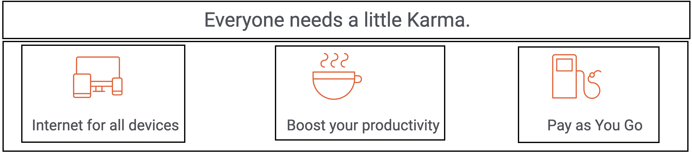
<!-- The code could look something like this (without the nasty inline styling!) -->
<div style="display: flex;">
  <p>Everyone needs a little Karma.</p>
  <div style="display: flex;">
    <div style="display: flex; flex-direction: column; align-items: centre;">
      <img alt="icon devices" src="/img/icon-devices.svg " />
      <p>Internet for all devices</p>
    </div>
    <!-- Insert the two other images with descriptions here -->
  </div>
</div>
This would solve your alignment issues on the images with text beneath quite nicely, and generally it's neater to group things together in the code that are grouped together in the user interface itself. This is particularly useful when we use semantic HTML, as it's good for accessibility to enclose all of the content for an article (which each of those three images/descriptions should arguably be) within the semantic HTML itself.
| experience" > | ||
| <div class="description"> | ||
| <p> | ||
| <i |
There was a problem hiding this comment.
I would take a look at the HTML/CSS style guide: https://www.w3schools.com/html/html5_syntax.asp
You can get formatting tools that handle this for you, and these things tend to only be guidelines rather than hard and fast rules, but I've not encountered formatting like this in the wild!
There was a problem hiding this comment.
VS Editor does it automatically when i save. I will keep a look to avoid it. THANK YOU
| anymore!"</i | ||
| > | ||
| </p> | ||
| <a href="store.html"><button>Get Karma today</button></a> |
There was a problem hiding this comment.
We use links to redirect our users to different pages, and buttons for user actions (more to be covered when we step into the wonderful world of JavaScript). Combining them both isn't best practice for accessibility or user experience.
| </div> | ||
| </section> | ||
| </main> | ||
| <footer> |
There was a problem hiding this comment.
Really good use semantic HTML throughout this
| <footer> | ||
| <hr /> | ||
| <p>Join us on</p> | ||
| <div class="container3"> |
There was a problem hiding this comment.
Variable names are pretty important, can you be more descriptive than container3? Remember to write code that someone in six months will have to read and change.
| align-items: flex-start; | ||
| margin-top: 5%; | ||
| } | ||
| .row { |
There was a problem hiding this comment.
Great to see the reusability of your CSS classes here.
| } | ||
| .flex { | ||
| display: flex; | ||
| flex-direction: column; |
There was a problem hiding this comment.
I would be careful here, as applying situational values to a class generically called 'flex' could lead to bad situations. I would just apply the rule of display: flex; in a class like this, and maybe have a variant of this class that applies a column.
There are loads of methodologies that you can use to structure your CSS to keep it clean and reusable, particularly at scale. BEM is one of them: https://getbem.com/introduction/ This is a lot to take in at the m
| <aside> | ||
| <img | ||
| src="/img/store-image_by-andrew-neel-unsplash.jpeg" | ||
| alt="store manager working on laptop" |
There was a problem hiding this comment.
Great consistent usage of alt tags here, a really good habit to get into.
2 participants
The page is designed to look according to the requirements.
Volunteers: Are you marking this coursework? You can find a guide on how to mark this coursework in
HOW_TO_MARK.mdin the root of this repositoryYour Details
Homework Details
Notes
What did you find easy?
-> Styling the content
What did you find hard?
What do you still not understand?
Any other notes?