London Class 9 - Lorena Capraru - HTML/CSS - WEEK 1 #488
There are no files selected for viewing
| Original file line number | Diff line number | Diff line change |
|---|---|---|
| @@ -0,0 +1,15 @@ | ||
| { | ||
| // Use IntelliSense to learn about possible attributes. | ||
| // Hover to view descriptions of existing attributes. | ||
| // For more information, visit: https://go.microsoft.com/fwlink/?linkid=830387 | ||
| "version": "0.2.0", | ||
| "configurations": [ | ||
| { | ||
| "type": "pwa-chrome", | ||
| "request": "launch", | ||
| "name": "Launch Chrome against localhost", | ||
| "url": "http://localhost:8080", | ||
| "webRoot": "${workspaceFolder}" | ||
| } | ||
| ] | ||
| } |
| Original file line number | Diff line number | Diff line change |
|---|---|---|
| @@ -1,9 +1,8 @@ | ||
| /* We are using the 'Roboto' font from Google. This has already been added to your HTML header */ | ||
|
|
||
| body { | ||
| font-family: "Roboto", sans-serif; | ||
| -webkit-font-smoothing: antialiased; | ||
| } | ||
|
|
||
| /** | ||
|
|
@@ -16,4 +15,171 @@ body { | |
| * - When using Flexbox, remember the items you want to move around need to be inside a parent container set to 'display: flex' | ||
| */ | ||
|
|
||
| nav { | ||
| padding-left: 10%; | ||
| padding-right: 10%; | ||
| padding-top: 1rem; | ||
| padding-bottom: 1rem; | ||
| background: rgba(196, 196, 196, 0.1); | ||
| } | ||
| nav img { | ||
| width: 2rem; | ||
| height: auto; | ||
| } | ||
| nav a { | ||
| float: right; | ||
| padding: 10px; | ||
| text-decoration: none; | ||
| color: #adb0b7; | ||
| } | ||
| nav a:hover { | ||
| color: #ea9376; | ||
| } | ||
|
|
||
| .container { | ||
| background-image: url("/img/first-background.jpg"); | ||
| background-size: cover; | ||
| height: auto; | ||
| padding: 200px; | ||
| } | ||
| .container p { | ||
| color: white; | ||
| text-align: center; | ||
| } | ||
|
|
||
| .container button { | ||
| display: flex; | ||
| margin-left: auto; | ||
| margin-right: auto; | ||
| padding-left: 20px; | ||
| padding-right: 20px; | ||
| padding-top: 10px; | ||
| padding-bottom: 10px; | ||
| color: white; | ||
| background-color: #e0633a; | ||
| border: none; | ||
| } | ||
|
|
||
| #bigFont { | ||
| font-size: 55px; | ||
| margin-top: 20px; | ||
| margin-bottom: 20px; | ||
| } | ||
| #meetKarma { | ||
| color: #50525a; | ||
| text-decoration: solid; | ||
| } | ||
| #smallFont { | ||
| font-size: 30px; | ||
| margin-top: 20px; | ||
| margin-bottom: 20px; | ||
| } | ||
|
|
||
| .container2 { | ||
| display: flex; | ||
| flex-direction: row; | ||
| justify-content: space-around; | ||
| } | ||
| .container2 img { | ||
| width: 100%; | ||
| height: 100px; | ||
| } | ||
| .container2 p { | ||
| font-size: 30px; | ||
| } | ||
|
|
||
| article p { | ||
| text-align: center; | ||
| font-size: 40px; | ||
| color: #50525a; | ||
| } | ||
|
|
||
| footer { | ||
| padding-bottom: 40px; | ||
| } | ||
| footer hr { | ||
| width: 90%; | ||
| } | ||
| footer p { | ||
| text-align: center; | ||
| } | ||
|
|
||
| .container3 { | ||
| display: flex; | ||
| flex-direction: row; | ||
| justify-content: center; | ||
| } | ||
|
|
||
| #fb, | ||
| #tweeter, | ||
| #instagram { | ||
| border-radius: 100px; | ||
| border: 1px solid #adb0b7; | ||
| padding: 5px; | ||
| margin: 5px; | ||
| width: 20px; | ||
| height: 20px; | ||
| } | ||
| #copyright { | ||
| color: #adb0b7; | ||
| } | ||
| section { | ||
| display: flex; | ||
| flex-direction: row; | ||
| align-items: center; | ||
| background-color: rgba(224, 99, 58, 0.1); | ||
| margin-bottom: 50px; | ||
| margin-top: 100px; | ||
| } | ||
|
|
||
| .description { | ||
| width: auto; | ||
| font-size: 42px; | ||
| text-align: center; | ||
| } | ||
|
|
||
| .mainform { | ||
| display: flex; | ||
| flex-direction: row; | ||
| align-content: space-around; | ||
| padding-left: 10%; | ||
| } | ||
| .form h1 { | ||
| font-size: 50px; | ||
| color: #de6e49; | ||
| } | ||
| .mainform img { | ||
| width: 701px; | ||
| } | ||
| .flex { | ||
| display: flex; | ||
| flex-direction: column; | ||
|
There was a problem hiding this comment. I would be careful here, as applying situational values to a class generically called 'flex' could lead to bad situations. I would just apply the rule of There are loads of methodologies that you can use to structure your CSS to keep it clean and reusable, particularly at scale. BEM is one of them: https://getbem.com/introduction/ This is a lot to take in at the m |
||
| align-items: flex-start; | ||
| margin-top: 5%; | ||
| } | ||
| .row { | ||
|
There was a problem hiding this comment. Great to see the reusability of your CSS classes here. |
||
| display: flex; | ||
| flex-direction: row; | ||
| justify-content: space-between; | ||
| margin-right: 20%; | ||
| margin-top: 5%; | ||
| } | ||
|
|
||
| button { | ||
| background-color: #e0633a; | ||
| border-radius: 4px; | ||
| padding: 10px 20px; | ||
| border-style: none; | ||
| color: white; | ||
| margin-top: 10%; | ||
| } | ||
|
|
||
| .radiob { | ||
| margin-bottom: 10%; | ||
| } | ||
| form p { | ||
| margin-top: 10%; | ||
| } | ||
| .form a { | ||
| text-decoration: none; | ||
| } | ||
| Original file line number | Diff line number | Diff line change |
|---|---|---|
| @@ -1,19 +1,76 @@ | ||
| <!DOCTYPE html> | ||
| <html lang="en"> | ||
| <head> | ||
| <meta charset="UTF-8" /> | ||
| <meta | ||
| name="viewport" | ||
| content="width=device-width, initial-scale=1, shrink-to-fit=no" | ||
| /> | ||
| <title>Karma</title> | ||
| <link | ||
| href="https://fonts.googleapis.com/css?family=Roboto:400,500,300" | ||
| rel="stylesheet" | ||
| type="text/css" | ||
| /> | ||
| <link rel="stylesheet" href="css/normalize.css" /> | ||
| <link rel="stylesheet" href="css/style.css" /> | ||
| <link rel="shortcut icon" type="image/x-icon" href="favicon.ico" /> | ||
| </head> | ||
| <body> | ||
| <!-- Add your HTML markup here --> | ||
| <!-- Remember: Use semantic HTML tags like <header>, <main>, <nav>, <footer>, <section> etc --> | ||
| <!-- All the images you need are in the 'img' folder --> | ||
| <nav> | ||
| <img alt=" Karma logo" src="/img/karma-logo.svg" /> | ||
| <a href="">Login</a> | ||
| <a href="">Help</a> | ||
| <a href="">Blog</a> | ||
| <a href="">Store</a> | ||
|
There was a problem hiding this comment. You put a lot of work into the Store page, you should link it here! |
||
| <a href="">How it Works</a> | ||
| <a id="meetKarma" href="">Meet Karma</a> | ||
| </nav> | ||
| <main> | ||
| <div class="container"> | ||
| <p id="bigFont">Introducing Karma</p> | ||
| <p id="smallFont">Bring WiFi with you, everywhere you go.</p> | ||
| <button>Learn More</button> | ||
| </div> | ||
| <article> | ||
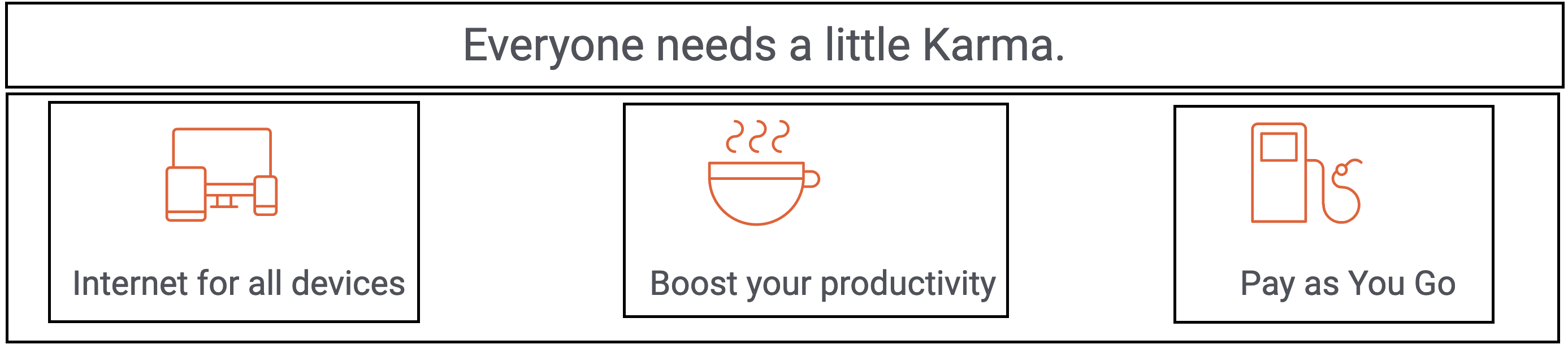
| <p>Everyone needs a little Karma.</p> | ||
| <div class="container2"> | ||
|
There was a problem hiding this comment. Here, rather than having two flex boxes as separated containers, I would put them inside a container of their own. You could then have a separate class for each image with descriptive text that would make it easier to centre. Often there are a lot of flex boxes within flexboxes within flexboxes, and it all starts to get like the plot of Inception, but it makes things like centering content significantly simpler (you can certainly also use a grid for this too)
This would solve your alignment issues on the images with text beneath quite nicely, and generally it's neater to group things together in the code that are grouped together in the user interface itself. This is particularly useful when we use semantic HTML, as it's good for accessibility to enclose all of the content for an article (which each of those three images/descriptions should arguably be) within the semantic HTML itself. |
||
| <img alt="icon devices" src="/img/icon-devices.svg " /> | ||
| <img alt="icon coffee" src="/img/icon-coffee.svg " /> | ||
| <img alt="icon refill" src="/img/icon-refill.svg " /> | ||
| </div> | ||
| <div class="container2"> | ||
| <p>Internet for all devices</p> | ||
| <p>Boost your productivity</p> | ||
| <p>Pay as You Go</p> | ||
| </div> | ||
| </article> | ||
| <section> | ||
| <img src="/img/sectionimg.png" alt=""Picture of a person enjoying the | ||
| experience" > | ||
| <div class="description"> | ||
| <p> | ||
| <i | ||
|
There was a problem hiding this comment. I would take a look at the HTML/CSS style guide: https://www.w3schools.com/html/html5_syntax.asp You can get formatting tools that handle this for you, and these things tend to only be guidelines rather than hard and fast rules, but I've not encountered formatting like this in the wild!
Author
There was a problem hiding this comment. VS Editor does it automatically when i save. I will keep a look to avoid it. THANK YOU |
||
| >"Wherever I am, I just don’t worry about my connection | ||
| anymore!"</i | ||
| > | ||
| </p> | ||
| <a href="store.html"><button>Get Karma today</button></a> | ||
|
There was a problem hiding this comment. We use links to redirect our users to different pages, and buttons for user actions (more to be covered when we step into the wonderful world of JavaScript). Combining them both isn't best practice for accessibility or user experience. |
||
| </div> | ||
| </section> | ||
| </main> | ||
| <footer> | ||
|
There was a problem hiding this comment. Really good use semantic HTML throughout this |
||
| <hr /> | ||
| <p>Join us on</p> | ||
| <div class="container3"> | ||
|
There was a problem hiding this comment. Variable names are pretty important, can you be more descriptive than container3? Remember to write code that someone in six months will have to read and change. |
||
| <img id="fb" alt="icon devices" src="/img/twitter-icon.svg" /> | ||
| <img id="tweeter" alt="icon coffee" src="/img/facebook-icon.svg" /> | ||
| <img id="instagram" alt="icon refill" src="/img/instagram-icon.svg" /> | ||
| </div> | ||
| <p id="copyright">© Karma Mobility, Inc</p> | ||
| </footer> | ||
| </body> | ||
| </html> | ||
There was a problem hiding this comment.
Choose a reason for hiding this comment
The reason will be displayed to describe this comment to others. Learn more.
Just for consistencies sake, I would try to leave a newline between each selector and block. It makes things slightly easier to read