Releases: Kanders-II/PoshUI
Release list
PoshUI v1.4.1

✨ PoshUI v1.4.1 — Canvas Polish & Release Showcase
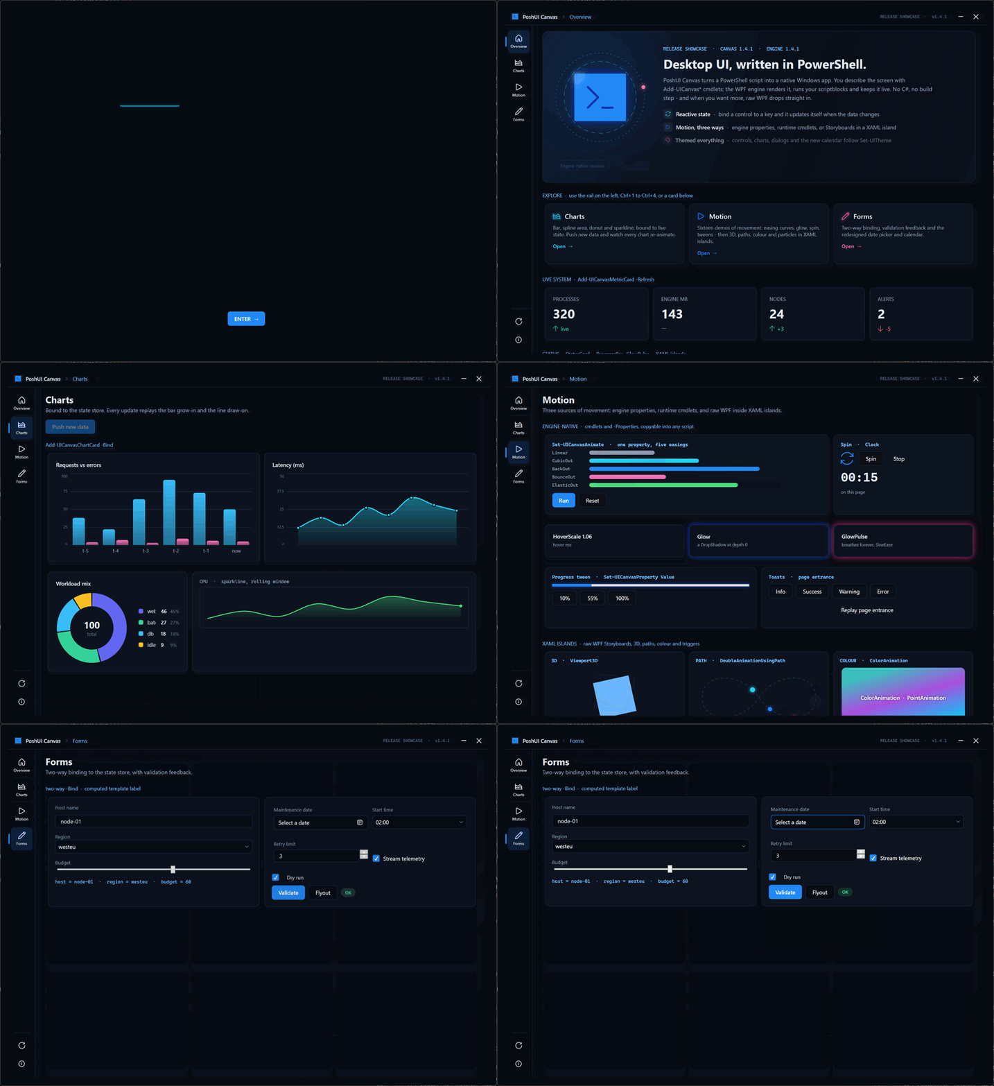
A polish release for PoshUI.Canvas. It brings a redesigned date picker and calendar, a showcase app that
takes Canvas to full stretch, and a complete guide to motion.
Nothing breaks. No cmdlet or parameter changed, so existing scripts run as they are. Every app that uses
Add-UICanvasDatePicker gets the new look automatically.
🆕 First Release With PoshUI.Canvas
This is the first signed release package since v1.3.1. Version 1.4.0 was never packaged, so everything it
added ships here for the first time:
- PoshUI.Canvas: free-form apps from ~85 cmdlets, where a single
.ps1is the whole app - An engine-native workflow runner with live progress, retry, timeouts, skip conditions and reboot-resume
- Off-gate script cards that stream output without freezing the app
- Declarative cascading fields, tabs, menus, splitters, Viewbox and master/detail grids
- A raw XAML escape hatch with
-Actionswiring, and per-monitor V2 DPI - Authoring diagnostics:
-Propertieskeys that nothing reads are logged by name
The full list is under 1.4.0 in the changelog.
📅 A Date Picker That Belongs in a Dark App
The old picker had no style of its own, so Canvas fell back to the stock Windows one. That meant:
- a hard-coded white border around the text;
- the old gradient calendar icon;
- faint text on a translucent fill;
- a light calendar popup, even inside a dark app.
Colours set on the outer control never reached the calendar inside it.
Every part is now themed, and follows Set-UITheme in both light and dark mode:
- Full-contrast day numbers
- An accent-filled selected day and a ring on today
- Dimmed days from the neighbouring months
- Chevron paging, with month and year views to match
- An accent border when the field has focus
🚀 Release Showcase
Examples\Showcase-Release.ps1 is one script that shows what Canvas can do. It's in the release zip together
with the logo files it uses. From the extracted folder:
Get-ChildItem -Recurse | Unblock-File
powershell -NoProfile -STA -File .\Examples\Showcase-Release.ps1- Splash: the PoshUI logo is revealed in two halves on opposite axes, with the colour channels converging
and a CRT power-down exit. It moves on to the app by itself. - Overview: a hero panel explaining Canvas, clickable explore cards and live metrics.
- Charts: bar, spline area, donut and sparkline charts, bound to live data. Push new data and watch every
chart animate again. - Motion: sixteen demos of movement (see below).
- Forms: two-way binding, validation feedback and the new calendar.
Navigation is a custom icon rail on the left, plus Ctrl+1 to Ctrl+4, under a slim top bar of the app's own.
🎬 Motion, Three Ways
Motion in the showcase comes from three places, and all of them are available to any script:
| Source | What it looks like |
|---|---|
| Engine properties | Stagger, HoverScale, Glow / GlowPulse: one line in -Properties |
| Runtime cmdlets | Set-UICanvasAnimate with Linear, Cubic, Back, Bounce and Elastic easings; Spin; progress tweens; the -Clock elapsed timer |
| XAML islands | Raw WPF inside Add-UICanvasXaml: a 3D cube, motion along a curve, colour animation, spring-on-hover, a particle field, an odometer, stroke draw-on |
New guide: Animation & Motion. It covers:
- what the engine animates for you, and where that stops;
- why storyboards in a XAML island must start themselves;
- the property paths that work, with a technique catalogue;
- easing and timing guidance;
- how to check that an animation works without watching it.
The AI context packs now include these motion rules too.
🔧 Fixed
- Faint, dated date picker. See above.
- A false
[unused property]warning forClockon elapsed-clock labels. - Garbled AI context packs. Docs saved without a byte-order mark came out with
—wherever there was an
em dash. The packs now also include every agent doc.
📦 Versions
| Component | Version |
|---|---|
PoshUI engine (PoshUI.exe) |
1.4.1 |
| PoshUI.Canvas | 1.4.1 (was 1.3.0; now matches the engine, and still accepts engine 1.4.0 or later) |
| PoshUI.Wizard / Dashboard / Workflow | 1.3.1 (unchanged) |
PoshUI.exe is Authenticode-signed. Check it with Get-AuthenticodeSignature .\bin\PoshUI.exe.
⚠️ Known Issue
Timers (-Refresh), state watchers and shortcuts registered on a page stay alive until the app closes. They are
registered again each time the user visits that page. If an app lets users move between pages a lot, throttle its
tickers. The showcase shows the pattern.
📋 Requirements
| Requirement | Version |
|---|---|
| Operating System | Windows 10/11 (64-bit) |
| PowerShell | Windows PowerShell 5.1 |
| .NET Framework | 4.8 (included with Windows 10/11) |
| Permissions | User-level (no admin required for most features) |
📖 Documentation
Full documentation: https://kanders-ii.github.io/PoshUI/
- Animation & Motion: the new motion guide
- About Canvas: what Canvas is and how it works
Made with ❤️ for the PowerShell Community
PoshUI v1.3.1
🔒 PoshUI v1.3.1 — Security Hardening & Bug Fixes
Drop-in upgrade. No changes to the public cmdlet API — all existing scripts work without modification.
🛡️ Security Fixes
Script Injection Prevention in ConvertTo-UIScript
ConvertTo-UIScript (PoshUI.Wizard and PoshUI.Workflow) now escapes every interpolated value — titles, labels, choices, defaults, branding keys/values, step metadata, and card/banner properties — for safe embedding in single-quoted PowerShell literals, and validates control/step names as safe identifiers.
Previously, a value containing a single quote (or one sourced from dynamic/external data) could break out of the generated string and execute arbitrary code when the wizard ran.
Repaired Value Escaper
ConvertTo-SafeScriptValue's boolean branch used return if (...), which threw a runtime error. Fixed across all three modules.
Removed Predictable Script Disclosure
Show-PoshUIWizard / Show-PoshUIWorkflow no longer write the generated script to a predictable %TEMP%\PoshUI_*.ps1 path on every run. The debug dump is now gated behind -AppDebug and written via a hardened secure-temp helper (cryptographically random filename + restrictive ACL).
Stronger Workflow-State Integrity
Protect-WorkflowState now uses DPAPI authenticated encryption instead of an HMAC keyed on guessable values (username + computer name). State files are written in the new POSHUI_STATE_V2 format; legacy V1 files are still read.
Signature Policy No Longer Downgraded
Calling Show-* without -RequireSignedScripts no longer forces POSHUI_SIGNATURE_MODE=Disabled over a stricter environment or organization policy setting — the prior value is respected and restored.
Temp-Directory Hardening
New-SecureTempFile / New-SecureTempScript now re-assert the restrictive directory ACL on every run, not only when the directory is first created.
Secret Redaction in Persisted State
Set-UIState now redacts fields with secret-sounding names (password, token, credential, etc.) and any SecureString / PSCredential values before writing form data to the registry.
🐛 Bug Fixes
- Fixed OptionGroup attribute being dropped — a stray
} else {inConvertTo-UIScriptmade the[WizardOptionGroup(...)]attribute (choices + orientation) unreachable; OptionGroup controls now render correctly in generated scripts - Fixed Date default double-append — a
DateTimedefault value was emitted twice, producing a malformed parameter default; date defaults now render exactly once (DateTimeformatted asyyyy-MM-dd, string values passed through unchanged) - Fixed verbose logging — corrected
${var.Length}string interpolation in workflow state encryption log messages
📦 What's Included
PoshUI/
├── PoshUI.Wizard/          # Wizard module (hardened script generator)
├── PoshUI.Dashboard/       # Dashboard module
├── PoshUI.Workflow/        # Workflow module (DPAPI state, hardened generator)
├── Examples/               # All v1.3.0 examples (unchanged)
├── Docs/                   # Documentation site
├── bin/                    # Signed PoshUI.exe v1.3.1
└── README.md
⚠️ Upgrade Note
Workflow state files saved by v1.3.1 use the new POSHUI_STATE_V2 format and cannot be read by v1.3.0 or earlier. Any in-progress workflows should be completed before upgrading. State files written by older versions continue to work normally.
🚀 Installation
- Download the release package
- Extract to your preferred location
- Import the module you need:
# For Wizards
Import-Module .\PoshUI\PoshUI.Wizard\PoshUI.Wizard.psd1

# For Dashboards
Import-Module .\PoshUI\PoshUI.Dashboard\PoshUI.Dashboard.psd1

# For Workflows
Import-Module .\PoshUI\PoshUI.Workflow\PoshUI.Workflow.psd1
🛠️ System Requirements
| Requirement | Version |
|---|---|
| Operating System | Windows 10/11 (64-bit) |
| PowerShell | Windows PowerShell 5.1 |
| .NET Framework | 4.8 (included with Windows 10/11) |
| Permissions | User-level (no admin required for most features) |
📖 Documentation
Full documentation: https://kanders-ii.github.io/PoshUI/
🤝 Getting Help
- Documentation: https://kanders-ii.github.io/PoshUI/
- Issues: GitHub Issues
- Examples: Check the
Examples/folder for working demos
Made with ❤️ for the PowerShell Community
PoshUI v1.3.0
🎨 PoshUI v1.3.0 Release
PNG Icons & Custom Themes
We're excited to announce PoshUI v1.3.0 - bringing full-color PNG icons and powerful custom theming to all three modules!
This release transforms PoshUI's visual capabilities, letting you create truly branded, professional interfaces with custom color palettes and vibrant icons.
🆕 What's New in v1.3.0
🖼️ Full-Color PNG Icon Support
Say goodbye to monochrome glyphs! v1.3.0 introduces PNG/ICO icon support across all UI elements:
- Sidebar Steps - Display colorful emoji or custom PNG icons in navigation
- Dashboard Cards - Add branded icons to MetricCards and InfoCards
- Carousel Banners - Per-slide PNG icons with customizable size and position
- Branding - Use your company logo in the sidebar header and window title
- Automatic Fallback - Gracefully falls back to glyph icons if PNG files are missing
Example:
# PNG emoji icons on wizard steps
Add-UIStep -Name 'Welcome' -Title 'Welcome' -IconPath 'C:\Icons\wave_emoji.png'

# PNG icons on dashboard metric cards
Add-UIMetricCard -Step 'Overview' -Name 'CPU' -Title 'CPU Usage' `
    -Value 45 -Unit '%' -IconPath 'C:\Icons\cpu_3d.png'

# PNG icons on carousel slides
$slides = @(
    @{
        Title = 'Performance Dashboard'
        Subtitle = 'Real-time monitoring'
        BackgroundColor = '#1B3A57'
        IconPath = 'C:\Icons\graph_3d.png'
    }
)
Add-UIBanner -Step 'Overview' -Title 'Dashboard' -CarouselSlides $slides

🎨 Dual-Mode Custom Themes
Create fully branded interfaces with independent light and dark color palettes:
- 22 Color Slots - Override any combination of colors (background, accent, text, buttons, etc.)
- Dual-Mode Support - Define separate palettes for light and dark themes
- Runtime Toggle - Users can switch themes with the sun/moon button in the title bar
- Persistent Customization - Custom colors persist across theme toggles
- Partial Overrides - Only specify the colors you want to change
Example:
# Define custom brand colors for both themes
Set-UITheme -Light @{
    AccentColor       = '#E91E63'
    SidebarBackground = '#880E4F'
    ButtonBackground  = '#C2185B'
} -Dark @{
    AccentColor       = '#00BFA5'
    SidebarBackground = '#0A1A18'
    ButtonBackground  = '#00897B'
}
Available Color Slots:
Background, ContentBackground, CardBackground, SidebarBackground, SidebarText, SidebarHighlight, TextPrimary, TextSecondary, AccentColor, ButtonBackground, ButtonForeground, InputBackground, InputBorder, BorderColor, TitleBarBackground, TitleBarText, SuccessColor, WarningColor, ErrorColor, HeadingForeground, BodyForeground, SecondaryForeground
🎠 Enhanced Carousel Banners
Carousel banners now support per-slide customization:
- PNG Icons - Display icons beside slide titles via
IconPathproperty - Icon Positioning - Choose
LeftorRighticon placement - Font Customization - Control
TitleFontSize,SubtitleFontSize,TitleFontWeight - Cross-Module Support - Works in Wizard, Dashboard, and Workflow modules
Example:
$carouselItems = @(
    @{
        Title = 'Performance Dashboard'
        Subtitle = 'Real-time system monitoring'
        BackgroundColor = '#1B3A57'
        IconPath = (Join-Path $PSScriptRoot 'Icons\graph_3d.png')
        IconSize = 80
        IconPosition = 'Right'
    },
    @{
        Title = 'Gauge Controls'
        Subtitle = 'Radial gauges at a glance'
        BackgroundColor = '#DC2626'
        IconPath = (Join-Path $PSScriptRoot 'Icons\stopwatch_3d.png')
        TitleFontSize = '36'
        SubtitleFontSize = '18'
    }
)

Add-UIBanner -Step 'Overview' -CarouselItems $carouselItems -AutoRotate $true
🐛 Bug Fixes
- Fixed theme toggle not applying custom colors - Theme toggle now correctly re-applies custom palettes
- Fixed InfoCard property name mismatch -
ConvertTo-UIScriptnow correctly readsIconPath,Icon,ImagePath, etc. - Fixed MetricCard IconPath not flowing through JSON -
JsonDefinitionLoadernow properly extractsIconPathfrom card properties - Fixed carousel PNG icons not rendering - Added
[OnDeserialized]callback to restore property defaults
📦 What's Included
PoshUI/
├── PoshUI.Wizard/          # Wizard module with PNG icons & custom themes
├── PoshUI.Dashboard/       # Dashboard module with PNG icons & custom themes
├── PoshUI.Workflow/        # Workflow module with PNG icons & custom themes
├── Examples/               # Updated examples with PNG icons
│   ├── Wizard-EmojiIcons.ps1
│   ├── Dashboard-ComputerMaintenance.ps1
│   ├── Dashboard-MultiPageDashboard.ps1
│   └── ... and more!
├── Examples/Icon8/         # 200+ PNG icons from Icons8
├── Examples/Emoji/         # Microsoft Fluent 3D emoji PNGs
├── Docs/                   # Updated documentation
├── bin/                    # Signed PoshUI.exe v1.3.0
└── README.md
🚀 Quick Start
Installation
- Download the release package
- Extract to your preferred location
- Import the module you need:
# For Wizards
Import-Module .\PoshUI\PoshUI.Wizard\PoshUI.Wizard.psd1

# For Dashboards
Import-Module .\PoshUI\PoshUI.Dashboard\PoshUI.Dashboard.psd1

# For Workflows
Import-Module .\PoshUI\PoshUI.Workflow\PoshUI.Workflow.psd1
Your First Custom-Themed Wizard with PNG Icons
Import-Module .\PoshUI\PoshUI.Wizard\PoshUI.Wizard.psd1

# Set custom brand colors
Set-UITheme -Light @{
    AccentColor = '#E91E63'
    SidebarBackground = '#880E4F'
} -Dark @{
    AccentColor = '#00BFA5'
    SidebarBackground = '#0A1A18'
}

New-PoshUIWizard -Title "Branded Wizard" -Description "With custom theme and PNG icons"

# Add step with PNG icon
Add-UIStep -Name "Welcome" -Title "Welcome" -Order 1 `
    -IconPath "C:\Icons\wave_emoji.png"

Add-UITextBox -Step "Welcome" -Name "UserName" -Label "Your Name" -Mandatory

Show-PoshUIWizard -ScriptBody {
    Write-Host "Hello, $UserName! Enjoy the new look!"
}
🎯 Perfect For
- Corporate Branding - Match your company's color scheme and logo
- Professional Tools - Create polished interfaces with custom icons
- User-Friendly Dashboards - Colorful icons make metrics easier to understand
- Themed Wizards - Light/dark modes with consistent branding
- Self-Service Portals - Beautiful interfaces users will love
📖 Documentation
Full documentation available at: https://kanders-ii.github.io/PoshUI/
- PNG Icons Guide - How to use PNG/ICO icons across all modules
- Custom Themes Guide - Complete color slot reference and examples
- Carousel Documentation - Per-slide customization options
- Updated Examples - New demo scripts showcasing v1.3.0 features
🛠️ System Requirements
- Operating System: Windows 10/11 (64-bit)
- PowerShell: Windows PowerShell 5.1
- .NET Framework: 4.8 (included with Windows 10/11)
- Permissions: User-level (no admin required for most features)
🤝 Getting Help
- Documentation: https://kanders-ii.github.io/PoshUI/
- Issues: GitHub Issues
- Examples: Check the
Examples/folder for working demos
🙏 Icon Attributions
This release includes example PNG icons from:
- Icons8 - https://icons8.com (License: https://icons8.com/license)
- Microsoft Fluent Emoji - https://github.com/microsoft/fluentui-emoji (MIT License)
💡 What's Next?
We're planning:
- PowerShell Gallery publishing
- Additional visualization controls
- More example icon sets
- Community-contributed themes and templates
🙏 Thank You
Thank you for using PoshUI! This project is built to help IT professionals create better tools for their teams.
If PoshUI helps you build something cool, we'd love to hear about it! Share your creations, report bugs, or suggest features on GitHub.
Happy Automating!
- Kanders-II
📄 License
PoshUI is released under the MIT License. See LICENSE for details.
Made with ❤️ for the PowerShell Community
PoshUI v1.0.0 - Initial Release
🎉 PoshUI v1.0.0 Release

Professional PowerShell UIs Made Simple


Welcome to PoshUI v1.0.0!
We're excited to share the first official release of PoshUI with the PowerShell community!
PoshUI transforms your PowerShell scripts into professional Windows 11-style interfaces—no WPF, XAML, or C# knowledge required. Just use familiar PowerShell cmdlets to create wizards, dashboards, and workflows that your team will actually enjoy using.
📦 What's in This Release
Three Powerful Modules
🧙 PoshUI.Wizard - Step-by-step guided interfaces
Create configuration wizards, deployment tools, and setup assistants with 20+ control types, dynamic dropdowns, and real-time validation.

📊 PoshUI.Dashboard - Real-time monitoring interfaces
Build beautiful card-based dashboards with live metrics, charts, and interactive ScriptCards that turn your PowerShell scripts into clickable tools.

ScriptCards turn your scripts into clickable tools:

⚙️ PoshUI.Workflow - Automated task orchestration
Chain PowerShell tasks together with approval gates, error handling, state persistence, and automatic resume-after-reboot capabilities.

✨ Key Features
- Zero Learning Curve - If you know PowerShell, you already know PoshUI
- 20+ Control Types - TextBox, Dropdown, Password, Date, File/Folder pickers, and more
- Dynamic Controls - Cascading dropdowns with scriptblock data sources
- Live Execution - Real-time console output during wizard execution
- Beautiful Themes - Auto/Light/Dark themes with Windows 11 styling
- State Persistence - Workflows survive reboots and resume automatically
- Approval Gates - Built-in checkpoints for critical operations
- Rich Documentation - Comprehensive guides and working examples
🚀 Quick Start
Installation
- Download the release package
- Extract to your preferred location
- Import the module you need:
# For Wizards
Import-Module .\PoshUI\PoshUI.Wizard\PoshUI.Wizard.psd1

# For Dashboards
Import-Module .\PoshUI\PoshUI.Dashboard\PoshUI.Dashboard.psd1

# For Workflows
Import-Module .\PoshUI\PoshUI.Workflow\PoshUI.Workflow.psd1
Your First Wizard (5 lines of code!)
Import-Module .\PoshUI\PoshUI.Wizard\PoshUI.Wizard.psd1

New-PoshUIWizard -Title "Hello PoshUI" -Description "My first wizard"
Add-UIStep -Name "Welcome" -Title "Welcome" -Order 1
Add-UITextBox -Step "Welcome" -Name "UserName" -Label "Your Name" -Mandatory
Show-PoshUIWizard -ScriptBody {
    Write-Host "Hello, $UserName! Welcome to PoshUI!"
}
📚 What's Included
PoshUI/
├── PoshUI.Wizard/          # Wizard module
├── PoshUI.Dashboard/       # Dashboard module
├── PoshUI.Workflow/        # Workflow module
├── Examples/               # 12 working demo scripts
│   ├── Wizard-AllControls.ps1
│   ├── Wizard-DynamicControls.ps1
│   ├── Dashboard-MultiPageDashboard.ps1
│   ├── Workflow-Complete.ps1
│   └── ... and more!
├── Docs/                   # Full documentation
├── Launcher/               # Pre-built PoshUI.exe
└── README.md              # Getting started guide
🎯 Perfect For
- Help Desk Tools - Give your team GUI interfaces for common tasks
- Deployment Wizards - Guide users through complex configurations
- Monitoring Dashboards - Visualize system health and metrics
- Automated Workflows - Chain tasks with approval gates and error handling
- Self-Service Portals - Empower users to run automation safely
📖 Documentation
Full documentation available at: https://asolutionit.github.io/PoshUI/
- Wizards Guide - Controls, validation, dynamic data sources
- Dashboards Guide - Cards, metrics, charts, ScriptCards
- Workflows Guide - Tasks, approval gates, state management
- Examples - 12 working demos to learn from
🛠️ System Requirements
- Operating System: Windows 10/11 (64-bit)
- PowerShell: Windows PowerShell 5.1
- .NET Framework: 4.8 (included with Windows 10/11)
- Permissions: User-level (no admin required for most features)
🤝 Getting Help
- Documentation: https://asolutionit.github.io/PoshUI/
- Issues: GitHub Issues
- Examples: Check the
Examples/folder for working demos
💡 What's Next?
This is just the beginning! We're planning:
- PowerShell Gallery publishing
- Additional control types and visualizations
- Enhanced theming and customization
- Community-contributed examples and templates
🙏 Thank You
Thank you for trying PoshUI! This project is my contribution to the PowerShell community—built to help IT professionals create better tools for their teams.
If PoshUI helps you build something cool, we'd love to hear about it! Share your creations, report bugs, or suggest features on GitHub.
Happy Automating!
- A Solution IT LLC
📄 License
PoshUI is released under the MIT License. See LICENSE for details.
Made with ❤️ for the PowerShell Community