[AutoComplete] Rebuild autocomplete internals to use new accessible components #3910
Conversation
 voiid
force-pushed
the
autocomplete-accessibility-improvements
branch
from
voiid
force-pushed
the
autocomplete-accessibility-improvements
branch
from
61d2402 to
432eb80
Compare
voiid
changed the title
| "Autocomplete": { | ||
| "spinnerAccessibilityLabel": "Loading" | ||
| "spinnerAccessibilityLabel": "Loading", | ||
| "ellipsis": "{content}…" |
There was a problem hiding this comment.
We're moving the ellipsis prop to a translated string for internationalization
| id?: string; | ||
| /** Collection of options to be listed */ | ||
| options: ComboBoxProps['options']; | ||
| options: ComboBoxOldProps['options']; |
There was a problem hiding this comment.
We're keep the interface the same to prevent breaking changes
| export const Autocomplete: React.FunctionComponent<AutocompleteProps> & { | ||
| ComboBox: typeof ComboBox; | ||
| TextField: typeof TextField; | ||
| ComboBox: typeof ComboBoxOld; |
| ComboBox: typeof ComboBox; | ||
| TextField: typeof TextField; | ||
| ComboBox: typeof ComboBoxOld; | ||
| TextField: typeof ComboBox.TextField; |
There was a problem hiding this comment.
Both text fields extend the base Polaris textfield without adding additional API's
| @@ -1,377 +1,153 @@ | |||
| import React, {useState, useEffect, useCallback} from 'react'; | |||
| import React, {useState, useCallback, useMemo, Children} from 'react'; | |||
There was a problem hiding this comment.
This component is a rebuild not a refactor so feel free to ignore the diff
| @@ -0,0 +1,377 @@ | |||
| import React, {useState, useEffect, useCallback} from 'react'; | |||
There was a problem hiding this comment.
This is the old combobox - nothing has been changed
| @@ -0,0 +1,661 @@ | |||
| import React from 'react'; | |||
| @@ -0,0 +1,122 @@ | |||
| import React, {useMemo} from 'react'; | |||
There was a problem hiding this comment.
We created a new action component to map the difference between the old & new API
| @@ -0,0 +1,51 @@ | |||
| import React, {memo} from 'react'; | |||
There was a problem hiding this comment.
We create a new option component to map the differences between the old + new API
| import { | ||
| createMount, | ||
| mount, | ||
| Element as ReactTestingElement, |
There was a problem hiding this comment.
Renaming because Element from the DOM is global
| const IGNORE_WARN_REGEXES: RegExp[] = [ | ||
| /Deprecation: <FilterControl \/> is deprecated\. This is a private component, do not use it\. This component might be removed in a minor version update\. Use <Filters \/> instead\./, | ||
| ]; | ||
| const IGNORE_WARN_REGEXES: RegExp[] = [/Deprecation:.*/]; |
There was a problem hiding this comment.
Changed this to a more general deprecation warning to remove test clutter.
 alex-page
left a comment
alex-page
left a comment
alex-page
left a comment
There was a problem hiding this comment.
This looks good to me. I would strongly recommend getting these child components down to the global level as soon as possible. The tech debt of supporting them isn't high value.
|
Thank you much for doing this @voiid and @AndrewMusgrave 2 things I noticed while tophatting:
|
|
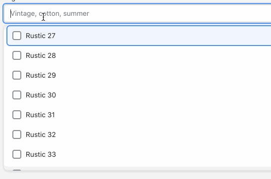
@dleroux The keyboard focus was an intentional change. We've fixed some bugs in the interaction and reverting to how it's currently in the autocomplete. As for the checkbox @voiid reached out to @HYPD for confirmation on visuals. The new styles weren't a great indication that multi-select was possible. So we've reverted to the old visuals. The checkbox has a role of presentation so it'll be skipped by screen readers & if you've top-hatted that it cannot gain focus I think we've in the clear! @voiid anything else you wanted to add? |
|
@dleroux @AndrewMusgrave Just about covers it! Both changes were made to reduce friction with getting this change out the door. For scrolling, I was thinking that we could revisit the scrolling behaviour with the team when we do the work to move the For checkboxes: The reason this change in particular was important is that while the new version communicated multiple selection very well once selections were made, having the visual checkboxes show does a better job of letting users know that multiple selection is possible before a selection is made. As Andrew mentioned it uses the presentation role so we should be safe on that front. The one negative here is that there could be an expectation that pressing the space key should select the option (in this case, it will actually enter a space into the text field and trigger a search change) but this matches the existing behaviour of the component (though the original had a weird bug that would only check on blur) so we thought it was acceptable for this version of the component. Something we should explore with usability testing for sure though! |
|
My bad, I see it now. I still would consider this a bug in the behavior. Maybe check with a designer on Polaris to confirm this? |
voiid
force-pushed
the
autocomplete-accessibility-improvements
branch
from
4363388 to
75ba773
Compare
 dleroux
left a comment
dleroux
left a comment
dleroux
left a comment
There was a problem hiding this comment.
I have not been able to tophat in web but in Polaris it works great 🎉
voiid
force-pushed
the
autocomplete-accessibility-improvements
branch
3 times, most recently
from
8fb3a6f to
f805a54
Compare
voiid
force-pushed
the
autocomplete-accessibility-improvements
branch
from
dafbc28 to
935a739
Compare
size-limit report
|
voiid
force-pushed
the
autocomplete-accessibility-improvements
branch
from
935a739 to
66ded1b
Compare
 voiid
force-pushed
the
autocomplete-accessibility-improvements
branch
from
voiid
force-pushed
the
autocomplete-accessibility-improvements
branch
from
2b6215b to
227a6f5
Compare
 alex-page
force-pushed
the
main
branch
5 times, most recently
from
alex-page
force-pushed
the
main
branch
5 times, most recently
from
9552c69 to
10da401
Compare
voiid
force-pushed
the
autocomplete-accessibility-improvements
branch
from
00ea87f to
b2449a6
Compare
 AndrewMusgrave
left a comment
AndrewMusgrave
left a comment
AndrewMusgrave
left a comment
There was a problem hiding this comment.
Looked over the docs for Autocomplete, ComboBox & ListBox. They're looking great 😍
| # Autocomplete | ||
|
|
||
| The autocomplete component is an input field that provides selectable suggestions as a merchant types into it. It allows merchants to quickly search through and select from large collections of options. | ||
| The autocomplete component is an input field that provides selectable suggestions as a merchant types into it. It allows merchants to quickly search through and select from large collections of options. Convenience wrapper around the `ComboBox` and `ListBox` components with minor UI differences. |
There was a problem hiding this comment.
| The autocomplete component is an input field that provides selectable suggestions as a merchant types into it. It allows merchants to quickly search through and select from large collections of options. Convenience wrapper around the `ComboBox` and `ListBox` components with minor UI differences. | |
| The autocomplete component is an input field that provides selectable suggestions as a merchant types into it. It allows merchants to quickly search through and select from large collections of options. It's a convenience wrapper around the `ComboBox` and `ListBox` components with minor UI differences. |
| - Traffic referrer source | ||
|
|
||
| #### Don’t | ||
|
|
||
| - Source |
There was a problem hiding this comment.
Same as above -
| - Traffic referrer source | |
| #### Don’t | |
| - Source | |
| - Traffic referrer source | |
| #### Don’t | |
| - Use interactive elements inside the list |
| ## Examples | ||
|
|
||
| ### Basic ListBox | ||
|
|
There was a problem hiding this comment.
It's not always done, but we'll want to add descriptions for the examples when possible
| Basic implementation of a control element used to let merchants select options |
src/components/ListBox/README.md
Outdated
| ### Basic ListBox | ||
|
|
||
| ```jsx | ||
| function baseListBoxExample() { |
There was a problem hiding this comment.
We'll want to capitalize the functions since they're components
| function baseListBoxExample() { | |
| function BaseListBoxExample() { |
| - list | ||
| - listbox |
There was a problem hiding this comment.
Are there anyone keywords we could add - maybe interactive list?
src/components/ComboBox/README.md
Outdated
| The `ComboBox` component is based on the [ARIA 1.2 combobox pattern](https://www.w3.org/TR/wai-aria-practices-1.1/#combobox). It is a combination of a single-line | ||
| `TextField` and a `Popover`. The current implementation expects a [`ListBox`] component to be used. |
There was a problem hiding this comment.
| The `ComboBox` component is based on the [ARIA 1.2 combobox pattern](https://www.w3.org/TR/wai-aria-practices-1.1/#combobox). It is a combination of a single-line | |
| `TextField` and a `Popover`. The current implementation expects a [`ListBox`] component to be used. | |
| The `ComboBox` component is based on the [ARIA 1.2 combobox pattern](https://www.w3.org/TR/wai-aria-practices-1.1/#combobox). It is a combination of a single-line `TextField` and a `Popover`. The current implementation expects a [`ListBox`] component to be used. |
src/components/ComboBox/README.md
Outdated
|
|
||
| The `ComboBox` popover displays below the text field or other control by default so it is easy for merchants to discover and use. However, you can change the position with the `preferredPosition` prop. | ||
|
|
||
| ComboBox features can be challenging for merchants with visual, motor, and cognitive disabilities. Even when they’re built using best practices, these features can be difficult to use with some assistive technologies. Merchants should always be able to search, enter data, or perform other activities without relying on the combobox. |
There was a problem hiding this comment.
| ComboBox features can be challenging for merchants with visual, motor, and cognitive disabilities. Even when they’re built using best practices, these features can be difficult to use with some assistive technologies. Merchants should always be able to search, enter data, or perform other activities without relying on the combobox. | |
| `ComboBox` features can be challenging for merchants with visual, motor, and cognitive disabilities. Even when they’re built using best practices, these features can be difficult to use with some assistive technologies. Merchants should always be able to search, enter data, or perform other activities without relying on the combobox. |
src/components/ComboBox/README.md
Outdated
|
|
||
| #### Do | ||
|
|
||
| Use combobox as progressive enhancement to make the interface easier to use for most merchants. |
There was a problem hiding this comment.
I think these are lists
| Use combobox as progressive enhancement to make the interface easier to use for most merchants. | |
| - Use combobox as progressive enhancement to make the interface easier to use for most merchants. |
src/components/ComboBox/README.md
Outdated
|
|
||
| #### Don’t | ||
|
|
||
| Require that merchants make a selection from the combobox to complete a task. |
There was a problem hiding this comment.
^
| Require that merchants make a selection from the combobox to complete a task. | |
| - Require that merchants make a selection from the combobox to complete a task. |
src/components/ComboBox/README.md
Outdated
|
|
||
| ### Keyboard support | ||
|
|
||
| - Give the combobox text input keyboard focus with the <kbd>tab</kbd> key (or <kbd>shift</kbd> + <kbd>tab</kbd> when tabbing backwards) |
There was a problem hiding this comment.
| - Give the combobox text input keyboard focus with the <kbd>tab</kbd> key (or <kbd>shift</kbd> + <kbd>tab</kbd> when tabbing backwards) | |
| - Give the combobox's text input keyboard focus with the <kbd>tab</kbd> key (or <kbd>shift</kbd> + <kbd>tab</kbd> when tabbing backwards) |
|
Thanks for looping me in, @voiid. These docs are in great shape! I'm dropping my feedback below, but it’s mostly questions and thinking out loud. I'll be OOO Thursday and Friday this week, but we have a meeting on Monday in case you want to chat through any of this. ListBox - intro:
ListBox - content guidelines:
ComboBox - intro:
ComboBox - accessibility > structure, Autocomplete - accessibility > structure:
Applies to all 3 docs:
|
src/components/ListBox/README.md
Outdated
|
|
||
| # ListBox | ||
|
|
||
| The `ListBox` component is a list component that implements part the [Aria 1.2 ListBox specs](https://www.w3.org/TR/wai-aria-practices-1.2/#Listbox). It presents a list of options and allows users to select one or more of them. Through composition, it is possible to customize the presentation of these lists by using sections, headers or custom elements. |
There was a problem hiding this comment.
| The `ListBox` component is a list component that implements part the [Aria 1.2 ListBox specs](https://www.w3.org/TR/wai-aria-practices-1.2/#Listbox). It presents a list of options and allows users to select one or more of them. Through composition, it is possible to customize the presentation of these lists by using sections, headers or custom elements. | |
| The `ListBox` component is a list component that implements part of the [Aria 1.2 ListBox specs](https://www.w3.org/TR/wai-aria-practices-1.2/#Listbox). |
src/components/ListBox/README.md
Outdated
|
|
||
| # ListBox | ||
|
|
||
| The `ListBox` component is a list component that implements part the [Aria 1.2 ListBox specs](https://www.w3.org/TR/wai-aria-practices-1.2/#Listbox). It presents a list of options and allows users to select one or more of them. Through composition, it is possible to customize the presentation of these lists by using sections, headers or custom elements. |
There was a problem hiding this comment.
If you need more structure than the standard component offers, use composition to customize the presentation of these lists by using sections, headers, or custom elements.
 - Replace internals with new combobox and list box
 - Add support for legacy combobox
 - Allow TextField and Checkbox to leverage new combobox
 - Include additional test coverage for autocomplete and new components

Co-authored-by: Andrew Musgrave <andrew.musgrave@shopify.com>
Co-authored-by: Daniel Leroux <daniel.leroux@shopify.com>
voiid
force-pushed
the
autocomplete-accessibility-improvements
branch
from
1e2567a to
d40ba0b
Compare
* Upgrade to node v12 (#4191)

* Move to node v12

* Bump merge-deep from 3.0.2 to 3.0.3 (#4254)

Bumps [merge-deep](https://github.com/jonschlinkert/merge-deep) from 3.0.2 to 3.0.3.
- [Release notes](https://github.com/jonschlinkert/merge-deep/releases)
- [Commits](jonschlinkert/merge-deep@3.0.2...3.0.3)

---
updated-dependencies:
- dependency-name: merge-deep
  dependency-type: indirect
...

Signed-off-by: dependabot[bot] <support@github.com>

Co-authored-by: dependabot[bot] <49699333+dependabot[bot]@users.noreply.github.com>

* Bump ws in /examples/create-react-app-ts-react-testing (#4242)

Bumps [ws](https://github.com/websockets/ws) from 6.2.1 to 6.2.2.
- [Release notes](https://github.com/websockets/ws/releases)
- [Commits](https://github.com/websockets/ws/commits)

---
updated-dependencies:
- dependency-name: ws
  dependency-type: indirect
...

Signed-off-by: dependabot[bot] <support@github.com>

Co-authored-by: dependabot[bot] <49699333+dependabot[bot]@users.noreply.github.com>

* Bump ws from 6.2.1 to 6.2.2 in /examples/create-react-app (#4241)

Bumps [ws](https://github.com/websockets/ws) from 6.2.1 to 6.2.2.
- [Release notes](https://github.com/websockets/ws/releases)
- [Commits](https://github.com/websockets/ws/commits)

---
updated-dependencies:
- dependency-name: ws
  dependency-type: indirect
...

Signed-off-by: dependabot[bot] <support@github.com>

Co-authored-by: dependabot[bot] <49699333+dependabot[bot]@users.noreply.github.com>

* Bump ws from 6.2.1 to 6.2.2 in /examples/webpack (#4240)

Bumps [ws](https://github.com/websockets/ws) from 6.2.1 to 6.2.2.
- [Release notes](https://github.com/websockets/ws/releases)
- [Commits](https://github.com/websockets/ws/commits)

---
updated-dependencies:
- dependency-name: ws
  dependency-type: indirect
...

Signed-off-by: dependabot[bot] <support@github.com>

Co-authored-by: dependabot[bot] <49699333+dependabot[bot]@users.noreply.github.com>

* Update UNRELEASED.md

Co-authored-by: dependabot[bot] <49699333+dependabot[bot]@users.noreply.github.com>

* Bump react and react-dom to v16.14.0 (#4279)

Co-authored-by: Ben Scott <227292+BPScott@users.noreply.github.com>

* [TextField] Make autoComplete prop a required string (#4267)

* Require autoComplete prop on TextField

* switch to autoComplete="off" as default

* Adding off recommendation.

* Fix link formatting issue in TextField/README.md

Co-authored-by: Genevieve Bulger <genevieve.bulger@shopify.com>

* Update browserslist to match shopify/browserslist-config v3.0.0 (#4304)

- Desktop Safari version is "last 3 safari versions" - mapping to
  Safari 13.1
- ios Safari version is "ios >= 13.4" - mapping to ios_saf 13.4-13.7

* [AutoComplete] Rebuild autocomplete internals to use new accessible components (#3910)

* Rebuild AutoComplete internals to fix accessibility issues

 - Replace internals with new combobox and list box
 - Add support for legacy combobox
 - Allow TextField and Checkbox to leverage new combobox
 - Include additional test coverage for autocomplete and new components

Co-authored-by: Andrew Musgrave <andrew.musgrave@shopify.com>
Co-authored-by: Daniel Leroux <daniel.leroux@shopify.com>

* Fix some accessibility warnings on listbox stories

* Remove listbox section example

Co-authored-by: Andrew Musgrave <andrew.musgrave@shopify.com>
Co-authored-by: Daniel Leroux <daniel.leroux@shopify.com>

Co-authored-by: Alex Page <alex@alexpage.com.au>
Co-authored-by: dependabot[bot] <49699333+dependabot[bot]@users.noreply.github.com>
Co-authored-by: Ben Scott <227292+BPScott@users.noreply.github.com>
Co-authored-by: Andrew McGoveran <andrew.mcgoveran@shopify.com>
Co-authored-by: Genevieve Bulger <genevieve.bulger@shopify.com>
Co-authored-by: Andrew Musgrave <andrew.musgrave@shopify.com>
Co-authored-by: Daniel Leroux <daniel.leroux@shopify.com>
…omponents (#3910)

* Rebuild AutoComplete internals to fix accessibility issues

 - Replace internals with new combobox and list box
 - Add support for legacy combobox
 - Allow TextField and Checkbox to leverage new combobox
 - Include additional test coverage for autocomplete and new components

Co-authored-by: Andrew Musgrave <andrew.musgrave@shopify.com>
Co-authored-by: Daniel Leroux <daniel.leroux@shopify.com>

* Fix some accessibility warnings on listbox stories

* Remove listbox section example

Co-authored-by: Andrew Musgrave <andrew.musgrave@shopify.com>
Co-authored-by: Daniel Leroux <daniel.leroux@shopify.com>
* Upgrade to node v12 (#4191)

* Move to node v12

* Bump merge-deep from 3.0.2 to 3.0.3 (#4254)

Bumps [merge-deep](https://github.com/jonschlinkert/merge-deep) from 3.0.2 to 3.0.3.
- [Release notes](https://github.com/jonschlinkert/merge-deep/releases)
- [Commits](jonschlinkert/merge-deep@3.0.2...3.0.3)

---
updated-dependencies:
- dependency-name: merge-deep
  dependency-type: indirect
...

Signed-off-by: dependabot[bot] <support@github.com>

Co-authored-by: dependabot[bot] <49699333+dependabot[bot]@users.noreply.github.com>

* Bump ws in /examples/create-react-app-ts-react-testing (#4242)

Bumps [ws](https://github.com/websockets/ws) from 6.2.1 to 6.2.2.
- [Release notes](https://github.com/websockets/ws/releases)
- [Commits](https://github.com/websockets/ws/commits)

---
updated-dependencies:
- dependency-name: ws
  dependency-type: indirect
...

Signed-off-by: dependabot[bot] <support@github.com>

Co-authored-by: dependabot[bot] <49699333+dependabot[bot]@users.noreply.github.com>

* Bump ws from 6.2.1 to 6.2.2 in /examples/create-react-app (#4241)

Bumps [ws](https://github.com/websockets/ws) from 6.2.1 to 6.2.2.
- [Release notes](https://github.com/websockets/ws/releases)
- [Commits](https://github.com/websockets/ws/commits)

---
updated-dependencies:
- dependency-name: ws
  dependency-type: indirect
...

Signed-off-by: dependabot[bot] <support@github.com>

Co-authored-by: dependabot[bot] <49699333+dependabot[bot]@users.noreply.github.com>

* Bump ws from 6.2.1 to 6.2.2 in /examples/webpack (#4240)

Bumps [ws](https://github.com/websockets/ws) from 6.2.1 to 6.2.2.
- [Release notes](https://github.com/websockets/ws/releases)
- [Commits](https://github.com/websockets/ws/commits)

---
updated-dependencies:
- dependency-name: ws
  dependency-type: indirect
...

Signed-off-by: dependabot[bot] <support@github.com>

Co-authored-by: dependabot[bot] <49699333+dependabot[bot]@users.noreply.github.com>

* Update UNRELEASED.md

Co-authored-by: dependabot[bot] <49699333+dependabot[bot]@users.noreply.github.com>

* Bump react and react-dom to v16.14.0 (#4279)

Co-authored-by: Ben Scott <227292+BPScott@users.noreply.github.com>

* [TextField] Make autoComplete prop a required string (#4267)

* Require autoComplete prop on TextField

* switch to autoComplete="off" as default

* Adding off recommendation.

* Fix link formatting issue in TextField/README.md

Co-authored-by: Genevieve Bulger <genevieve.bulger@shopify.com>

* Update browserslist to match shopify/browserslist-config v3.0.0 (#4304)

- Desktop Safari version is "last 3 safari versions" - mapping to
  Safari 13.1
- ios Safari version is "ios >= 13.4" - mapping to ios_saf 13.4-13.7

* [AutoComplete] Rebuild autocomplete internals to use new accessible components (#3910)

* Rebuild AutoComplete internals to fix accessibility issues

 - Replace internals with new combobox and list box
 - Add support for legacy combobox
 - Allow TextField and Checkbox to leverage new combobox
 - Include additional test coverage for autocomplete and new components

Co-authored-by: Andrew Musgrave <andrew.musgrave@shopify.com>
Co-authored-by: Daniel Leroux <daniel.leroux@shopify.com>

* Fix some accessibility warnings on listbox stories

* Remove listbox section example

Co-authored-by: Andrew Musgrave <andrew.musgrave@shopify.com>
Co-authored-by: Daniel Leroux <daniel.leroux@shopify.com>

* Update to node 12.22.0 and react-testing v3.2.0 (#4349)

* Update node version to 12.22.0

Released on 2021-03-30, this is the first version of node where
esmodules are considered stable. We're not relying on that yet, but this
sets the stage for the future.

* Update @shopify/react-testing to v3.2.0

This adds support for React 17 so future migration will be easier

* Remove deprecated languages (#4351)

* Update translation.yml

* Delete locales/hi.json

* Delete locales/ms.json

* format translation.yml as expected

Co-authored-by: translation-platform[bot] <35075727+translation-platform@users.noreply.github.com>

* Rename ComboBox and ListBox to Combobox and Listbox (#4379)

* Fix autocomlete docs

Co-authored-by: Alex Page <alex@alexpage.com.au>
Co-authored-by: dependabot[bot] <49699333+dependabot[bot]@users.noreply.github.com>
Co-authored-by: Ben Scott <227292+BPScott@users.noreply.github.com>
Co-authored-by: Andrew McGoveran <andrew.mcgoveran@shopify.com>
Co-authored-by: Genevieve Bulger <genevieve.bulger@shopify.com>
Co-authored-by: Andrew Musgrave <andrew.musgrave@shopify.com>
Co-authored-by: Daniel Leroux <daniel.leroux@shopify.com>
Co-authored-by: Kyle Durand <kyle.durand@shopify.com>
Co-authored-by: Al-Campuzano <32461613+Al-Campuzano@users.noreply.github.com>
Co-authored-by: translation-platform[bot] <35075727+translation-platform@users.noreply.github.com>
…omponents (#3910)

* Rebuild AutoComplete internals to fix accessibility issues

 - Replace internals with new combobox and list box
 - Add support for legacy combobox
 - Allow TextField and Checkbox to leverage new combobox
 - Include additional test coverage for autocomplete and new components

Co-authored-by: Andrew Musgrave <andrew.musgrave@shopify.com>
Co-authored-by: Daniel Leroux <daniel.leroux@shopify.com>

* Fix some accessibility warnings on listbox stories

* Remove listbox section example

Co-authored-by: Andrew Musgrave <andrew.musgrave@shopify.com>
Co-authored-by: Daniel Leroux <daniel.leroux@shopify.com>
* Upgrade to node v12 (#4191)

* Move to node v12

* Bump merge-deep from 3.0.2 to 3.0.3 (#4254)

Bumps [merge-deep](https://github.com/jonschlinkert/merge-deep) from 3.0.2 to 3.0.3.
- [Release notes](https://github.com/jonschlinkert/merge-deep/releases)
- [Commits](jonschlinkert/merge-deep@3.0.2...3.0.3)

---
updated-dependencies:
- dependency-name: merge-deep
  dependency-type: indirect
...

Signed-off-by: dependabot[bot] <support@github.com>

Co-authored-by: dependabot[bot] <49699333+dependabot[bot]@users.noreply.github.com>

* Bump ws in /examples/create-react-app-ts-react-testing (#4242)

Bumps [ws](https://github.com/websockets/ws) from 6.2.1 to 6.2.2.
- [Release notes](https://github.com/websockets/ws/releases)
- [Commits](https://github.com/websockets/ws/commits)

---
updated-dependencies:
- dependency-name: ws
  dependency-type: indirect
...

Signed-off-by: dependabot[bot] <support@github.com>

Co-authored-by: dependabot[bot] <49699333+dependabot[bot]@users.noreply.github.com>

* Bump ws from 6.2.1 to 6.2.2 in /examples/create-react-app (#4241)

Bumps [ws](https://github.com/websockets/ws) from 6.2.1 to 6.2.2.
- [Release notes](https://github.com/websockets/ws/releases)
- [Commits](https://github.com/websockets/ws/commits)

---
updated-dependencies:
- dependency-name: ws
  dependency-type: indirect
...

Signed-off-by: dependabot[bot] <support@github.com>

Co-authored-by: dependabot[bot] <49699333+dependabot[bot]@users.noreply.github.com>

* Bump ws from 6.2.1 to 6.2.2 in /examples/webpack (#4240)

Bumps [ws](https://github.com/websockets/ws) from 6.2.1 to 6.2.2.
- [Release notes](https://github.com/websockets/ws/releases)
- [Commits](https://github.com/websockets/ws/commits)

---
updated-dependencies:
- dependency-name: ws
  dependency-type: indirect
...

Signed-off-by: dependabot[bot] <support@github.com>

Co-authored-by: dependabot[bot] <49699333+dependabot[bot]@users.noreply.github.com>

* Update UNRELEASED.md

Co-authored-by: dependabot[bot] <49699333+dependabot[bot]@users.noreply.github.com>

* Bump react and react-dom to v16.14.0 (#4279)

Co-authored-by: Ben Scott <227292+BPScott@users.noreply.github.com>

* [TextField] Make autoComplete prop a required string (#4267)

* Require autoComplete prop on TextField

* switch to autoComplete="off" as default

* Adding off recommendation.

* Fix link formatting issue in TextField/README.md

Co-authored-by: Genevieve Bulger <genevieve.bulger@shopify.com>

* Update browserslist to match shopify/browserslist-config v3.0.0 (#4304)

- Desktop Safari version is "last 3 safari versions" - mapping to
  Safari 13.1
- ios Safari version is "ios >= 13.4" - mapping to ios_saf 13.4-13.7

* [AutoComplete] Rebuild autocomplete internals to use new accessible components (#3910)

* Rebuild AutoComplete internals to fix accessibility issues

 - Replace internals with new combobox and list box
 - Add support for legacy combobox
 - Allow TextField and Checkbox to leverage new combobox
 - Include additional test coverage for autocomplete and new components

Co-authored-by: Andrew Musgrave <andrew.musgrave@shopify.com>
Co-authored-by: Daniel Leroux <daniel.leroux@shopify.com>

* Fix some accessibility warnings on listbox stories

* Remove listbox section example

Co-authored-by: Andrew Musgrave <andrew.musgrave@shopify.com>
Co-authored-by: Daniel Leroux <daniel.leroux@shopify.com>

Co-authored-by: Alex Page <alex@alexpage.com.au>
Co-authored-by: dependabot[bot] <49699333+dependabot[bot]@users.noreply.github.com>
Co-authored-by: Ben Scott <227292+BPScott@users.noreply.github.com>
Co-authored-by: Andrew McGoveran <andrew.mcgoveran@shopify.com>
Co-authored-by: Genevieve Bulger <genevieve.bulger@shopify.com>
Co-authored-by: Andrew Musgrave <andrew.musgrave@shopify.com>
Co-authored-by: Daniel Leroux <daniel.leroux@shopify.com>
5 participants
WHY are these changes introduced?
Fixes #3811
Fixes accessibility issues on all uses of the Autocomplete component.
This PR includes the following:
ComboBoxandListBoxcomponents built by @dleroux with help from @AndrewMusgrave. These are currently subcomponents of Autocomplete for now, but our intention is to get these in a state (mostly missing documentation) to become top level components in the future. These follow the aria 1.2 spec.Visual change audit
To maintain full backwards compatibility we did our absolute best to match all of the visuals of the component 1 to 1. There are a few intentional changes to help differentiate between hover and selection states but otherwise, everything should match.
The link below contains a comprehensive before and after comparison of just about every prop combination.
https://docs.google.com/spreadsheets/d/12X7igZB6jN3mzuhaXL9WK2SlK2HvRhJyAepCJkZRB7M/edit?userstoinvite=andrew.musgrave@shopify.com&ts=6011e9fc#gid=0
Render graphs
Test coverage
The test coverage is near perfect. The failure stems from the old combobox being added as additions
WHAT is this pull request doing?
How to 🎩
🖥 Local development instructions
🗒 General tophatting guidelines
📄 Changelog guidelines
Copy-paste this code in
playground/Playground.tsx:🎩 checklist
README.mdwith documentation changes