Repository navigation
v1.5.0

Your header, your way — and four asks from the community. The dashboard's tabs, the sidebar's head and the header's actions are now Fluvy's to style, the "by source" chart draws from your power sensors, rows take templates, a wall tablet reads larger, and the cards that ran long have compact variants.
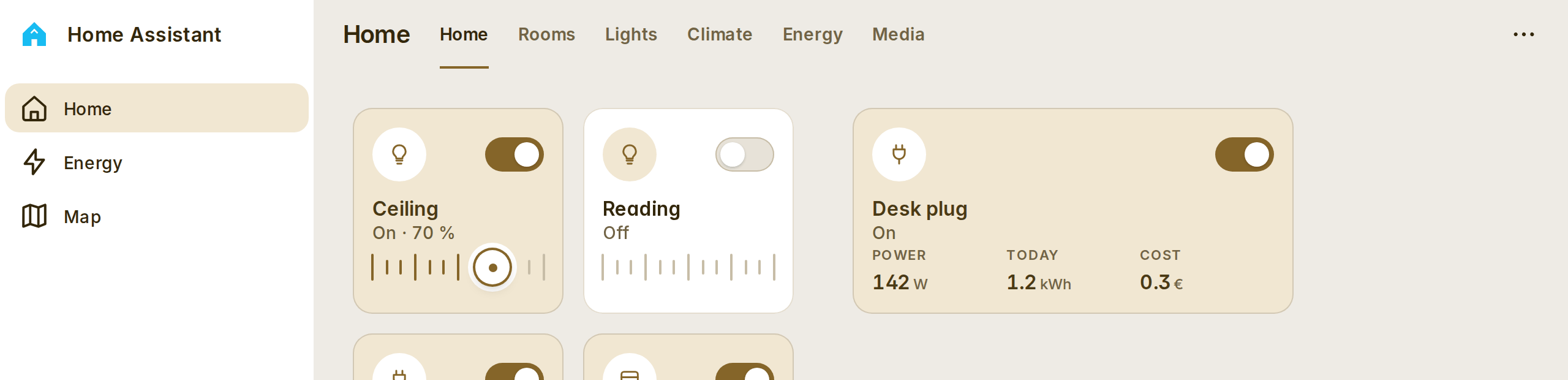
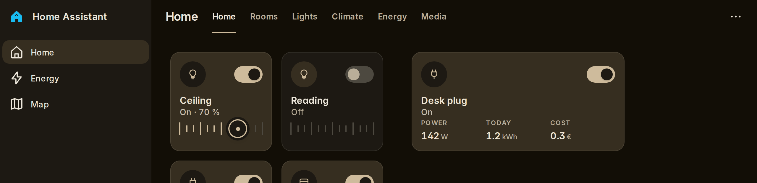
Everything in the header is a choice
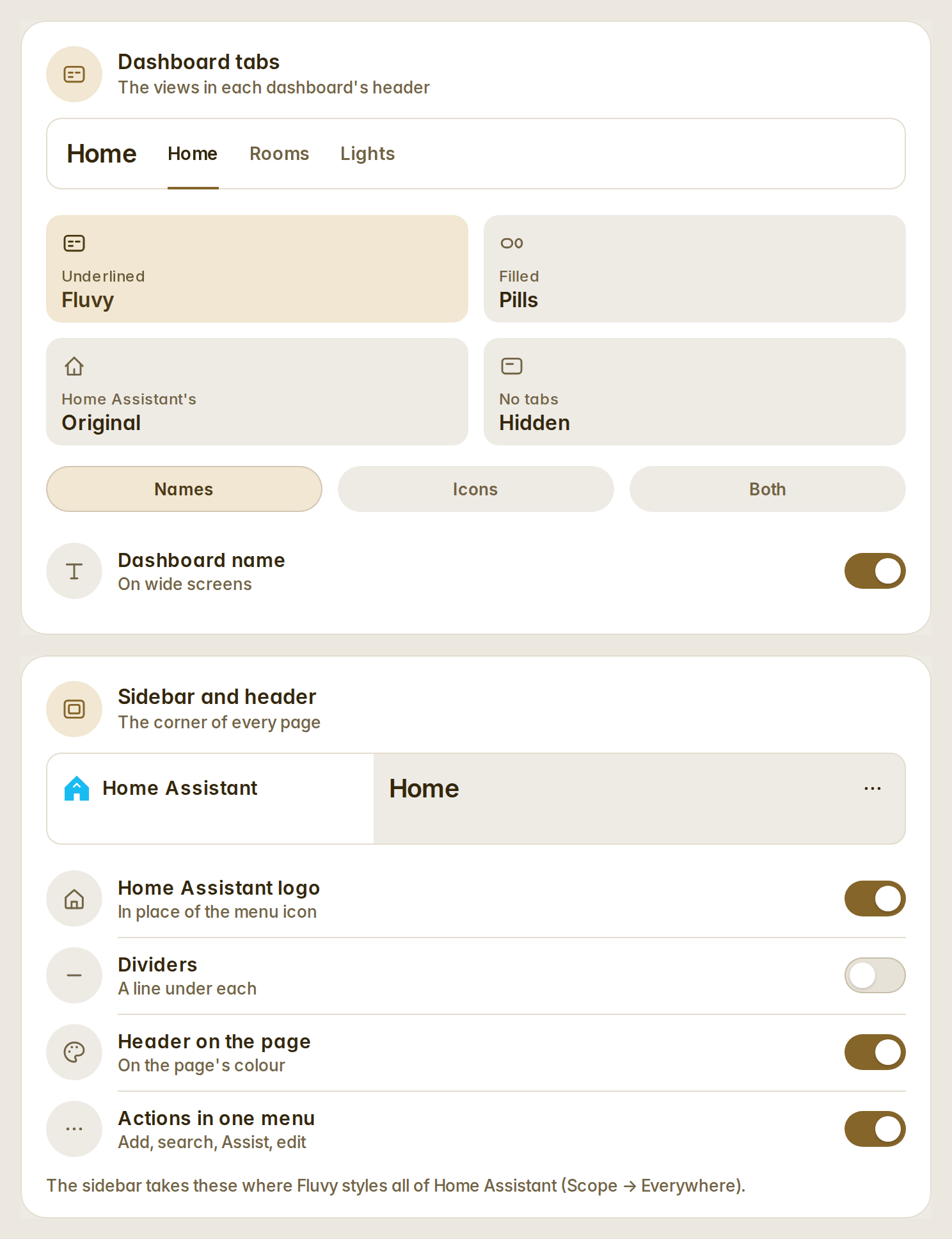
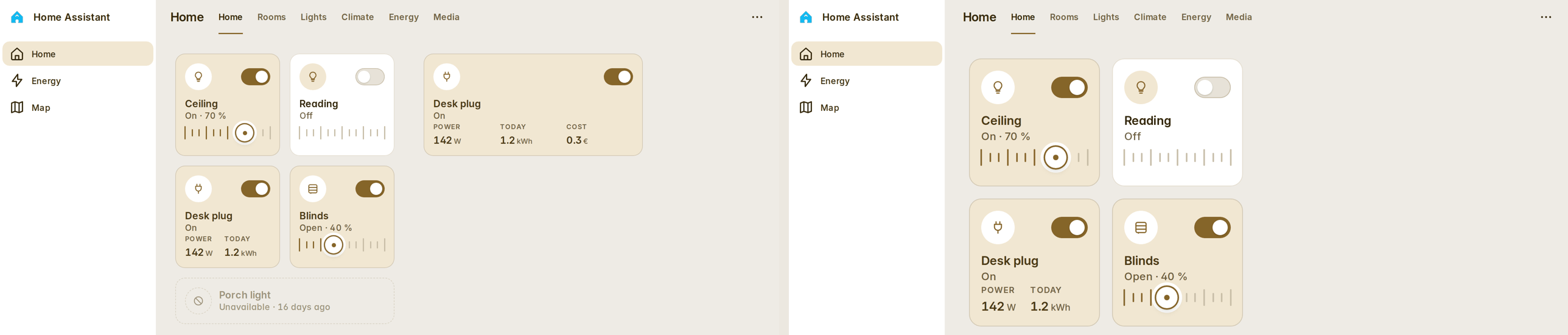
Appearance has two new cards. Dashboard tabs: Fluvy's (the views as words, the accent under the open one), pills, Home Assistant's original, or hidden; each tab with its name, its icon or both — a view without an icon gets the one its name says, in any of Fluvy's languages — and the dashboard's name before the tabs in any style. Sidebar and header: Home Assistant's logo in place of the menu icon, the dividers on or off, the header on the page's own colour, and add / search / Assist / edit in one "…" menu. All on, it is the corner of Fluvy's screenshots (#20).
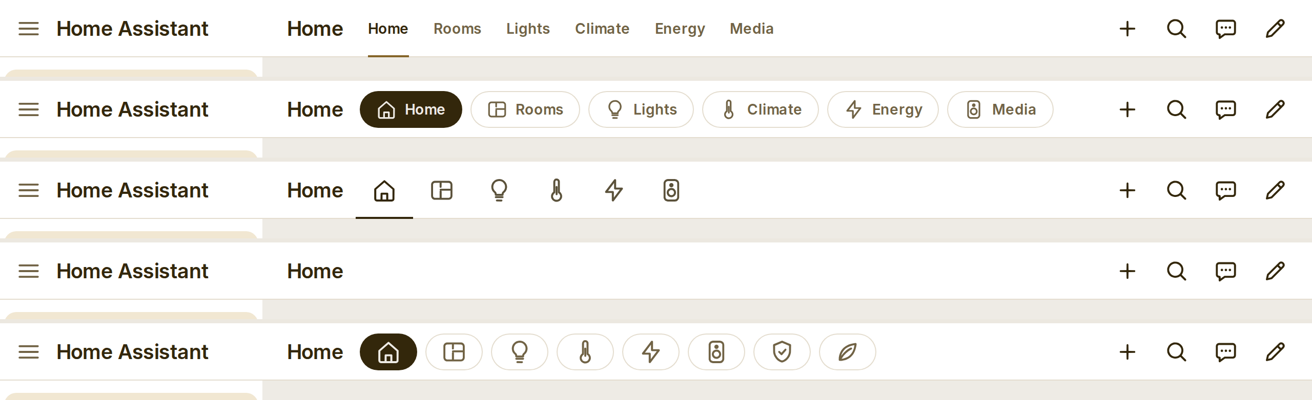
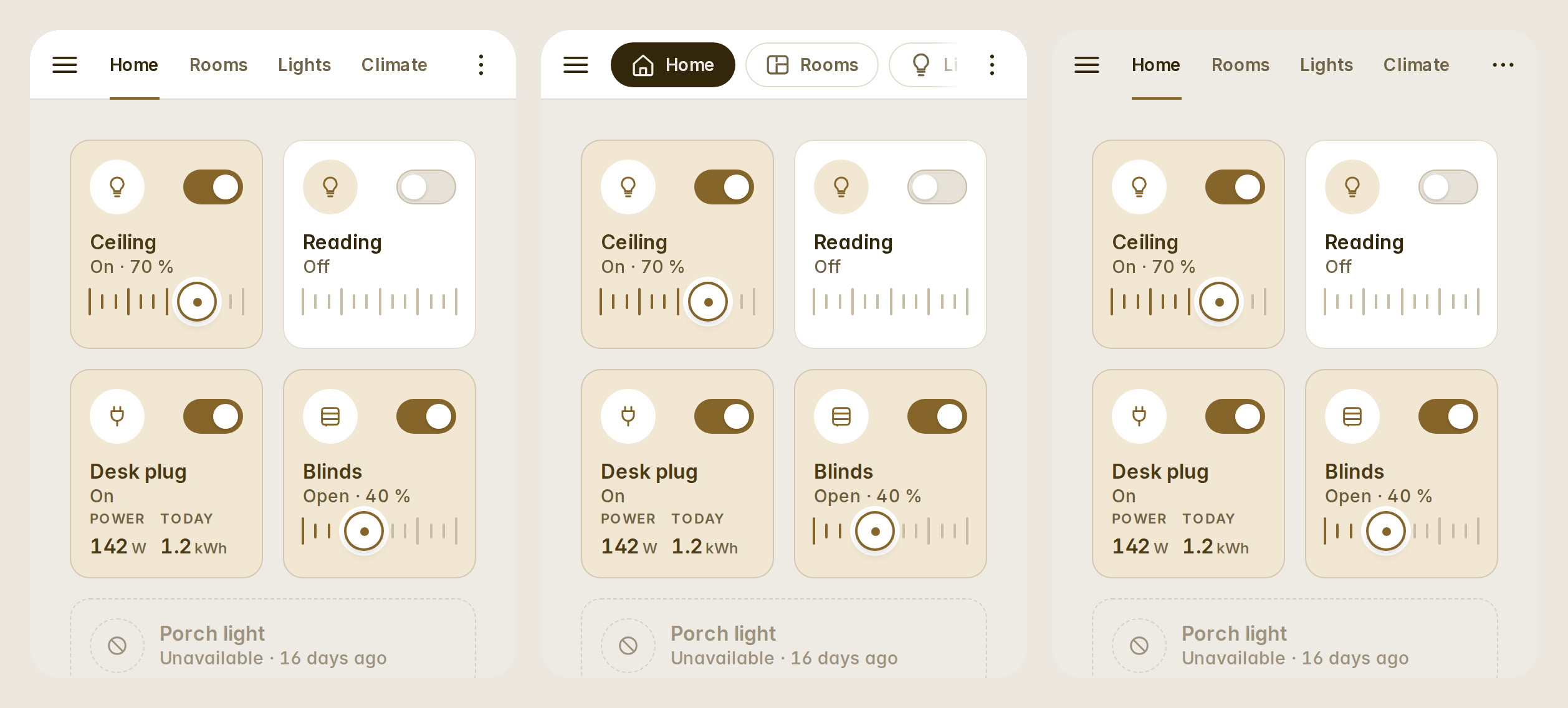
- On a phone the tabs scroll under the finger and fade where the row goes on; the edit mode and subviews keep Home Assistant's header.
- The automatic dashboards no longer repeat their views as chips under the greeting; each dashboard's options put them back.
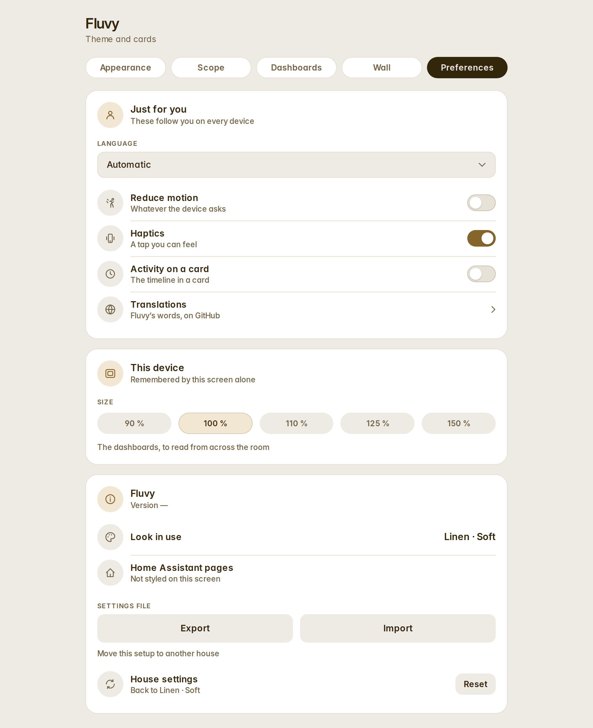
- The settings panel's tabs fit one line: About is now the last card of Preferences.
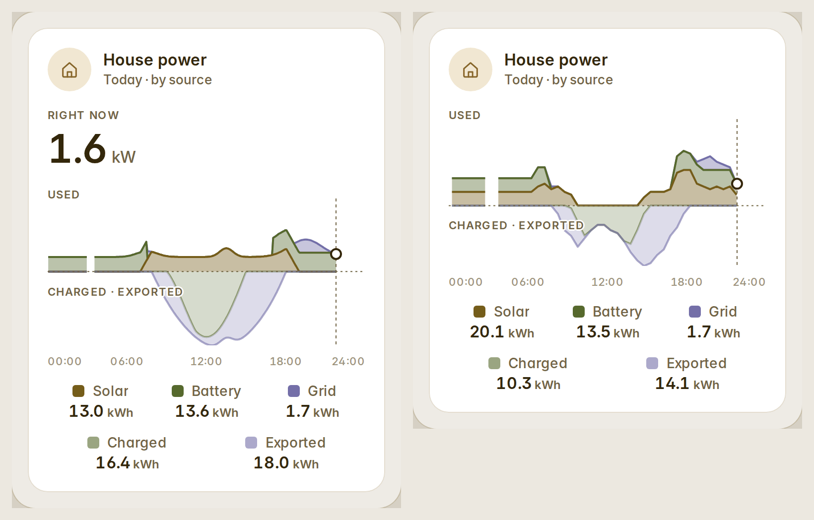
House power by source, fixed
The sources variant now draws from the power sensors in your Energy dashboard — the same five-minute data as Home Assistant's own "Power sources" graph — so a hybrid inverter or meters that count in 0.1 kWh no longer flatten the midday or put the sun in the night. What went into the battery shows under the line with the export, "Right now" is the house's own use, and a gap in the recorder stays a gap (#23).
Templates in row text
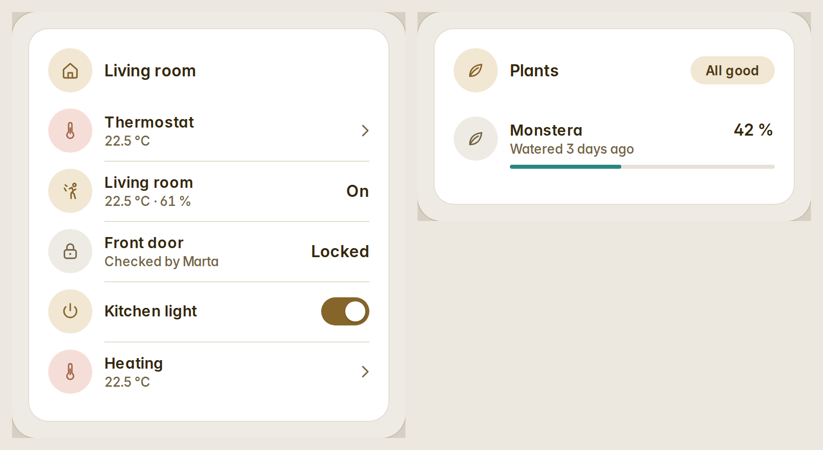
A row's secondary can be a Home Assistant template — {{ state_attr('climate.living', 'current_temperature') }} °C — rendered by Home Assistant and kept live on entities, lock, alarm, camera, bars, stat tiles, actions and helpers rows. A template that fails shows nothing, never its own text (#21).
A size per device
Each screen remembers its own size: 90, 100, 110, 125 or 150 %. Set it in Preferences → This device, or open a dashboard once with ?zoom=125 on the wall tablet. Only the dashboard's view grows; the header, the sidebar and the edit mode keep theirs, and every slider, dial and drag still lands under your finger (#21).
Compact variants and power on the media cards
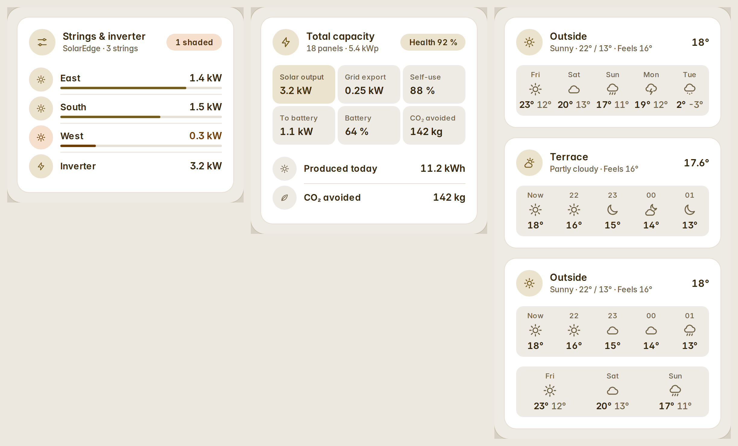
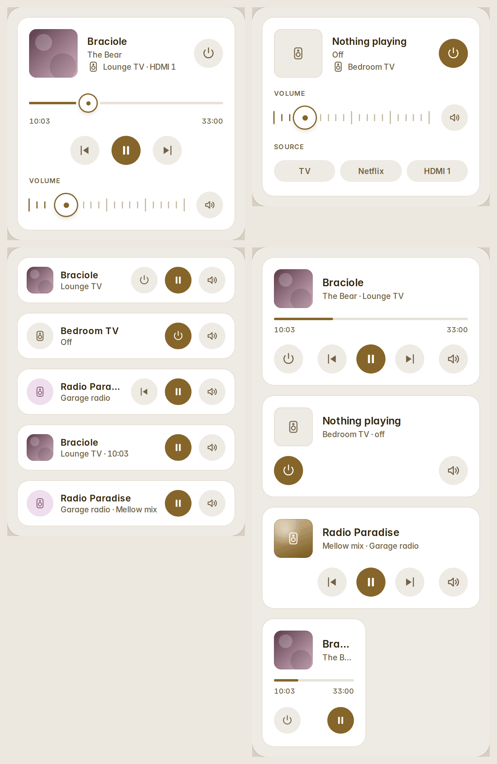
variant: compact for bars (48 px rows), weather (one head row, the days as columns) and stat tiles (64 px tiles, three a row). The media cards turn a player on and off, and the compact rows take controls in the order you write them (#21).
Also fixed
- An automatic dashboard whose grid meter is found by its name drew its grid gauge without an entity; it names the meter.
- Bars and stat tiles count their rows' real heights, so an automatic dashboard's columns end level.
- A row squeezed into half a column keeps its name, and a row that cannot be read says why.
Full list: CHANGELOG.