Repository navigation
Releases: acosta290/fluvy
Release list
v1.8.0

Three issues from the first days of 1.7 — two new cards and the light card's colours of your own — and the fix that keeps the chips still. Thank you svb91 and xoatrash.
Automations (#33)
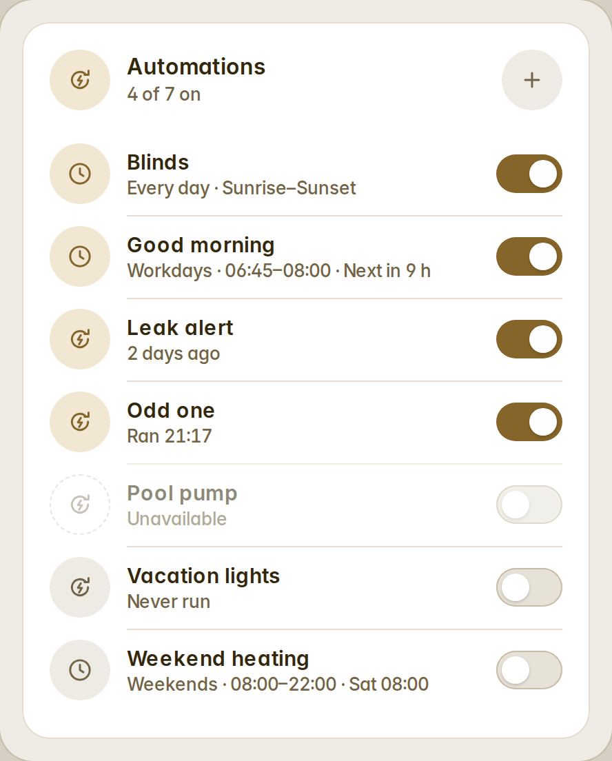
fluvy-automations-card lists every automation of the house — a switch, the last run, filters, rows, compact rows or tiles, a fold row for the rest — and writes schedules as native Home Assistant automations through the config API. There is no scheduler of its own and nothing stored outside Home Assistant: every schedule is also in Settings → Automations, editable there, and anything edited there beyond Fluvy's shape is still listed as a plain row.
A schedule is what to do (turn on or off, open or close, run — with a brightness for lights or a temperature for climate), on which days (every day, workdays by the Workday sensor or Mon–Fri, weekends, chosen weekdays), from a time or sunrise/sunset with an offset, until another time if you want, with a name suggested for you. A schedule's row reads the way people say it: "Workdays · 06:45–08:00 · Next in 9 h".
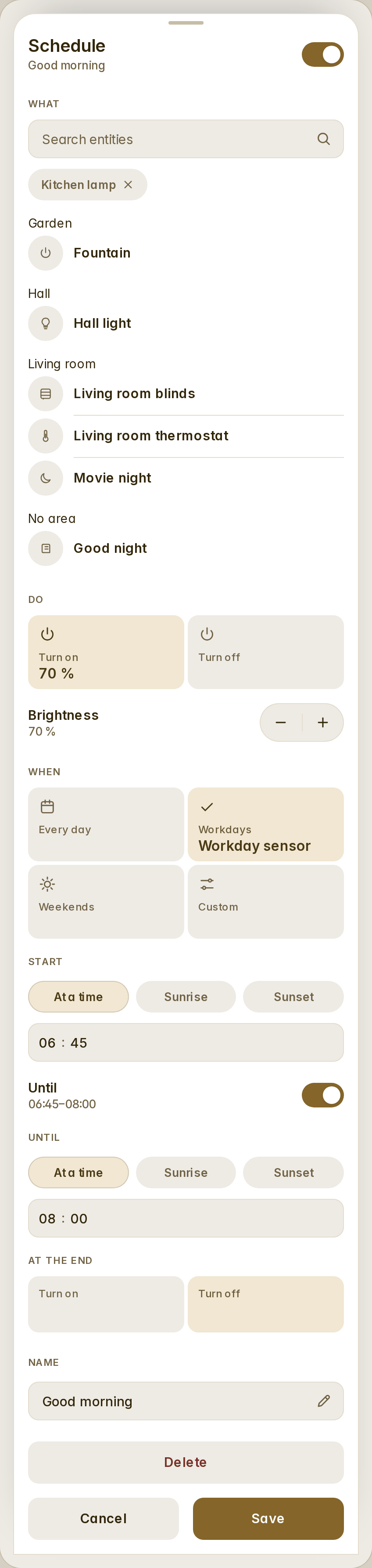
Administrators add and edit in a bottom sheet (search the entities, pick the verb and the level, the days, the start and the end, Save only when the schedule is whole, Delete armed on a first tap); everyone else sees the list, switches and runs. A plain automation opens its details: Run, Open in Home Assistant, Traces.
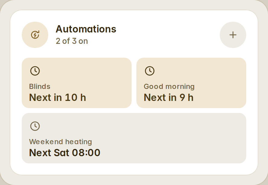
type: custom:fluvy-automations-card
show: schedules
variant: tiles
History bars (#38)
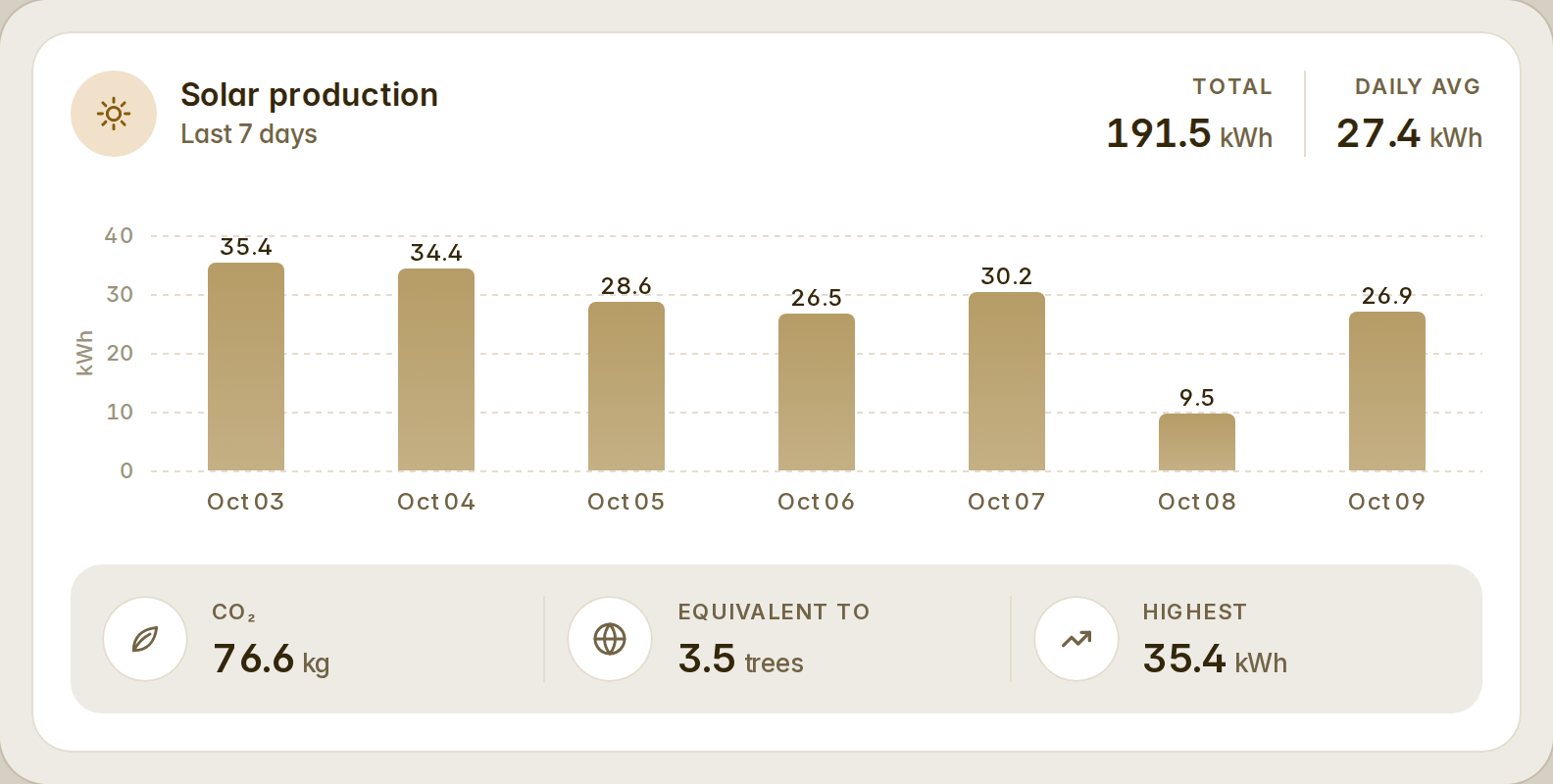
fluvy-history-bars-card draws a sensor's last days, weeks or months as bars from Home Assistant's long-term statistics: the total and the daily average in the head, the value over every bar on a nice scale with dashed gridlines and the unit on the axis, the dates under, and a strip of facts under the chart. Scrub the bars to read a day in the head.
The head readouts and the facts are lists you compose in order — total, average, highest, lowest, today, CO₂ and its trees or kilometres, a share of another sensor, money at a price, a template — each with its own name, icon, colour, unit, decimals, factor and tap action. Every part can be hidden; full, compact and mini. The defaults are honest numbers (highest, lowest, average); the equivalents appear only when you add them and their factors are in the open.
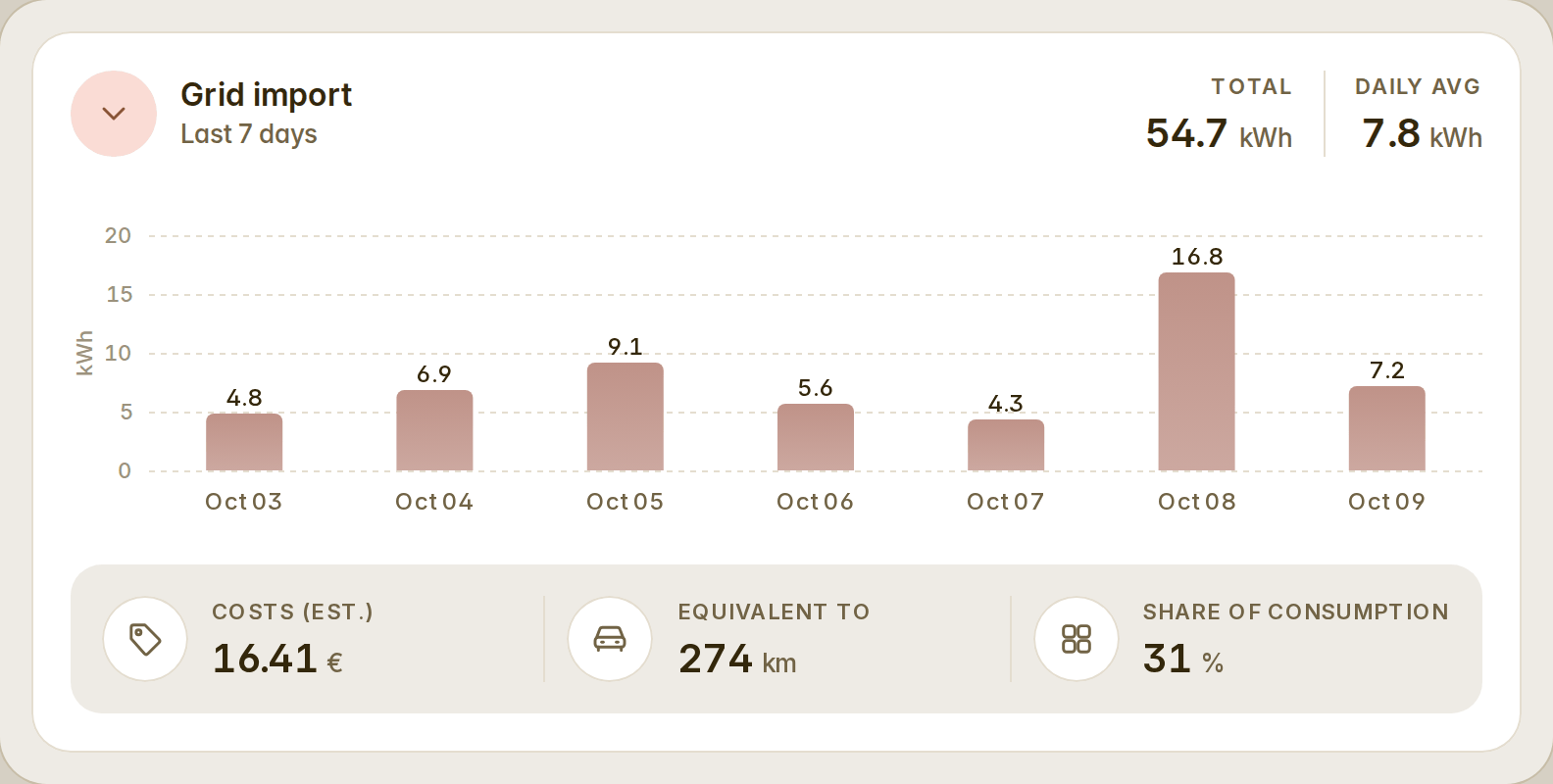
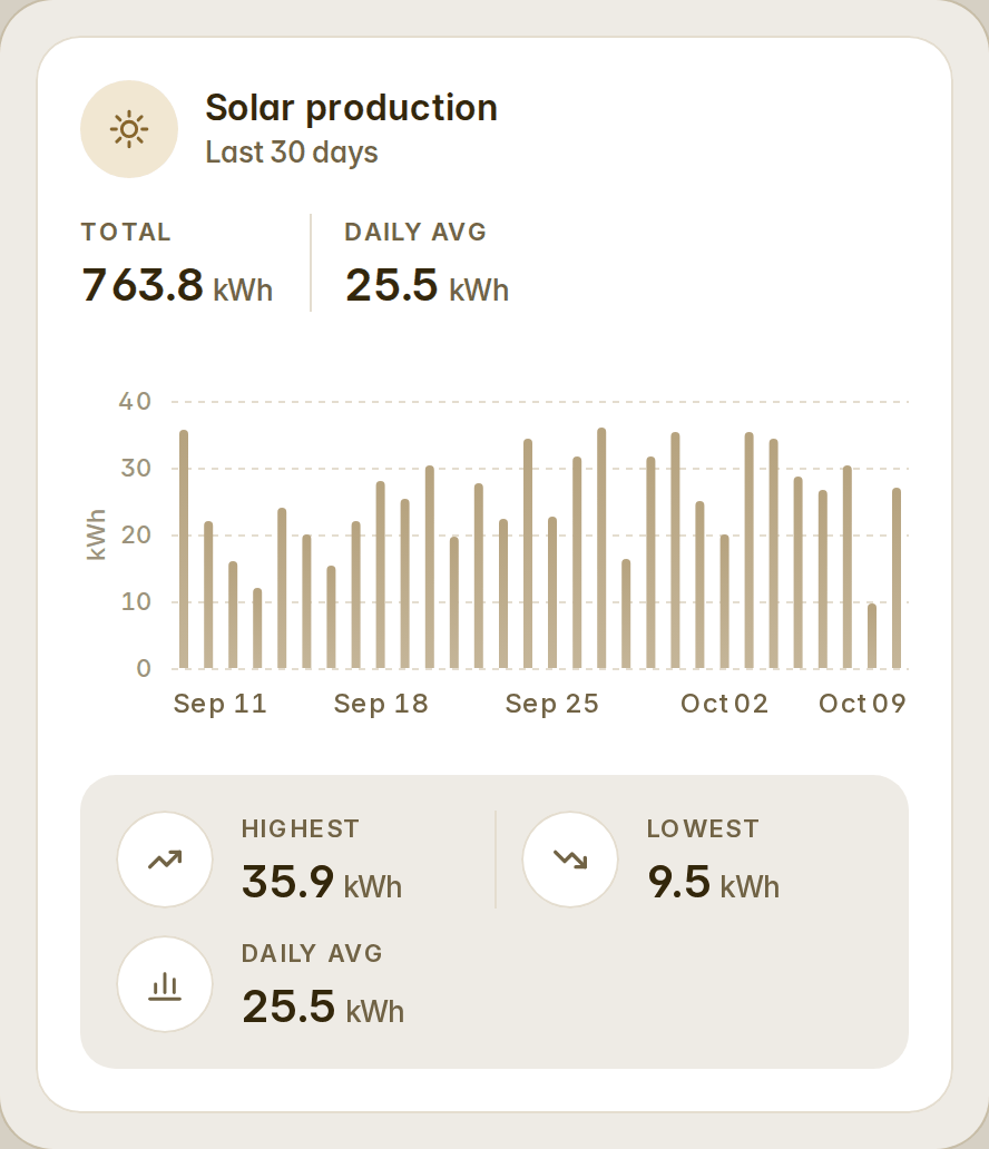
type: custom:fluvy-history-bars-card
entity: sensor.solar_production
color: '#C9A063'
days: 7
head: [total, average]
facts:
  - kind: co2
  - kind: trees
  - kind: highest
Quick colours of your own (#37)
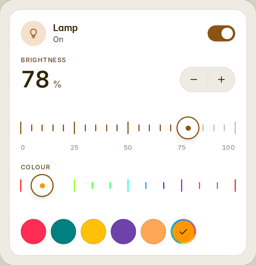
The light card's colors takes any number of entries, in your order, each a word (warm, cool, a Home Assistant colour name), a #rrggbb, [r, g, b], picker, or { color, name } so the round says your name for it. The rounds wrap six a row and the card grows with them. The visual editor edits the list row by row: a word from the list, or "Custom colour" with a colour well and a name.
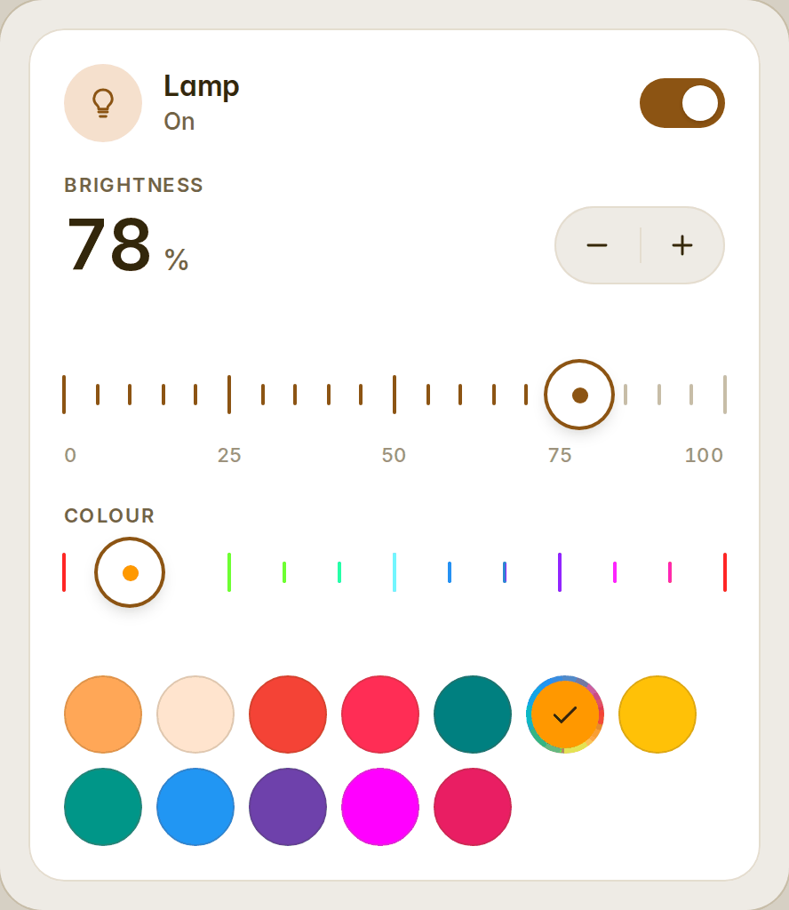
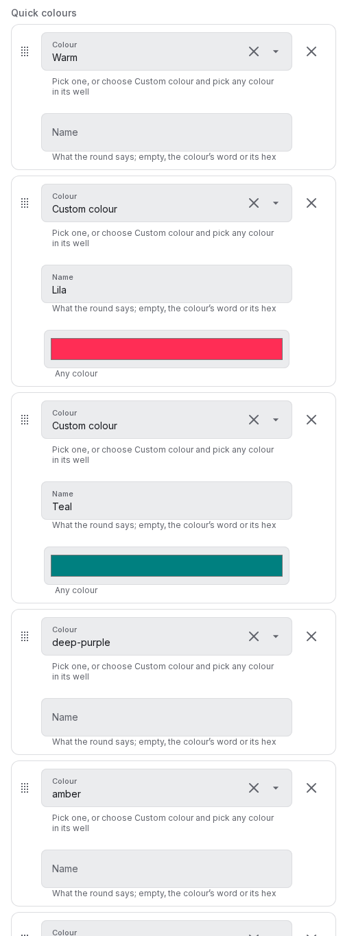
type: custom:fluvy-light-card
entity: light.lamp
colors:
  - warm
  - color: '#ff2d55'
    name: Lila
  - color: [0, 128, 128]
    name: Teal
  - deep-purple
  - picker
Also
- A chip was fitted by its box instead of its content and fitted again in the font event itself, so a tab row could flicker between filling its line and not; fixed, stable under zoom.
- Dev dependencies: eslint 10.12, typescript-eslint 8.71.1, Vite 8.3.4, happy-dom 20.14.6, Playwright 1.64.
- Fifty-two cards. Full details in the changelog.
v1.7.0
Six issues from the first days of 1.6, and the narrow-column list that came out of its review. Thank you xoatrash, eduardoribeiro, dmsteel59-svg and svb91.
Colour on the light card (#32)
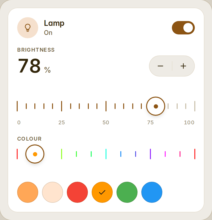
A colour bulb gets a row of quick colours under its ruler — two whites first where it has a temperature, then red, orange, green and blue — and a hue ruler takes the temperature ruler's slot while the bulb glows a colour; a white swatch brings the temperature ruler back. The card wears the bulb's colour: its icon, its switch and its brightness ruler take it. Your own list goes in colors (warm, cool, a Home Assistant colour name, #rrggbb or [r, g, b]); show_color: false is the white bulb's card.
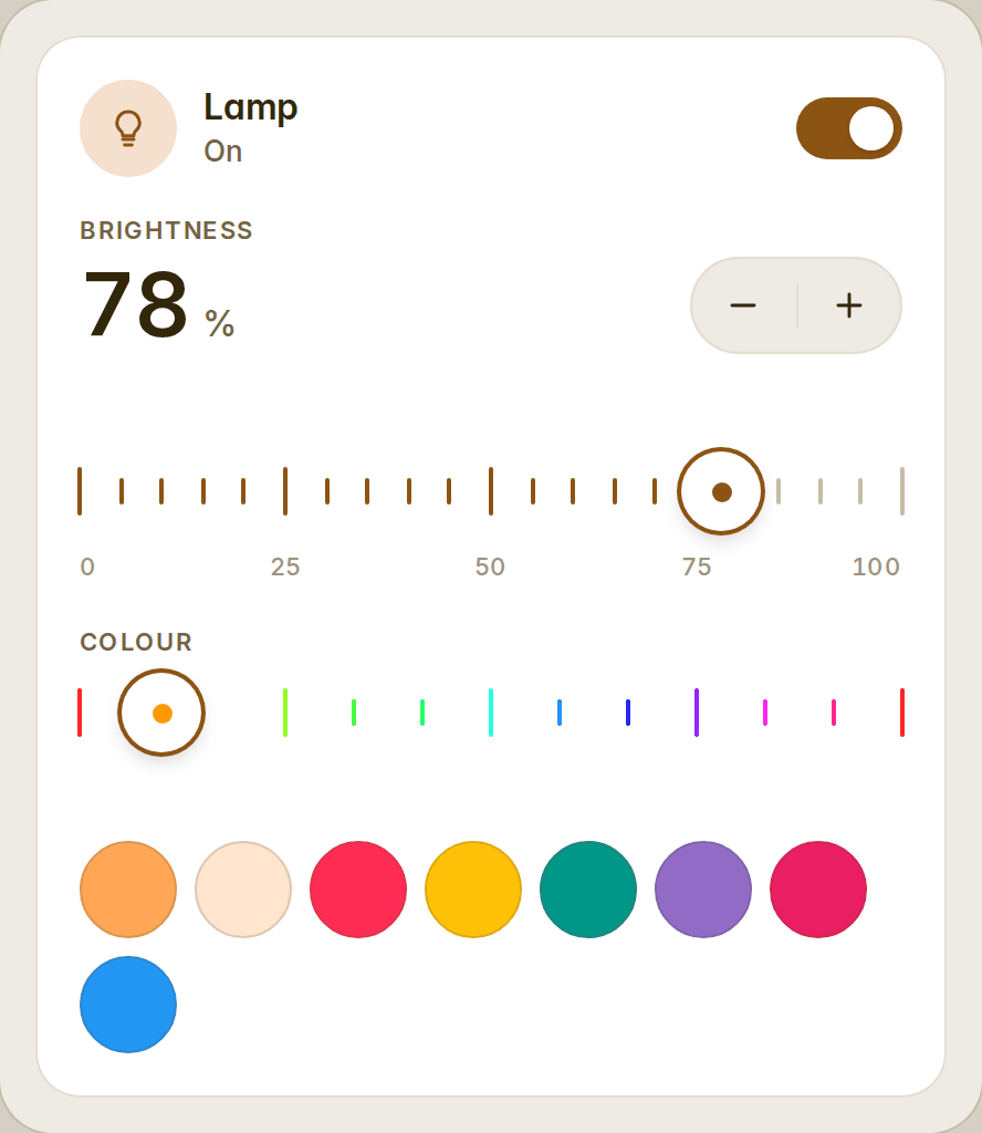
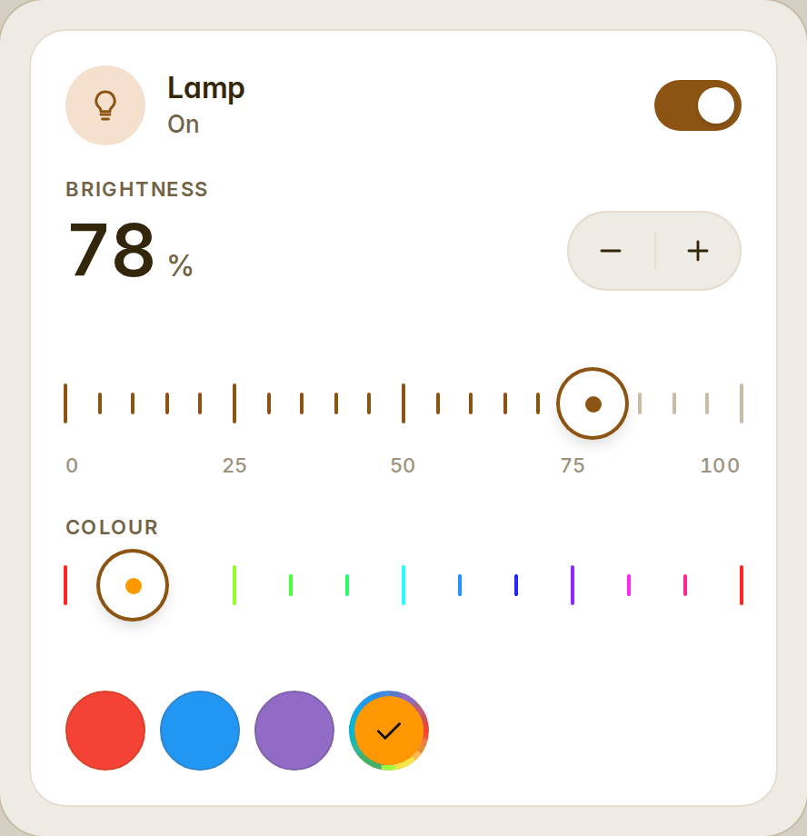
One of the rounds can be the colour picker: picker in the list is a round ringed in the hues that opens your browser's own colour picker, and it holds the bulb's colour, checked, whenever the bulb glows a colour none of the other rounds has — so colors: [red, blue, purple, picker] gives three favourites and any other colour.
A colour for the whole card (#34)
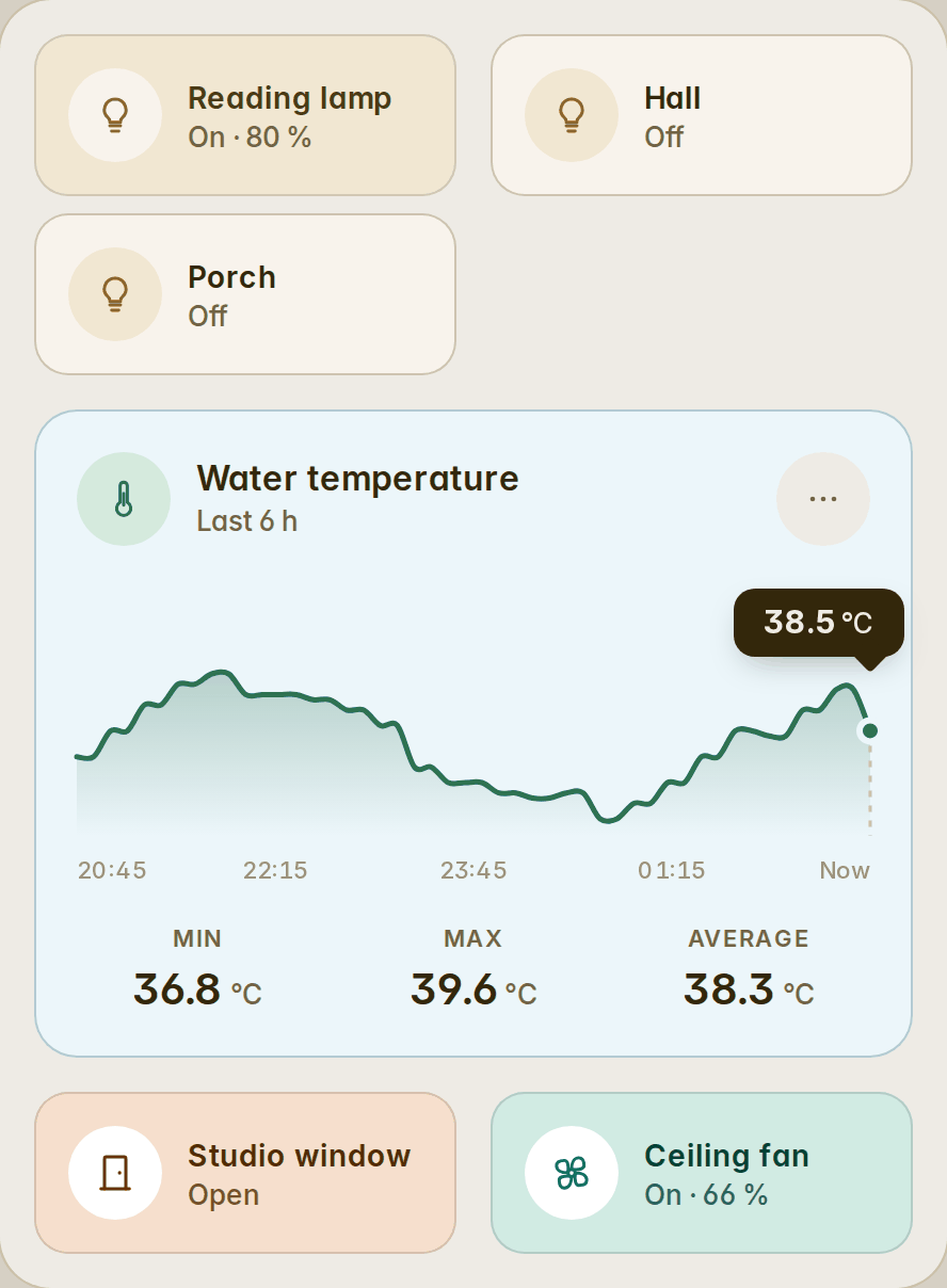
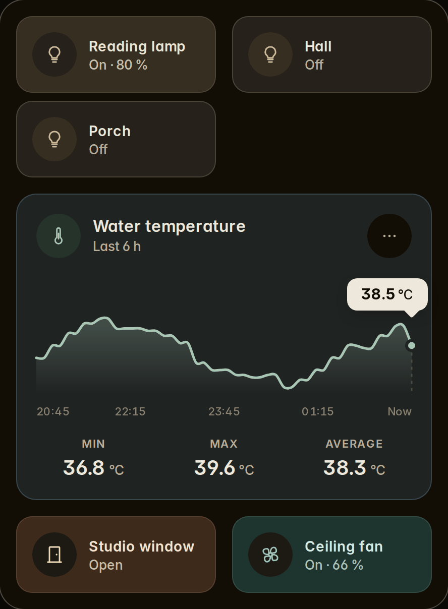
Every card that takes a color now also takes card_color (Card colour in the editor): a quiet wash of the colour as the card's own surface, its edge and dividers in the colour, independent of the accent inside — so all your lights can be warm and all your covers blue. The words keep full contrast on every palette, light and dark, and a card that is off or unavailable stays neutral.
The essentials while off (#31)
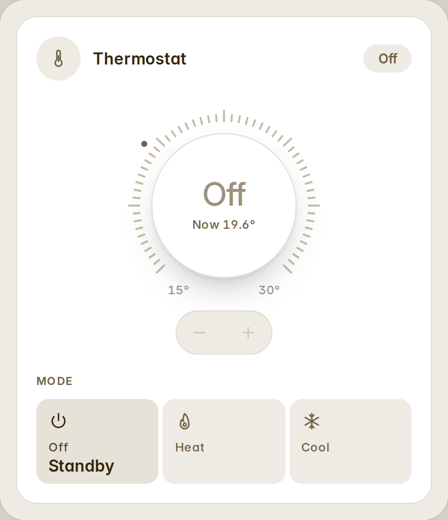
The thermostat and fan cards take when_off: essentials (When off → The essentials): while the device is off, only the head, the value and the mode selector stay; presets and fan speeds — oscillation and direction on the fan — come back the moment it is turned on, below what you tapped.
Nine printer integrations (#29, #30)
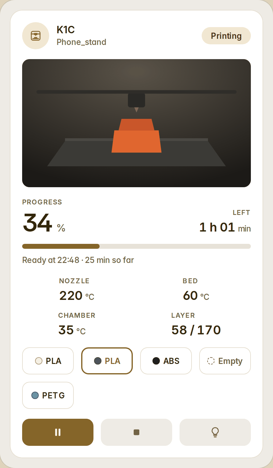
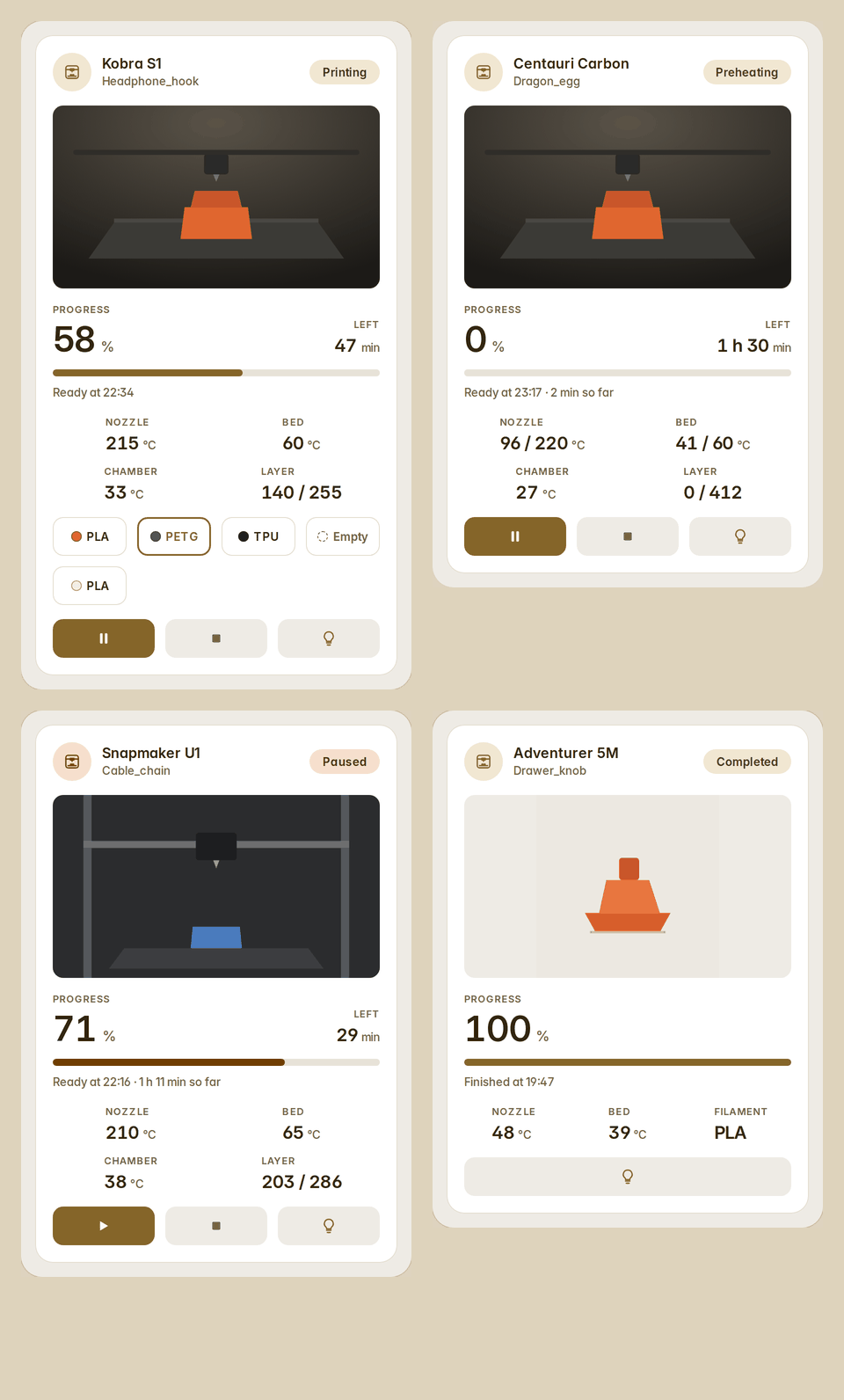
The 3D printer card now discovers Creality (ha_creality_ws), Elegoo, Anycubic (local, with ACE trays), Snapmaker U1 and the legacy Snapmaker integration, and FlashForge, beside OctoPrint, PrusaLink, Bambu Lab and Moonraker. A printer is known by what it has — a status, a nozzle or a bed, a job's measure — so a printer of an unknown integration still works given its device and roles. File names and error codes are read off the status sensor where an integration has no entity for them.
Sensor readouts by name (#28)
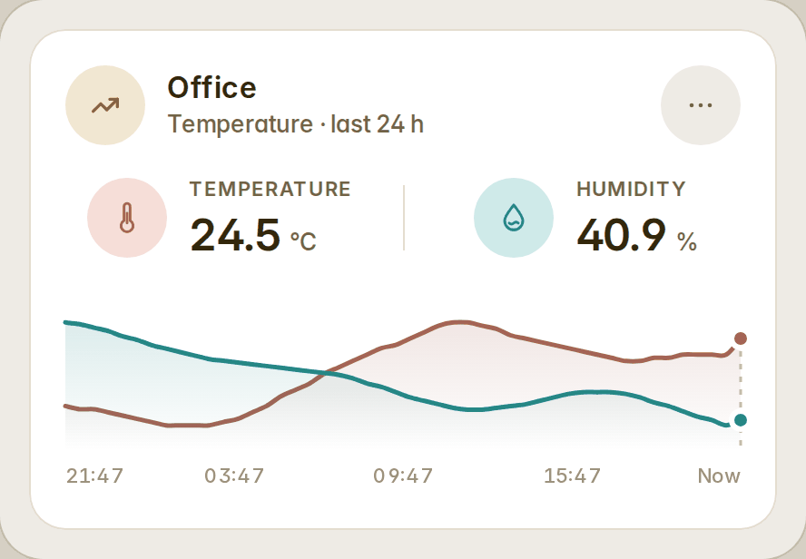
The card's own sensor takes a label under its readout when others share the chart, as an entry's name does. Left empty, a readout is called by its measure — "Temperature", "Humidity" — when no other sensor on the chart measures the same. An entry's color now paints its key and its curve.
Fixed
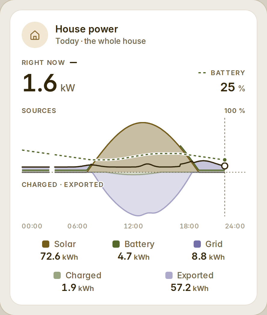
- The overview's state of charge keeps to the positive half: 0 % on the kW zero line, so a low battery on a day of heavy export never reads as an outflow (#28).
- The camera's live stream stays put: one stream element for the card's life, kept 45 s off screen, torn down for good when the mode or camera changes, retried after a failure — no more session churn on every scroll (#28).
- Narrow columns (the 1.6.1 list): at the widths a phone's zoom makes, mode tiles give way to chips rather than cut a word; a tile's foot shows one readout where two labels would overlap; the sensor's statistics take fewer columns where a label would not fit; the flow's dead-source line, the weather's context and the keypad's line give way in segments; the lock's slide hint hides where it would not fit; the camera's off text takes two lines; scene lines drop rather than cut; a room's head line and a map row's word fit their room; the energy card's rolling axis keeps its middle label only where it stands apart; a long panel tab keeps its words; a fold that hides an alert says so in the warning ink; a short age is read in full; the Spanish camera pill says "En directo".
Every page now loads 220.5 KB gzip (the budget rose from 220 to 222 KB for the light's colour wiring, the surface colour and the essentials); the light's colour controls come in their own 2.7 KB chunk, fetched by the first colour bulb. Fifty cards, eight languages, 1419 words each.
v1.6.0
What the community asked for. The whole house on one chart, a way back from a subview on the wall, a camera in its own shape and live, a greeting for whoever is signed in, several sensors on one chart, people with their own actions and their phone's battery, openings with their own names, a colour per item, at rest too, and a new card for 3D printers.
The whole house on one chart
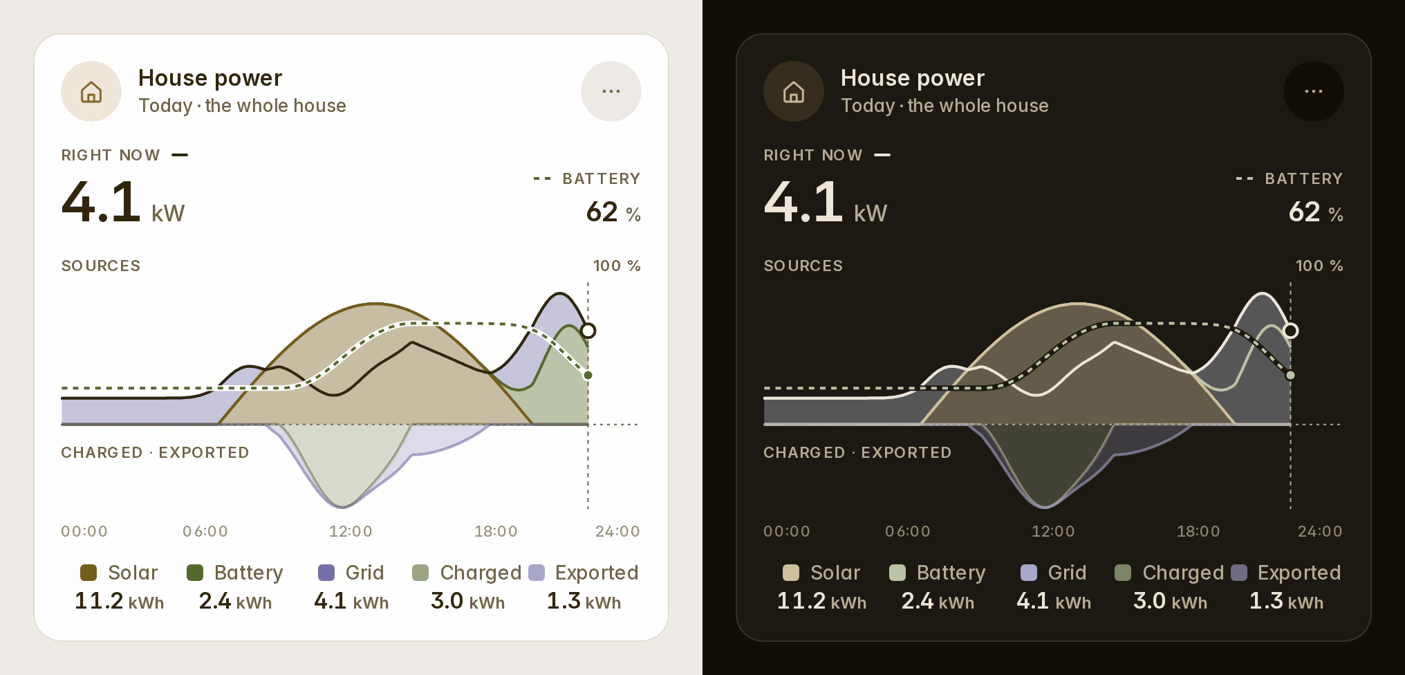
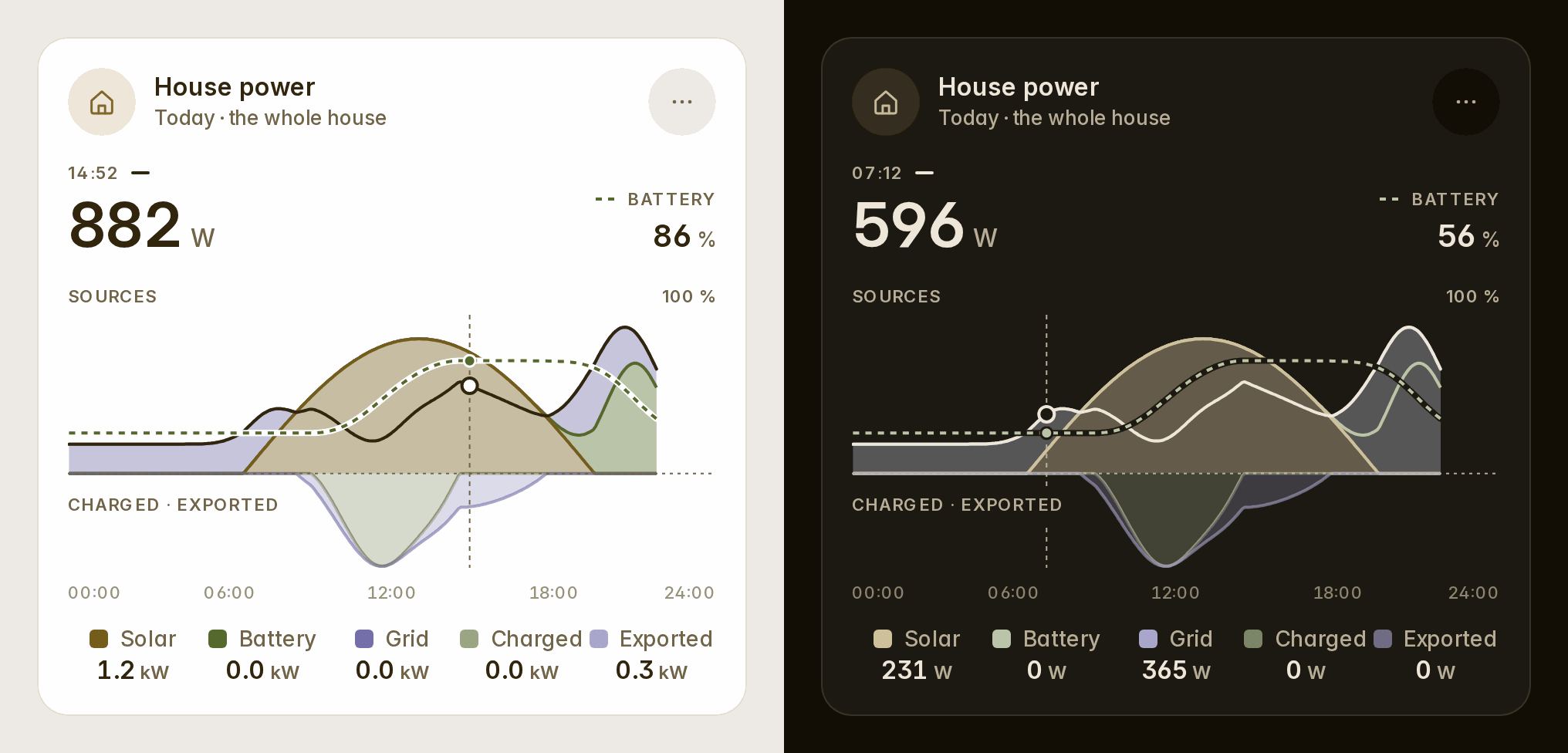
The energy card's variant: overview draws your day the way Home Assistant's "Power sources" graph does. The sun's whole production, the battery's discharge and the grid's import are stacked above the line. What went into the battery and out to the grid sits under it. The house's own use is a line over all of them. Your batteries' charge is dashed on its own 0–100 % scale. At rest the legend gives the day's energy; under your finger, each flow's power at that moment (#26).
type: custom:fluvy-energy-card
variant: overview
show_soc: true    # the batteries' charge, dashed (default: on when there is a battery)
show_house: true  # the house's use as a line
A way back from a subview on the wall
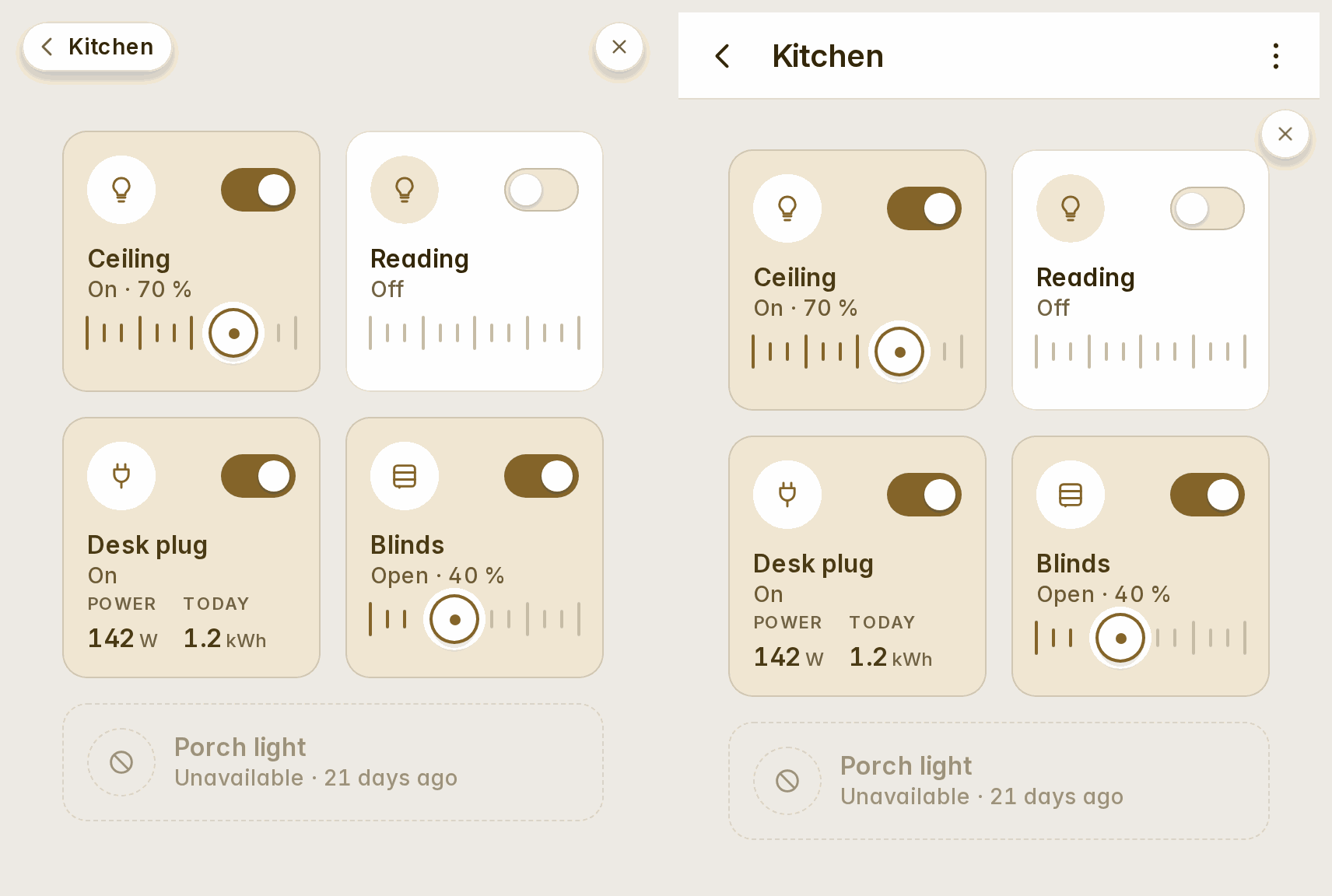
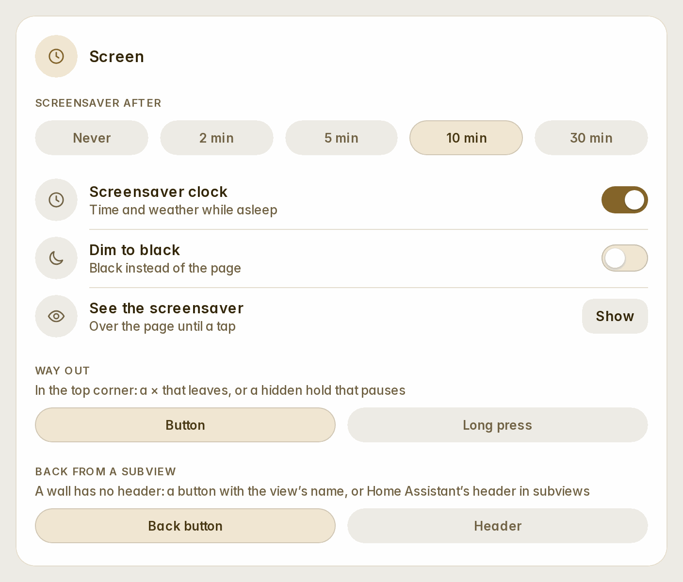
A wall has no header, so Home Assistant's back arrow went with it. Wall → Back from a subview now offers a choice (#26):
- a back button, the default: a pill at the top left with the subview's name, on the line of the exit corner;
- Home Assistant's header, in subviews only.
The camera, live and in its own shape
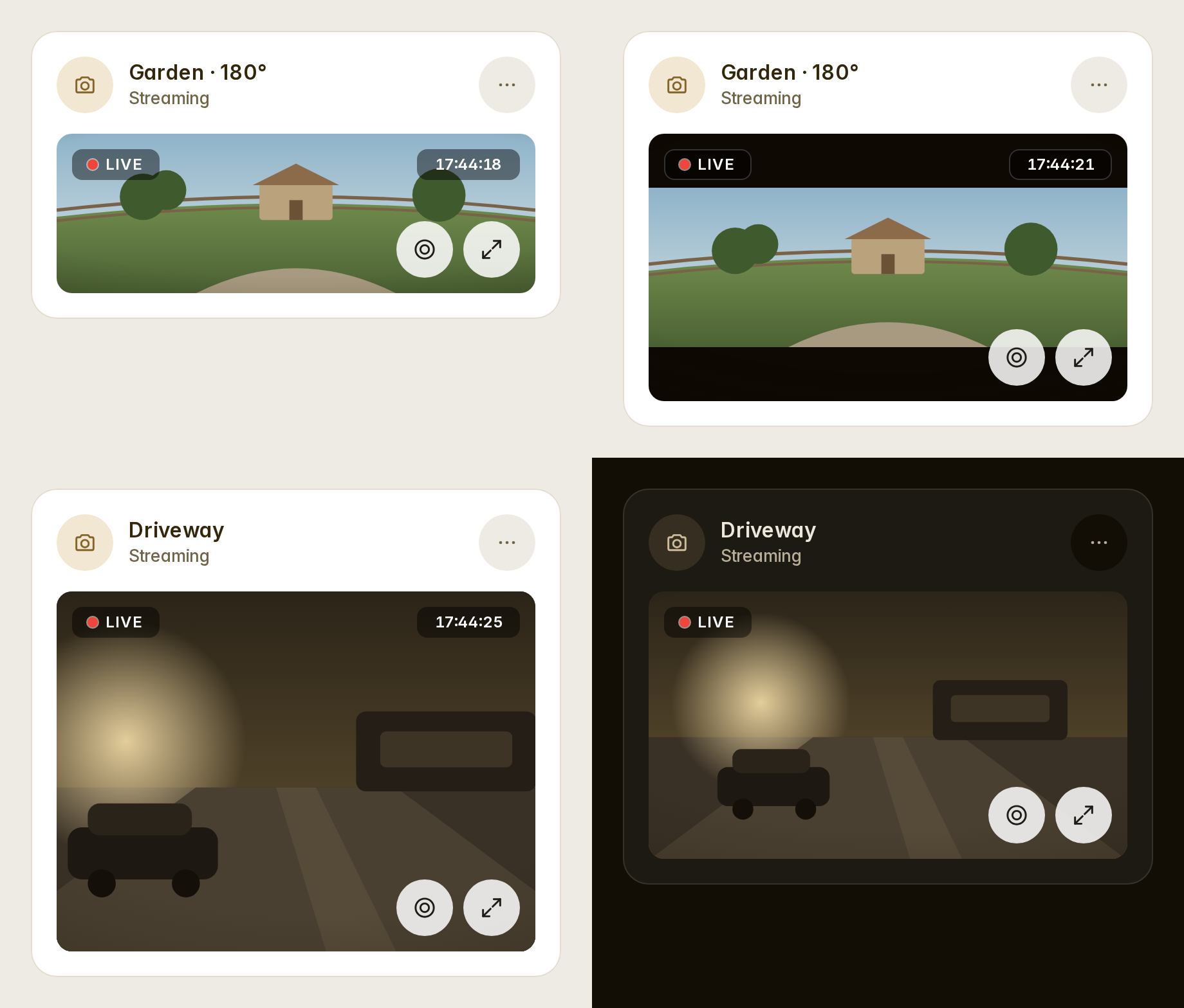
camera_view: live plays Home Assistant's own stream (WebRTC, HLS or MJPEG, whatever the camera offers) while the card is on screen. Where there is no stream, it falls back to stills. aspect_ratio takes 16:9, 4:3, 3:2, 1:1, 2:1, 21:9, or native, the camera's own. fit_mode: contain shows the whole picture, as a 180° camera needs. refresh now goes down to half a second. Stills are asked at the card's width in device pixels: sharp, and no heavier than they need to be (#26).
type: custom:fluvy-camera-card
entity: camera.garden
camera_view: live     # or auto: stills every `refresh` seconds (0.5 and up)
aspect_ratio: native  # 16:9 · 4:3 · 3:2 · 1:1 · 2:1 · 21:9 · native
fit_mode: contain     # the whole picture; cover fills the plate
The greeting is whoever is signed in
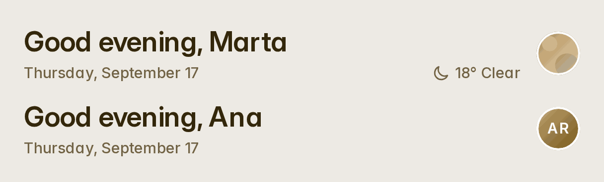
A greeting card without a person now greets whoever is signed in, with their person's name, their picture and their details on a tap. The automatic dashboards and a new card no longer write a person into it. A card that names one keeps it: empty its Person field to follow the signed-in user (#26).
Several sensors on one chart
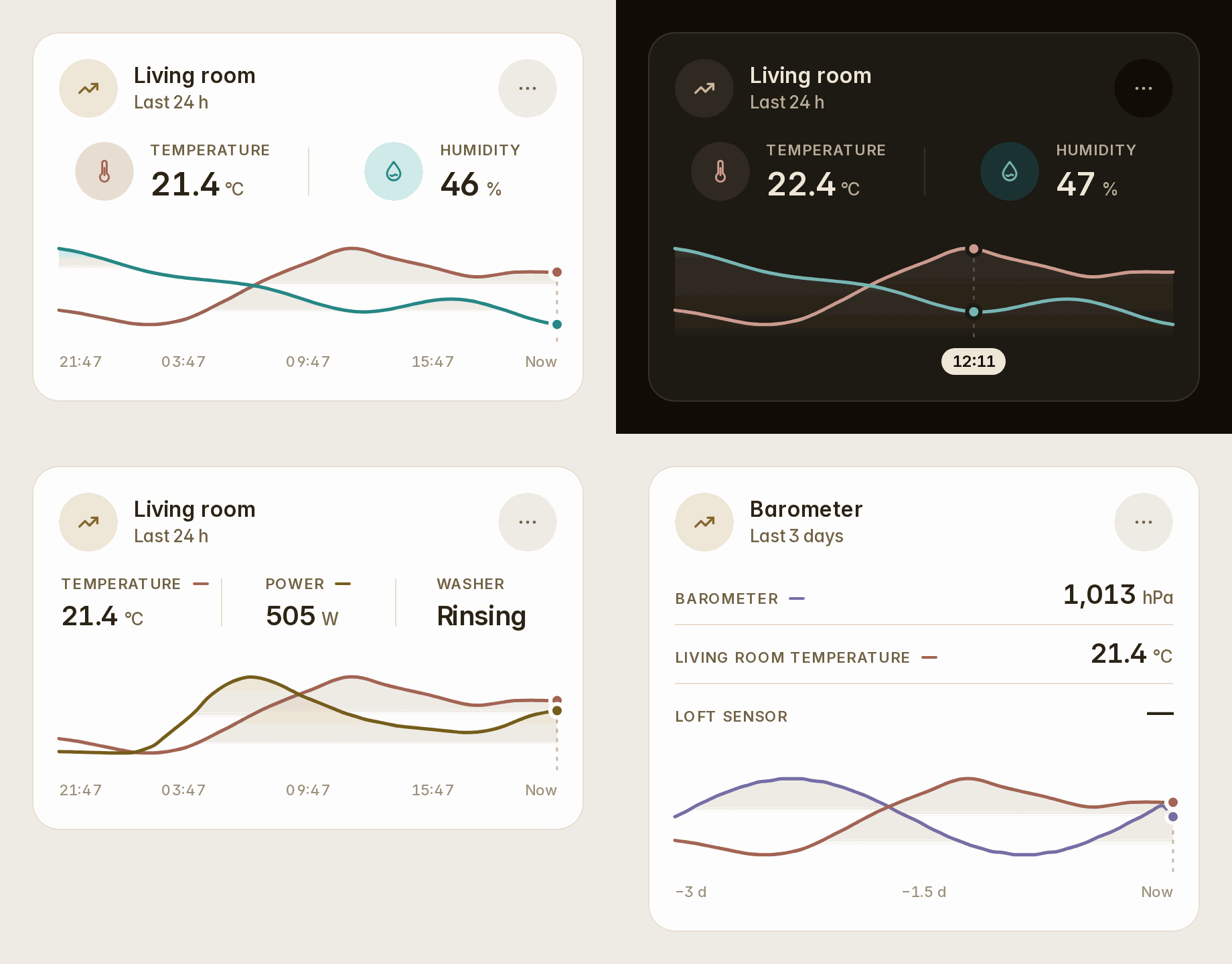
The sensor card's Also on the chart adds up to two more sensors. Each gets a readout above the chart and a curve on its own scale, in its measure's tone. Scrub the chart and every readout says that moment while the axis says when (#26).
type: custom:fluvy-sensor-card
entity: sensor.living_temperature
entities:
  - sensor.living_humidity
People: an action and a phone battery each
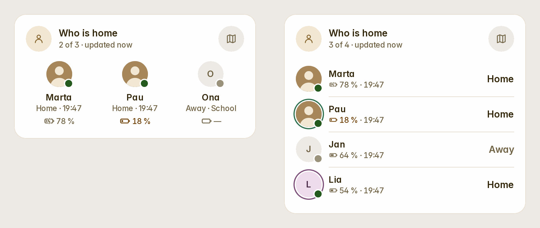
The people card's people take a name, a colour (a ring round their picture), and a tap and a hold action for each person. One use is navigate to a page of their own (#25). show_battery puts each phone's battery beside its person: a glyph filled to its level and "78 %", in the warning tone at 20 % and under, with a bolt while it charges. It is found from the person's phone, or named as battery (#26).
type: custom:fluvy-people-card
show_battery: true
people:
  - entity: person.marta
    tap_action:
      action: navigate
      navigation_path: /dashboard-family/marta
  - entity: person.pau
    color: teal
    battery: sensor.pau_phone_battery_level
Openings with their own names
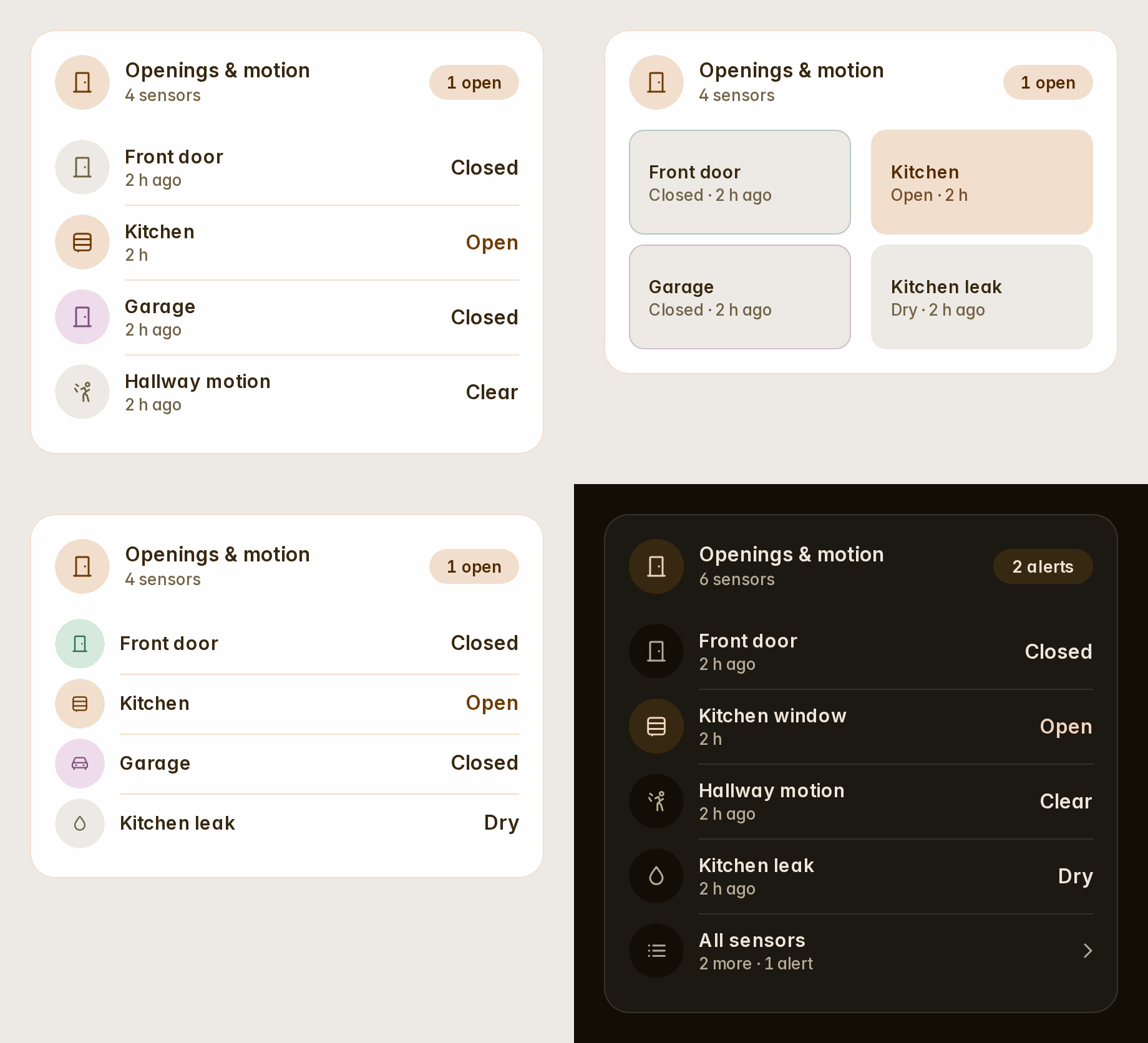
The openings card's rows take a name, an icon, a colour and a tap and a hold for each opening. variant: compact lays them out as 48 px rows, variant: tiles puts them two a row, and show_time takes the times away. An alert folded under All sensors is always said there, before its count (#26).
type: custom:fluvy-openings-card
variant: tiles
rows:
  - entity: binary_sensor.front_door_contact
    name: Front door
    color: teal
  - entity: binary_sensor.garage_door_contact
    name: Garage
    icon: mdi:garage
A colour per item, at rest too
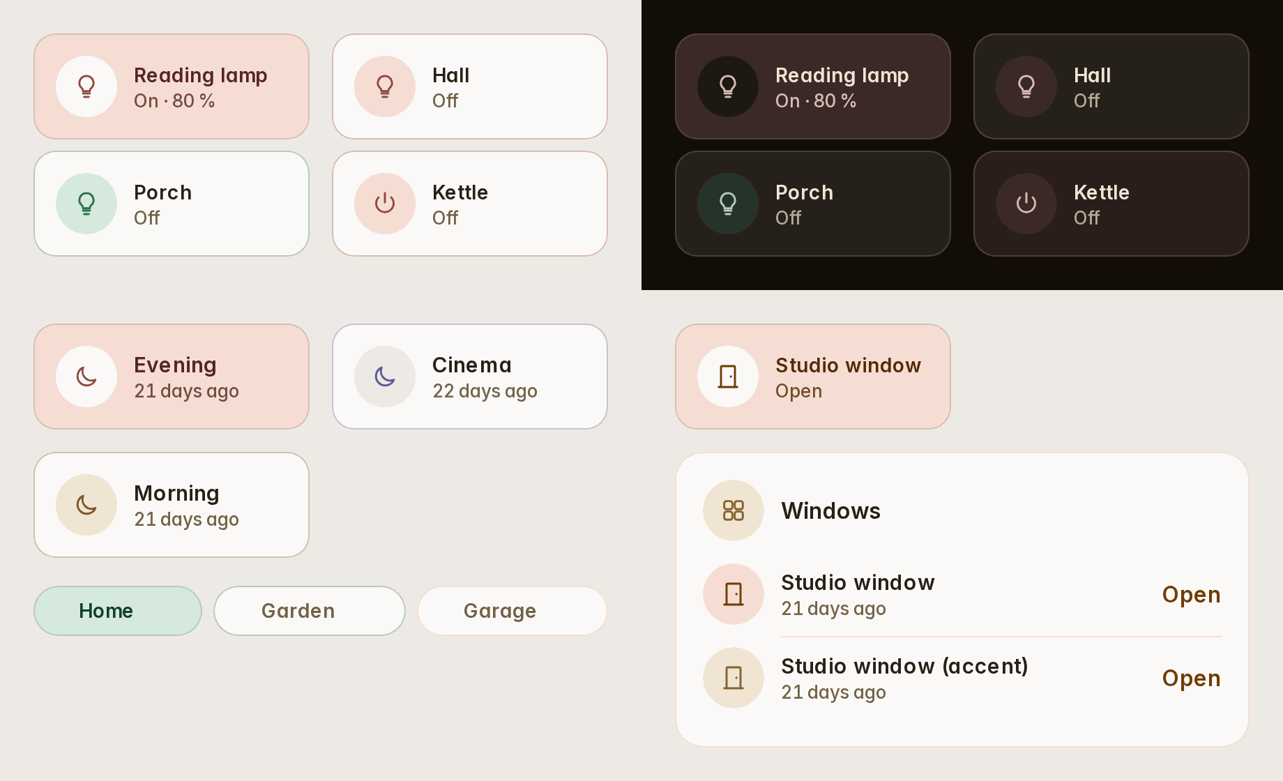
Scenes, chips, people and openings take a color for each item, as tiles already did. tint: always on tiles, tile groups, scenes, chips, rooms and lights shows an item's colour at rest too: a quiet wash with a hairline of it, while on keeps the full fill. A colour never hides a status: an open window stays in the warning's tone (#26).
type: custom:fluvy-tiles-card
tint: always
tiles:
  - entity: light.reading_lamp
    color: red
  - entity: light.porch
    color: teal
A card for 3D printers
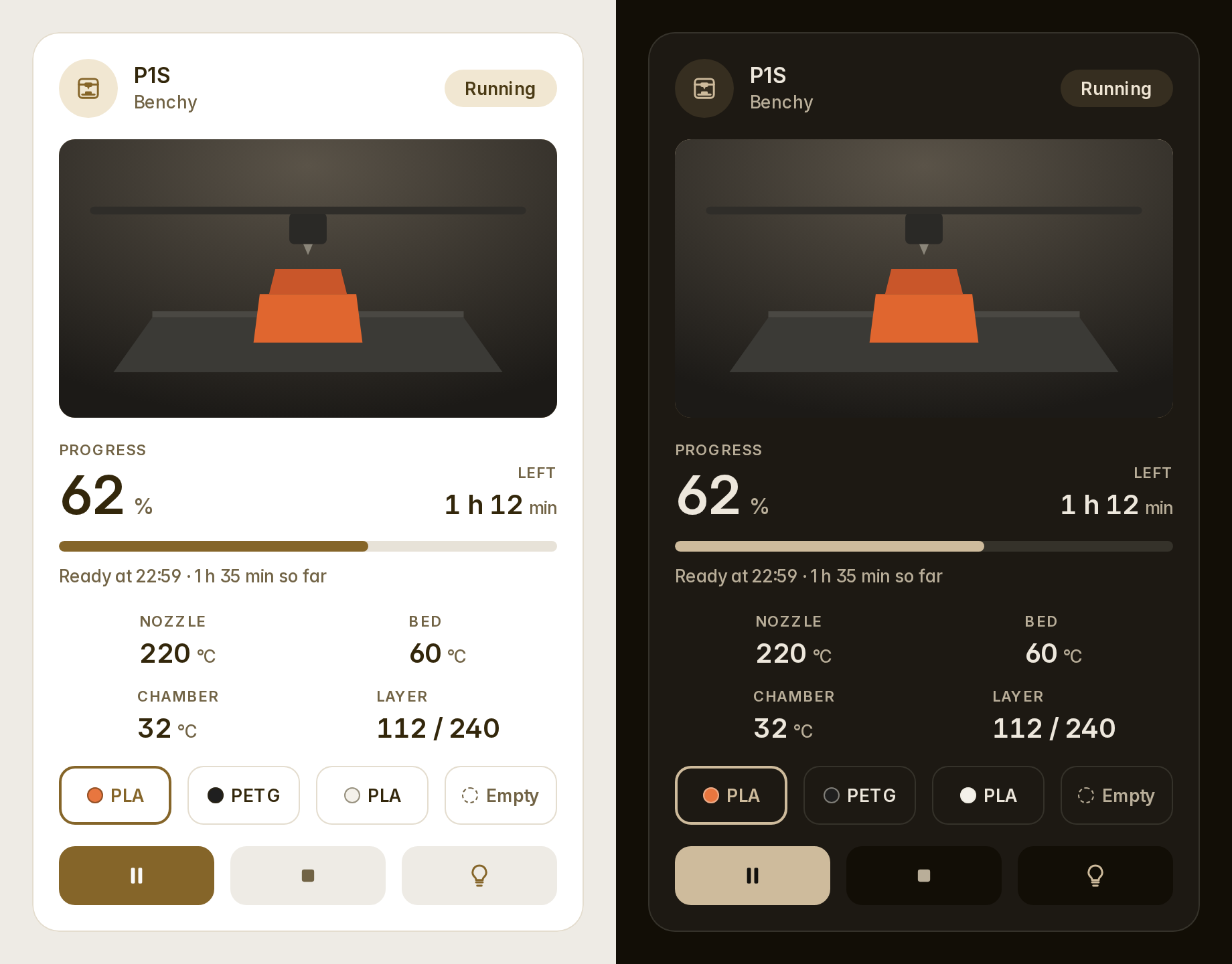
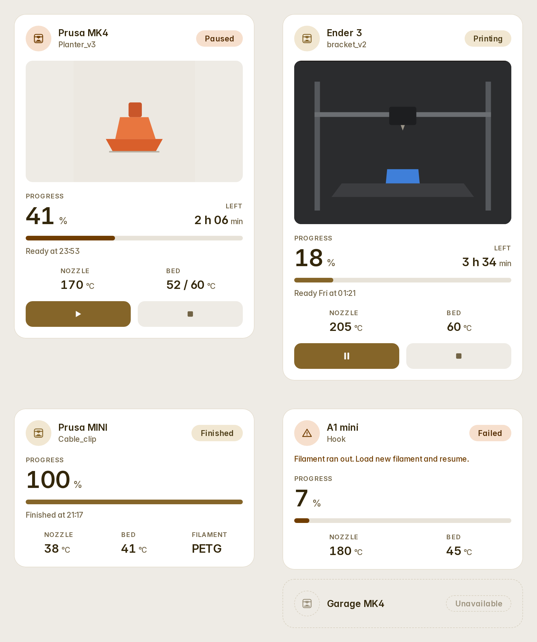
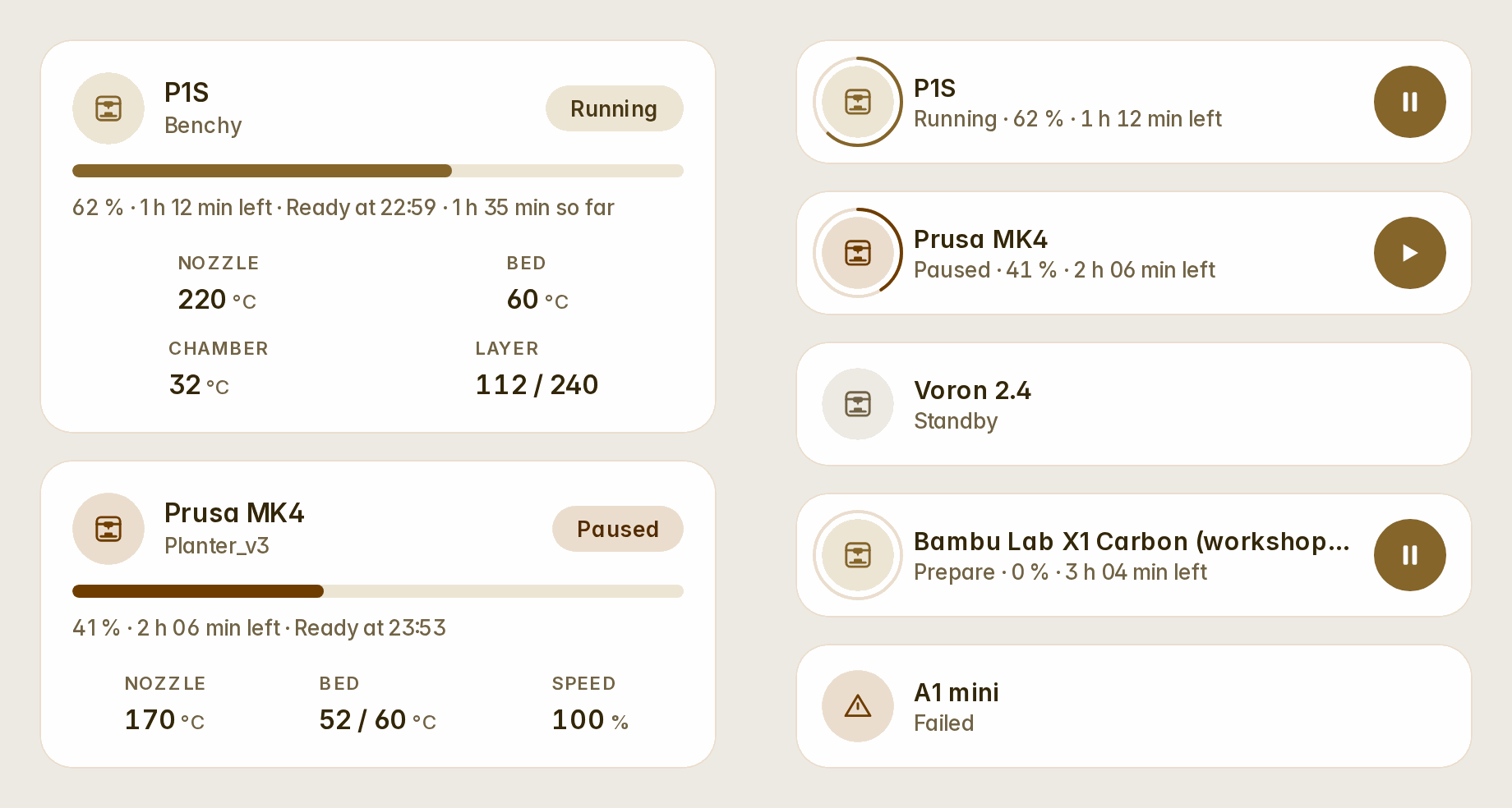
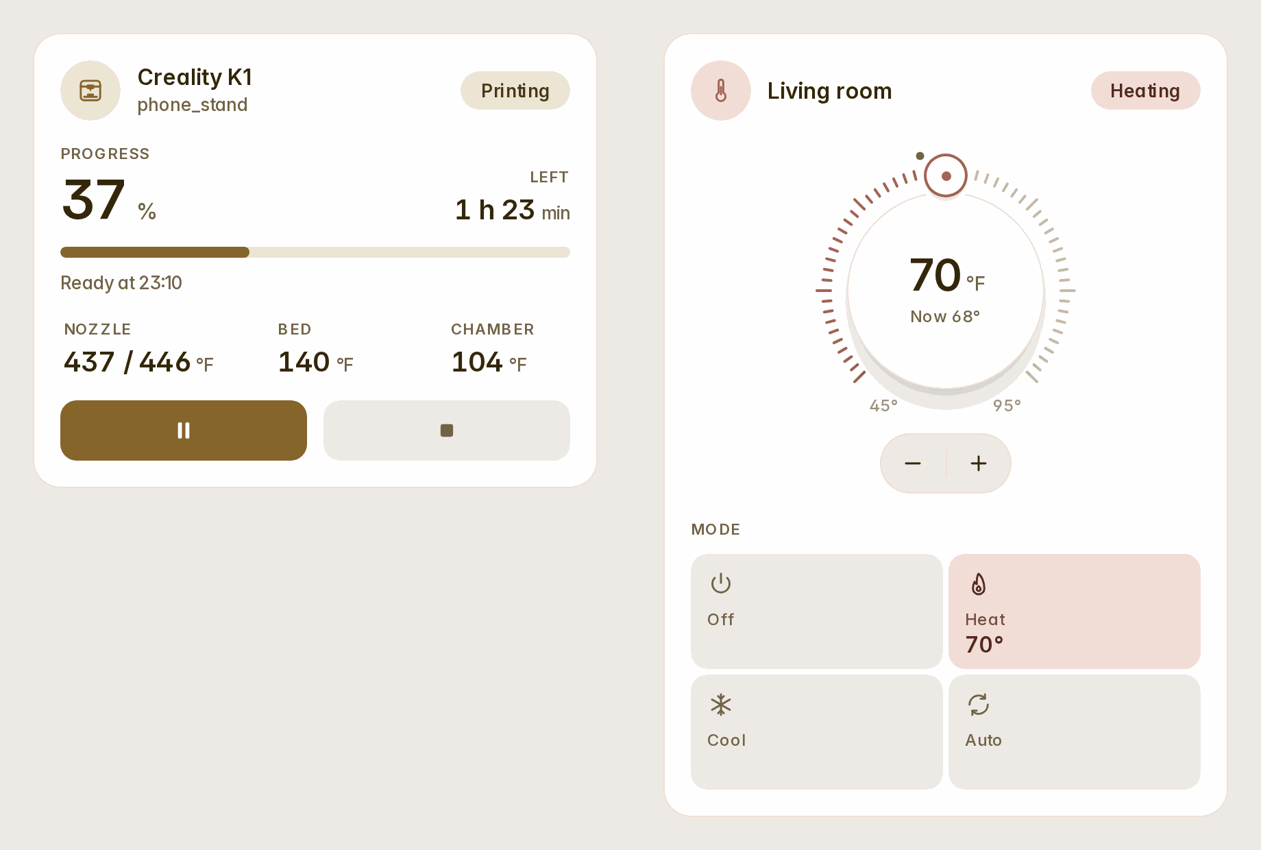
custom:fluvy-printer-card finds everything on your printer's device itself, for OctoPrint, PrusaLink, Bambu Lab and Moonraker (#27). It shows:
- the job and its picture: the camera's stills, its live stream, or the job's preview;
- the progress, the time left, when it will be ready and how long it has run;
- the nozzle, the bed and the chamber (both figures while a heater is on its way), the layers, the speed and the filament;
- a Bambu Lab AMS's trays with their colours, the one printing marked;
- the stage while it prepares and, when a print fails, why.
Pause or resume, stop (asked first) and the light are one tap away. Any readout opens its entity, and any other entity of the printer can be one more readout. System buttons and an emergency stop are never shown. The automatic Home dashboard adds one for each printer it finds.
type: custom:fluvy-printer-card
device: <your printer's device>   # picked in the editor
variant: full                     # full · compact · row
readouts: [nozzle, bed, chamber, layer, speed, filament, elapsed]
sensors:
  - sensor.p1s_aux_fan
camera_view: live
Celsius and Fahrenheit
Every card reads a temperature in your house's unit. In a house in Fahrenheit, a thermostat whose entity gives no range or step takes Home Assistant's own: 45–95 °F, a whole degree a step. The printer's heaters say "now / target" from 5 °F off.
#...
v1.5.0
Your header, your way — and four asks from the community. The dashboard's tabs, the sidebar's head and the header's actions are now Fluvy's to style, the "by source" chart draws from your power sensors, rows take templates, a wall tablet reads larger, and the cards that ran long have compact variants.
Everything in the header is a choice
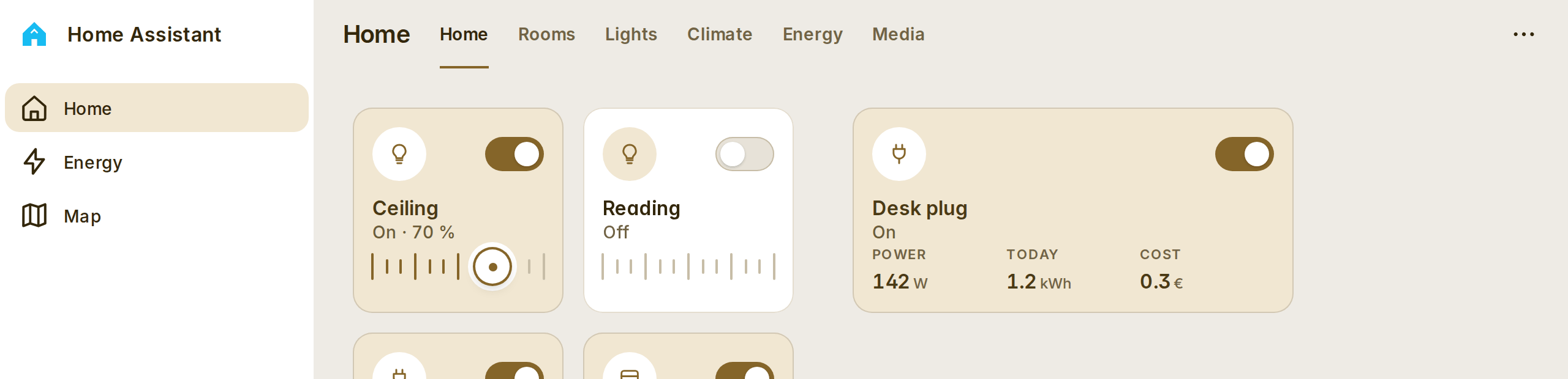
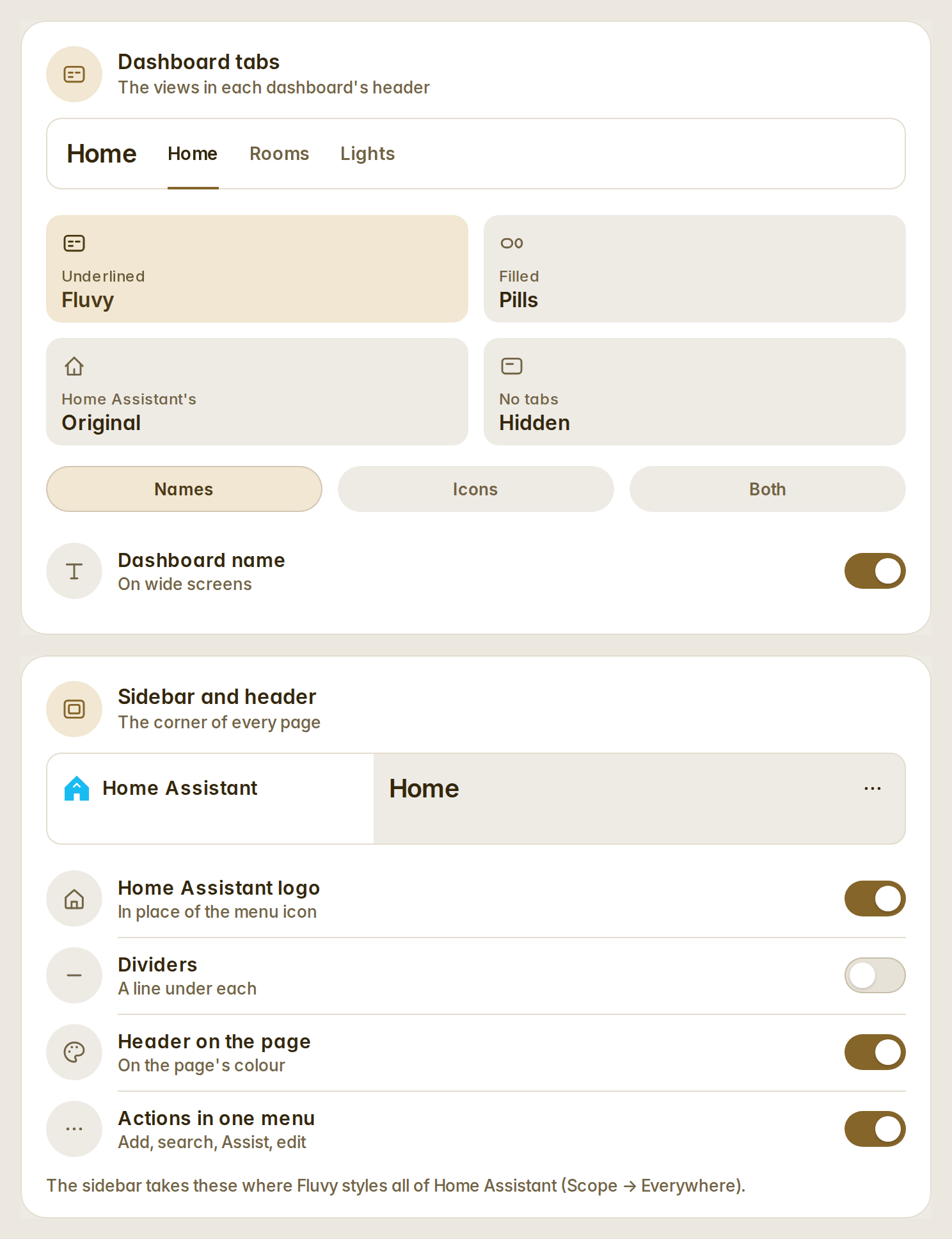
Appearance has two new cards. Dashboard tabs: Fluvy's (the views as words, the accent under the open one), pills, Home Assistant's original, or hidden; each tab with its name, its icon or both — a view without an icon gets the one its name says, in any of Fluvy's languages — and the dashboard's name before the tabs in any style. Sidebar and header: Home Assistant's logo in place of the menu icon, the dividers on or off, the header on the page's own colour, and add / search / Assist / edit in one "…" menu. All on, it is the corner of Fluvy's screenshots (#20).
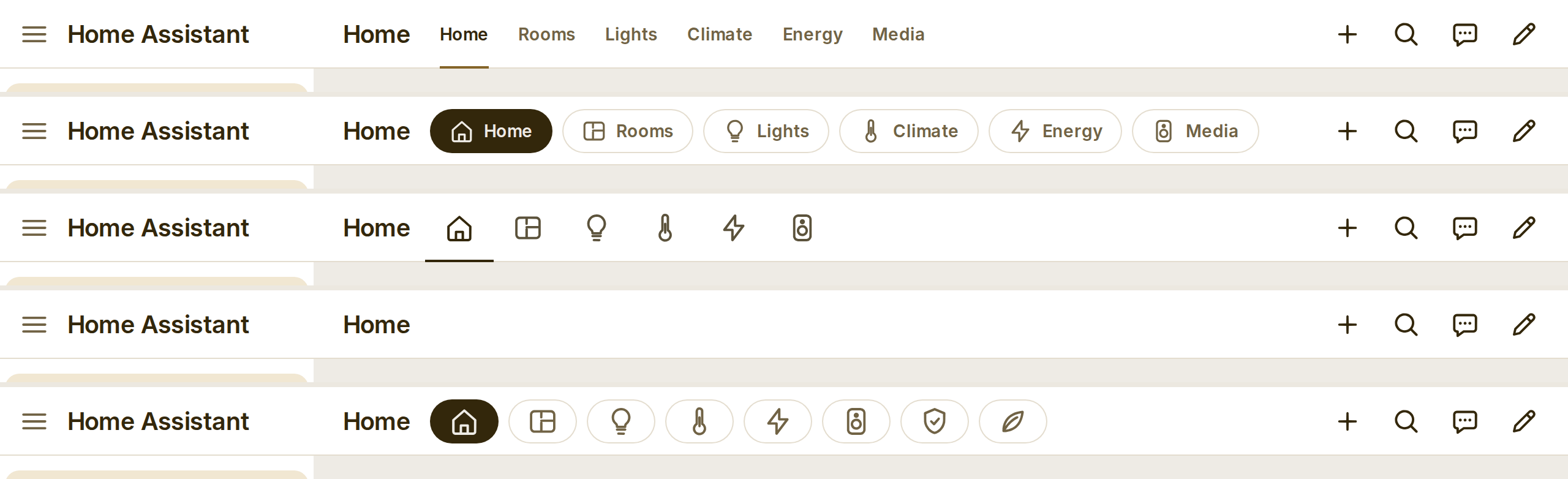
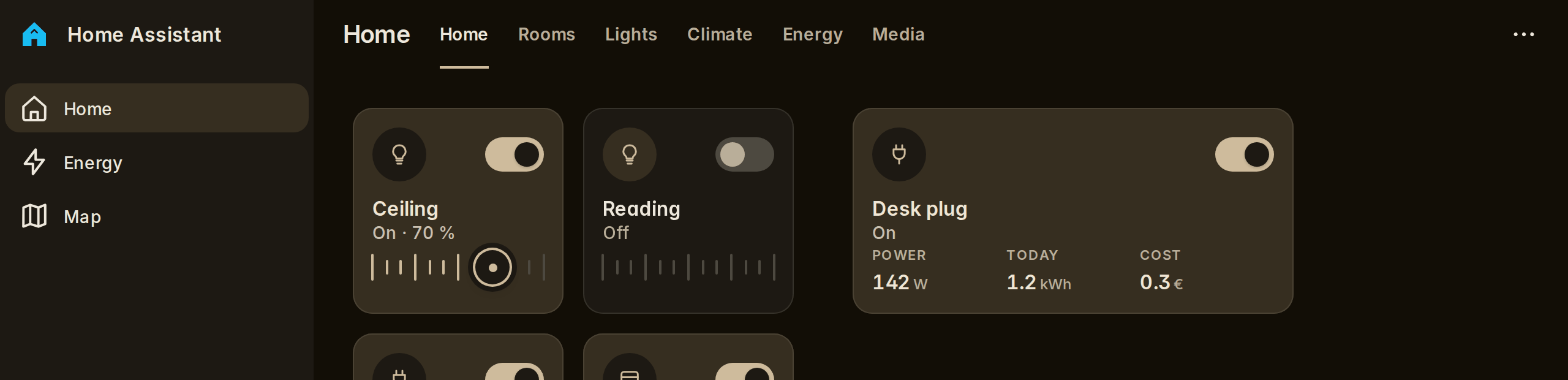
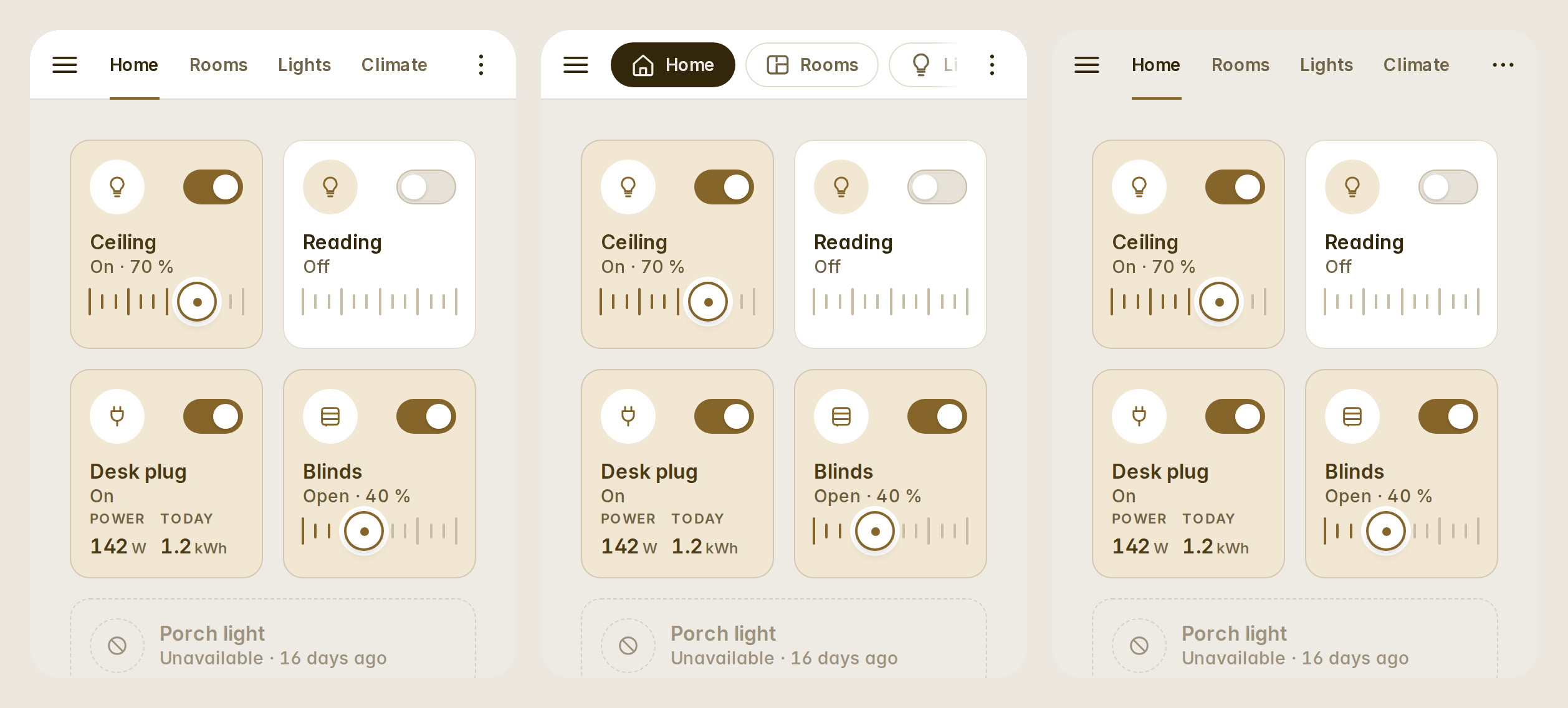
- On a phone the tabs scroll under the finger and fade where the row goes on; the edit mode and subviews keep Home Assistant's header.
- The automatic dashboards no longer repeat their views as chips under the greeting; each dashboard's options put them back.
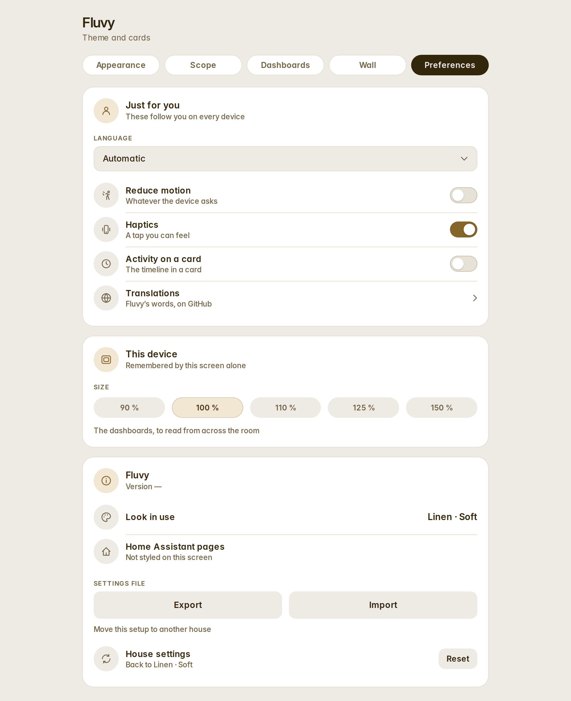
- The settings panel's tabs fit one line: About is now the last card of Preferences.
House power by source, fixed
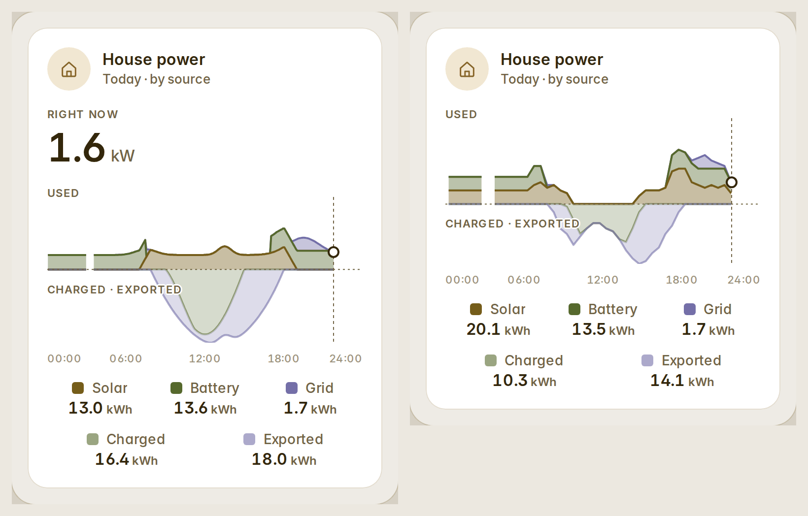
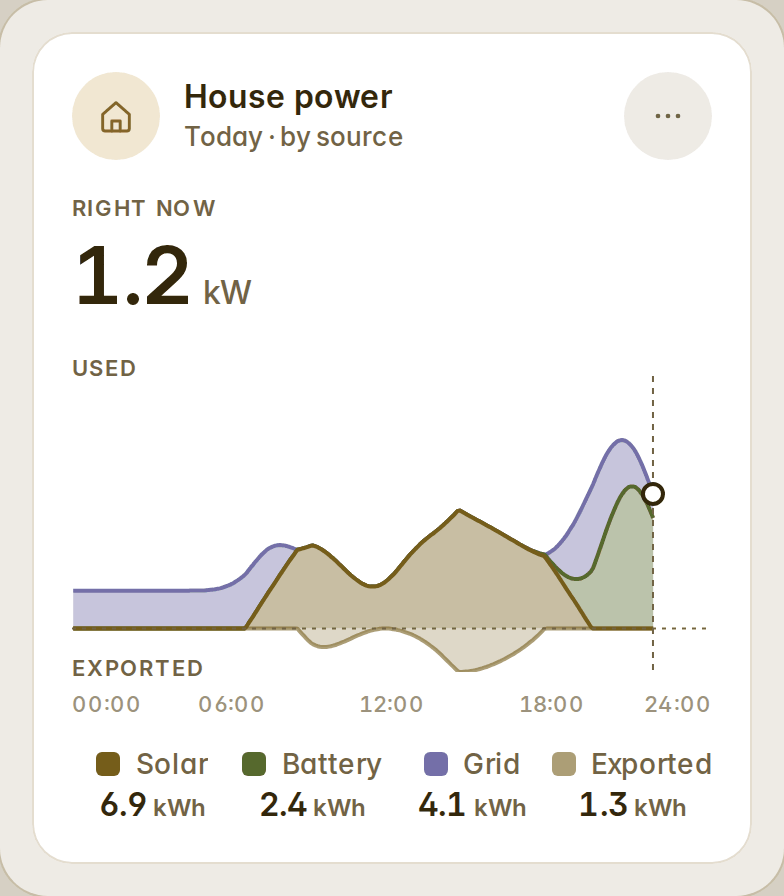
The sources variant now draws from the power sensors in your Energy dashboard — the same five-minute data as Home Assistant's own "Power sources" graph — so a hybrid inverter or meters that count in 0.1 kWh no longer flatten the midday or put the sun in the night. What went into the battery shows under the line with the export, "Right now" is the house's own use, and a gap in the recorder stays a gap (#23).
Templates in row text
A row's secondary can be a Home Assistant template — {{ state_attr('climate.living', 'current_temperature') }} °C — rendered by Home Assistant and kept live on entities, lock, alarm, camera, bars, stat tiles, actions and helpers rows. A template that fails shows nothing, never its own text (#21).
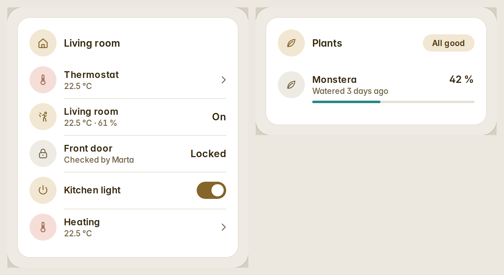
A size per device
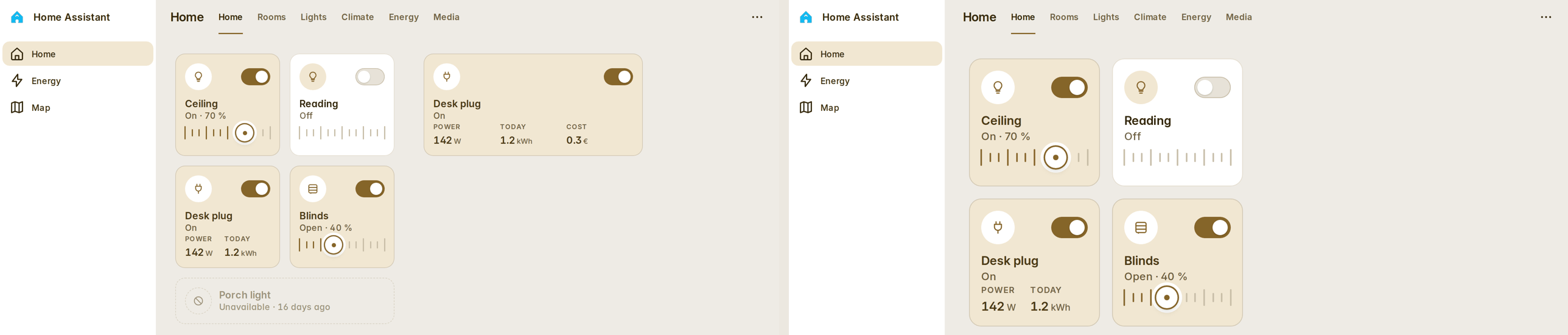
Each screen remembers its own size: 90, 100, 110, 125 or 150 %. Set it in Preferences → This device, or open a dashboard once with ?zoom=125 on the wall tablet. Only the dashboard's view grows; the header, the sidebar and the edit mode keep theirs, and every slider, dial and drag still lands under your finger (#21).
Compact variants and power on the media cards
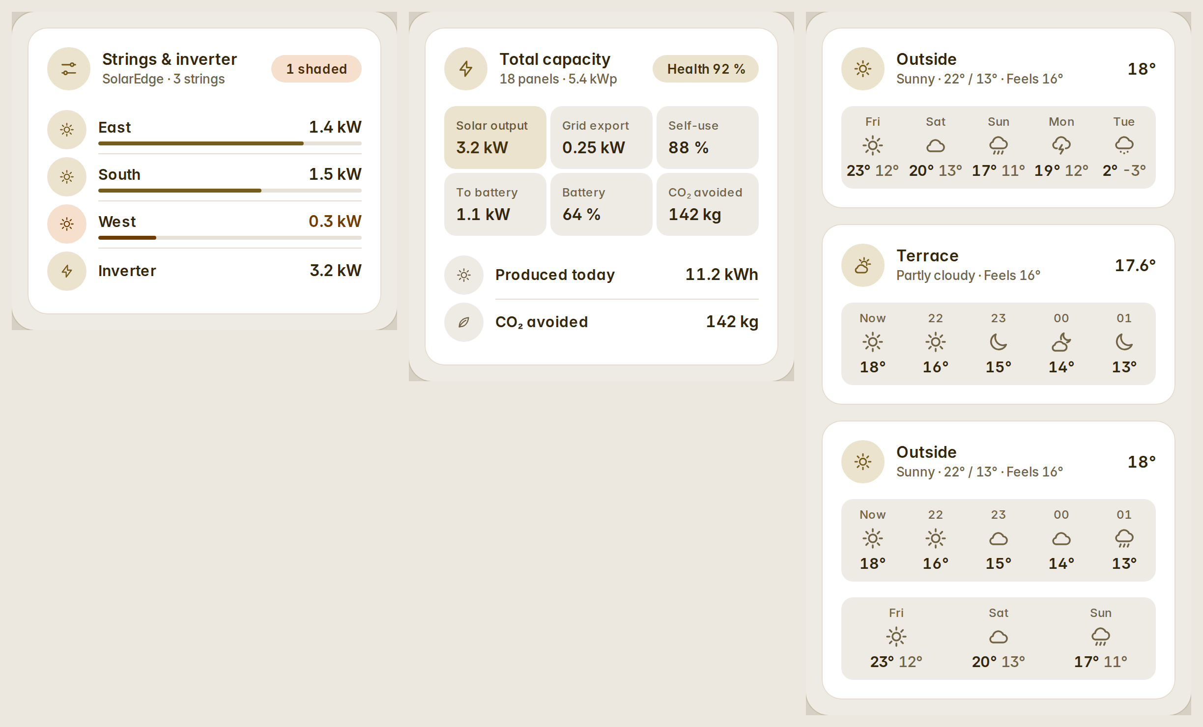
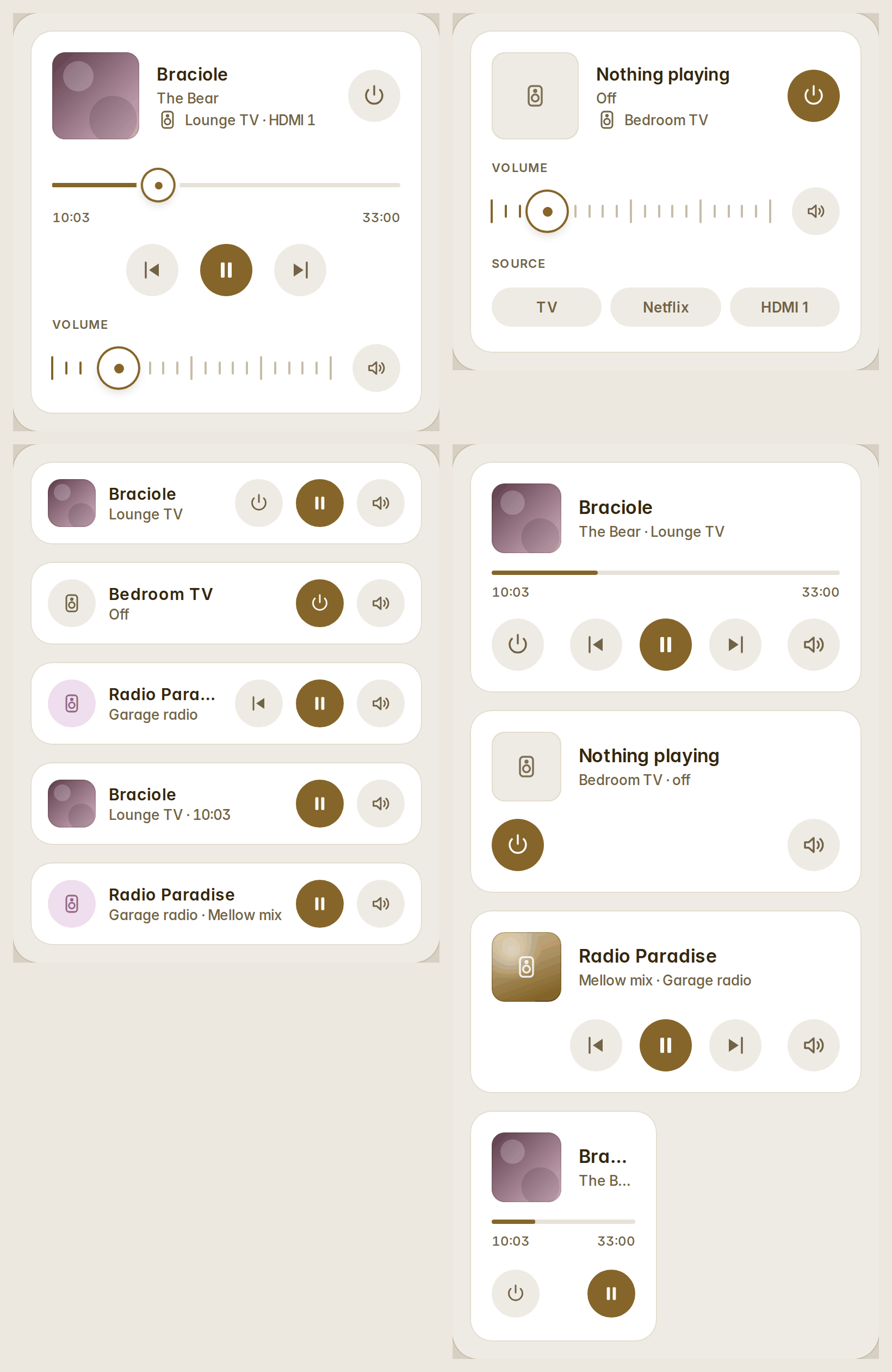
variant: compact for bars (48 px rows), weather (one head row, the days as columns) and stat tiles (64 px tiles, three a row). The media cards turn a player on and off, and the compact rows take controls in the order you write them (#21).
Also fixed
- An automatic dashboard whose grid meter is found by its name drew its grid gauge without an entity; it names the meter.
- Bars and stat tiles count their rows' real heights, so an automatic dashboard's columns end level.
- A row squeezed into half a column keeps its name, and a row that cannot be read says why.
Full list: CHANGELOG.
v1.4.0
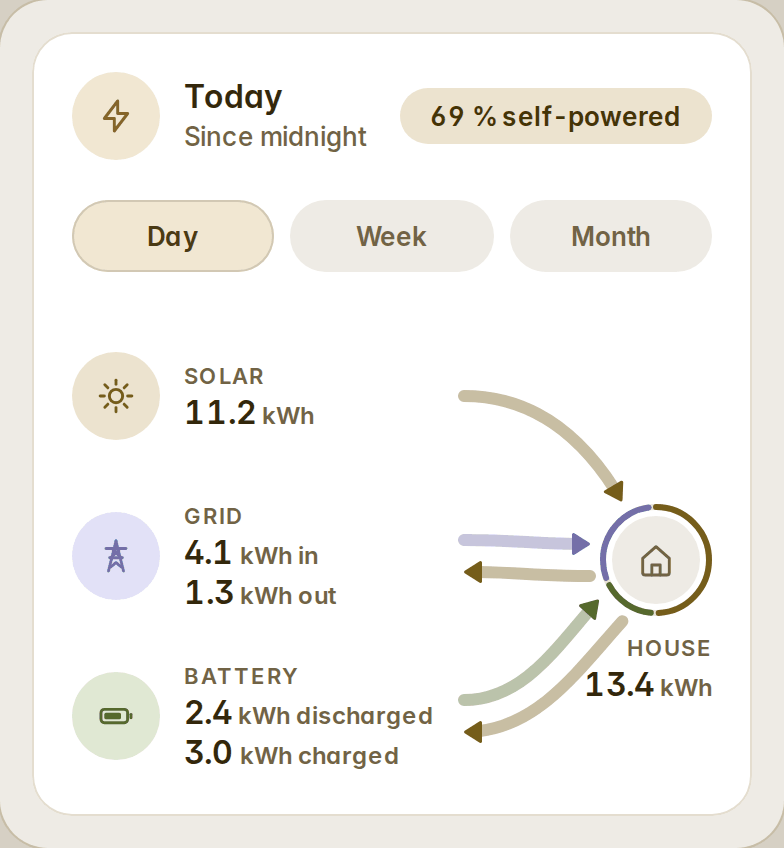
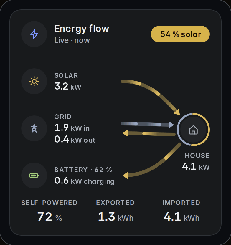
Energy, complete — and one card for a room's lights. The energy flow is rebuilt on one energy model shared by every energy card, seven energy cards are new, and four are better: everything reads a house the way its meters do, and says only what it measures.
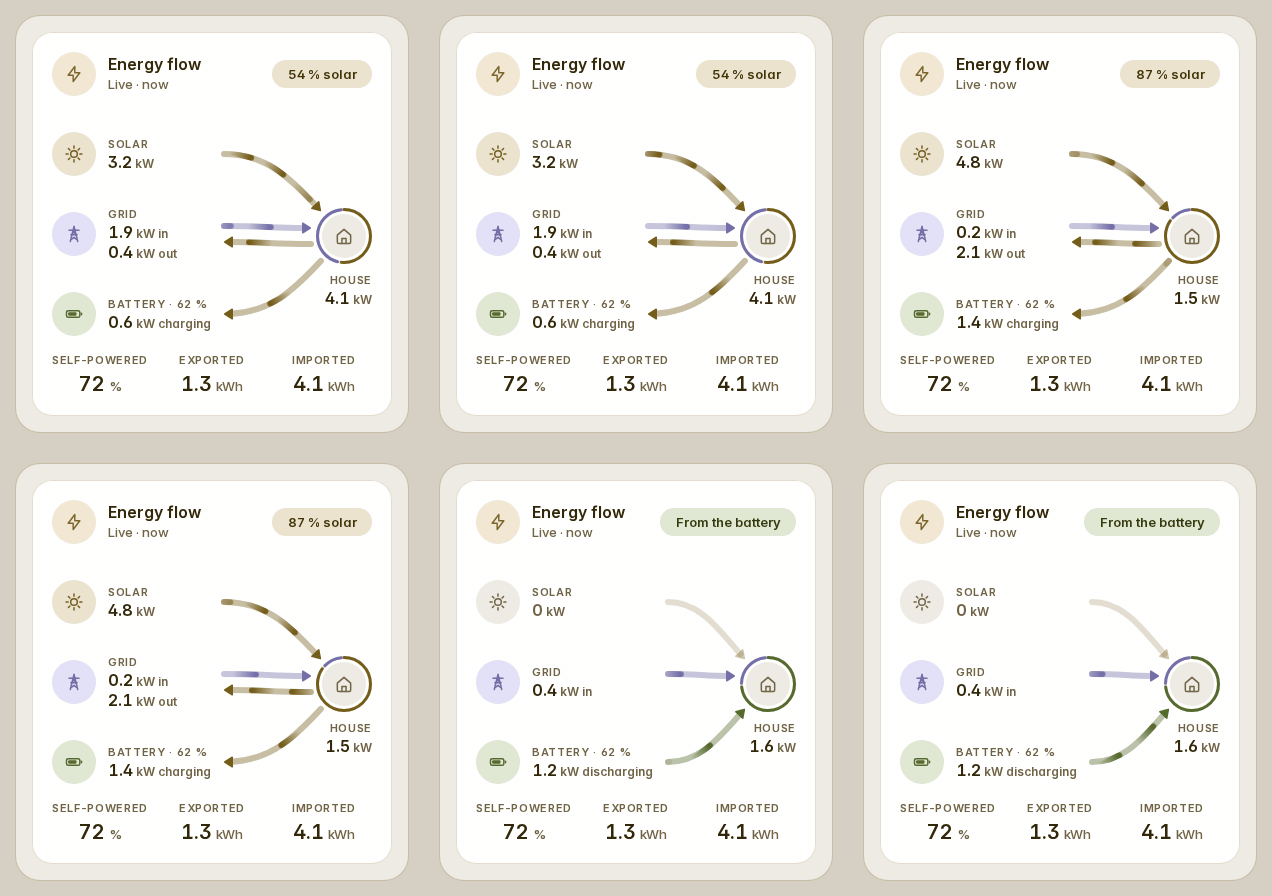
The energy flow, rebuilt
A source is read the way its meter is: one signed sensor, two sensors (what comes in and what goes out), or one sensor per phase summed per sign. A three-phase house that imports on two phases while the third exports now shows both flows at once, and the sun's share of the house is right again (#19). With no sources given, the card reads the Energy dashboard's own: every grid connection, array and battery, and a grid set up there with two power sensors keeps both.
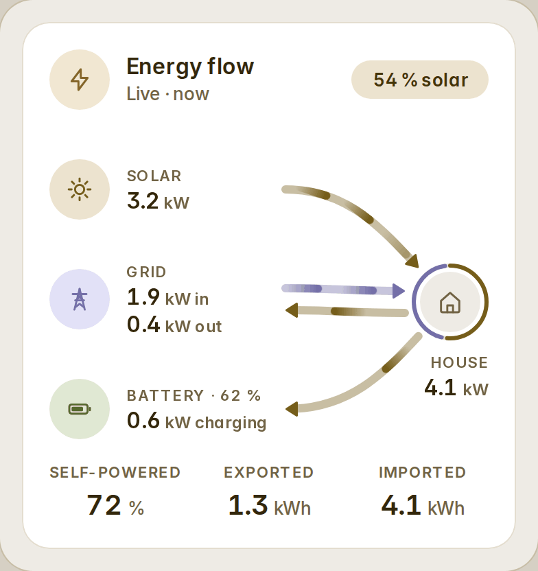
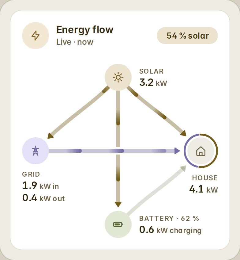
- Every lane in the colour of where its energy came from: the sun's surplus going to the grid is gold, the grid charging the battery is lilac.
- Solid arrowheads whose tip ends the lane; pulses of light at a steady 24–72 px/s, eight a card at most, paused off screen and in a hidden tab, none under reduced motion.
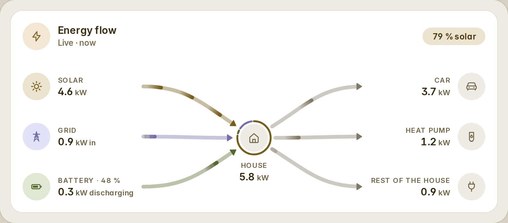
- Sources: solar, grid, battery, generator and a car that powers the house, several of each, each with its own name, icon, colour, threshold, arrows and when to show.
consumers: where the energy goes, beside the house on a wide card, as rows on a phone, with the rest of the house.- Variants
rows,crossandlist; stylesstream,legsandrail;motion: full | calm | off; the badge says the sun's share, the self-sufficiency or the grid's way. - A day, a week or a month from the statistics, allocated hour by hour the way the Energy dashboard does, so the figures match.
- Honest states: a flow below its threshold rests, stale readings say how old they are, an unreadable source is a dashed hairline and the house is never guessed.
Room lights
A room's lights on one card. Tap the card and the whole room turns on or off; each light is its own round beside the room's name — a tap turns it, a hold opens its details. A light that is on wears its bulb's colour and a ring of its level. Prefer names? variant: chips or tiles. show_brightness adds one brightness for the room, and the lights come from an area or your own list, each with its own name, icon and colour.
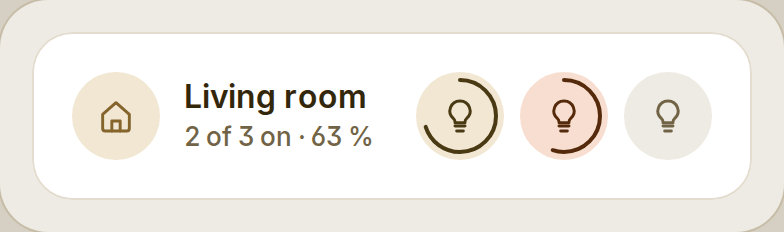
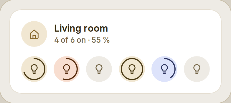
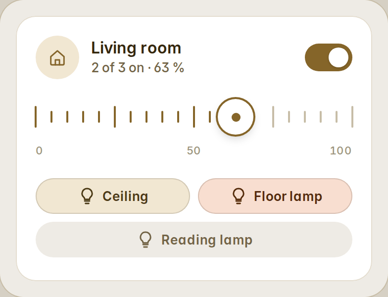
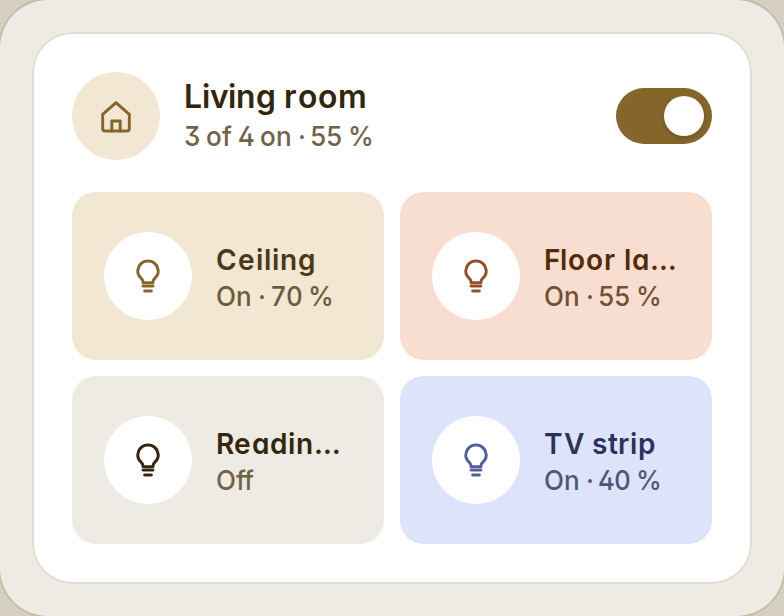
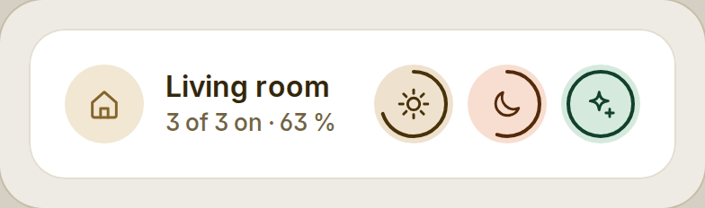
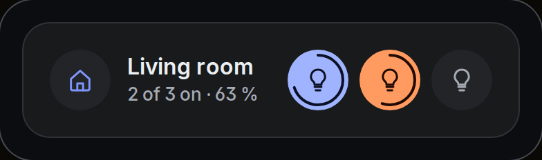
type: custom:fluvy-lights-card
area: living_room          # or lights: [light.ceiling, light.floor_lamp, …]
variant: row               # row · chips · tiles
show_brightness: false
New energy cards
Energy balance — what comes in against what goes out, live or over a period, always adding up; the grid's phases under it; over a period, what it cost and what the feed-in paid.
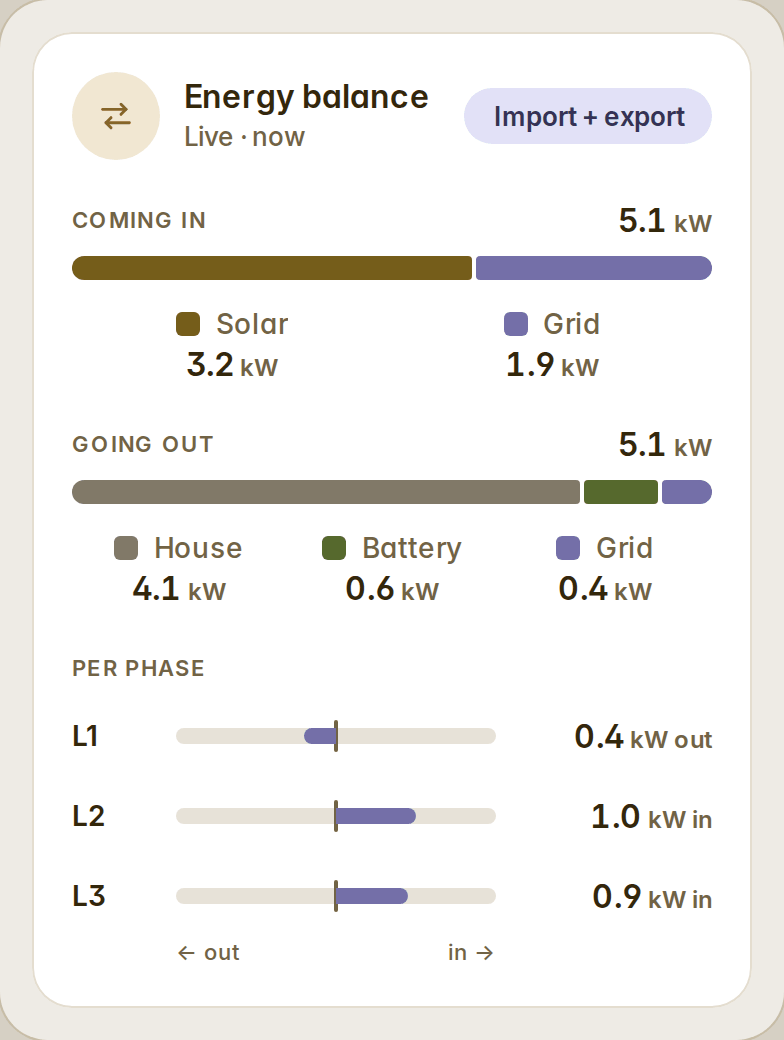
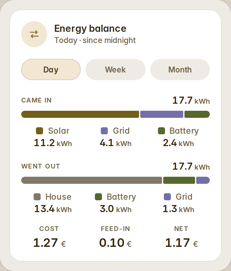
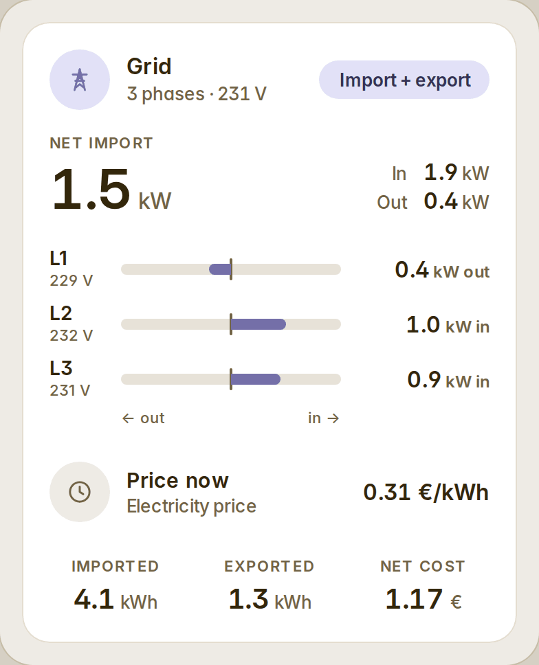
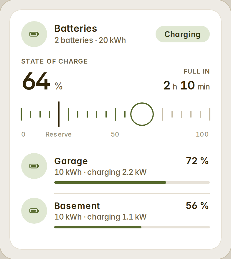
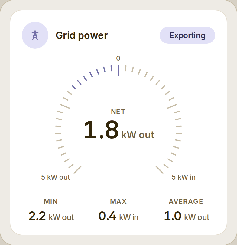
Grid — the net import or export, what comes in and goes out, each phase with its voltage, the price now, and today's import, export and cost. Batteries — one charge for several batteries (weighted by capacity), full in or empty in, the reserve, a row per battery and their mode.
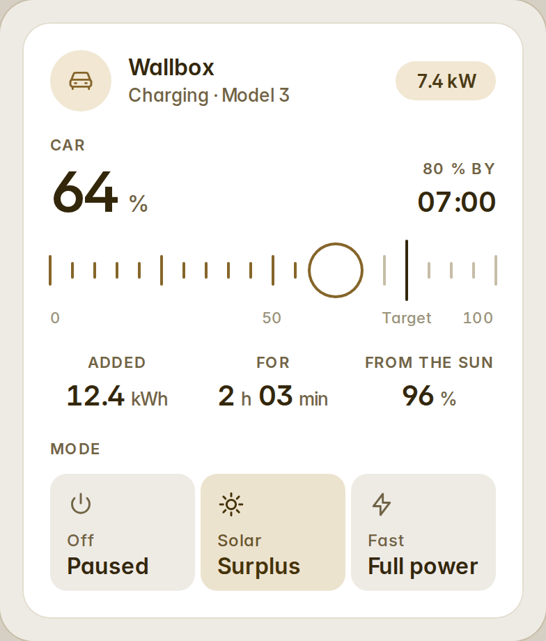
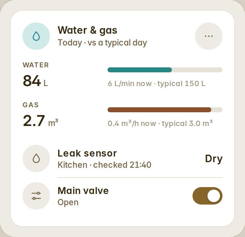
Car charger — the car's charge against its target and when it should be ready, what the session added, how much came from the sun, the charging mode. Water & gas — each meter's use today against a typical day, what flows right now, a leak sensor and a valve beside them.
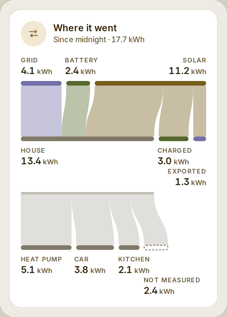
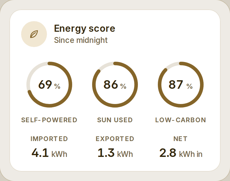
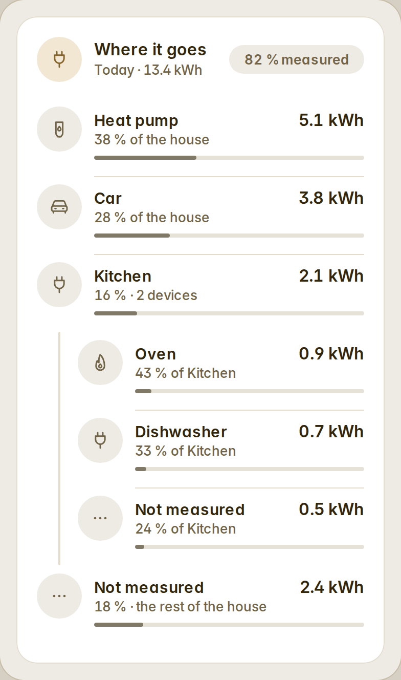
Where it went — a day, a week or a month from where to where, in true proportions, with what the house's devices took and what is not measured. Energy score — self-powered, the sun used and low-carbon, as the Energy dashboard's own gauges compute them.
Better cards
- Energy:
variant: sourcesdraws the house's power today by where it came from, with what went to the grid below the line. - Energy devices: rows nest (
parent), and atotalmeter shows what is not measured at every level. - Production:
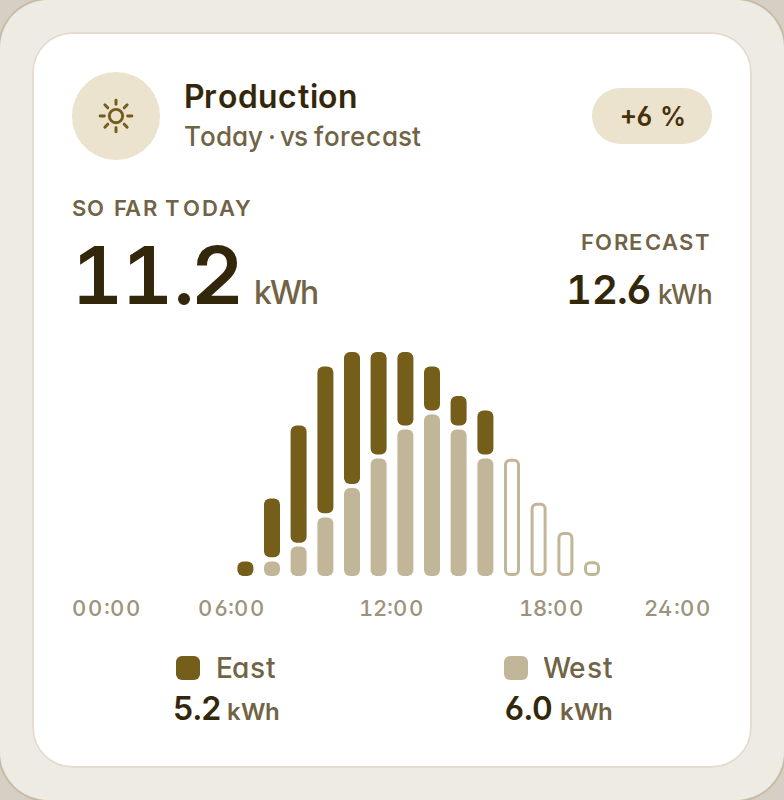
arraysstacks each array's hourly bars, and "today" is counted on the house's clock. - Gauge:
variant: signedfor a meter that can go negative, zero at the top. - Distribution:
total, the whole's own meter, shows what no source accounts for.
The automatic dashboards
They read the whole Energy dashboard — every grid connection, the battery's charge, water and gas — and the Energy template gains a Today view (the day's flow, where it went, the score) and a Water & gas view. A meter named for what leaves the house is now the grid's second sensor, never the grid itself, and grid meters named by phase are read per phase. In the Lights view, each room with two lights or more starts with its room lights card.
Upgrading
Nothing to change: 1.3's flow keys (solar_power, grid_power, grid_invert, battery_*, home_power, flow_style: ribbons) are still read. The energy cards now arrive as their own file, fetched as Fluvy starts, so a dashboard without energy on it never waits for them.
How the energy cards read a house, and every case: docs/energy.md. Every change: CHANGELOG.
v1.3.3
Added
fire-dom-eventas a card action, as Home Assistant's own cards take it: the whole action leaves the card as
ll-custom, so browser_mod's popups (withbrowser_id: THIS) and other frontend integrations answer a
Fluvy card's tap and hold.assistas a card action (it opens Home Assistant's Assist), andnavigation_replaceon anavigate.
Fixed
- An action with a
confirmationran without asking. Home Assistant's own dialog now asks first, with its words
and its exemptions, and a tile no longer flips before the answer. call-service, asperform-actionwas written before Home Assistant 2024.8 (withserviceand
service_data), did nothing.
v1.3.2
Added
- A visible way out of wall mode: a small × in the top-right corner, there when the wall comes and whenever
someone touches the screen, gone when it rests. A tap takes the device out of the wall, and a notice offers the
way back for a few seconds. The house chooses in the Wall tab (Way out) between this button, the default,
and the hidden long press of before, which pauses the wall instead.
v1.3.1
Fixed
- A light card in half a phone's column (two lamps on a line) had no switch: under 200 px its head dropped it and
left the ruler to turn the lamp on and off. The head is now fitted round the switch, as the fan's is — the sub
steps aside, then the icon circle, never the switch — and the card keeps its height.
v1.3.0
Added
- Five automatic dashboards, each a template and a strategy of its own: Home (the dashboard of before, with a
Rooms view when the house has two rooms with something in them, and a page per room), Rooms (a tab a floor,
a card a room), Energy (now, production, devices, meters), Security (the alarm, the cameras, the openings
room by room) and Wall (two columns for a tablet, without tabs). The panel's Dashboards tab lists them,
creates any with one tap, edits each one's options apart, lists it in the sidebar or not, and recreates it in two
taps; the settings file carries every dashboard's options. - Two cards, forty-one in all: Room — an area as the approved area card (its photo under the name pill, its
temperature, humidity and how many devices are on, its lights, climate, media and devices as rows or as inner
tiles; as a tile, or as a compact row) — and Map — where everyone is, as columns of zones with the faces in
each (two, then a "+N" disc), as rows, or as Home Assistant's own map on a plate. - Wall mode for a tablet on the wall: no sidebar, no header, the screen kept awake, a screensaver with the clock (or
black) after a while that any touch or a motion sensor wakes, day and night by Home Assistant's mode, the sun or
a pair of hours with a night veil, the wall mesh behind the cards. The house sets it in the panel's Wall tab,
whose preview shows the wall as it would be now (its night included) and which shows the screensaver itself on a
tap; the tablet becomes a wall with?kioskon the address (or the tab's switch) and remembers; a hold of the
top-right corner pauses it. Everything of the wall loads only on a device that is one. - Palettes that travel: a custom palette shared as a file (
<name>.fluvy-palette.json) with a title and an author,
read back onto the gallery, saved to the house (twelve, under Yours) or removed; the palettes the community has
contributed ship under Community with their authors. A draft that equals one of them is that palette. - Turkish (
tr): the eighth language, in every card, page, dialog and editor form, with the words the automatic
dashboards read a Turkish-named house by. - Every card under one editors' contract: what to show (
show_*), which items and in which order (subset lists
with Fluvy's rows editor), at least one other layout (variant), the chip rows filling by default
(<x>_style: full | chips), atap_actionand ahold_action(a still press on the head) on every entity card,
atoneand acoloron the card and on each item,unknowndrawn as a live surface. New variants: compact cover,
fan, vacuum, lock and alarm (144 tall), a camera tile, a gauge bar, compact energy and production, distribution
rows, readouts grid, a plain heading, compact entities, the clock's face and layout apart, the calendar's
calendars as items. - Colour per card: every card takes a
color— one of Home Assistant's colour names (teal,deep-orange…) or
any#rrggbb— that stands in for the palette's accent inside it: its chart, its lit light, its icon circle,
its dial. The colour is derived on the very palette the card wears, in light and in dark, through the same
arithmetic that makes the palette (its ink readable on the card, its fill legible under its ink, twelve graph
series apart), so a red card on Linen is Linen's red. The editor offers Home Assistant's colour picker, whose
swatches show the palette's colours. Device tones (a fan, a heater, a speaker) keep their own. - The dropdown: the cards' text field as a button, opening its list in the browser's top layer — over Home
Assistant's sidebar and dialogs — under the field, or over it near the foot of the page, as wide as the field;
keys, letters and the pointer as a native select's, a hint beside each name, the chosen row marked. The
Preferences tab's language is the first to use it (eight chips before): Automatic with the language it
resolves to, then Fluvy's languages by their own names with the English name beside. - Preferences: a Help improve this translation row that opens the translating guide.
- View backgrounds: the wall mesh (
--fluvy-mesh-*), derived from the palette's own page colour.
Changed
- The cards' options share one vocabulary:
subtitle(sub,metabefore),variant(layout,view),
hours(trend_hours),color(accent),nameon an entity card (titlebefore on the to-do, energy and
production cards),show_*for every switch (hide_completedbefore),calendarsas items on the calendar
(entities+tones). Every older name is still read, for good; it is never written back. - The settings are version 2: the house keeps its shared palettes and its wall. A house that goes back to 1.2 keeps
them unread; a 1.2 save keeps what it does not know once the house has been saved by 1.3. - The panel has six tabs — Dashboards (it was Dashboard) and Wall are new.
- The automatic dashboards' strategy, the wall, the community palettes and the cards' visual editor load on demand
(their own chunks); a dashboard page pays only for the cards. The automatic dashboards cut their columns by every card's declared
height, measured at a phone's column — the layouts are level where the old table left them uneven. - The theme's named colours follow the tone Home Assistant gives each: pink is the armed alarm's rose, cyan the
water, teal the presence green, lime the dehumidifier's green, light green the battery, deep purple the house,
brown the gas (it was the accent). Every surface Home Assistant paints through them moves with them. - The theme says which palette it is (
--fluvy-palette), and so does a look applied live. - Card editors: the choices of a dropdown (a variant, a forecast, a first weekday…) and the tones are said in the
dashboard's language; they were English words whatever the language. - A compact tile inside a card (a room's controls) is an inner tile: 84 tall, the control radius, the page's fill,
no hairline; off, its icon circle is the card's fill with the text ink. The state line on an on-fill is the fill's
ink at 80 % (4.5:1 on every palette; the palette gates hold it). - The docs' card tables are generated from the code (
pnpm docs:cards), and the release refuses a chunk over its budget.
Fixed
- Tiles: a mini tile is never narrower than 84 px (a group asked for more columns lays out fewer), so its icon
circle is always the 44 of every other tile; a small tile's state line is fitted to the tile — "Open · 40 %"
loses its figure before it is cut, and an unavailable tile shows "—" where the word cannot fit — and a large
unavailable tile drops its "· 11 days ago" the same way. A compact tile's icon left under 160 px, not under 128:
the size queries measured the content box. - Energy flow, gauge, bars and the other chart cards: in a column too narrow for the icon circle and the title,
the circle goes and the title stays whole (a typed title may end in an ellipsis, as a name does). The energy
card's curve draws in the card's colour again (its chart lacked a tone carrier). - The cards' words arriving in a new language refreshed every card twice.
- The dropdown's list, once it scrolls (nine languages), was a tab stop of its own.
- The docs said "five tabs", listed the automatic dashboard's options without
weatherandlanguage, and gave
the Security view a rule it does not follow (it needs an alarm, a lock, a camera or a gate).
v1.2.1
Removed
- The swipe between a dashboard's views (1.2.0). Home Assistant draws one view at a time, so the arriving view
could only appear once it was on the page — a slide out, a gap, a slide in — and rendering the neighbouring
view ourselves proved neither light nor safe. A gesture that cannot show what is coming is worse than none;
the tabs stay, and the Swipe between views preference goes with it.