Skip to content

Implement table headerless column - #1081

Merged
devongovett merged 16 commits into
adobe:mainfrom
shahsnidhi:table-headerless-columns
Oct 13, 2020
Merged

Implement table headerless column#1081
devongovett merged 16 commits into
adobe:mainfrom
shahsnidhi:table-headerless-columns

Conversation

@shahsnidhi

@shahsnidhi shahsnidhi commented Sep 21, 2020

Copy link
Copy Markdown
Contributor

Closes
#912

✅ Pull Request Checklist:

  • Included link to corresponding React Spectrum GitHub Issue.
  • Added/updated unit tests and storybook for this change (for new code or code which already has tests).
  • Filled out test instructions.
  • Updated documentation (if it already exists for this component).
  • Looked at the Accessibility Practices for this feature - Aria Practices

📝 Test Instructions:

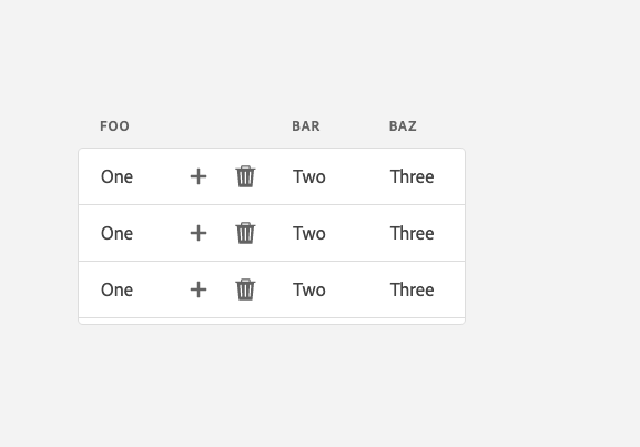
Add a hideHeader prop to the column. This will

  1. Not add a textual header to the column
  2. Tooltip will be added instead of the text
  3. The column will have a default fixed width depending on the scale

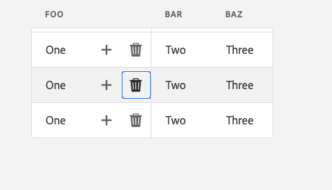
Screen Shot 2020-10-06 at 4 44 31 PM

Screen Shot 2020-10-06 at 4 44 38 PM

Screen Shot 2020-10-06 at 4 45 27 PM

🧢 Your Project:

Comment thread packages/@react-spectrum/table/src/Table.tsx Outdated
@mischnic mischnic linked an issue Sep 21, 2020 that may be closed by this pull request
@shahsnidhi
shahsnidhi force-pushed the table-headerless-columns branch from ebeb682 to 3a5549a Compare September 28, 2020 23:41
@shahsnidhi shahsnidhi closed this Sep 28, 2020
@shahsnidhi shahsnidhi reopened this Sep 28, 2020
@shahsnidhi shahsnidhi closed this Sep 29, 2020
@shahsnidhi shahsnidhi reopened this Sep 29, 2020
@shahsnidhi
shahsnidhi force-pushed the table-headerless-columns branch 2 times, most recently from b921e21 to beb91cd Compare September 29, 2020 16:11
@shahsnidhi shahsnidhi changed the title WIP implement table headerless column Implement table headerless column Sep 29, 2020

@snowystinger snowystinger left a comment

Copy link
Copy Markdown
Member

Choose a reason for hiding this comment

The reason will be displayed to describe this comment to others. Learn more.

Thanks for getting this going!

Comment thread packages/@react-aria/table/src/useTableColumnHeader.ts
Comment thread packages/@react-spectrum/table/src/Table.tsx Outdated
Comment thread packages/@react-types/table/src/index.d.ts Outdated
Comment thread packages/@react-spectrum/table/src/Table.tsx Outdated
Comment thread packages/@react-spectrum/table/src/table.css Outdated
Comment thread packages/@react-spectrum/table/stories/Table.stories.tsx Outdated
Comment thread packages/@react-types/table/src/index.d.ts Outdated
Comment thread packages/@react-stately/layout/src/ListLayout.ts Outdated
Comment thread packages/@react-stately/layout/src/TableLayout.ts Outdated
Comment thread packages/@react-spectrum/table/src/Table.tsx Outdated
@shahsnidhi
shahsnidhi force-pushed the table-headerless-columns branch from 670a228 to c07e8a3 Compare October 2, 2020 00:32
Comment thread packages/@react-spectrum/table/package.json Outdated
@shahsnidhi
shahsnidhi force-pushed the table-headerless-columns branch from 2b7f96a to be290d4 Compare October 3, 2020 01:12
@shahsnidhi

Copy link
Copy Markdown
Contributor Author

@snowystinger Made some changes as discussed.

@snowystinger snowystinger left a comment

Copy link
Copy Markdown
Member

Choose a reason for hiding this comment

The reason will be displayed to describe this comment to others. Learn more.

Looking really good, couple last small things

Comment thread packages/@react-spectrum/table/src/Table.tsx Outdated
Comment thread packages/@react-stately/layout/src/TableLayout.ts Outdated
Comment thread packages/@react-spectrum/table/src/Table.tsx Outdated
}

.react-spectrum-Table-cellContents--hideHeader {
text-overflow: clip;

Copy link
Copy Markdown
Member

Choose a reason for hiding this comment

The reason will be displayed to describe this comment to others. Learn more.

curious, why is clip needed?

@shahsnidhi shahsnidhi Oct 3, 2020

Copy link
Copy Markdown
Contributor Author

Choose a reason for hiding this comment

The reason will be displayed to describe this comment to others. Learn more.

Here I am overriding text-overflow: ellipsis in https://github.com/adobe/react-spectrum/blob/main/packages/@adobe/spectrum-css-temp/components/table/index.css#L156 with default as we wouldn't want to add ellipsis hideHeader column

Copy link
Copy Markdown
Member

Choose a reason for hiding this comment

The reason will be displayed to describe this comment to others. Learn more.

does it affect something if we don't touch it? we wouldn't render anything in there right?

@shahsnidhi shahsnidhi Oct 4, 2020

Copy link
Copy Markdown
Contributor Author

Choose a reason for hiding this comment

The reason will be displayed to describe this comment to others. Learn more.

This is the hideHeader column content, so we would have the action button in there.
In absence of this style, i see ellipsis getting added when a showDivider props is added to the column. I am going to make some changes to the styles of hideHeader cell and contents and the defaultWidth so we don't need to default this.
Let me know if there is a better solution

Comment thread packages/@react-spectrum/table/src/table.css Outdated
medium: 34,
large: 42
medium: 35,
large: 43

Copy link
Copy Markdown
Contributor Author

Choose a reason for hiding this comment

The reason will be displayed to describe this comment to others. Learn more.

adds a px to support the divider

Copy link
Copy Markdown
Member

Choose a reason for hiding this comment

The reason will be displayed to describe this comment to others. Learn more.

What are the implications of this? if there is no divider, is it still ok?

Copy link
Copy Markdown
Contributor Author

Choose a reason for hiding this comment

The reason will be displayed to describe this comment to others. Learn more.

Yes
Screen Shot 2020-10-05 at 4 01 52 PM
Screen Shot 2020-10-05 at 4 01 30 PM
Screen Shot 2020-10-05 at 4 05 36 PM

Copy link
Copy Markdown
Member

Choose a reason for hiding this comment

The reason will be displayed to describe this comment to others. Learn more.

What if we kept the width at the right amount, and added 1px for the columns with a divider?

    getDefaultWidth: (column) => {
      let {hideHeader, isSelectionCell} = column;
      let width;
      if (hideHeader) {
        width = DEFAULT_HIDE_HEADER_CELL_WIDTH[scale];
      } else if (isSelectionCell) {
        width = SELECTION_CELL_DEFAULT_WIDTH;
      }
      if (column.showDivider && !isNaN(width)) {
        width += 1;
      }
      return width;
    }

Copy link
Copy Markdown
Member

Choose a reason for hiding this comment

The reason will be displayed to describe this comment to others. Learn more.

The screenshots don't quite look right, the focus ring around a button shouldn't be clipped like that
I think we still need https://github.com/adobe/react-spectrum/blob/main/packages/%40adobe/spectrum-css-temp/components/table/index.css#L158 and I think we might actually need it to be

.spectrum-Table-cellContents--hideHeader {
  /* allow focus ring of child to extend outside the bounds */
  padding: 4px;
  margin: -4px;
}

I suggest this as an alternative because this helps the clipping at the top and bottom

I think it also needs something closer to this:

const DEFAULT_HIDE_HEADER_CELL_WIDTH = {
  medium: 36,
  large: 44
};

but i don't know where those values were originally pulled from
I still have some clipping on the left with all the above changes, but I missed editing something you've already thought of. Any ideas?

Copy link
Copy Markdown
Contributor Author

Choose a reason for hiding this comment

The reason will be displayed to describe this comment to others. Learn more.

So the focus ring around a button is different than a focus ring around textual content check out the table story for crud and focus around the actions /?path=/story/table--crud
I believe that's the expected behavior. So we don't need the negating margin padding combo for this

The width of the button icon was taking into consideration the width of actionButton ie.
32 and 40 (based on scale).
The button has a border 1 px so adding 2 px to the overall width
34 and 42 (based on scale)
plus the divider 1px
35 and 43 (based on scale)

If we add padding of 4px we will have to increase the width by 8px to accommodate the added pxs

Comment thread packages/@react-spectrum/table/src/table.css Outdated

@snowystinger snowystinger left a comment

Copy link
Copy Markdown
Member

Choose a reason for hiding this comment

The reason will be displayed to describe this comment to others. Learn more.

lets adjust the names to match the rest, the other references will need to be adjusted as well

Comment thread packages/@adobe/spectrum-css-temp/components/table/index.css Outdated
@shahsnidhi
shahsnidhi force-pushed the table-headerless-columns branch 2 times, most recently from 9efa366 to eff04d8 Compare October 6, 2020 04:21
)
}>
{column.rendered}
{!columnProps.hideHeader && column.rendered}

Copy link
Copy Markdown
Collaborator

Choose a reason for hiding this comment

The reason will be displayed to describe this comment to others. Learn more.

Since TooltipTrigger should not add aria-describedby until the Tooltip is open, we should add the rendered column header content within a VisuallyHidden element:

        {columnProps.hideHeader ?
          <VisuallyHidden>{column.rendered}</VisuallyHidden> :
          column.rendered
        }

Copy link
Copy Markdown
Collaborator

Choose a reason for hiding this comment

The reason will be displayed to describe this comment to others. Learn more.

Related to this, TooltipTrigger is always adding aria-describedby regardless of whether the state.isOpen or not.

At:

'aria-describedby': state.open ? tooltipId : undefined,

state.open is a function, so it's always true, whereas state.isOpen is a boolean, this line should be:

      'aria-describedby': state.isOpen ? tooltipId : undefined,

Copy link
Copy Markdown
Collaborator

Choose a reason for hiding this comment

The reason will be displayed to describe this comment to others. Learn more.

I've opened a related issue: #1149.

Copy link
Copy Markdown
Contributor Author

Choose a reason for hiding this comment

The reason will be displayed to describe this comment to others. Learn more.

Made the required changes
cc: @snowystinger @majornista

@shahsnidhi
shahsnidhi force-pushed the table-headerless-columns branch from b858e6f to 642c6cf Compare October 7, 2020 18:49
return {
triggerProps: {
'aria-describedby': state.open ? tooltipId : undefined,
'aria-describedby': state.isOpen ? tooltipId : undefined,

Copy link
Copy Markdown
Collaborator

Choose a reason for hiding this comment

The reason will be displayed to describe this comment to others. Learn more.

#1150 fixes this issue and includes a unit test.

majornista
majornista previously approved these changes Oct 7, 2020
snowystinger
snowystinger previously approved these changes Oct 7, 2020
}

.spectrum-Table-cell--hideHeader {
padding: 0 2px;

Copy link
Copy Markdown
Member

Choose a reason for hiding this comment

The reason will be displayed to describe this comment to others. Learn more.

can you add a comment to explain this one and why it's different from the other one?

Copy link
Copy Markdown
Contributor Author

Choose a reason for hiding this comment

The reason will be displayed to describe this comment to others. Learn more.

So looks like the content is not center aligned and this padding helps to align the content
I can also fix the issue of left focus ring getting cut off with

.spectrum-Table-cell--hideHeader {
   padding: 0; // default padding for other cells is around 16px, so we need to override that
  justify-content: center;
}

The same happens to all the buttons in the table when we remove the padding around them and also remove the alignment. checkout the CRUD example
Need your inputs on which method would be better? existing OR above, considering the other pieces in the table

Copy link
Copy Markdown
Member

Choose a reason for hiding this comment

The reason will be displayed to describe this comment to others. Learn more.

setting padding to 0 and justifying center should be the better way to do it i think

Copy link
Copy Markdown
Contributor Author

Choose a reason for hiding this comment

The reason will be displayed to describe this comment to others. Learn more.

Agreed, we should be good to go now

@shahsnidhi
shahsnidhi dismissed stale reviews from snowystinger and majornista via e369cc2 October 7, 2020 23:16
Comment thread packages/@adobe/spectrum-css-temp/components/table/index.css Outdated
@devongovett
devongovett merged commit f07194e into adobe:main Oct 13, 2020
Sign up for free to join this conversation on GitHub. Already have an account? Sign in to comment

Labels

None yet

Projects

None yet

Development

Successfully merging this pull request may close these issues.

Build support for header-less "action" columns in Table

4 participants