Layout and Appearance
- 📐 Sections Auto-height
- 🕒 Y-Axis Label Formats
- 👁️ Y2 Axis Visibility
↕️ Independent Y-Axis- 📊 Stacked Mode
- 🔄 Invert Bars (Butterfly Charts)
- 🏷️ Data Labels
- 🎛️ Gauge Display
- ✨ Sparkline Mode
- 🔋 Battery Icon
- 🏷️ Compact Legend
- 📊 Per-Entity Legend Stats
- ⬇️ State Row Position
📐 Sections Auto-height
In Home Assistant's Sections view the card now reports proper grid sizing — the "does not fully support resizing" warning is gone, and you can resize it from the card's Layout tab.
By default height is a fixed pixel value (150). Set it to auto to make the chart fill the grid cell it is given instead:
type: custom:statistics-graph-chart-card
height: auto          # fill the cell; size the card from the Layout tab
entities:
- entity: sensor.power- A numeric
height(e.g.300) still pins the graph to that many pixels, exactly as before. - With
height: autothe chart grows and shrinks to match the grid cell — drag the card's resize handle (or setgrid_optionsrows) in the Layout tab. Handy for lining a chart up with a neighbouring card's height.
The Height field accepts a number or the word auto. Leaving it empty is treated as auto.
🕒 Y-Axis Label Formats
Render axis values as durations or with a custom template instead of plain numbers. The format follows the entity everywhere: axis ticks, tooltips, data labels, the state row and the average-line label.
y2_axis_format: h:mm    # 5400 → 1:30
duration_unit: s # raw unit: s (default) / ms / min / h| Format |
5400 becomes |
|---|---|
h:mm |
1:30 |
h:mm:ss |
1:30:00 |
mm:ss |
90:00 |
d h:mm |
1:30 — and 90000 becomes 1d 1:00
|
y_axis_format: "{fixed(value/1000,1)} kW"     # 2350 → 2.4 kW
y2_axis_format: "{floor(value/3600)}:{pad2(floor(value%3600/60))}"
Templates accept numbers, value, + - * / %, parentheses and the functions floor, ceil, round, abs, min, max, sqrt, pad2(x), pad(x,width), fixed(x,decimals). No JavaScript is executed — invalid formats are simply ignored and the axis falls back to plain numbers.
General Settings → Y Axis → Labels → Y Tick Format / Y2 Tick Format / Duration Unit.
👁️ Y2 Axis Visibility
The primary (left) and secondary (right) Y axis labels can be toggled independently:
show_y_axis: true       # primary — left side
show_y2_axis: false     # secondary — right side hidden
entities:
  - entity: sensor.temperature
    y_axis: primary
  - entity: sensor.humidity
    y_axis: secondary     # still plotted, just no labels on right
Useful when the secondary axis labels are distracting or when you want to maximize horizontal graph space. Both entities continue to be plotted against their respective axes — only the labels are hidden.
↕️ Independent Y-Axis
Overlay sensors with completely different units on a single graph for trend comparison. Each independent entity gets its own hidden scale based on its data's min/max range. No axis labels are shown — only the visual trend matters.
entities:
  - entity: sensor.temperature
    y_axis: primary          # Left axis, shared scale, visible labels
    color: "#ff4757"
  - entity: sensor.humidity
    y_axis: secondary        # Right axis, shared scale, visible labels
    color: "#378ADD"
  - entity: sensor.illuminance
    y_axis: independent      # Own hidden scale: 0–10000 lux
    color: "#f39c12"
  - entity: sensor.pressure
    y_axis: independent      # Own hidden scale: 980–1020 hPa
    color: "#2ecc71"
There is no limit on the number of independent entities. Each one is scaled individually. Primary and secondary entities continue to share their respective axis scales.
The Y Axis dropdown stays visible in every chart mode, not just Timeline — besides picking the axis a series is drawn against, it also decides which tick format applies to that entity: y_axis: secondary makes y2_axis_format govern the entity's numbers everywhere (axis, tooltip, data labels, state row, legend), and every other value uses y_axis_format. That is why the v3.32 editor — which otherwise hides options that do nothing for the selected chart mode, down to the individual field, collapsing headings and tabs as they empty — keeps this one on screen in all 14 modes. Hidden options are never dropped: they keep their YAML value and come back when you switch modes.
Editor: Per-entity → Basic tab → Y Axis dropdown → "Independent"
📊 Stacked Mode
Card-level stacked: true stacks entities on top of each other (Timeline mode only). Bar entities stack vertically. Line/area entities stack as bands. Entities on the same Y axis and graph type are stacked together. The tooltip shows a "Total" row.
stacked: true
entities:
  - entity: sensor.solar_production
    color: "#f39c12"
  - entity: sensor.grid_import
    color: "#e74c3c"
  - entity: sensor.battery_discharge
color: "#3498db"By default, all bar entities stack into a single column. Use stack_group to create named groups — entities within the same group stack on top of each other, while different groups sit side by side.
stacked: true
group_by: date
entities:
  - entity: sensor.solar_production
    graph_type: bar
    stack_group: energy
    color: "#2ecc71"
  - entity: sensor.grid_import
    graph_type: bar
    stack_group: energy
    color: "#e74c3c"
  - entity: sensor.cost_peak
    graph_type: bar
    stack_group: cost
    color: "#f39c12"
  - entity: sensor.cost_offpeak
    graph_type: bar
    stack_group: cost
    color: "#3498db"
This renders two side-by-side bar groups per time slot: an "energy" stack (solar + grid) and a "cost" stack (peak + off-peak). Backward compatible — if no stack_group is set, all entities stack together as before.
Per-group tooltip totals. With tooltip_stacked_total: true (the default), the tooltip shows a separate total for each named group — labelled with the group name (e.g. "energy Total", "cost Total") — so you can read each stack's sum at a glance. It is independent of show_tooltip_total: leave both on to show the per-group totals together with the grand Total of all entities, or turn either one off to show only the other. The per-group rows appear only when there are two or more stack groups; ungrouped entities roll into the grand Total.
Editor: Per-entity → Graph tab → Stack Group text field (visible when Stacked is enabled)
🔄 Invert Bars (Butterfly Charts)
Per-entity invert: true draws bars downward from the zero line. Tooltip, state row, and extrema labels show positive values. Combined with stacked: true, creates butterfly charts for energy import/export, network in/out, and similar comparisons.
stacked: true
entities:
  - entity: sensor.grid_import
    graph_type: bar
    aggregate_func: change
    color: "#f39c12"
    name: Import
  - entity: sensor.grid_export
    graph_type: bar
    aggregate_func: change
    invert: true
    color: "#3498db"
    name: Export
Inverted entities automatically form their own stacking group — normal bars stack upward from zero, inverted bars stack downward independently. The Y-axis expands symmetrically to accommodate both directions.
When used with line or area charts (not just bars), the fill correctly stops at the zero baseline: mirrored lines fill upward to zero, normal lines fill downward to zero, and series that cross zero get a clean positive/negative split.
invert flips the sign of the value in the shared data pipeline, so it is not timeline-only: in Waterfall it turns the entity into a subtraction step (see Waterfall), and it applies in every other chart mode too.
Editor: Per-entity → Advanced tab → Invert (Mirror) checkbox (next to Fixed Value)
🏷️ Data Labels
Print the numeric value of every visible data point right above its bar / line / point — the same kind of inline annotation ApexCharts calls dataLabels. Useful when you want the chart to be readable at a glance without forcing the viewer to hover for every value.
entities:
  - entity: sensor.solar_production_today
    graph_type: bar
    aggregate_func: change
    show_data_labels: true
    decimals: 1
color: "#f1c40f"- Labels render above each point, in the entity's color, with a card-background halo so they stay readable over crowded areas.
- Number formatting follows the entity's own
decimalsandnumber_formatsettings — no separate config. - For bars, the font size adapts to the available bar width and shrinks down to a minimum of 7 px — it stops shrinking there and the label is still drawn, so on very narrow bars labels can overlap. Use
data_labels_font_sizeto pin a specific size if you'd rather control it yourself. - For lines / steps, labels anchor to the X position of each data point at a default 10 px.
- Bar charts of daily / hourly aggregates where the exact number matters (energy, rain, hours of sunshine)
- Compact summary cards where hover isn't practical (mobile, kiosk displays)
- Reports / screenshots where the chart needs to stand alone without tooltip interaction
- High-density line charts — labels will overlap and become illegible
- When you already use
show_extremato highlight just the peaks; the two combined creates visual noise
Entity → Graph tab → Data Labels toggle, sitting next to Show Average and Break on Gaps. The toggle appears in Timeline mode only; Break on Gaps stays visible in every chart mode.
🎛️ Gauge Display
Replace the numeric state row with a half-circle gauge arc. Set show_state: gauge on any entity.
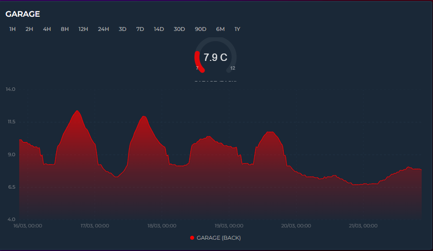
entities:
  - entity: sensor.temperature
    show_state: gauge
    color: "#ff4757"
    lower_bound: 15    # gauge minimum
    upper_bound: 30    # gauge maximum
The gauge arc sweeps 270° from lower_bound to upper_bound. The center shows the current value + unit, bottom edges show min/max labels. Multiple gauge entities display side-by-side: 1 entity = large gauge, 2+ = compact.
color_thresholds work with gauge — the arc color changes dynamically based on value.
The graph below the gauge continues to show the historical trend as usual.
✨ Sparkline Mode
Card-level sparkline: true strips all chrome and renders ultra-compact inline graphs. Only available in Timeline mode.

sparkline: true
entities:
  - entity: sensor.temperature
    color: "#ff4757"
  - entity: sensor.humidity
    color: "#378ADD"
grid_options:
  columns: 12
  rows: 2
Each entity becomes one row: name + value + trend icon on the left, tiny graph on the right. Removed: header, icon, toolbar, axes, grid, tooltip, legend, annotations. Preserved: entity colors, line smoothing, fill, trend icons, live streaming, color thresholds, and rise/fall colors.
🔋 Battery Icon
Display a battery level indicator on the card. When a header exists (title or icon), the battery appears in the top-right corner. When there's no header, it appears on the right side of the state row.
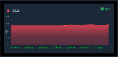
battery_entity: sensor.temperature_battery
battery_low_threshold: 20
Color adapts to battery level:
| Level | Color |
|---|---|
| >50% | Green |
| 25–50% | Yellow |
| low–25% | Orange |
| Below threshold | Red |
The low threshold defaults to 20% and accepts a number, entity ID (sensor.x), or entity attribute (sensor.x.attribute). Hover shows the entity friendly name and exact percentage.
The icon and percentage text scale proportionally with the Header & Battery Size setting (card_header_size). This applies in both header and state row positions.
Editor: General Settings → Display tab → Battery
🏷️ Compact Legend
Card-level show_legend: true adds a compact color-coded entity name key below the graph. Just colored dots and names — no values, no stats. Wraps to multiple lines on narrow cards.
show_legend: true
entities:
  - entity: sensor.memory
    name: "Memory"
    color: "#f39c12"
    show_state: false
  - entity: sensor.disk
    name: "Disk"
    color: "#85b7eb"
    show_state: false
  - entity: sensor.cpu
    name: "CPU"
    color: "#00bcd4"
    show_state: false
This produces: ● Memory ● Disk ● CPU in a centered wrapping row below the graph. Combine with show_state: false on entities to maximize graph area while still identifying colors.
For per-entity statistics (Min, Avg, Max, Sum, Last, Live), use the entity-level Legend toggle instead — see Entity Legend Stats.
📊 Per-Entity Legend Stats
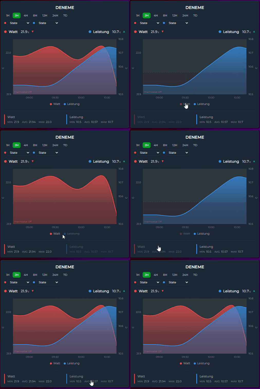
Each entity's Legend toggle (show_in_legend: true) lets you choose which statistics to display. Select any combination of Min, Avg, Max, Sum, Last and Live.
entities:
  - entity: sensor.temperature
    show_in_legend: true
    legend_stats:
      - avg
      - last
  - entity: sensor.humidity
    show_in_legend: true
    legend_stats:
      - min
- maxmin, avg, max and sum describe the time range currently on screen, and last is the final plotted value in it — so all five move when you change the period or zoom.
live (v3.32) is different: for a normal history-backed entity it is the state right now, independent of the displayed range.
entities:
  - entity: sensor.power
    show_in_legend: true
    legend_stats:
      - avg
      - live      # today's average, next to what the meter reads this second
It goes through the same value pipeline as the state row, so the two agree on what the number means:
- an
attribute:entity shows that attribute, not the entity's own state; - a
state_mapentity shows its mapped text label; -
invert,value_factorandvalue_transformare applied; - with
ref_entityit shows the combined value (theA − Byour chart draws), and shows—rather than a misleading number if the combination has nothing to report; - comparison ghost rows never get a Live value — a ghost shares the main entity's ID, so "now" would be printed under a "previous period" heading.
Two deliberate differences from the state row:
-
primary_state_as(and the legacyshow_state_last) are ignored here. Those pick what the state row displays; the Live chip is always the live reading, so a card withprimary_state_as: maxshows the max in the header and the current value in the legend. - Three configurations have no live state to show and fall back to the last value in the fetched window instead:
ref_entity(the last point of the combined series), a non-zerooffset, and long-term-statistics rows. For those the value follows the displayed range like the other stats do.
Otherwise the Live value refreshes as soon as the entity changes, without waiting for the next data refresh.
The editor shows six checkboxes (Min, Avg, Max, Last, Sum, Live) inside the Legend section. Default is [min, avg, max] for backward compatibility.
⬇️ State Row Position
Entity state rows can be placed below the graph instead of above. The align_state option accepts six positions:
| Value | Position |
|---|---|
left (default)
|
Above graph, left-aligned |
center |
Above graph, centered |
right |
Above graph, right-aligned |
bottom-left |
Below graph, left-aligned |
bottom-center |
Below graph, centered |
bottom-right |
Below graph, right-aligned |
entities:
  - entity: sensor.temperature
    align_state: bottom-left
  - entity: sensor.humidity
    align_state: left         # stays above the graph
Mix and match — some entities above, some below. Useful when you want the graph to be the first thing visible, with values underneath.