Zoom Export and Tools
🔍 Brush Zoom
Click and drag on any Timeline mode graph to zoom into a specific time range. No configuration needed — it's always available.
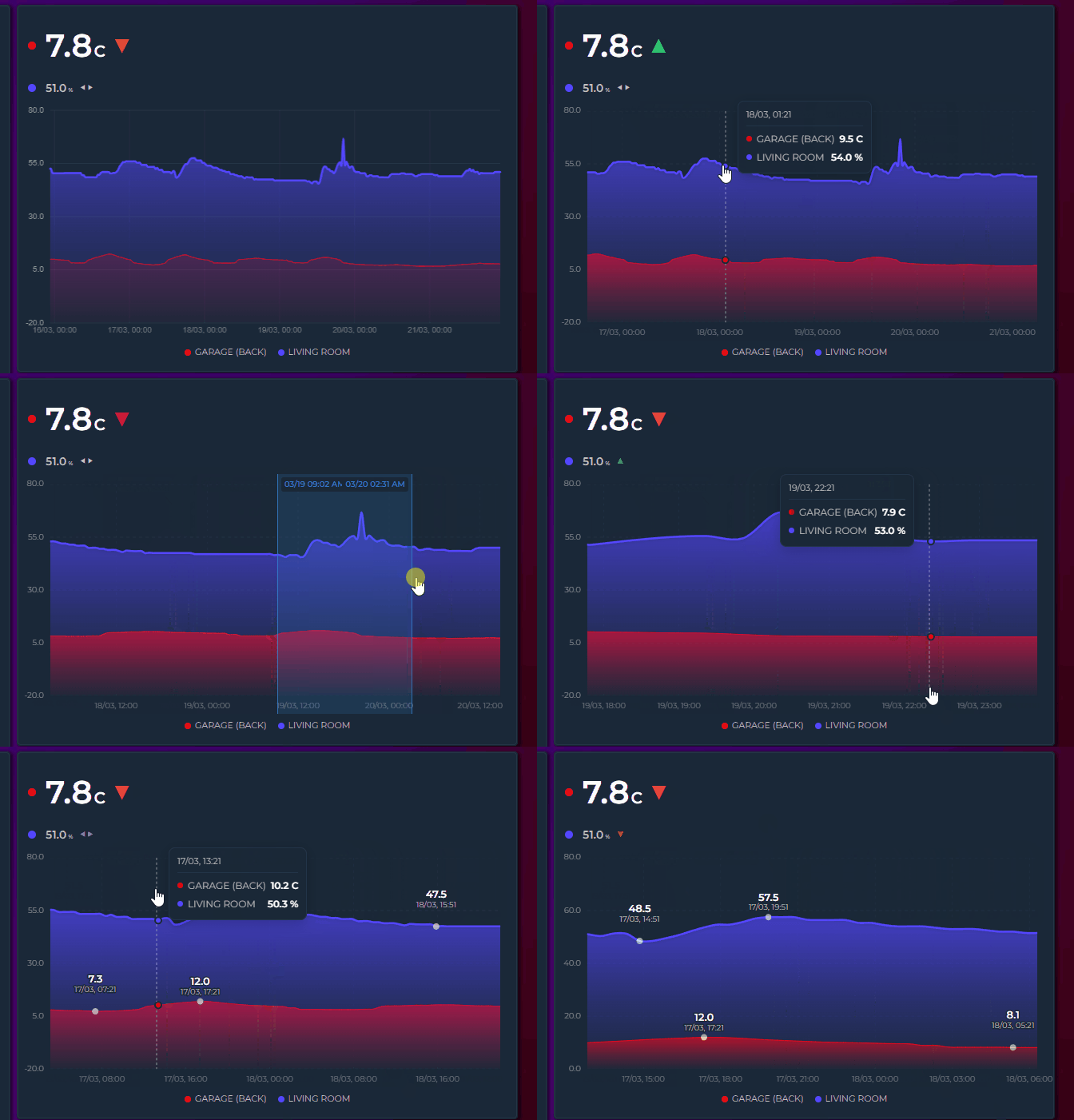
- Click and drag horizontally — a blue selection overlay appears with formatted timestamps at both edges
- Release — the graph zooms into the selected range, recalculating Y axis, grid, statistics (Min/Avg/Max), extrema labels, and legend values
- Step back / reset — double-click the graph to step back one zoom level (see Zoom History), or click the "Reset zoom" button in the top-right corner to restore the full window in one go
Key details:
- Instant zoom — zooming never re-fetches data from Home Assistant; zoom and reset are immediate.
- Progressive zoom — zoom again within an already-zoomed view to drill deeper into spikes or anomalies
- Touch support — works on mobile: touch and drag to select
- Minimum 15px selection — prevents accidental zoom from regular clicks or taps
- Time formatting — selection labels show time only for ranges under 24H, date + time for longer ranges
- Interval picker aware — changing the time range via the interval picker resets any active zoom and fetches fresh data
On touch devices, a two-finger pinch zooms the timeline directly — no long press needed:
- Spread two fingers to zoom in — the view scales live around the midpoint of the gesture while the fingers move
- Bring them together to zoom back out — zooming all the way out returns to the full window
- Any pinch angle works (improved in v3.26) — the gesture measures the true 2D distance between the fingers, so vertical and diagonal pinches (thumb below, index above — the most natural grip) zoom just like horizontal ones
- Amplified response (improved in v3.26) — zoom follows an amplified (squared) curve, so a small real-world pinch zooms meaningfully instead of barely moving the window; pinching inward zooms out just as strongly
- Double-tap still steps back one zoom level at a time — see Zoom History below
- Available whenever the drag brush is — the same gate applies (Timeline mode, brush zoom not disabled)
- Works with cross-card Zoom Sync: the final window is broadcast once at gesture end, not continuously during the pinch
Every committed zoom — a released brush selection or a finished pinch — pushes the previous window onto a history stack (up to 20 levels):
- Double-click (mouse) or double-tap (touch) steps back one level at a time
- With an empty stack, double-click shows the full window
- The stack resets whenever the data window itself refreshes — date/interval picker changes, the live window sliding forward, or a polling refresh
Changed in v3.25: double-click used to reset the zoom completely in one go. It now steps back level by level, so you can retrace a deep drill-down. The "Reset zoom" button still restores the full window in a single click.
No new YAML options — pinch zoom and zoom history are part of the standard brush zoom behavior.
On phones and tablets, touch gestures separate tooltip exploration from brush zoom:
| Gesture | Action |
|---|---|
| Tap | Tooltip appears instantly with crosshair and values |
| Quick slide | Tooltip follows finger across the graph |
| Hold on bar | Tooltip + bar highlight stay visible as long as finger is held |
| Long press (600ms) + drag | Brush zoom selection starts |
| Two-finger pinch | Zooms the timeline live around the gesture midpoint — any finger angle, amplified response curve (improved in v3.26) |
| Double-tap | Steps back one zoom level; full window once the history is empty (v3.25) |
| Lift finger | Tooltip and highlights clear |
Holding still for 600ms prepares zoom but does not activate it — zoom only starts when the finger moves. This prevents the tooltip from disappearing while exploring a single data point.
📥 PNG / CSV Export
Card-level show_export: true overlays a small download icon on the top-right of the card. Clicking it opens a menu — Download PNG (Chart) / Download PNG (Card) / Download CSV — and the menu closes on any outside click.
type: custom:statistics-graph-chart-card
card_header: Energy Overview
show_export: true
entities:
- entity: sensor.energy_consumption- Download PNG (Chart) — a 2× resolution snapshot of the current plot — crisp on high-DPI displays
- Download PNG (Card) — captures the entire card exactly as rendered: header, chart, state row, and legend included
- Works in all chart modes: canvas-rendered modes (Pie, Heatmap, Ranking, …) are copied directly, and the SVG timeline is serialized with the correct axis-label styling and the card background color, so the file looks exactly like the card
- When the active theme paints the card with an external background image, the Card capture falls back to the Chart export — browsers block capturing images that come from another server.
-
Wide format — the first column is
time(ISO 8601, UTC), followed by one column per visible series; series hidden via the legend are excluded - UTF-8 with BOM and CRLF row endings, so the file opens correctly in Excel without an import wizard
- Period Comparison ghosts export as their own suffixed columns, with timestamps shifted into the current window so they align with the main series
- Candlestick series export the bucket value only — no separate OHLC columns
- Export what you see — if the chart is zoomed (brush or pinch), both the PNG and the CSV cover exactly the zoomed range
- Filenames combine the sanitized
card_headerwith a timestamp, e.g.Energy_Overview-20260715-1630.png/.csv - Hidden in sparkline mode
-
show_exportaccepts{{ }}templates — see Template Toggles
General Settings → Chart → Visual Options → Show Export Button.
📌 Annotations
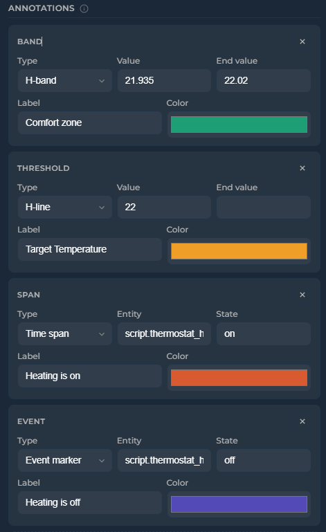
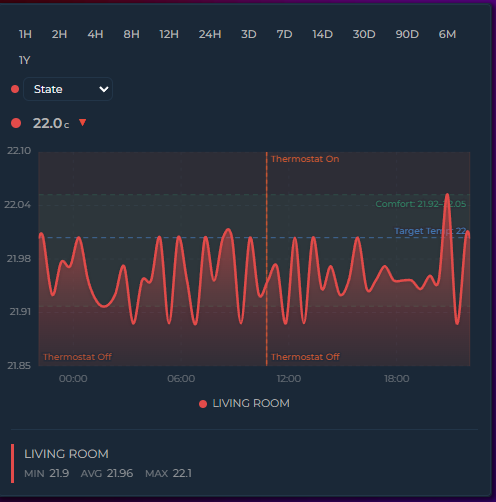
Add reference lines, event markers, and highlight bands to the graph (Timeline mode only). Configure via the editor (General Settings → Overlays → Annotations) or YAML.
annotations:
  - type: threshold       # horizontal dashed line
    value: 22.5
    label: "Target"
    color: "#1D9E75"
  - type: threshold       # dynamic value from entity
    value: sensor.climate_setpoint
    label: "Setpoint"
    color: "#f39c12"
  - type: band            # horizontal shaded band
    value: 20
    value_end: 23
    label: "Comfort zone"
    color: "#1D9E75"
  - type: band            # dynamic band from entity attributes
    value: sensor.comfort.min_temp
    value_end: sensor.comfort.max_temp
    label: "Dynamic comfort"
    color: "#3498db"
  - type: event           # vertical marker at state transitions
    entity: binary_sensor.heating
    state: "on"
    label: "Heating on"
    color: "#D85A30"
  - type: span            # vertical band for active periods
    entity: binary_sensor.heating
    state: "on"
color: "#D85A30"| Type | Description |
|---|---|
threshold |
Horizontal dashed line at a fixed value, entity state, or entity attribute |
band |
Horizontal shaded band between value and value_end. Both accept numbers, entity IDs, or entity.attribute paths |
event |
Vertical marker — entity-driven (at each state transition) or manual (fixed timestamp) |
span |
Vertical shaded band — entity-driven (duration in a specific state) or manual (fixed start/end timestamps) |
| Option | Applies to | Description |
|---|---|---|
opacity |
All types | Prominence of the annotation (0–1) — fill for bands/spans, stroke for thresholds/events, and its label (v3.32). Default: 0.15 for bands/spans, 1 for thresholds/events |
label_opacity |
All types | Opacity of the label only (0–1), overriding whatever opacity would give it. Default: none (v3.32)
|
show_values |
threshold, band | Show numeric values alongside the label. Default: true |
label |
All types | Text label displayed on the annotation |
color |
All types | Color of the annotation line, fill, or marker |
label_color |
All types | Color of the label. Default: the annotation's color
|
label_font_size |
All types | Label size in px. Default: 10 |
label_position |
threshold, event |
left/right for thresholds (default right), top/bottom for events (default top) |
line_width |
threshold, event | Line thickness in px. Default: 1.5 |
line_style |
threshold, event |
solid, dashed or dotted. Default: dashed for thresholds, dotted for events |
y_axis |
threshold, band | Set to secondary to position the annotation against the secondary Y axis |
The editor's annotation rows expose Type, Source/Value, Label, Color, Opacity and Show Values. The remaining options —
label_opacity,label_color,label_font_size,label_position,line_width,line_styleandy_axis— are YAML only.
Threshold and band values accept: 22.5 (number), sensor.x (entity state), sensor.x.attribute (entity attribute with nested path support).
Live updates: when a threshold or band value references a sensor or input helper, the annotation updates instantly as soon as that entity's state changes — no need to wait for the next data refresh. Combine with a HA template sensor to get seasonal or month-based thresholds that automatically move over time:
# configuration.yaml
template:
  - sensor:
      - name: Solar Target
        state: >
          {% set m = now().month %}
          {% if m in [6,7,8] %}8000
          {% elif m in [4,5,9,10] %}5000
          {% else %}2000
          {% endif %}
        unit_of_measurement: kWh
# card
annotations:
- type: threshold
value: sensor.solar_target
label: Seasonal target
color: "#1D9E75"Use show_values: false on any threshold or band to hide the value label while keeping the line/band visible. When enabled (default), the numeric value appears alongside the label — or by itself if no label is set:
annotations:
  - type: band
    value: 20
    value_end: 25
    label: "Comfort"
    color: "#1D9E75"
    show_values: false    # band visible, no text labels
Manual timestamps — event markers and time spans can use fixed timestamps instead of tracking an entity. Switch between Entity and Manual source in the editor, or set directly in YAML:
annotations:
  - type: span
    start: "2026-04-15T08:00:00"
    end: "2026-04-15T18:00:00"
    label: "Day shift"
    color: "#ff9800"
  - type: event
    time: "2026-04-15T12:00:00"
    label: "Noon"
    color: "#e74c3c"
Opacity — control the prominence of each annotation with the opacity option (0–1). Applies to all types: fill opacity for bands and spans, stroke opacity for threshold lines and event markers, and the annotation's label (v3.32) — so a faded annotation fades as a whole instead of keeping a solid caption on top.
Labels follow opacity relative to that type's own default, because the defaults differ for a good reason: a band fills a whole region, so it defaults to a light 0.15, while a line and a caption default to fully opaque. In practice:
| You write | Threshold / event label | Band / span label |
|---|---|---|
| nothing | fully opaque | fully opaque |
opacity: 0.15 |
15% | fully opaque (0.15 is the band default — same rect, same label) |
opacity: 0.5 |
50% | fully opaque |
opacity: 0.075 |
7.5% | 50% (half the default → half strength) |
So dimming an annotation below its normal look dims its label by the same proportion, and for thresholds and event markers — whose normal look is fully opaque — the label simply uses the value you set.
label_opacity overrides all of that when a label needs its own alpha:
annotations:
  - type: band
    value: 18
    value_end: 24
    label: "Comfort zone"
    opacity: 0.04          # barely-there fill
    label_opacity: 0.9     # but a clearly readable caption
Annotations that never set opacity are unchanged: their labels stay fully opaque. One consequence worth knowing: opacity: 0 on any annotation used to hide the shape while keeping its caption — that now hides the caption too, so add label_opacity: 1 if you relied on it.
annotations:
  - type: band
    value: 18
    value_end: 24
    color: "#1D9E75"
    opacity: 0.3        # more prominent than default 0.15
  - type: threshold
    value: 30
    color: "#e74c3c"
    opacity: 0.5         # semi-transparent line
Jinja2 templates — annotation fields start, end, time, value, value_end, and label accept Jinja2 templates. Values update automatically when referenced entities change:
annotations:
  - type: threshold
    value: "{{ states('sensor.target_temperature') | float }}"
    label: "{{ states('input_text.target_label') }}"
    color: "#e74c3c"
  - type: span
    start: "{{ states('input_datetime.shift_start') }}"
    end: "{{ states('input_datetime.shift_end') }}"
    label: "Shift"
    color: "#ff9800"
🙈 Auto Hide Entities
Start the card with every series hidden — ideal for "pick what you want to see" dashboards with many entities.
auto_hide_entities: true
show_legend: true
Click legend items to reveal series. Reveals stick for the session, and entities added later also start hidden.
General Settings → Chart → Visual Options → Auto Hide Entities.