Zoom Export and Tools
🔍 Brush Zoom
Click and drag on any Timeline mode graph to zoom into a specific time range. No configuration needed — it's always available.
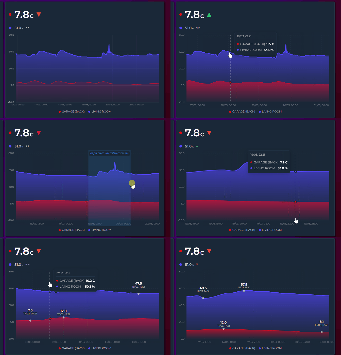
- Click and drag horizontally — a blue selection overlay appears with formatted timestamps at both edges
- Release — the graph zooms into the selected range, recalculating Y axis, grid, statistics (Min/Avg/Max), extrema labels, and legend values
- Step back — double-click the graph (double-tap on mobile) to step back one zoom level (see Zoom History). Keep double-clicking to unwind every level and return to the full window
Key details:
- Instant zoom — zooming never re-fetches data from Home Assistant; zoom and reset are immediate.
- Progressive zoom — zoom again within an already-zoomed view to drill deeper into spikes or anomalies
- Touch support — works on mobile: touch and drag to select
- Minimum 15px selection — prevents accidental zoom from regular clicks or taps
- Time formatting — selection labels show time only for ranges under 24H, date + time for longer ranges
- Interval picker aware — changing the time range via the interval picker resets any active zoom and fetches fresh data
On touch devices, a two-finger pinch zooms the timeline directly — no long press needed:
- Spread two fingers to zoom in — the view scales live around the midpoint of the gesture while the fingers move
- Bring them together to zoom back out — zooming all the way out returns to the full window
- Any pinch angle works (improved in v3.26) — the gesture measures the true 2D distance between the fingers, so vertical and diagonal pinches (thumb below, index above — the most natural grip) zoom just like horizontal ones
- Amplified response (improved in v3.26) — zoom follows an amplified (squared) curve, so a small real-world pinch zooms meaningfully instead of barely moving the window; pinching inward zooms out just as strongly
- Double-tap still steps back one zoom level at a time — see Zoom History below
- Available whenever the drag brush is — the same gate applies (Timeline mode, brush zoom not disabled)
- Works with cross-card Zoom Sync: the final window is broadcast once at gesture end, not continuously during the pinch
Every committed zoom — a released brush selection or a finished pinch — pushes the previous window onto a history stack (up to 20 levels):
- Double-click (mouse) or double-tap (touch) steps back one level at a time
- With an empty stack, double-click shows the full window
- The stack resets whenever the data window itself refreshes — date/interval picker changes, the live window sliding forward, or a polling refresh
Changed in v3.25: double-click used to reset the zoom completely in one go. It now steps back one level at a time, so you can retrace a deep zoom instead of losing it all at once. Double-click repeatedly to unwind every level.
No new YAML options — pinch zoom and zoom history are part of the standard brush zoom behavior.
On phones and tablets, touch gestures separate tooltip exploration from brush zoom:
| Gesture | Action |
|---|---|
| Tap | Tooltip appears instantly with crosshair and values |
| Quick slide | Tooltip follows finger across the graph |
| Hold on bar | Tooltip + bar highlight stay visible as long as finger is held |
| Long press (600ms) + drag | Brush zoom selection starts |
| Two-finger pinch | Zooms the timeline live around the gesture midpoint — any finger angle, amplified response curve (improved in v3.26) |
| Double-tap | Steps back one zoom level; full window once the history is empty (v3.25) |
| Lift finger | Tooltip and highlights clear |
Holding still for 600ms prepares zoom but does not activate it — zoom only starts when the finger moves. This prevents the tooltip from disappearing while exploring a single data point.
🔽 Drill Down (new in v3.33)
Brush zoom magnifies the points you already have. Drill down goes and gets more: click a single bucket and the card reloads the chart for just that period, re-reading history at the finer resolution that shorter window allows.
type: custom:statistics-graph-chart-card
drill_down: true
entities:
- entity: sensor.power- Click a bucket — a single click on the graph, no dragging. The card takes the period under the cursor and makes it the whole chart
- Keep going — click again inside the new view to go one level deeper
- Step back — double-click steps out one level at a time, the same gesture that unwinds a brush zoom
Key details:
- This refetches — unlike zooming, the card re-reads history for the narrower window, so it shows detail that was never in the original chart. Expect a brief load, not an instant redraw
-
Requires Brush Zooming — drill down shares the click handler with the brush. With
brush_zoom: falsethe toggle stays visible in the editor but clicking does nothing - One-minute floor — a bucket shorter than a minute will not drill further
- Already a single bucket — clicking a bucket that fills the view does nothing, and clicking empty space does nothing
- 20 levels — the way back holds 20 steps; deeper than that and the oldest step is dropped
- Picking a new period resets it — any date picker change (mode buttons, arrows, presets, a calendar day, Now) or interval picker change drops every drill level and returns you to that period. A synced change arriving from another card does the same. You never end up looking at a drilled slice of a range you have since moved away from
- Timeline only, off by default. The toggle sits next to Brush Zooming in the editor's Overlay tab
Sharing the double-click: if you brush-zoomed after drilling, double-click unwinds the brush zoom levels first, then starts stepping out of the drill levels.
With Zoom Sync on, each drill step broadcasts its window to the other cards in the group, which follow along by narrowing to the same range.
📥 PNG / CSV Export
Card-level show_export: true overlays a small download icon on the top-right of the card. Clicking it opens a menu — Download PNG (Chart) / Download PNG (Card) / Download CSV — and the menu closes on any outside click.
type: custom:statistics-graph-chart-card
card_header: Energy Overview
show_export: true
entities:
- entity: sensor.energy_consumption- Download PNG (Chart) — a 2× resolution snapshot of the current plot — crisp on high-DPI displays
- Download PNG (Card) — captures the entire card exactly as rendered: header, chart, state row, and legend included
- Works in all chart modes: canvas-rendered modes (Pie, Heatmap, Ranking, …) are copied directly, and the SVG timeline is serialized with the correct axis-label styling and the card background color, so the file looks exactly like the card
- When the active theme paints the card with an external background image, the Card capture falls back to the Chart export — browsers block capturing images that come from another server.
-
Wide format — the first column is
time(ISO 8601, UTC), followed by one column per visible series; series hidden via the legend are excluded - UTF-8 with BOM and CRLF row endings, so the file opens correctly in Excel without an import wizard
- Period Comparison ghosts export as their own suffixed columns, with timestamps shifted into the current window so they align with the main series
- Candlestick series export the bucket value only — no separate OHLC columns
- Export what you see — if the chart is zoomed (brush or pinch), both the PNG and the CSV cover exactly the zoomed range
- Filenames combine the sanitized
card_headerwith a timestamp, e.g.Energy_Overview-20260715-1630.png/.csv - Hidden in sparkline mode
-
show_exportaccepts{{ }}templates — see Template Toggles
General Settings → Chart → Visual Options → Show Export Button.
📌 Annotations
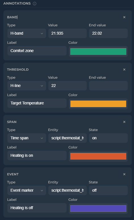
Add reference lines, event markers, and highlight bands to the graph (Timeline mode only). Configure via the editor (General Settings → Overlays → Annotations) or YAML.
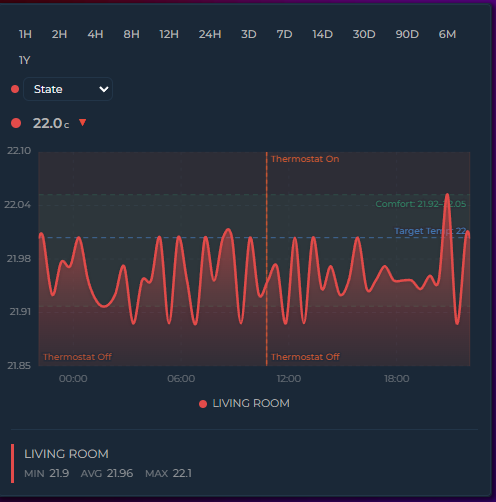
annotations:
  - type: threshold       # horizontal dashed line
    value: 22.5
    label: "Target"
    color: "#1D9E75"
  - type: threshold       # dynamic value from entity
    value: sensor.climate_setpoint
    label: "Setpoint"
    color: "#f39c12"
  - type: band            # horizontal shaded band
    value: 20
    value_end: 23
    label: "Comfort zone"
    color: "#1D9E75"
  - type: band            # dynamic band from entity attributes
    value: sensor.comfort.min_temp
    value_end: sensor.comfort.max_temp
    label: "Dynamic comfort"
    color: "#3498db"
  - type: event           # vertical marker at state transitions
    entity: binary_sensor.heating
    state: "on"
    label: "Heating on"
    color: "#D85A30"
  - type: span            # vertical band for active periods
    entity: binary_sensor.heating
    state: "on"
color: "#D85A30"| Type | Description |
|---|---|
threshold |
Horizontal dashed line at a fixed value, entity state, or entity attribute |
band |
Horizontal shaded band between value and value_end. Both accept numbers, entity IDs, or entity.attribute paths |
event |
Vertical marker — entity-driven (at each state transition) or manual (fixed timestamp) |
span |
Vertical shaded band — entity-driven (duration in a specific state) or manual (fixed start/end timestamps) |
| Option | Applies to | Description |
|---|---|---|
opacity |
All types | Prominence of the annotation (0–1) — fill for bands/spans, stroke for thresholds/events, and its label (v3.32). Default: 0.15 for bands/spans, 1 for thresholds/events |
label_opacity |
All types | Opacity of the label only (0–1), overriding whatever opacity would give it. Default: none (v3.32)
|
show_values |
threshold, band | Show numeric values alongside the label. Default: true |
label |
All types | Text label displayed on the annotation |
color |
All types | Color of the annotation line, fill, or marker |
label_color |
All types | Color of the label. Default: the annotation's color
|
label_font_size |
All types | Label size in px. Default: 10 |
label_position |
threshold, event |
left/right for thresholds (default right), top/bottom for events (default top) |
line_width |
threshold, event | Line thickness in px. Default: 1.5 |
line_style |
threshold, event |
solid, dashed or dotted. Default: dashed for thresholds, dotted for events |
y_axis |
threshold, band | Set to secondary to position the annotation against the secondary Y axis |
The editor's annotation rows expose Type, Source/Value, Label, Color, Opacity and Show Values. The remaining options —
label_opacity,label_color,label_font_size,label_position,line_width,line_styleandy_axis— are YAML only.
Threshold and band values accept: 22.5 (number), sensor.x (entity state), sensor.x.attribute (entity attribute with nested path support).
Live updates: when a threshold or band value references a sensor or input helper, the annotation updates instantly as soon as that entity's state changes — no need to wait for the next data refresh. Combine with a HA template sensor to get seasonal or month-based thresholds that automatically move over time:
# configuration.yaml
template:
  - sensor:
      - name: Solar Target
        state: >
          {% set m = now().month %}
          {% if m in [6,7,8] %}8000
          {% elif m in [4,5,9,10] %}5000
          {% else %}2000
          {% endif %}
        unit_of_measurement: kWh
# card
annotations:
- type: threshold
value: sensor.solar_target
label: Seasonal target
color: "#1D9E75"Use show_values: false on any threshold or band to hide the value label while keeping the line/band visible. When enabled (default), the numeric value appears alongside the label — or by itself if no label is set:
annotations:
  - type: band
    value: 20
    value_end: 25
    label: "Comfort"
    color: "#1D9E75"
    show_values: false    # band visible, no text labels
Manual timestamps — event markers and time spans can use fixed timestamps instead of tracking an entity. Switch between Entity and Manual source in the editor, or set directly in YAML:
annotations:
  - type: span
    start: "2026-04-15T08:00:00"
    end: "2026-04-15T18:00:00"
    label: "Day shift"
    color: "#ff9800"
  - type: event
    time: "2026-04-15T12:00:00"
    label: "Noon"
    color: "#e74c3c"
Opacity — control the prominence of each annotation with the opacity option (0–1). Applies to all types: fill opacity for bands and spans, stroke opacity for threshold lines and event markers, and the annotation's label (v3.32) — so a faded annotation fades as a whole instead of keeping a solid caption on top.
Labels follow opacity relative to that type's own default, because the defaults differ for a good reason: a band fills a whole region, so it defaults to a light 0.15, while a line and a caption default to fully opaque. In practice:
| You write | Threshold / event label | Band / span label |
|---|---|---|
| nothing | fully opaque | fully opaque |
opacity: 0.15 |
15% | fully opaque (0.15 is the band default — same rect, same label) |
opacity: 0.5 |
50% | fully opaque |
opacity: 0.075 |
7.5% | 50% (half the default → half strength) |
So dimming an annotation below its normal look dims its label by the same proportion, and for thresholds and event markers — whose normal look is fully opaque — the label simply uses the value you set.
label_opacity overrides all of that when a label needs its own alpha:
annotations:
  - type: band
    value: 18
    value_end: 24
    label: "Comfort zone"
    opacity: 0.04          # barely-there fill
    label_opacity: 0.9     # but a clearly readable caption
Annotations that never set opacity are unchanged: their labels stay fully opaque. One consequence worth knowing: opacity: 0 on any annotation used to hide the shape while keeping its caption — that now hides the caption too, so add label_opacity: 1 if you relied on it.
annotations:
  - type: band
    value: 18
    value_end: 24
    color: "#1D9E75"
    opacity: 0.3        # more prominent than default 0.15
  - type: threshold
    value: 30
    color: "#e74c3c"
    opacity: 0.5         # semi-transparent line
Jinja2 templates — annotation fields start, end, time, value, value_end, and label accept Jinja2 templates. Values update automatically when referenced entities change:
annotations:
  - type: threshold
    value: "{{ states('sensor.target_temperature') | float }}"
    label: "{{ states('input_text.target_label') }}"
    color: "#e74c3c"
  - type: span
    start: "{{ states('input_datetime.shift_start') }}"
    end: "{{ states('input_datetime.shift_end') }}"
    label: "Shift"
    color: "#ff9800"
🙈 Auto Hide Entities
Start the card with every series hidden — ideal for "pick what you want to see" dashboards with many entities.
auto_hide_entities: true
show_legend: true
Click legend items to reveal series. Reveals stick for the session, and entities added later also start hidden.
General Settings → Chart → Visual Options → Auto Hide Entities.