Widen site grid - #3284
Conversation





|
This change is |


|
cc: @jseldess @lhirata @rmloveland @Amruta-Ranade This first build implements the independently-scrollable sidenav which is QA-able at this point. I have not merged or duplicated the other sidenav changes from the work performed last week. |

|
Scrollable sidenav looks to be working great, @j-low. I don't see the page toc moved to the right gutter, though. Is that still coming? |

|
For the independently scrolling side nav, is there a way to lock the minimum size of the sidebar container? What I'm noticing is that it gets squished when you scroll down to the bottom of the main content / footer. For example:
Let me know if you need clarification! |


|
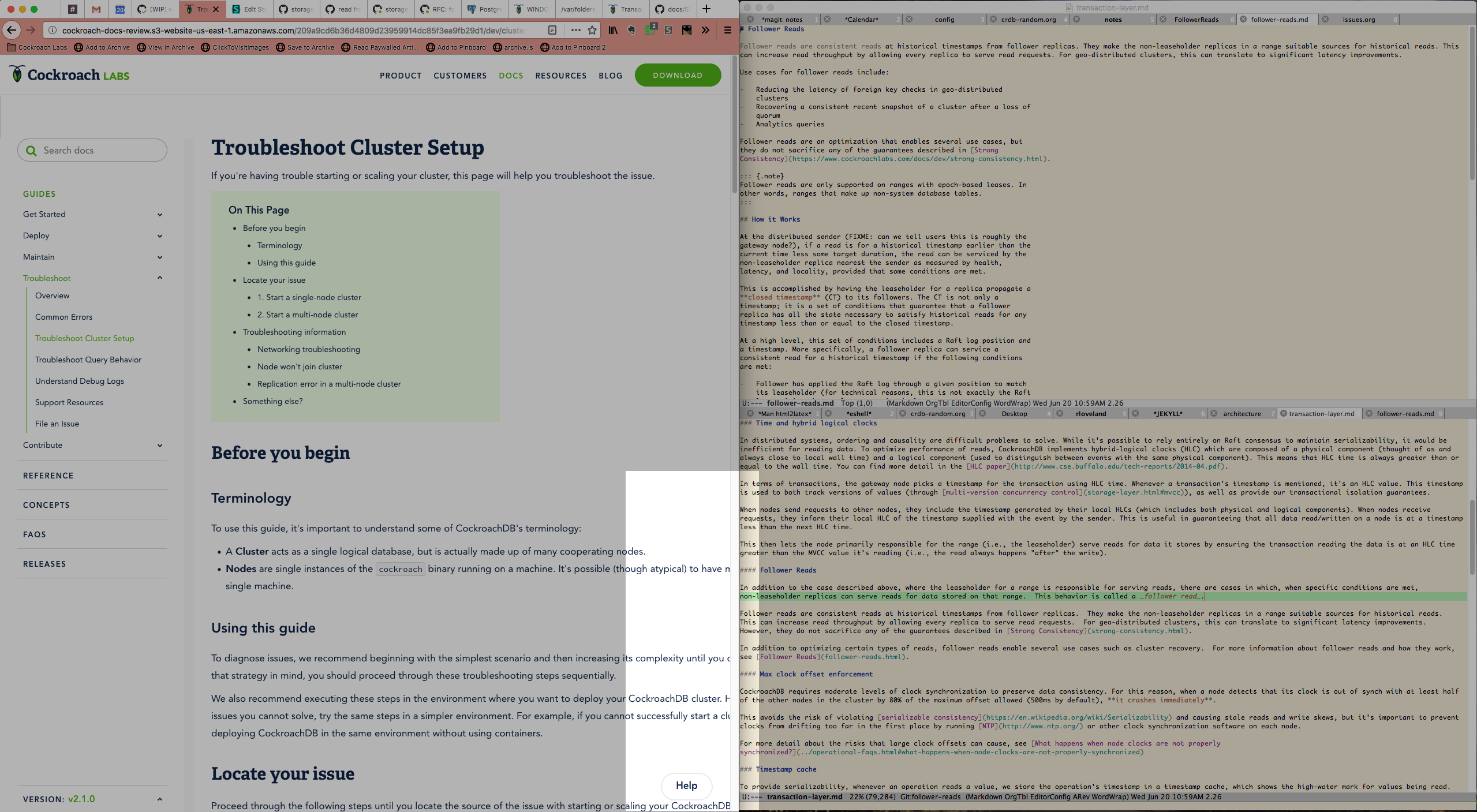
Hey @j-low thanks for working on this! Really looking forward to a wider layout on the site. Unfortunately I have one issue: The new layout causes the content text not to wrap to fit inside the browser window when the browser is using half the screen in a "2-up" configuration with another app (screenshot attached).
In other words, it seems like this layout really wants the browser to be full-screened or at least prefer to be a horizontal rectangle rather than a vertical rectangle. I suspect this might break for some developers who read docs on a vertical monitor (something I've seen around), or for people like me who work in side-by-side windows. |
|
@rmloveland thanks for the QA! That's actually a known issue that's being worked on. It just didn't make it into the last commit. |
|
Ignore that last commit message; that was meant for a Hugo commit. There is another update coming with the actual QA feedback implemented. |
|
The most recent build represents the first version ready for QA. There are a few judgment calls I made we should discuss, e.g.:
There are likely other things that will probably come up in the QA process but perhaps we can have a brief stakeholder check-in early next week to run through it all. |
|
@j-low I love the new layout! The highest compliment I can pay is this: once this is out I can stop using my custom page-widening CSS for the site (which was sorta broken anyway as I'm not a developer). Thank you! |
|
This is looking awesome, @j-low! A few observations and requests:
|
|
@jseldess great stuff, thanks for the feedback. I like all the suggestions. The one about removing the green background @kuanluo had also suggested too but I had forgotten to remove it in this PR. Bullets can definitely go. I will experiment with making the TOC itself scrollable as well as removing all the extra whitespace. I will notify the docs channel when the PR is updated. One question re: the green background: do we want it to be removed when the screen is resized and the TOC is rendered in the original area? @rmloveland glad this all seems to be an improvement! |

|
@j-low @jseldess I echo all of Jesse's feedback.
When the screen is resized and TOC is rendered in the original area, we can also get rid of the green background, depend on the way it's redesigned. In Firebase's case, for example, the right blue sidebar works well in smaller screens.
Agreed. @j-low and I discussed further tweaks to reduce the whitespace, as well as the line-height.
Yes. @j-low, can you tweak the look and feel of the TOC and see how it goes?
|
|
@jseldess PR updated with the changes we discussed earlier (e.g. TOC sub-item highlighting, merge conflicts resolved; first tier nav items default to open on all versions). |
|
This looks great! One minor thing I noticed is when you use search, the version toggle disappears. Since the search is limited to the selected version, it would be helpful to have an indicator of what version you're looking at. |
…ix broken clear-search functionality
…dion behavior on all pages

Previously, there were multiple ways for a page to have a toc.
Now, the only way is if `toc: true` is in the front-matter.

This PR makes this change and adds the script that was used
to do so.
|
@j-low, all pages now either have |
…atter in default template; refactor CSS to align left edges of header logo and sidenav


6 participants


[description]: