Theme
The theme is defined by a quite complex but not really token structure.
A token is a key-value pair that describes a specific characteristic in the design system.
Example:
button.color.primary.background.enabled = Green100
These tokens are used to ensure consistency across platforms, tools, and departments in our organization.
These are mostly used inside the design system when developing components BUT can also be changed by client apps as part of a custom theme, allowing very granular changes in the theme.
By default, the design system comes with a DefaultTheme to be used right away, but there is the possibility to customize each token in client apps.
You need to define a EverliTheme as the root of your composition tree or use the DefaultTheme
ℹ️ The theme is heavily inspired by Material Theme and involves usage of Composition Local Providers.
🙏 Please have a look at these two concepts to understand how theme works in compose.
@Composable
fun EverliApp() {
    DefaultTheme() {
        // your app
    }
}
Then inside any @Composable you will have access to any token of the design system via the EverliTheme object
@Composable
fun SomeRandomComponent() {
    Text(
        text = "label",
        style = EverliTheme.typography.subtitleSemibold),
    )
}Note: Most (if not all) components provided in the library, require you to have a defined EverliTheme to work properly.
If you want to provide a custom implementation, you can just copy DefaultTheme components or implement your own EverliTheme
val SupplyButtonTheme = DefaultButtonTheme.copy(
  color = DefaultButtonTheme.color.copy(
    primary = DefaultButtonTheme.color.primary.copy(
      fill = DefaultButtonTheme.color.primary.fill.copy(
        background = DefaultButtonTheme.color.primary.fill.background.copy(
          enabled = EverliColors.Purple100,
          pressed = purple80,
        ),
      ),
      outline = DefaultButtonTheme.color.primary.outline.copy(
        background = DefaultButtonTheme.color.primary.outline.background.copy(
          pressed = purple20,
        ),
        border = DefaultButtonTheme.color.primary.outline.border.copy(
          enabled = purple80,
        ),
      ),
      flat = DefaultButtonTheme.color.primary.flat.copy(
        background = DefaultButtonTheme.color.primary.flat.background.copy(
          pressed = purple20,
        ),
      ),
    ),
  ),
)

@Composable
fun AppWithCustomTheme() {
  EverliTheme(
    typography = DefaultTypography,
    radius = DefaultRadius,
    dimensions = DefaultDimensions,
    buttonTheme = SupplyButtonTheme,
  ) {
    // your content
  }
}
In the above example, we define a custom theme just for the Button. Note that all components of the Theme have dedicated data classes and are easily customizable via kotlin's .copy method as shown above.
Another nice advantage of Compose is that we can nest multiple themes in the same app:
@Preview
@Composable
fun InnerCustomTheme() {
  DefaultTheme {
    Column {
      // Default Theme
      EverliButton(onClick = { /*TODO*/ }, text = "Default Theme")

      // Inner custom theme
      EverliTheme(
        buttonTheme = SupplyButtonTheme,
      ) {
        EverliButton(onClick = { /*TODO*/ }, text = "Custom Theme")
      }
    }
  }
}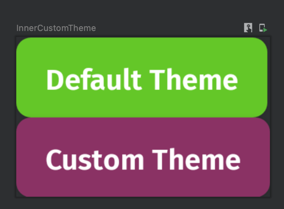
Notice that the second button used a different theme just for the button, all other tokens are inherited by the parent theme. Again, all this is possible thanks to CompositionLocalProviders
This can be useful if you want a particular section of the app to use a different theme (e.g. debug area).
Our theme extends the Material2 one, so we also allow you to pass the parameters needed to override any token. ℹ️ This allows using components from both Everli design system and Material Components
@Composable
fun EverliTheme(
  typography: EverliTypography = EverliTheme.typography,
  buttonTheme: ButtonTheme = EverliTheme.button,
  radiusTheme: RadiusTheme = EverliTheme.radius,
  iconTheme: IconTheme = EverliTheme.icon,
  textTheme: TextTheme = EverliTheme.text,
  materialColors: Colors = MaterialTheme.colors, // override material colors
  materialTypography: Typography = MaterialTheme.typography, // override material typo
  materialShapes: Shapes = MaterialTheme.shapes, // override material shapes
  content: @Composable () -> Unit,
) {
  CompositionLocalProvider(
    LocalTypography provides typography,
    LocalButtonTheme provides buttonTheme,
    LocalRadiusTheme provides radiusTheme,
    LocalTextTheme provides textTheme,
    LocalIconTheme provides iconTheme,
  ) {
    MaterialTheme(
      colors = materialColors,
      typography = materialTypography,
      shapes = materialShapes,
      content = content,
    )
  }
}There are some limitations when it comes to XML and theming, it's not as flexible as the Compose.
By default the design system creates a EverliTheme that extends one of Material2:
<style name="EverliTheme" parent="Theme.MaterialComponents.Light.NoActionBar">All tokens are available in the theme apart from text styles. This is a limitation. That's because behind the scenes we create a Compose theme based on the XML one, but currently there is no nice way to map XML text styles to Compose ones.
There are some workarounds for that if needed. But currently most of the times you would only change the colors.
Customizing colors and dimensions:
  <style name="Theme.DesignSystemAndroid" parent="EverliTheme">
    <!-- Override material theme -->
    <item name="colorPrimary">@color/purple_500</item>
    <item name="colorPrimaryVariant">@color/purple_700</item>
    <item name="colorOnPrimary">@color/white</item>

    <!-- Everli Design system specific -->
    <item name="buttonColorPrimaryFillBackgroundEnabled">@color/purple_100</item>
    <item name="buttonColorPrimaryFillBackgroundPressed">@color/purple_80</item>
    <item name="buttonColorPrimaryOutlineBackgroundPressed">@color/purple_20</item>
    <item name="buttonColorPrimaryOutlineBorderEnabled">@color/purple_80</item>
    <item name="buttonColorPrimaryFlatBackgroundPressed">@color/purple_20</item>
  </style>
These tokens are then used by all XML compatible components such as the EverliButtonView, more about that in the components section.
You can also use the tokens via the attribute syntax android:layout_width="?attr/iconSizeSmall"
We also provide a Theme Adapter inspired by Material Theme Adapter.
The scope of the adapter is to allow generating Compose themes based on XML theme. This concept is used customize the xml components, more about that in the components section.
You can create the Compose theme from XML using the ThemeAdapter function:
@Composable
fun ThemeAdapter(
  context: Context,
  density: Density = Density(context),
  content: @Composable () -> Unit,
) {
  val theme = EverliThemeAdapter.createFromContextTheme(context, density)

  EverliTheme(
    typography = theme.everliTypography,
    buttonTheme = theme.buttonTheme,
    radiusTheme = theme.radiusTheme,
    iconTheme = theme.iconTheme,
    textTheme = theme.textTheme,
    content = content,
  )
}
EverliThemeAdapter.createFromContextTheme(context, density) will load all tokens you defined in your theme.xml