Font Project Git Repo URL:
https://github.com/arekbr/ogonek64
Super short description of the Font Family:
Ogonek 64 Mono is a monospaced pixel typeface on an 8×12 grid, in the spirit of early
8-bit home computer character sets, with the complete GF Latin Core glyphset and a full
set of Polish diacritics — something those character sets never had. Two styles, Regular
and Bold. Built for terminals and code.
The repository also contains two sibling families built from the same sources — Ogonek 64
Sans (proportional) and Ogonek 64 CRT (scanline display face). I am submitting Mono first;
happy to open separate issues for the other two if you would like to see them.
Why this family, given the pixel faces already in the catalogue:
General-purpose pixel faces in Google Fonts do cover Central European: VT323, Pixelify Sans and
Handjet all have 18/18 Polish letters and the full Latin Core, and Press Start 2P has 18/18 as well.
The gap is in one specific corner — faces that reproduce the raster character sets of 8-bit home
computers. Measured with fontTools on the TTF files currently in this repository (cmap coverage,
GF Latin Core taken from the glyphsets package). The last row is the family proposed here,
measured the same way:
| family in the catalogue |
Polish letters |
GF Latin Core |
| Sixtyfour |
2/18 |
201/319 |
| Workbench |
2/18 |
199/319 |
| Silkscreen |
2/18 |
209/319 |
| DotGothic16 |
4/18 |
220/319 |
| Ogonek 64 Mono (this submission) |
18/18 |
319/319 |
Sixtyfour is described in the catalogue as "a rework of some old pixel versions of the Commodore 64
and Amiga Workbench fonts" — that is exactly the tradition this family comes from, and exactly where
Central European diacritics are missing.
This is a long-standing, practical problem in the retro-computing community, not a theoretical one.
The TrueType conversion that the Commodore 64 scene actually uses has no Polish letters at all,
and its licence forbids modification and redistribution — so nobody can legally fix it, however much
they want to. People writing about these machines in Polish, Czech, Hungarian or Turkish either drop
their own diacritics or drop the typeface. Ogonek 64 exists to close that gap under a licence that
lets anyone build on it: the whole point of putting it under the OFL with no Reserved Font Name.
Requirements:
AI tools disclosure:
The fonts are generated by code rather than drawn in a font editor, so I want to be precise
about what that means.
The build tooling (sources/*.py), the QA scripts and the glyph-composition rules were
written with AI assistance (Claude, Anthropic), directed and reviewed by me throughout.
No part of the process is a black box: the composition is deterministic, and two independent
builds differ only in the head.modified timestamp.
What the code actually does:
- The Latin base is a one-time export of the character ROM of a 1982 8-bit home computer
into a pixel map, kept from then on as a plain text file in the repo (# = pixel on).
No ROM binary is redistributed. On an 8×8 grid a legible Latin capital has essentially one
solution; the US position on typeface designs (37 CFR § 202.1(e), Eltra Corp. v. Ringer)
is summarised in documentation/PRAWO.md.
- Diacritics, punctuation and the GF Latin Core additions are composed deterministically
from a base letter plus a mark, by rules in sources/zrob_glify.py and
sources/glify_latin.py.
- Every shape decision was made and approved by me, on rendered proofs — and those are
the decisions that determined whether the font is readable at all: giving accents two rows
plus a pixel of clearance from the letter; distinguishing Ź from Ż by stroke weight
rather than by a one-pixel offset; deriving the bar of Ł/ł from the position of the
stem instead of hardcoding it; letting the accent replace the dot on i/j. In each case
the table-level checks passed both the good and the bad variant — only looking at the
rendering caught the difference. The same applies to the standalone spacing marks, which
I moved to accent height after seeing a full glyph sheet.
QA:
fontbakery check-googlefonts — 0 FAIL across 455 check executions for each of the three
families. Remaining WARNs are the ones inherent to a pixel face (contour_count,
unreachable_subsetting) plus alt_caron, where the Czech apostrophe-style caron for
ď ľ ť is a design choice I am happy to revisit if you prefer it.
Coverage: 321 characters — GF Latin Core complete, 18/18 Polish diacritics, 14 zero-width
combining marks, Polish punctuation. UPM 2048, OS/2 version 4 with USE_TYPO_METRICS,
fsType 0, gasp and prep present, contours clockwise.
Note: I previously opened PRs #10815, #10816 and #10817 before understanding the process
— thanks to @emmamarichal for pointing me to the right way in. Closing that loop here.
Image:
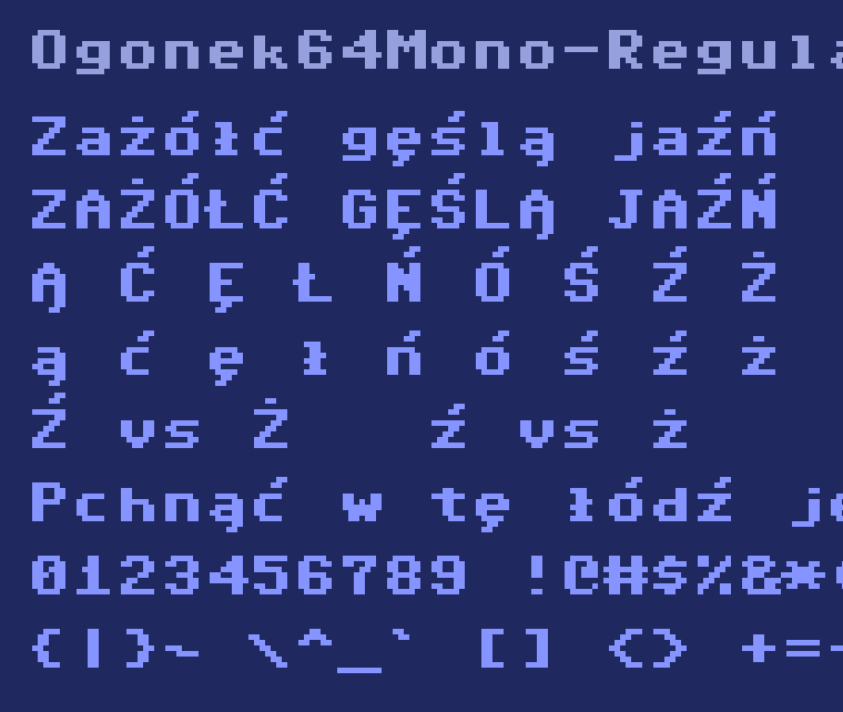
All 321 characters at a glance: documentation/arkusz-znakow.png · the four styles side by side: documentation/specimen-odmiany.png
Font Project Git Repo URL:
https://github.com/arekbr/ogonek64
Super short description of the Font Family:
Ogonek 64 Mono is a monospaced pixel typeface on an 8×12 grid, in the spirit of early
8-bit home computer character sets, with the complete GF Latin Core glyphset and a full
set of Polish diacritics — something those character sets never had. Two styles, Regular
and Bold. Built for terminals and code.
The repository also contains two sibling families built from the same sources — Ogonek 64
Sans (proportional) and Ogonek 64 CRT (scanline display face). I am submitting Mono first;
happy to open separate issues for the other two if you would like to see them.
Why this family, given the pixel faces already in the catalogue:
General-purpose pixel faces in Google Fonts do cover Central European: VT323, Pixelify Sans and
Handjet all have 18/18 Polish letters and the full Latin Core, and Press Start 2P has 18/18 as well.
The gap is in one specific corner — faces that reproduce the raster character sets of 8-bit home
computers. Measured with
fontToolson the TTF files currently in this repository (cmapcoverage,GF Latin Core taken from the
glyphsetspackage). The last row is the family proposed here,measured the same way:
Sixtyfour is described in the catalogue as "a rework of some old pixel versions of the Commodore 64
and Amiga Workbench fonts" — that is exactly the tradition this family comes from, and exactly where
Central European diacritics are missing.
This is a long-standing, practical problem in the retro-computing community, not a theoretical one.
The TrueType conversion that the Commodore 64 scene actually uses has no Polish letters at all,
and its licence forbids modification and redistribution — so nobody can legally fix it, however much
they want to. People writing about these machines in Polish, Czech, Hungarian or Turkish either drop
their own diacritics or drop the typeface. Ogonek 64 exists to close that gap under a licence that
lets anyone build on it: the whole point of putting it under the OFL with no Reserved Font Name.
Requirements:
AI tools disclosure:
The fonts are generated by code rather than drawn in a font editor, so I want to be precise
about what that means.
The build tooling (
sources/*.py), the QA scripts and the glyph-composition rules werewritten with AI assistance (Claude, Anthropic), directed and reviewed by me throughout.
No part of the process is a black box: the composition is deterministic, and two independent
builds differ only in the
head.modifiedtimestamp.What the code actually does:
into a pixel map, kept from then on as a plain text file in the repo (
#= pixel on).No ROM binary is redistributed. On an 8×8 grid a legible Latin capital has essentially one
solution; the US position on typeface designs (37 CFR § 202.1(e), Eltra Corp. v. Ringer)
is summarised in
documentation/PRAWO.md.from a base letter plus a mark, by rules in
sources/zrob_glify.pyandsources/glify_latin.py.the decisions that determined whether the font is readable at all: giving accents two rows
plus a pixel of clearance from the letter; distinguishing
ŹfromŻby stroke weightrather than by a one-pixel offset; deriving the bar of
Ł/łfrom the position of thestem instead of hardcoding it; letting the accent replace the dot on
i/j. In each casethe table-level checks passed both the good and the bad variant — only looking at the
rendering caught the difference. The same applies to the standalone spacing marks, which
I moved to accent height after seeing a full glyph sheet.
QA:
fontbakery check-googlefonts— 0 FAIL across 455 check executions for each of the threefamilies. Remaining WARNs are the ones inherent to a pixel face (
contour_count,unreachable_subsetting) plusalt_caron, where the Czech apostrophe-style caron forď ľ ťis a design choice I am happy to revisit if you prefer it.Coverage: 321 characters — GF Latin Core complete, 18/18 Polish diacritics, 14 zero-width
combining marks, Polish punctuation. UPM 2048,
OS/2version 4 withUSE_TYPO_METRICS,fsType 0,gaspandpreppresent, contours clockwise.Note: I previously opened PRs #10815, #10816 and #10817 before understanding the process
— thanks to @emmamarichal for pointing me to the right way in. Closing that loop here.
Image:
All 321 characters at a glance:
documentation/arkusz-znakow.png· the four styles side by side:documentation/specimen-odmiany.png